A map that interests me is The World of Music Map by David Gleich, Matt Resmussen, Kevin Lang and Leonid Zhukov.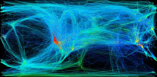 The World of Music, by researchers at Standford, MIT and Yahoo!, intends to render the music space in an unprecedented way. This visualization shows 9,276 artists and how they are related to each other. The artist relation data is mined from user ratings of artists in the Yahoo! Music service. The researchers used a technique called semidefinite programming (which is sometimes called Semidefinite embedding) to layout and cluster the data. The artists with over 100 ratings were selected and similar artists were connected based on the user ratings. For each pair of artists, similarity was determined by the number of users that rated them highly. The map is interactive and the viewer can hover to view different genre names. Upon clicking on these genres, the constituent names and nodes of connection in that genre area will pop up on the map as shown below.
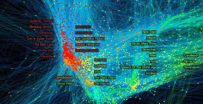 What concerns me about this map is the use of the world “relation”. The map is published as “artists related to one other”, which makes me think these artists are related in genre or music style. However when I dig deeper into the method of drawing relation based on user ratings, I learn that the makers concluded that two artists are related if more users rate them highly. If this is being called “related”, it is not implied by or implies similarity. I am therefore interested to know in what kind of relation this is, and what information is this giving the viewer? In my first view, I misread this map and the meaning of relation.
It is interested to see the pattern in how genre zones are linked.