# # # # # # # # # # # #
( 1 )
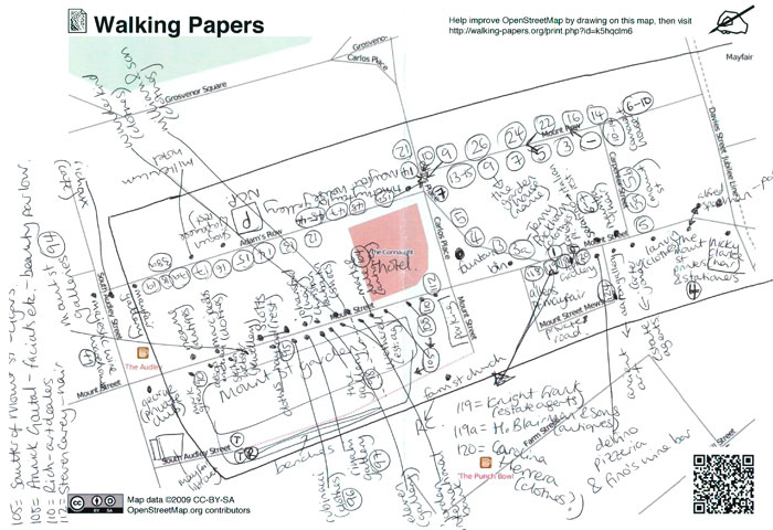
Though Google Maps now has a similarly styled ‘peer review’ process for crowdsourcing chunks of map data, Walking Papers incorporates the analogue experience of tracing a path on a piece of paper and marking down places of interest as you come upon them. These maps can then be merged directly back into the larger digital project via scan.
This service is powerful, then, for the following two reasons:
A. The anachronism of recording your edits, annotations, etc. on paper and then being able to contribute to them easily to the larger digital project speaks for itself.
B. Walking Papers contributes to OpenStreetMap, a larger opensource mapping project that is not beholden to shareholders the way Google is.
# # # # # # # # # # # #
( 2 )
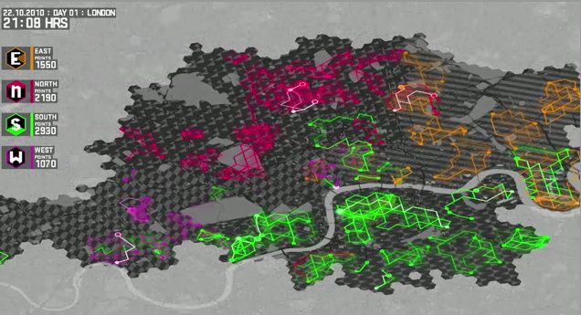
This is a great example of a data visualization that further enlivens and rounds out a well conceived experience. Nike Grid promotes running through a clever combination of game mechanics and ‘obsolete’ infrastructure (i.e. phone booths). The team behind the project recognized that statistics play an important role to spectators and players in most any game, and so have incorporated daily visualizations of the gameplay. Even if data viz is only part of the whole here, it highlights how compelling the merger of analogue and digital can be. Especially in this case where athletics is involved.
# # # # # # # # # # # #
( 3 )

Infographic as aesthetic. I don’t care whether or not these things communicate information–their visual impact overshadows anything they might be trying to convey. In this sense, if their intent is indeed to communicate relationships within datasets they probably fail.
# # # # # # # # # # # #