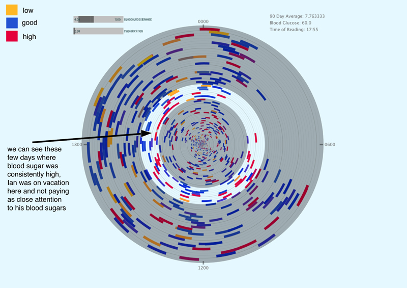
This is a visualization of blood glucose data created by Andrew Nip and Sara Krugman. It is a part of a platform called LINE that helps users to visualize, contextualize, connect and share blood glucose data.
We are using a twenty-four hour clock, each ring represents a day. Users are able to zoom in and out to see long and short term trends as well as control the range of blood glucose that they are aiming for. The colors of each reading represent low, good and high numbers. Mousing over individual readings display the number and time of the reading.
Data is uploaded as a csv file through the Glooko cord. The Glooko cord interfaces with multiple blood sugar meters and connects directly to an iphone. Users export and email the data file to LINE’s server which then uploads it into the visualization and application.
 special thanks to…
Golan Levine, Martin Ignac, and Ian Jorgensen
www.linehq.com
andrew@linehq.com
sara@linehq.com - http://designhealthtech.tumblr.com/
