Monthly Archives: February 2014

Shan Huang

21 Feb 2014

CONTACT: augmented acoustic

Can it get any cooler? This project turns a table into a tangible surface by collecting sounds generated from interaction with the wooden surface. The project coincides with an idea I had a while ago – making a sort of electronic drum kit by collecting sounds of “table drumming”. While it’s a little disappointing to find that it has been done, I admire how the system seems to be very responsive and accurate. The visuals and audios do a good job of augmenting the surface and giving feedback to users on their actions. The only thing I find a bit redundant is the leap sensor. I don’t fully get what the sensor is doing there. Though the system also reacts to waving your hand in the air, the interaction is way less intuitive than just knocking on an solid object.

Rain Room at MOMA

Rain room is an installation in MOMA in which people can walk through a rainy room without getting wet. The room has 3D cameras that track people’s movement so that it temporarily and regionally stops raining when people pass by. I find it an inspiring illustration of how technology can surprise people by simulating nature in an unauthentic way. The lighting setup in the room also creates a mysterious atmosphere that turns rain into an unfamiliar matter. Therefore even though rain is so ordinary, rain falling down in an unexpected way in an unfamiliar environment is a piece of art.

The kids stay in the picture + more Yorgo Alexopoulos’s work

Yorgo Alexopoulos brings still images to life by cutting them into planes and overlaying them with shapes and moving them around to create a parallax effect. His work strikes me by showing how much power rests in still images. By moving planes of images around in different directions he can control how audiences experience these images. He can easily shift audiences’ focus around, by doing which he turns images into narratives. I guess the project doesn’t show much interactivity because the movements are all predefined, but I think his idea could get even cooler by integrating some interactive technologies.

Chanamon Ratanalert

19 Feb 2014

Interaction

1. Radio
In my spare time, I like to not-creepily stalk CMU students’ online design portfolios. One that I came across quite a while ago but has always remained in my mind is RADIO by current senior in industrial design, Ethan Frier (I don’t know him… let’s just leave it at that). In this project, he created tangible plaster forms of 5 radio stations: jazz, NPR, pop, freeform, and rock. These tangible stations are shaped differently to represent the radio station. The user takes a station form and puts it onto a dock, which registers the station through RFID tagging. The user can then move the form up and down the dock to control volume.
What could be improved is the solidity of putting in a plaster form. I feel like the audio beep is satisfying, but a physical form of click to go along with the physical aspect of the station would be a more gratifying experience.
I really appreciate this project because it required multiple levels of interaction. Moving a piece up and down to control volume is one thing, but to create separate, physical pieces to represent radio stations another. I like that the full interaction experience of changing and adjusting a radio station is created in this project.

2. Your line or mine – Crowd-sourced animations at the Stedelijk Musem

This interactive exhibit has pieces of paper with varying dots on them. People come along and draw lines, shapes, etc. that connect these dots. They then scan the page and see their creation combined with others’ on a large screen, progressing as the dots move and the pictures change. What I like about this exhibit is that it is not interacting with the art itself, but with others. Not only are you able to play around with the project, but you contribute to it. Additionally, I like how it’s more complex than it seems. In each video of the collection of people’s drawings, you can see there is great variance between what people drew. Connecting the dots is something we did as children before we knew how to draw, but this project takes it to a higher level and pushes thought through it. You can see people in the video really considering what they want to put to the page; what they want to contribute to the project. This project offered a guide for people to connect, but offered great opportunity to be creative and for people to do whatever they wanted.

3. Radiohead: Polyfauna – An immersive, expansive world of primitive life

Described as “a living, breathing, growing touchscreen environment, born from abstraction of the studio sessions from King of Limbs and the organic drawings of Stanley Donwood,” this project kind of creeps me out. It is an iPad app that moves in 3-d motion space and consists of environment scenery, sound, and touch interactions by the user. It’s hard to explain what it is, mostly because I don’t quite understand it (it’s that creepy), so take a look at the video yourself. I like this project because it combines multiple features: motion interaction (moving the iPad around moves the scenery around), visual environments, and audio. I wish this project were a little less abstract so I could understand why changes in the environment occur, but I guess that’s part of their abstract audio-connection visualization they were going for.

Haris Usmani

19 Feb 2014

MirrorFugue

By Xiao Xiao

This project explores music collaboration across space and time, communicating through sound and gestures. The system has two modes: “Reflection” and “Organ”. In reflection mode, the player can see and hear what is being played in the reflection of the keys while in organ mode, the virtual player’s hand appear as projected hands on the keys themselves. Anyone can be the virtual player, you could even play with yourself or collaborate with another miles away. I personally liked the project as it preserves the aesthetics of the instrument while enhancing interaction between the two worlds (the real-time and the virtual) by sound and vision. Xiao used MIDI keyboards, wide-angle cameras, projectors and MAX/MSP to build the prototype.


“The Treachery of Sanctuary”


by Chris Milk

This is an art installation that consists of three panels that represent the process of creative inception. The artist who conceptualized the project was very close to the idea of how birds live (in fact he mentions he lives on the beach!), and so he used the motion of birds to convey his point across. The first panel tells us about inspiration, where the individual’s shadow disintegrates into birds that fly away. The second panel presents the impossibilities- the moment where outside forces start to limit or kill the ideas we come up with; here the individual’s shadow is eaten away as birds fly towards it and snatch a part away. In the third panel, the individual learns how to make the idea work- its where ‘you and the idea transcend’. The individuals shadow appears to grow wings in this stage. It’s made possible using Kinect to detect the person and interact with his body motion. What moved me most about it was how people reacted to the installation- skip to the last few minutes of the video to see the gestures and emotions people show.


Voice Spray

By Rafael Lozano-Hemmer

This is a sound art installation where the participants can come in and speak into the intercom. Their voices are converted into flashes of light, and a unique pattern of blinking lights is generated which traverses over the light array. Near the end of the audio, the participant can hear chunks of the last 288 recordings made on the device, so this project keeps accumulating the last 288 recordings done on it.

Chanamon Ratanalert

18 Feb 2014

For the past few weeks, I’ve been collecting data about myself for what I thought was going to be my quantified selfie. My plan was to see the correlations between how much work I have, the sleep I get, my mood, the weather, and how much junk food I eat. I always knew it was a shallow idea, but it was a starting point. Last week, after I was appalled at the large pile of clothes on my floor during my upkit2 work days, I started logging “how many things are on the floor” at around 9pm each day.

My project has now shifted to focus on this floorspace issue. However, I have very little data now that I’ve changed it. I also don’t know how to progress from here, or how to visualize it. Others (Wanfang and Harris) suggested that I take progressive photos of my floor to better capture times of day and how much is on the floor. The issues I have with this is privacy and feasibility of taking these pictures due to the arrangement of my room and the existence of my roommate. Also, after thinking about it, the stuff on my floor is generally consistent within a day; meaning that if there are 5 things on the floor at the start of my day, there will be about 5 things on my floor when I get home. This is generally due to the fact that the things don’t move on their own when I’m not around. In conclusion, it’s more of the day to day change that will be varying. My thoughts right now are to take a picture of my floor right before I go to bed. This will pretty much be the time in which I’ll have decided to either clean my room or not give a flying poop and leave it the way it is.

From these pictures, I’ll hope to generate a program to gather the percentage of floorspace left of my floor (in comparison to a picture of my floor when it’s clean, if that’s even possible). From this, as Kevyn suggested, I can visualize the floor junk in comparison to a stack of books representing how much work I have.

I think how much sleep I get, restlessness, etc. (things I gather from my FitBit and AskMeEvery questions) count a great deal into my messiness. It is not just a matter of what I have that day that makes my room messy, but what I could have the next day or have had the previous days. For example, I may not have a lot of work today, but if I just had a long streak of work and sleepless nights, then I’ll be too exhausted to care about my tidiness.

My current 2 ideas on possible visualizations are as follows:
1. A Predictor: I will analyze the data and synthesize some sort of correlation between work, sleep, and mess. Then I can create a software system (or physical, but less plausible) in which you can adjust amounts of work or sleep given to me and see how messy my room might be. I would then send this to my mother and tell her to get off my back about cleaning my room. Or to my roommate as a warning and apology for my side of the room having been struck by a tornado.
2. A physical somewhat abstract creation: I’m obsessed with somehow finding a project I can do that is physical. As much as I love communication design and lack the skills of an industrial person, I desperately love tangible objects and wish I could create something for it. I would probably create some sort of sphere or cylinder in which a person could turn it over in their hand and follow the work flow (possible color-mapped with light colors representing light work and darker colors representing heavy work load). Those portions of the object would be bumpy or somehow physically changed to represent the mess. I don’t want to create anything too abstract otherwise the data collection will have been useless, so we’ll see how far I can take this idea.

I have class right now, so those are all my thoughts for now. I’ll figure it out.

Andre Le

18 Feb 2014

[vimeo=http://vimeo.com/52192606]

Seismo

Seismo was a data visualization project developed by oblong industries, an interactive design agency that was behind the interfaces for the 2002 movie Minority Report. Here, they demonstrate the power of their Greenhouse SDK by allowing the user to freely interact with the data using purely gestures. They demonstrate both macro movements to move around, as well as micro movements for selection of data points. Finally, they show off the ability to seamlessly switch to smartphone interactions.


[vimeo=http://vimeo.com/79290868]

Calderan – Hyper Island

Calderan was a project developed by students from Hyper Island in Stockholm. Hyper Island is considered a boot camp for digital media artists. For their final presentation, they built a “holographic” display in which users would interact with using gestures. The holographic illusion is performed using an old optical trick called “Pepper’s Ghost.” In this instance, they project images on to four sides of a pyramid to give the illusion of a truly 3-dimensional experience.

[vimeo=http://vimeo.com/55599700]

Lamps: Dumb things, Smart Light

In this video, Berg has taken on Google as a client to discover how to help people interact with the physical world. In this interaction design experiment, they toy with the concept of using “dumb” object with no technology built into them, and augment them using projection and camera tracking to create a dynamic interaction. This reminds me of another project seen in a previous IACD class where users could draw an interface and a projection of the actual interface would be projected on top.

Afnan Fahim

18 Feb 2014

Interactivity

1 – Webcam based interactivity with RevealJS

http://revealjs.herokuapp.com/

This project is inspiring because the creator thinks about how a commonplace document – the powerpoint – can be made more engaging and playful. The author uses webcam based gesture recognition to allow a user to control the flow of a slideshow. The project could have been more effective had it not just done complex computer vision algorithms but also supported rudimentary optimizations like if a finger is very close the the webcam and covers most of the view of the camera.

2 – Starfield

http://vimeo.com/36892768

In general I am a stickler for interactivity that goes beyond the desktop / mobile screen and stretches into the physical world around us. This project really took that liking to a whole new level. It is simple but really gives the user an immersive experience by accelerating the stars in the direction opposite to the rotation of the swing. I think the project could have been more realistic if the swings were suspended inside domes so that the user could get a 360 degrees view of the sky. However as it is, the project is really immersive and i’d love to try it out.

3 – A Louer

http://www.youtube.com/watch?v=skpS_C0HVik

This project signifies the social impact that interactivity can have. This application, built on openframeworks and featured on creativeapps, uses computer vision to detect location of passers by in the street, and then moves a commonplace “rental” sign board alongside the passers by as they walk. This is inspirational for me because it takes something really ordinary and makes it interactive for normal people walking on the street. These normal people get to experience something new, enjoy, and move on with their lives hopefully undistributed. This simple but engaging experience is what the makes or A Louer really got right.

Emily Danchik

18 Feb 2014

Aireal

This project was done at Disney Research on the CMU campus. Using a small device that shoots air at the participant, the project can simulate the feeling of pressure on one’s hands, such as blocking a soccer ball or feeling a butterfly fly up and down one’s arm.
Tactile feedback is still in its infancy, and this is a good solution, given the technologies we have available.


The Evolution Door

This project takes an everyday object and reimagines it in a way that is novel, but still practical. Instead of opening and closing like a typical door, this one rolls to the side in two sections in one graceful motion. The interaction is no more difficult than opening a traditional door, just different. The design is elegant and functional.


Make Like a Tree

In this project, as viewers move in front of the installation, their shadows are recorded and replicated further and further back in the forest, in a kind of delayed, reflective interaction.

MacKenzie Bates

18 Feb 2014

Ghost

Given the kind of weather we have been  having I thought this project was rather fitting. It is an interactive installation of a snow storm, raging within an abandoned, barren landscape. Using OpenFrameworks with OpenNI, OSC and custom shaders visitors become a part of the installation as their bodies are recorded and they are placed  within the storm in a line with their peers as they try to find a way out.

Weather Worlds

Thought it was an interesting compare/contrast to see two OpenFrameworks interactive weather-themed pieces side by side. Weather Worlds is an interactive installation that grants children weather controlling superpowers. Once again a camera and projection is utilized to allow visitors to become immersed in the environment. But instead of being a passive view who is scanned and then deposited, storms can be conjured with your hands, tornados twisted, you can literally make it rain (and in a far classier way than Juicy J’s Bandz A Make Her Dance interactive game).

Enra

This amazing projection augmented performance project has the goal to become the first single performance of “enra”. Enra is a new style of dance performance that combines video and physical expression. 

Not sure what they are using to accomplish the augmentation but it is quite impressive.

It is currently a Makuake project (Chinese version of Kickstarter I believe. Here is the page translated to english: here

Breeze

An Interactive L-System generator to design trees.

DevArt

Kevyn McPhail

17 Feb 2014

Project 1:

Long Distance Art

Project 2:

Appseed

Project 3:

HypoSurface

I chose these projects because of my interests in the digital representation and recreation of analog activities.

As someone who has been looking into with getting robots to work intuitively with humans I am really impressed with the first project by its ability to translate human movement to the robot arm. What is interesting about the project is that even thought the robot and the artist are pretty much perfectly in sync, you can see that the robot’s drawing is a close but slightly modified version.  But this is probably due to a lot of technical faults such as the sensing and reaction timing of the robots in addition to the motors getting up to speed, etc… However this project is still pretty amazing and a good precedent for a potential capstone project.

I was really interested the second project because of how it very elegantly touches on the ideas of digitally representing analog items very well. Especially since it makes it very easy to prototype application interfaces. It removes a lot of steps in between sketching and wire framing to interface development.

Lastly the final project caught my eye because of its flexibility  in interaction. The hyposurface responds to almost any type of physical interaction with the wall. The three key interactions that it responds to are sound, light and touch. But it can also respond to a mix of these senses. From an architectural stand point, the hyposerface can introduce a whole new perception of spaces, allowing them to be responsive to it’s inhabitants. It can also change the way buildings perform allowing spaces to be, literally, shaped by the emotions and physical reactions of a building’s users.

Sama Kanbour

17 Feb 2014

Usable: Celebrating every minute spent outside

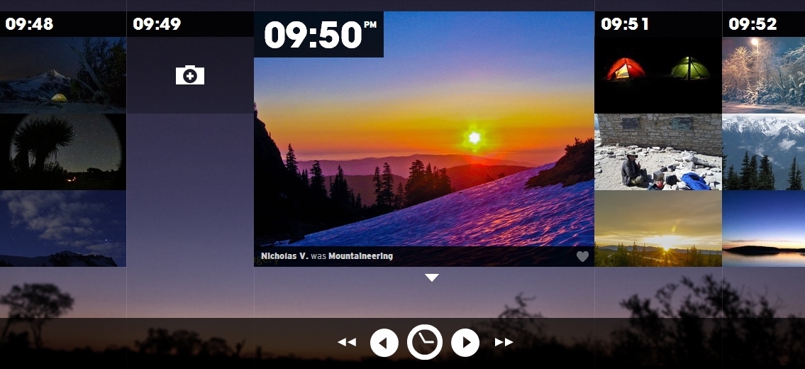
Description This website presents an interactive timeline that shows how different people spend their time minute by minute on a daily basis. The timeline integrates images along with captions. People can be tagged to an entry, and thus can be tracked. A search feature allows the user to find specific entries by the time they took place. The timeline animation is very pleasant.
Tools and resources the timeline was generated using JavaScript

ScreenShot002


Useful: Interactive design

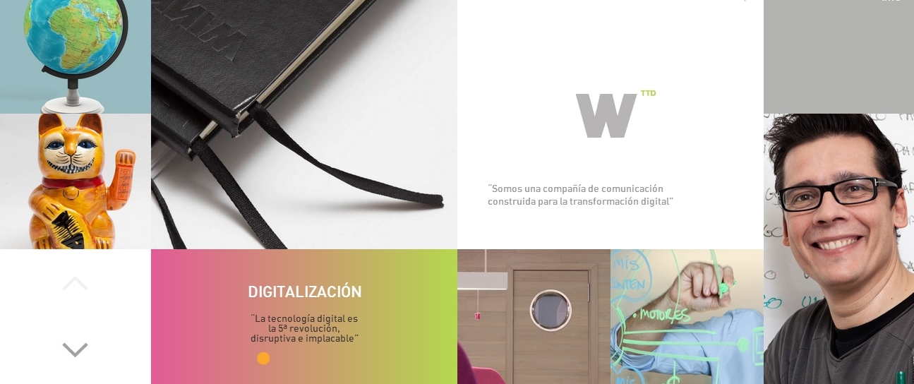
Description what I liked about this interactive website is not the idea or content, but rather the animated transition between the different layouts. I find this example of interaction useful for my own project as I am gathering ideas about how I can visually organize my information for the Quantified Selfie.
Improvement looking at the source code, it appears that the developer used JavaScript to create animations, which I don’t think is ideal. Given how powerful CSS3 is today, I am confident there is a way to recreate these animations using CSS only.

ScreenShot003


Desirable: Express your musicality!

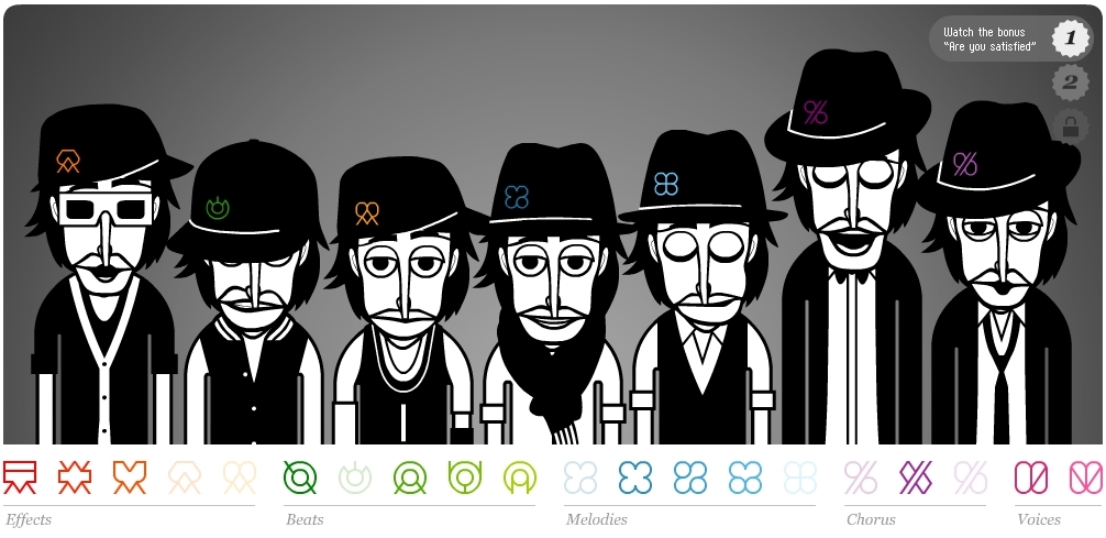
Description: this is a web app that allows you to make a human miniature beatbox. To me, this app is more related to a cappella music than beatboxing. Given that cappella music is à la mode, this app in my opinion is very entertaining and fun to play with. It could almost reproduce Mike Tompkins’ exceptional vocal art!

ScreenShot005