Category Archives: 30-Visualization

Emily Danchik

13 May 2014

Finding emilyisms in my online interactions.

This post is long overdue, and exemplifies the time-honored MHCI mantra of “done is better than perfect.”

I downloaded my entire Facebook and Google Hangouts history, hoping to find examples of “emilyisms.” By that, I mean key words or phrases that I repeat commonly enough for someone to associate them with me.

Once I isolated the text itself, I read it into NLTK, and used it to find n-grams of words, for combinations 2-7 words long. Then, I put the data into a bubble cloud using D3, hoping to visually find phrases which identify my speech. Here is the result: (you can see the full version here)

big


My original intent was for phrases with fewer words to be lighter colors, and phrases with more words to be darker. This way, I hoped to easily point out phrases which were uniquely mine. Many of the larger circles represent two-word combinations that I use frequently, but are not particularly Emily-like.

I mean, of course I say "and I" a lot

I mean, of course I say “and I” a lot

Through exploring data in the visualization, I did find some interesting patterns. For example, during my in-class critique, it was pointed out that I say “can you” twice as often as I say “I can.” That realization actually helped me shape the rest of my semester here, as silly as it sounds.

There are some definite emilyisms mixed in, but they are not highlighted:

Screen Shot 2014-05-13 at 4.47.01 PM

Screen Shot 2014-05-13 at 4.47.46 PM

Screen Shot 2014-05-13 at 4.48.11 PM

The last picture represents a feature / quirk of NLTK: it knows to analyze conjunctions as two separate words. This may have affected my emilyism search.

Once I figure out coffeescript, I hope to highlight the phrases with fewer words, so the majority of the bubbles will be light green, and the ones with more words will be darker.


Spencer Barton

12 May 2014

I recently used Amazon’s Mechanical Turk for the quantified selfie project. Mechanical Turk is a crowd sourced marketplace where you submit small tasks for hundreds of people to complete. Mechanical Turk is used to tag images, transcribe text, analyze sentiment and perform other tasks. A request puts up a HIT (Human Intelligence Task) and offers a small reward for completion. People from all over the world then complete the task (if you priced it right). The result is large, hard to compute tasks are completed quickly for far less then minimum wage. Turkers are choosing to work

Turking is a bit magical. You put HITs (Human Intelligence Tasks) up and a few hours later a mass of humanity has completed your task, unless you screw up.

I screwed-up a bit and I learned a few lessons. First it is essential to keep it simple. My first HIT had directions to include newlines. I got a few emails from Turkers – it appears that newlines were a bit confusing. I also learned that task completion is completely dependent on the price paid. Make sure to pay enough – look at similar projects that are currently running.

Brandon Taylor

08 May 2014

An openFrameworks application that highlights unique passages in each day’s readings.

The application interface consists of a slider along the top that controls a range of dates.  Books that were read during the selected time range are then displayed in the center of the screen with markers on the timeline corresponding to the start and end dates of that book.

QS_WideTimeline2
[Wide Range Photo]

Moving the mouse along the timeline will then select a day an individual day.  If any reading occurred on that day, the text that was read is analyzed against the entirety of the book.  The sentence containing the most unique phrase in a given day’s reading is then displayed.

QS_tfidfExample2

[Detailed tf-idf Photo]

The application is built with openFrameworks.  The text analysis is done using Beautiful Soup and the Natural Language Toolkit in Python.  Currently, data tracking the books and pages read over time are manually recorded in a CSV file.

Github

The first version of the application (seen below) performed similar frequency analyses with several more information sources (fitness trackers, financial data, etc.).  However, the interface was poorly developed.  Trying to throw more data into a single common interface, simply muddied the execution.  Focusing only on the text analysis resulted in a much cleaner project.

QS_FirstApproach

Yingri Guan

06 Mar 2014


Screen Shot 2014-03-06 at 10.17.20 AM

Over the last 38 days, I tried to take at least 3 images of my tongue throughout the day(morning, afternoon and night). What I found interesting was the variation of shapes of the tongue.


Shan Huang

06 Mar 2014

Tweetable one-sentence overview: A chrome extension that visualizes your browser history as a favicon stack.

Github of the Chrome extension

Full size screenshot download

The Million Dollar Home Page – another internet pixel art project recommended by Golan

Background

I decided to dig deep into my browser history data for my data visualization project. Because I spend so much time online everyday, doing all sorts of things from working to socializing to just aimless wandering, I thought browser history alone could narrate a significant portion of my life and what was on my mind. A plus of using browser history was that the data was nice and easy to obtain. Therefore I could skip the trudge of collecting and cleaning the data and focus on the content itself.

Process

My initial idea was to create a library (of books) of all webpages I viewed. I was curious about the equivalent amount of reading I would have done if all the webpages I had viewed were books. I was planning on creating a book for each site visited, and the thickness of the book would be porportional by the total word count of all pages viewed under the site. I went ahead and downloaded raw html files of all pages in my history, keeping track of byte count in each file (i.e. file size). While doing so, it became obvious that I also needed some sort of images for my book covers. I thought about favicons – low resolution icons associated with sites – and was happy with the solution because favicons are so recognizable and easy to scrape. Thus this is what my library ended up looking like:

(built with Three.js. The environment was fully 3D. To the left of each shelf is the book Lord of the Rings: Return of the King. The conclusion was that every week I read at least ten times as many words as those in LOTR: return of the King. )

3

There where several things that I wasn’t quite satisfied with the book visualization. Foremost I found a glitch in the way I decided the byte count of pages, and thus the word count was dubious. (Many pages I scraped had length 0 which was apparently due to HTTP request failure, though I did not handle the case.) Secondly the frame rate was kind of poor (10-20 fps when navigating), which was understandable because I was dealing with 10k+ cubes in browser. Lastly the favicons did look a bit ugly due to the low resolution.

In the process I accidentally created the graph below… I was trying to draw all favicons into divs so that I could fetch their dominant colors with ColorThief for something else. It was a silly idea. Chrome didn’t like running the expensive function over my 10000+ favicons at all, and I forgot to hide the divs. My laptop froze for a few minutes and sounded like a helicopter. But at the end of the wait Chrome spitted out this image:

5

This side product immediately caught my eyes. I realized it could become something more interesting than the book visualization. The concept was so simple – a favicon for each visit. There was no extra layout trick at all, just divs after divs after divs. Yet I was really amazed by the patterns that naturally emerged from the grouping of favicons. For instance I obviously used google A LOT. There were also subtle behaviors like me jumping between katespade.com and google shopping to compare the best price offered for a handbag: 

6

I was excited about this accidental discovery but not sure if I should switch. On Tuesday, after discussing my two ideas with Golan, who also seemed excited about the favicon visualization, I made up my mind to go forward with the favicon stack. Two days later, after frantically coding to better performance and manually cleaning up the scraped data (another bad bad idea), I had a working version – a reasonably responsive page filled with a crazy amount of favicons separated by date tags.

The result

full1-small (Click to see the full 2842×25455 screenshot.)

Checkout the demo here.

The result doesn’t look much different from the earliest version, though I included tags to mark up dates. I also implemented very minimal interactivity. You can hover over a favicon to see the title and accessed time of its associated page, or click on the favicon to go that page.

Curious about how often I gave up sleep for surfing the net and if I was being productive at all, I added a day / night toggle. You can hit the ‘h’ key to show visits happened between 12:00AM – 7:00AM. Interestingly enough I found I quite frequently stayed up doing online shopping, especially around Thanksgiving…

9

(UO = urban outfitters. red star = macy’s. Z = zara. The ‘g’s here are mostly google shopping.)

But I did stay up for productive reasons too. For instance here is when I pulled an all-nighter for the anitype assignment. (The blue dots are www.anitype.com)10

The Chrome extension

Many people pointed out in critique that the favicon visualization should be a chrome plugin. So I turned the project into a chrome extension during spring break. You can find the unpacked extension here. The github page has instructions on installation and usage.

Chrome keeps all its history in a local sqlite3 database and it can be accessed through a friendly API. Chrome also caches website favicons in a separate sqlite3 database, which can be even more easily accessed through chrome://favicon/. The existence of these two APIs makes scraping history data almost a trivial job, though sadly I did not look into them until after the critique. Another very bad bad idea. Anyways, for the extension I revamped the code to take advantage of these APIs. I also implemented a filter bar to allow filtering by most visited sites and different times of the day.

8


7

One key change of the chrome extension is that it shows one favicon for each ‘url’, as opposed to each ‘visit’ in my demo page. A url is a unique page address, whereas a visit is each visit paid to a certain url. Therefore multiple visits can be associated with the same url. Ideally I would like to visualize visits because ‘visit’ is the lowest-level unit of browser history. However Chrome history API only provide access to urls timestamped by their last visit time, so my only option was to visualize urls. This gives us less data, but nevertheless it doesn’t take away the indicative power of the result.


Andre Le

06 Mar 2014

Screen Shot 2014-03-06 at 2.53.02 AM

Every email starts with a greeting, and this project is the culmination of 6 years of just that, mapped across various categories of people and formalities.

This project uses data email data downloaded from my Google App’s account. The data spans back to mid-2008, which is when I purchased my domain and made the switch from a gmail address to my andrele.com email address. Email is something that is very interesting for me because of the frequency of its use, and the variety of people that I interact with using it. Unlike social media such as Facebook or Twitter, my emails tend to be crafted with care and special attention paid to the greeting and closings.

As I progressed through this project, I learned that not only did I have too much data to work with (8.9gb of email data alone!) but it was also not normalized. My python scripts that I hacked together to parse the data kept failing with obscure errors. While the data itself is simple, it took a lot of debugging for me to pull out usable data from the huge dataset that I obtained. Throughout the process, I learned quite a bit about Python, character encodings, regular expressions, and more. If I had more time, I would have liked to explore alternate ways of displaying and linking this information, how it correlates to other external sources of data, and possibly included types of closings in addition to the salutations within the emails.

Throughout the data, I found quirky data points that caused me to reflect on my life at that point. For example, what was I doing in March 2010? It seemed like it was all work and no play.

Screen Shot 2014-03-06 at 3.46.24 AM 

Below you can find some of my process work. I started out with just pulling data and comparing the numbers in the command line.

Screen Shot 2014-03-02 at 7.25.29 PM

Then, I tried mapping some of the attributes that I discovered to circles and movement. It ended up looking horrible, but at least I got a feel of the range of variability that could occur in the data. This helped me narrow down which parts of the data were interesting enough to visualize further.

Screen Shot 2014-03-05 at 8.04.08 PM Screen Shot 2014-03-04 at 1.40.21 AM Screen Shot 2014-03-04 at 1.28.47 AM

MacKenzie Bates

06 Mar 2014

The “Flappy Noise”

Note: Click on an image to see its hi-res version. I did all my visualizations in OpenFrameworks (which is definitely not the best), so scaled down images in this post are unreadable. 

Uncommented Code: Here
Tweet-able Description:
The Flappy Noise: An investigation into the creation of a data-driven bot to rule the skies in FlapMMO (the Flappy Bird MMO).

Inspiration

What to do for my data visualization project? Hmmm I guess something with video games seems like the obvious answer. But what with video games? The examining the sales, ratings or similarities of video games still seems a bit bland. So it must be gameplay data then.

With the rise of “Data-Driven Design” in video games, gameplay data is now hidden under lock & key. So even though all these games have tons of gameplay data is sent back to the company, I can’t get that data without backward engineering the game or hacking into somewhere that I shouldn’t be.

That really left two options. A) I make my own game so I have control over everything and I can put data hooks in myself as I wish. B) I find some set of gameplay data that has been made public.

As I sat there pondering my options, Joel made my decision for me by sending me this great visualization of data from the FlapMMO (Flappy Bird MMO). Connor Sauve does a great job of weaving his data analysis/visualization into a narrative. And most important of all, he made his data open source.

<beginRant>
Oh and just as a note: I am not the biggest fan of Flappy Bird and as someone who wants to be in the game industry it is painful to see that despite game developers efforts to create meaningful and engaging experiences, that people just want a mindless game with unrewarding repetitive action (this is at least 10x worse than Call of Duty in my books). Not to mention the fact that it is just a copy of the Helicopter game that has been around since 2004 (Read here). Oh and I love how every 24 minutes a new Flappy Bird clone is posted on the App Store (Read here).
</endRant>

The Curious Incident of the Bird in the App-Store

The “Flappy Noise” is my idea that their is a specific tap frequency or tap pattern that will cause the player to go the furtherest in the game. So that was my original hypothesis and from there I wanted to see if it had any possibility of truth behind it.

The Pursuit of the Elusive “Flappy Noise”

Step 1: Tap Frequency vs. Distance Traveled
X-Axis: Tap Frequency (total frames traveled / number taps)
Y-Axis: Distance Traveled (total frames traveled)

tap_freq_vs_dist_traveled

From this graph (because of the vertical line) we can see there is a definitely an average tap frequency which the players who go the furthest maintain.

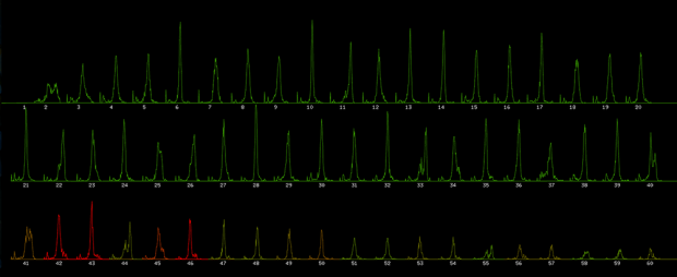
Step 2: Time vs Number of Taps (per Flap – for 1st 20 flaps)
X-Axis: Time (in frames)
Y-Axis: Number of players who tapped at the frame for that flap (in number of players)
Color : Percentage of deaths that occurred after this flap vs. total number of deaths (red – most deaths occurred after this flap, green – most player survived to flap again)

all_plyrs_time_of_tap_lines

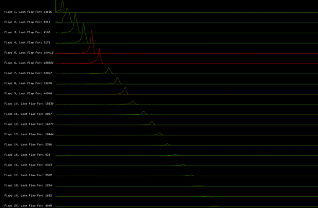
Here we see that there is a reoccurring shape of when players tap, which again suggested that the “Flappy Noise” maybe exist.

all_plyrs_time_of_tap_combined

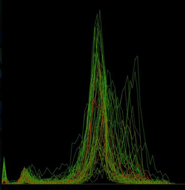
Here I layered the first 20 flaps. Not sure how meaningful it is, but its interesting to see them side by side.

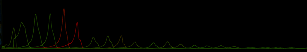
Step 2.5: Time vs Number of Taps (per Flap) [Change in meaning of Colors]
X-Axis: Time (in frames)
Y-Axis: Number of players who tapped at the frame for that flap (in number of players)
Color : Percentage of deaths that occurred after this flap vs. total number for this flap (red – most deathly flap, green – easiest flap)

all_plyrs_time_of_tap_lines_color_vs_num_alive_at_tap

We see that there is an interesting pattern regarding when players die. We can see that every 3-4 flaps a large majority of the alive players die by running into a pipe.

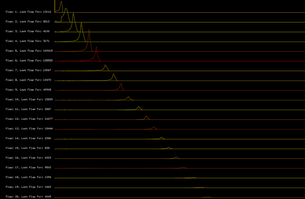
Step 3: Top Players – Time vs Number of Taps (per Flap – for 1st 60 flaps)
Restriction: For this run the player must have survived at least 40 flaps
X-Axis: Time (in frames)
Y-Axis: Number of players who tapped at the frame for that flap (in number of players)
Color : Percentage of deaths that occurred after this flap vs. total number of deaths (red – most deaths occurred after this flap, green – most player survived to flap again)

surv_40p_plyrs_time_of_tap

Here we see that the top players a decent amount of variance regarding when they tap per flap, which could suggest different tapping methods/times. This is partially reaffirmed by the fact that after the majority of players who survived the first 40 flaps die by flap 48, that we still see a large amount of variance in tapping in flaps 48-60. So possibly there are numerous “Flappy Noise”s or it could be one “Flappy Noise” but players just started at different times.

Step 4: Top Players – Tap Frequency vs Number of Taps (per Flap – for 1st 60 flaps)
Restriction: For this run the player must have survived at least 40 flaps
X-Axis: Number of frames since last tap (in frames) [shown for each flap]
Y-Axis: Number of players who waited that long since their previous tap to tap again (in number of players)
Color : Percentage of deaths that occurred after this flap vs. total number of deaths (red – most deaths occurred after this flap, green – most player survived to flap again)

surv_40p_plyrs_freq_per_tap_lines

This is where “The Flappy Noise” begins to seem like it could truly exist. The majority of top players wait the same number of frames between taps. We can see that at the front end of each flap there is a spike of players who waited a small number of frames to tap again. This could be players who either practice a fast tapping approach or could be “rescue taps” that players have to make to survive from running into a pipe.

Step 4.5: Top Players – Tap Frequency vs Number of Taps (per Flap) [Combined]
Restriction: For this run the player must have survived at least 40 flaps
X-Axis: Number of frames since last tap (in frames) [all flaps layer onto of each other]
Y-Axis: Number of players who waited that long since their previous tap to tap again (in number of players)
Color : Percentage of deaths that occurred after this flap vs. total number of deaths (red – most deaths occurred after this flap, green – most player survived to flap again)

surv_40p_plyrs_freq_per_tap_combined

Here we see that while there certainly is some variance in tap frequency per flap, there is a definite a common frequency that players keep throughout their run. This common tap frequency is every 38 frames (the game runs at 60 fps). Could this be the “Flappy Noise”?

Testing the “Flappy Noise”: No Birds Injured in the Process

Now that I may have found the “Flappy Noise”, it is time to test if it actually works. Humans are not that reliable to tap every 38 frames (especially one who can’t play a musical instrument). So I went to Processing and used the Java Robot Class to allow me to fake keyboard presses. FlapMMO runs at 60fps as did my Processing sketch.

Of course I couldn’t have an ugly processing sketch, so I added the Flappy Bird sprite with movement and a bird wing flapping noise. Now when the processing sketch goes to input a keystroke every 38 frames we see the “cute” flappy bird jump and hear its wings flap.

Screen Shot 2014-03-06 at 1.40.13 AM

I had somehow not realized until this point that FlapMMO has different servers and each server has a different variant of the Flappy Bird course (and that the course per server changes occasionally to prevent anyone from cheating, since its an MMO). Luckily Sauve mentioned in his write up that the majority of the data was collected on Server 6, so I ensured that I was on server 6 for all testing. [I did test everything that I will mention below on other servers to just see, but they were epic fails to say the least]

Static 38 Frames Jump-Rate

Most Flaps Achieved: 8
Max Pipes Cleared: 1
The results of the testing with a static 38 frames jump-rate were not the best. I couldn’t get past the second pipe. It would never jump in quick enough succession to go over the pipe.

Top Player Average Frame Per Flap

Most Flaps Achieved: 6
Max Pipes Cleared: 0
So after the disheartening results with the static 38 frames between jump theory, I decided to reconsider the idea that the “Flappy Noise” could be a pattern. I decided to work with the top players data (those who had made it 40 flaps). For each flap (2-60) I took the average interval between the previous flap and that flap and stored it in an array. Next I found the average first frame that top player flap on. Finally I used these two items to create an array of frame numbers on which I should flap.

Top Three Flap Record Runs

Most Flaps Achieved: 5
Max Pipes Cleared: 0
Well the whole involved top player average didn’t work and neither did the static frames, I wonder if I screwed something up somewhere. I know what to do! I will take the best run and just use its frame array to dictate when to jump. That will take out any chance of me screwing something up. …… So I tried that and it didn’t work, it was worse than the top player average. Maybe that run was done on a different server, so I tried it with second and third best runs and got the same results.

Combo Move: Static 38 Frames Jump-Rate + Top Player Average Frame Per Flap

Most Flaps Achieved: 13
Max Pipes Cleared: 2
I was beginning to lose faith, so I began just trying things with the hope that I would land on something that worked. And it sort of worked … well not really, but I got past the second pipe. The method that achieved this was: that the standard frame-wait between flaps would be 38 frames, but 1/3 of the time the frame-wait would be the average frame-wait for the top players for that flap and 1/22 of the time the frame-wait would be 45 frames (to cause it to drop in time).

Breaking News: Flappy Bird following “Flappy Noise” crashes through Plane Windshield

Conclusion:

For the FlapMMO a “Flappy Noise” does not exist. FlapMMO has too many inconsistencies to allow for a “Flappy Noise” to exist; FlapMMO’s multiple servers with unique pipe layouts, the fact that the pipe layout even changes for a specific server if you stay on it long enough and the inconsistency of the frame rate of the Processing sketch and the frame rate of FlapMMO (often depending on the number of player).

For a version of Flappy Bird for Processing or even on other platforms (as long as the above problems do not exist), I certainly believe the “Flappy Noise” exists. But what is the fun in that? What would have been great about the “Flappy Noise” existing for FlapMMO is that others see you dominate them in near real-time, and that the leader for a specific server in FlapMMO gets a flappy bird that wears a crown.

Note: Creating a standard bot for FlapMMO was definitely possible when it first came out and still may be possible (though lots of the security weaknesses have been fixed since then). What I was trying to create was a data-driven bot that moved according to player gameplay data, and NOT by just reading in the current state of the game.

Wanfang Diao

06 Mar 2014

My idea is to look at the average color of my Iphone’s photo I took while traveling.
So I try to calculate 6 cluster center of pixels’ color by kmeans in Matlab. I used HSV as the 3 dimensions of colors and got a satisfying result.
0002

0013

Data: Photos in my Iphone.

Clean the data: delete videos, classified them by place/date. rename them and resize them. This process cost my most of the time because I did them manually.

Then I used all the picture I took in a particular city to calculate the top 3 “average color” and visualized them by openFramework. The height is the number of photos. I compare them with the result from google image.

PLACE


Pittsburgh’s photos were took in December, so there is snow color in it. KeyWest and Bahama I took a lot of sceneries such sea, plants and beach.  Most of NY photo’s are Manhattan’s building and people.

What’s more, I also collect a 10-day traveling photos and visual them by day.

Travel

However, the result seems a little surprised me. So I decide to look into each photo’s 3 colors. This is Bahama Day (Day 3)

BAHAMA


This is Keywest Day (Day 9)

Keywest


Austin McCasland

04 Mar 2014

A visualization of every show played by every band at sxsw2014 over the last 30 years.

All Roads Lead To SXSW 2014 from Austin Man on Vimeo.

All Roads Lead to South by Southwest is a data visualization of every show that has been played since 1975 for each band playing at South By Southwest 2014. There were over 1500 artists attending South by Southwest 2014 who had played over 90,000 combined shows. During the animation, the radius of the dot indicates the popularity of the artist, and the saturation of the dot’s color is relative to how many shows that particular artist has played over their career. All the data was scraped from last.fm’s database.

A Data Love Story

dataloveMDThe vision I had for this project was to tell a love story through the use of personal data. The closer you are the more intense the reaction and as you drift apart into the cold reaches of space, energy is lost and loneliness sets in. That was the idea anyway. What was actually created was a screensaver for the web. Bright colors and fast movements that draw the eye, distracting from the data hidden below.

I used a D3JS’s Force Layout, and the HTML 5 canvas to create the visualization. Much of the fancy eye candy was drawn from a project written by Daniel Puhe, which I modified to meet the needs of my project. The data was collected using OpenPaths running on my cell phone and that of a very nice female volunteer in my graduate cohort.

Visually the project appears more or less the way I originally thought of it. Some elements require a bit of tuning, such as acceleration values and linear speeds. But that being said, the final result doesn’t elicit the emotional draw that I was really aiming for. The introduction I added before the visualization helped set the stage a bit better, but I think the movements in the actual visualization are too fast to allow the viewer to gain a sense of what is going on. It’s like playing a movie in super fast forward.

Source code: https://github.com/jeffcrossman/DataLove
Live Demo: http://sandbox.jeffcrossman.com/datalove/