Lecture-01-18
Some things to consider about information visualization.
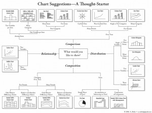
A chart about how to choose a chart (from here):
Ben Fry’s 8 steps for producing information visualizations, from Chapter 5 of his PhD thesis:
- What is the Question?
Know your users’ task. “In addressing data problems, the more specific the question can be made, the more specific and clear the visual result.” - Acquire.
“The first step of the process is about how the data is first retrieved (where does it come from?) and the most basic aspects of how it is
initially filtered.” Some possible data sources:- analog signal
- file on a disk
- stream from a network
- relational database
- an entire experience
- Parse.
“This step looks at converting a raw stream of data into useful portions of content. The data might first be pre-filtered, and is later parsed into
structures usable by a program. Almost always, data boils down to just lists, matrices, or graphs.”- Pre-filter: offset, filter, unpack, decompress, decrypt
- Parsing tasks: dividing bit/byte cycles, parsing texts (delimiters), markup languages, BNF grammars
- Filter.
“The filtering step handles preparing a relevant subset of the data to be considered by the user. It is strongly tied to the later ‘interact’ step, because the data of interest might change. […] The filtering step sits in the middle of the process steps, the first step that doesn’t handle the data in a completely “blind” fashion, but its methods are not as advanced as the statistics and mining methods of the step that follows.” - Mine.
“This covers everything from mathematics, to statistics, to more advanced data mining operations.”- Basic Mathematics & Statistics
- Max & Min
- Median
- Normalization
- Variance, Standard Deviation, Skew, etc.
- Sorting
- Distance Metrics, Similarity Matrix
- Count unique instances
- Dimensional Measures & Transformation
- principle components analysis
- multidimensional scaling
- fourier transform
- autocorrelogram
- Classification, Sorting, & Search
- clustering
- probabilistic estimation
- self-organizing maps
- dimensional reduction
- scoring methods
- search & optimization methods
- Basic Mathematics & Statistics
- Represent.
“This part of the process considers representation in its most basic forms. This is a laundry list of techniques, a catalog of starting points to be used by the designer when considering the data in question.”- Table
- Scatter-Plot
- Line Graph
- Bar Graph
- Box Plot
- Physical Map
- Heat Map
- Matrix
- Half-Matrix
- Tree
- Graph
- Histogram
- Dendrogram
- Linear/Radial Parallel Coordinates
- Star Plot
- Permutation Matrix
- Survey Plot
- Chernoff Faces
- Rubber Sheet
- Isosurfaces
- Tree Maps
- Visual Diff
- and many more…..
- Refine.
Graphic design skills provide useful fundamentals for the type of questions to be asked when seeking to communicate the content of a complex data set.- Contrast
- Hierarchy
- Grouping
- Interact.
Interaction methods involve either how the data interacts with itself on-screen (e.g. automatic layout), or how users can interact with and control the data representation (HCI).
Ben Schneiderman’s 4 core activities for interactive visualizations:
- Zoom
- Sort
- Filter
- Query
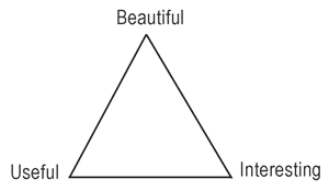
Martin Wattenberg’s goal-triangle:

+ Have a look at Martin’s lab’s initiative, Many Eyes….
Comments Off on Lecture-01-18
