wire speaker
Speaker interactively sculpts wire forms based on the sounds of people
talking. A micro-controller is used to analyze speech and control
several small motors that push and bend wire.


Comments Off on wire speaker
Speaker interactively sculpts wire forms based on the sounds of people
talking. A micro-controller is used to analyze speech and control
several small motors that push and bend wire.
This project aims to create static images representing musical compositions. Each image is like a fingerprint of the song that visually expresses that piece’s use of instruments, rhythmic layout, and how expressively the piece is performed. Information about the music was collected through midi files of each piece. Through Processing/Java, these midi files were parsed and evaluated to visually display various aspects of the songs.
Each note within the piece is represented by small circles. The center circle represents the center of a keyboard, “Middle C”. The placement of a note is determined by the size of its interval from middle c.

The notes are placed on a square canvas based on the distance from middle C (creating its distance from the center) and also based on where it is played within the measure it is in. This way, if a note is played on the first beat, it will be displayed directly to the right of the center note, if a note is played on the second beat, it will be displayed directly below the center note, and so on. This visually displays the rhythmic patters within the composition as well as creating a strong graphic pattern that can be used to discern how expressively or rigidly a piece is played.

When a note is played, it is displayed in a color representing the instrument that played that note. This makes it easy to see patterns within individual instruments as well as the overall variety of instruments.

Through visually displaying these aspects of the music, one can begin to discover certain differences and similarities within the songs. The images displayed on the poster are organized by genre so that the viewer can easily understand the differences of the pieces within each genre as well as the differences between the genres overall.

For my project tracking color changes in different things over time, I was able to do eight color experiments, with the ability to add more.
The web interface can be found here: http://carynaudenried.net/colorshift/colorshift.php
I would like to add more color experiments in the future because there were several that I just ran out of time to be able to do. I would also like to make some sort of physical output with these gradients, such as printing them on a coffee cup or having the colors stitched onto a tee shirt. If I can do this, I’ll update this page.
Overall this project was very challenging to me, just in organization and getting all the technical aspects working, but I had a lot of fun with it. I think there is a lot of potential to branch off into related areas with this project as well, and I’ve found a new interest in timelapse photography.
Below are some screen shots of the site. The source code and ACT files can all be downloaded from the site.


![]()
I actually came up with the idea for this project a while ago. Last semester, I wanted to do an information visualization piece for my senior studio class and after searching for ideas for things that hadn’t been tackled in the realm of computational information design yet, I thought up this project. The only visualizations of typeface classification and the relationships between fonts had been static posters, so I thought this was a real opportunity to do something that hadn’t been done before. At the time, however, I felt too inexperienced in information visualization to tackle this project.
The concept has a fairly broad scope and can be expanded to include any number of ideas and applications, but for the sake of making it workable for this class, I decided to focus my efforts mainly on the analysis of the letter shapes and the mapping in 2D space, where proximity represents a measure of similarity between two typefaces. Obviously there are a number of other visualizations that could be tried, and the applet could serve a number of different uses, and someday I’d like to try a lot of those things, but in terms of this project, there just wasn’t time. The project would have two deliverables: a large poster representing the map, as well as an interactive applet implemented in Processing and Java.
Many people have asked me, “Why do this project? Why are you interested in this?” The answer is that I think a lot of us graphic designers carry a vague notion of this typeface map in our heads, but if you asked us exactly to describe it (or even draw it) I think we’d have a hard time just because I think our understanding of the relationships between typefaces is based as much as, if not moreso, on this intuitive sense, rather than facts and math. So, I’m interested in comparing the maps in our heads with a mapping based on mathematical analysis.
In addition, part of the inspiration for this project came when a non-designer friend asked me, “I’ve been using Helvetica all the time because I love it, but I feel like I should be branching out. What typefaces are similar to Helvetica that I can try?” I rattled off a list before even thinking about it, and then I started wondering how I knew that and why he didn’t. Part of my intent behind this project was to create a tool for non-designers that will allow them to understand more about the world of typefaces, and make informed decisions about which fonts to used (not based on purpose, since that’s an entirely different animal, but based on relationships to well-known fonts).
The project had two main components: Analysis of the letter shapes using various metrics and shape analysis methods, and mapping the nodes in 2D space using PCA. The letter shape analysis was done using the Geomerative library for Processing, which unfortunately had a number of problems; for example, the fact that the positions of the points on the outline of the letter shape start at a different and completely random position for each font. As a result, some of my computations were slightly hack’ish, and when I continue this project, I’d like to make them more sophisticated and smart, but with how little time we had, I didn’t really have the time to dwell on these things if I had a hack that was working.
As for the mapping using PCA, I used the TuftsGeometry library for Java, which is very lightweight and easy to use. Unfortunately, it doesn’t quite have that many useful extensions; for example, it can’t give me a readout of exactly which factors are included in the PCA projection and how dominant they are. However, the ease of use of this library compared to many other PCA libraries for Java to me was much more important than its extensions.
Once I figured out how to do the PCA projection using this library, I just needed to add the new variables to the matrix input every time I added one, so that was fairly simple and easy. One of the trickier bits was weighting the variables. Since the variables are in different units (some are actual measures while others are ratios) the real variance between them isn’t always indicative of how important a variable is, and so you need to weight them accordingly. Finding the correct weightings took up a lot of time in this project.
A classmate suggested that I also use this to calculate the best serif/sans-serif pairings for each typeface, so I did. That was fairly easy to do; it just used some of the same variables but with a different weighting to look for the typeface in the opposite “class” (serif or sans serif) with the highest degree of similarity.
The final product essentially does the following:
Also, for the sake of comparing the mapping to our learned knowledge related to typefaces, the program reads in a CSV file with some information for each typeface such as the year it was made and the pedantic classification it’s been given by ATypI. The digital applet allows the user to overlay this information on the mapping to see if any interesting and/or unexpected results are shown.
The project actually progressed fairly well until I ran into a major technical difficulty the day before the final show. I had just rendered the PDF poster and was going to print it when I realized a few things I needed to add and opened Eclipse back up. For some reason, however, it had deleted all the contents of my /bin/data folder, which contained all of the TrueType font files I had been working with. I was able to recover some of them, but most of them had been downloaded from FontYukle.com and were low-quality. Before rendering the PDF, I’d managed to replace most of those with fonts from my own OpenType font library that I’d converted to TTF files, but all of those were gone and unrecoverable. Sometime over the summer, I’d like to do all of those conversions again so I can restore the applet to what it looked like when it was working well. Thankfully at least I had the poster as proof of my program’s success.
The poster can be seen below:

The applet currently isn’t online since it needs a lot of fixing up. Hopefully I can work on that over the summer because I do want to continue this project since I think it has a lot of potential.
Once I have some time to relax and detox from this busy school year, here’s some things I want to work on next:
http://hackandsleep.com/2girls1cup
As of posting, 70,000 hits and counting!
From Wikipedia
2 Girls 1 Cup is the unofficial nickname of the trailer for Hungry Bitches, a scat-fetish pornographic film produced by MFX Media. The trailer features two women conducting themselves in fetishistic intimate relations, including defecating into a cup, taking turns ostensibly consuming the excrement, and vomiting it into each other’s mouths. “Lovers Theme”, from Herve Roy’s Romantic Themes, plays throughout.
Part of what has facilitated 2 Girls 1 Cup’s spread are the reactions it causes. Thousands of videos exist on YouTube of users showing the original video (off-camera) to their friends and taping their reactions, although some videos seem to be staged.
Analysis
A collection of twenty of the most-viewed YouTube reaction videos were downloaded and then edited to start at the same time. This was possible by listening for the start of the audio for the 2 Girls 1 Cup video. Each of these videos were then processed to collect data about optical flow and volume.
Volume
Loud reactions are common in the reaction videos. Screams of disbelief and horror are a big part of what make the reactions so interesting. For each frame of a reaction video, the fast Fourier transform calculated the frequency spectrum of an instance of audio. The frequency bins were then summed to calculate the volume. A window of one second was used to smooth the data.
Optical Flow
There are often strong visible reactions to the video, with people either flailing or cowering in fear. Optical flow is the amount of movement in a video. This differs from techniques such as background subtraction and differencing because the amount of image displacement is calculated. For this project, the openCV function cvCalcOpticalFlowBM was used to retrieve the amount of motion between consecutive frames. As with the audio, a window of one second was used to smooth the data.
Pretty graphs
Each color represents a different reaction video plotted over time.

The median value for each second was used to lessen the effect of outliers.


So in the end, were there any conclusions that resulted from this analysis? I had hoped by analyzing the reaction videos quantitatively, patterns would emerge that could, in an indirect way, describe 2 Girls 1 Cup. But it appears that once the mayhem begins, the reaction videos turn into chaos, maintaining the shock through the duration of the video.
This project was created for Golan Levin‘s
Shameless plug for other projects:
So much for trying to put numbers to scat-fetish porn.
“How to Sculpt an Elephant: A Foolproof Method
Step one: Obtain a very large block of marble.
Step two: Remove everything that does not look like an elephant.”
– from comments on project sketch
Introduction:
Sub-Fabricator is a framework that enables Processing users to fabricate objects as the output of their Processing codes. The goal of Sub-Fabricator is providing a simple way for Processing users to exhibit their code outputs in form of fabricating prototypes through connecting Processing and Rhino GrassHopper while enabling users to create their desired forms in an interactive or a static way.
More Details:
Taking advantages of both, Sub-Fabricator provides a link between Processing and Grasshopper. Processing users can use Sub-Fabricator by implementing sub-fabricator interface for writing their code. They should provide Sub-Fabricator their code as a class which creates a set of drill paths for CNC router or milling robot. Then they can statically preview the output of their code or interactively create outputs in Sub-Fabricator user interface, which also runs in Processing. After adjusting their desired parameters for fabrication in Sub-Fabricator interface, they can send their desired output to GrassHopper. Additionally, they can, simply, tweak the outputs in GrassHopper Sub-Fabricator definition. From GrassHopper, users can send their file for fabrication.
Sub-Fabricator supports these features:
– Creating drill points or milling paths for one layer and multiple layer fabrication
– Interactive creation of drill points or milling paths
– 3d Environment for previewing outputs in Processing
– One sided and double sided milling or drilling
– Tessellating outputs on surfaces
You can find project:
Examples:
1- Sine wave with a grid of openings:
Processing Code:
UserClass3(int numInXDir, int numInYDir, float stepSize) { this.numInXDir = numInXDir; this.numInYDir = numInYDir; this.stepSize = stepSize; float maxDis = numInXDir * numInXDir + numInYDir * numInYDir; for (float x = 0; x <= numInXDir; x += stepSize) { for (float y = 0; y <= numInYDir; y += stepSize) { PVector position = new PVector(x, y, 60 + 40 * sin(map((x+y) / (numInXDir + numInYDir), 0 , 1, 0, 2 * PI))); float magnitude = ((x % 20 < 4 || x % 20 > 16) || (y % 20 < 4 || y % 20 > 16) ? 20 * sin(map((x+y)/ (numInXDir + numInYDir), 0 , 1, 0, PI)) : 0); float diameter = 1; CNCOneLayerData curData = new CNCOneLayerData(position, magnitude, diameter); COLData.add(curData); } } } |
Fabrication Image:

Fabrication Video:
2- Diffusion Limited Aggregation Image:
Processing Code:
UserClass2() { // enter path to your image here img = loadImage("C:\\temp\\images\\wdrop.jpg"); this.numInXDir = img.width; this.numInYDir = img.height; this.stepSize = 10; int cols = floor(this.numInXDir / stepSize); int rows = floor(this.numInYDir / stepSize); for (int i = 0; i < cols; i++) { for (int j = 0; j < rows; j++) { float x = i * stepSize + stepSize / 2; // x position float y = j * stepSize + stepSize / 2; // y position int loc = floor(x + y * numInXDir); // Pixel array location color c = img.pixels[loc]; // Grab the color // Calculate a z position as a function of mouseX and pixel brightness float z = (brightness(img.pixels[loc])) / 255 * 10; PVector position = new PVector(x, y, 20); float magnitude = z; float diameter = 1; CNCOneLayerData curData = new CNCOneLayerData(position, magnitude, diameter); COLData.add(curData); } } } |
Original Image: (a small portion of this image fabricated)

Fabrication Image:

Fabrication Video:
3- Random sine waves:
Processing Code:
UserClass5(int numInXDir, int numInYDir, float stepSize) { this.numInXDir = numInXDir; this.numInYDir = numInYDir; this.stepSize = stepSize; for (float x = 0; x < numInXDir; x += stepSize) { int randStart = (int) random(0, 100); for (float y = 0; y < numInYDir; y += stepSize) { float z = 15 + 5 * sin(map((y - randStart), 0, 100, 0, 2 * PI)) ; PVector position = new PVector(x, y, z); float magnitude = 10 * sin(map(y/ (numInYDir), 0 , 1, 0, PI)); float diameter = 1; CNCOneLayerData curData = new CNCOneLayerData(position, magnitude, diameter); COLData.add(curData); } } } |
Fabrication Image:

Fabrication Video:
What I Have Learned:
Working on this project I learned:
1- Lot about fabrication. Most important one is that milling is much, much faster and safer than drilling a point. While drilling DLA image I broke two drilling bits. Fabricating the small DLA image takes an hour while fabricating others take one hour totally (the change of material from wood to foam was helpful to some extents. I tested milling on MDF as well, it was much faster than drilling MDF. )
2- How to work with hash sets and tables.
3- Some data handling algorithms.
Challenges:
While writing codes and creating prototypes for demonstrating SubFabricator functionality, I have encountered many problems and challenges:
1- Checking if a form can be created even by a simple idea like drilling a bunch of points is a complicated problem, since every time a path milled or a point drilled the remain material changes and it may not be stable anymore for further fabrication, as an example think of fabricating a sphere.
2- Creating molds which are functional, usable, and stable and checking for all of these features needs considering many situations and exceptions. For example, questions like “Is all spaces connected?” and ”Do molds stay stable after casting?” come to the mind.
3- Creating reusable molds for complex shapes is an open problem.
4- Figuring out if a path is valid for milling using a 7 axis robot is mind blowing.
5- Implementing algorithms which has low run-time complexity for doing all data handling and problem solving is still a big challenge.
To Be Continued:
Current code just supports creating one layer form using CNC router. The complete project will support CNC multilayer and Robot one layer/multilayer forms as well. It also works based on drill points, this will changed to milling paths for sake of faster and safer fabrication. In addition, my final goal is providing a script writing environment for SubFabricator, where users can write and run their interactive codes in Processing language.
Head Monster from kuanjuwu on Vimeo.


0.Introduction
“LIVES IN MY HEAD. IT CONSISTS OF MY WILL.
WHEN IT EATS SOMETHING, I HAVE A FEELING.
SOMETIMES HAPPY, SOMETIMES SAD.
SOMETIMES SWEET, SOMETIMES FUCK.
IT IS HARD TO CONTROL MY FEELING, JUST LIKE
TO CONTROLL THE HEAD MONSTER.”
Head Monster is an interactive game that the user uses a face shape control panel to drive a head like small robot. When the robot hit an object (projection), it will eat the object, and the face will change. Some objects represent good some mean bad. We earn points by eating those good objects and get minus point by eating bad objects. In the limited time the user need to gain the points as high as possible.
1.Motivation
The idea of creating a small creature that has simple behavior (follows simple rule) came to my mind at the first time. In many movies like AVATAR or Princess Mononoke we can find a character that is small and white and represents the spirit of pureness. Inspired by Valentino Braitenberg’s VEHICLES I started building simple moving robots that follow people.
2.Exploration
To Make a Braitenberg Vehicle I tried different approaches:

(Two servo motors and two light sensors hook up with Arduino)

(Two DC motors and two light sensor with a handmade Arduino board)

(Two light sensors and two pager motors connected with transistor. No Arduino )
To control these people following robots I was thinking using projector from top projects bright white spot on the floor which enable robots to follow with. A camera from top captures the image of player and find the position, and then projects white circles that are flocking around.

This idea fail because:
1. Robots are too slow to chase the white spots.
2. Player’s shadow might block the light.
3. The light environment has many noise which causes randomness of robots.
At this point I changed the idea:
Instead of making robots follow light spots, I make the white spots (projection) follow a robot. And here is the basic structure of HEAD MONSTER:
Using a IR-camera from the top we can find the position of IR emitter embedded robot and project image on the robot.The robot is made by a small RC vehicle which controlled by a four tilt sensors embedded controller.


4.Implementation
ROBOT:

(The form of head monster. Drawn in Alias, cut by CNC milling machine.)

(Vacuum forming the head shape foam, the upper part is embedded with an IR emitter)
 (The lower part has a four wheel robot inside)

(Hacked radio controller. Four tilt sensors control four directions of movement)
IR CAMERA:

(Hacked PS3 Eye, the IR filter has been taken off. Instruction: http://www.peauproductions.blogspot.com/)
INTERFACE:
Programmed in Openframeworks.


(When the small face moves cross over an object, the score and the big face change)


5.Final Thought
There are many challenges of controlling small robots that following people, which makes me think of: It is so hard to 100% control the robot. What if we abandon the right of control and let the randomness of the physical world (the ambient light, the form of robot, sensors, motors…) drives the robot, the robot might become more vivid. Although the original idea was not success, we learned the experience from this exploration.
‘Shaper’ is a prototype device that uses a three axis CNC machine to interactively dispense expanding polyurethane foam material. The device can be controlled directly via a translucent touch screen, allowing the user to look into the fabrication area and create physical artifacts with simple gestures.
This project tried to challenge the conventional process of ‘digital fabrication’, by prototyping fabrication devices that allowed for direct interactive control. The motivation behind this was a belief that the current digital fabrication process was too fragmented, and new creative possibilities could be uncovered by using new interfaces designed for ‘interactive fabrication’.
The question still remains: What does interactive control offer over conventional CAD-based digital fabrication processes or even manual fabrication processes? I don’t have a definitive answer but there are a handful of ideas I can suggest.
+ A better understanding of materials. By bringing the physical devices together the user automatically starts to design/create with consideration of the nature of the material.
Initial Concept: I wanted to make a big interactive installation. At the same time, I wanted to revisit my first project involving mapping the cheapest flights. So, I mashed them together and involved some LED throwies.
Golan’s Verdict: I just turned something that was meant to be really useful into an installation that doesn’t really help anybody and isn’t entirely compelling. Based on his recommendation, I decided to drop the CV stuff a week before the show and re-make the project in HTML5 using Canvas.
Result: I learned a lot about computer vision and am planning on doing something this summer with a projector, my new found CV knowledge and all the LED throwies I made. The website is up and will definitely be getting an overhaul. The link is above.
Implementation: As mentioned before, the site uses HTML5. All of the drawing takes place in a canvas tag. I had to implement my own animated beziers by calculating them during each animation cycle. I have a Ruby script running on the server constantly requesting tickets from Kayak. Unfortunately, Kayak keeps kicking me out which is not helping me collect data. Anyway, data for the cheapest ticket is stored in a MySQL database. When someone searches for a flight from somewhere, all of the most recent tickets from that place are pulled from the database via AJAX and used to populate the hover boxes. I also provided a Book It! link that takes users to the Kayak purchase page.
Final Thoughts: I want to make the website prettier. Also, I’m not sure about the name FlightSage. If anyone has some great ideas for names or just wants to comment on the current one, I’d appreciate it.
Recursive Photo Booth: Fun within pictures, within pictures, within pictures…
By Sol Bisker
What is the Recursive Photo Booth?
The Recursive Photo Booth uses marker-based augmented reality (AR) to enable a simple and fun form of collaborative photography. It is best experienced while tired, giddy or drunk.
To help you understand it, my friends have prepared a Q&A:
Sol! What is this thing?
It’s a photobooth! Sort of. It’s like a real photobooth. But we give you an little black and white man to pose with. He’s holding up a picture of himself, holding up a picture.

See? Isn’t he cute?
Ok, why would I want to pose with that little man?
He’s no ordinary little black and white man. When you see him on our screen, he becomes…a picture! Of me, to start. Every good recursion needs a base case.

Aren’t *I* cute?
So, you pose with the picture shown on the frame. When you’re ready, you take your picture…

Now, the image you’re holding up becomes…the picture you just took! For the next person to enter the photo booth to pose with.

You can take a photo by pushing a red button on the top of the image, as though it were a camera shutter button.
That’s…awfully simple. How could this possibly be fun?
Well, it turns out that once people start playing with it, they find their own ways to have fun with the thing. Ways we had never even dreamed of.
We let nearly a hundred people try out the recursive photo booth at an installation, and here’s some of the many things they did with it:

Pose with yourself!

Pose with your colleagues!

Pose with some old dude you’ve never met!

Fall deeper

and deeper

and deeper and deeper…

until you pop back out!

Do the adorable couple thing!

Cower in fear…

…of yourself!

Punch someone in the face!

Then punch yourself in the face! (Why, we’re not sure – it looks painful.)

Cover the black frame with your thumb while taking the photo and screw up the tracking!
(It’s cool; that’s why we have the “restart” and “undo” buttons.)

Lay yourself flat!

…whoa.

Turn yourself sideways…sideways?

Group shot!

Do some weird growly thing with your hands!
Alright, so how’d you build this?
The “black and white man” is actually a marker for a visual augmented reality library called ARToolkit. The image taken by the previous user is drawn by ARToolkit onto the live webcam feed as you pose with it. Once you press the button to take a picture, we do a screen capture of the webcam feed as your “photo”, save it to disk, and making your new photo the picture for the next person to pose with.
All of this occurs in Processing, although we’d like to port it to OpenFrameworks in the coming weeks.
How does the wireless “camera” with the red button work to take a photo?

Simple. It’s hand-soldered into the button on a standard off-the-shelf presenter’s slide remote. The remote then communicates wirelessly to our computer, which registers your button press as a key press in Processing as if you were advancing a slide on a boring Powerpoint. A cheap and effective hack.

In our prototype installation, we’ve embedded the remote in layers of foamcore without any problems of reliability or wireless signal loss. So our next version will be made thicker and sturdier, out of wood or plastic, to allow for days of Recursive Photo Booth fun! (In fact, we’ll bring a few of them, just in case one breaks.)
Ok, enough already! …wait a second. Sol! How on earth did you get full marks on your semester studio project for at most a week’s worth of actual work?
Shhhhhhhhhh.
Motivation
Once I had the knowledge about the physical computing, I have always wanted to build interactive ART. This semester I got to have great chance to build them. So, before I started, I decided to focus and study 2 different things for interactive art: One is visual, and the other is audio. Using a camera and a microphone, I wanted to show many different aspects of the viewer(user)’s own appearance or voice interacting with their tangible and physical behaviors- touch, movement, rotating things. Finally, one became a Kaleidoscope mirror(visual) and the other became a Singing sculpture.
Idea
Kaleidoscope Mirror is the interactive art. It is a rotatable mirror. If the viewer rotates (forward) the mirror frame, it starts to generate his or her mirroring image in many, many interesting way. There are kaleidoscope and twirl effect so, once they start rotating it, it works just as a kaleidoscope, if you rotate it faster, it starts to generate the twirl so your image will be twisted in even more interesting ways. If you rotate the mirror backwards, you will see yourself of the past so you can do a time travel. There is a timeline and the indicator that tells you where you are at the past or the present.
Process (How it works)

–1) Quartz composer : For software part, I used apple’s quartz composer. The CMU’s genius freshman, Max Hawkins(BCSA) introduced me this program and gave me huge help everytime I was stuck. (Thanks, Max) Quarts Composer is a patch based program. It is easy to learn, already has many built-in patches and even writing a patch is not so difficult. I highly recommend to check this QC out if you need to deal with some graphics.

–2) Lazy Susan: The world-famous media artist and the instructor for this course, Golan Levin gave me many creative ideas. One of them is using the lazy Susan for rotatable mirror frame. I bought this good wooden lazy Susan on Ebay for $45.

–3) Rotation Detection: Whenever I was having hard time finding the solution for tricky problem, my classmates gave me brilliant idea. This time, Mike Hill (ETC) gave me the idea of using optical mouse to detect the rotation of the mirror. This is such a simple idea and I saved huge amount of time. Thanks, Mike!
–4) Projection: Projecting the screen is another tricky problem. I had to play with the angle of the projection for a while to find the best angle and the postion of the mirror screen.
–5) Timeline: I decided to include the Time travel feature at the final stage of developing this work. I just did not want this Kaleidoscope Mirror to deal with only realtime visual manipulation but also time-based manipulation too. Your simple physical gesture controls your appearance and the time. How nice idea it is!!
Here are several Screenshots from the Kaleidoscope Mirror at the show!:
 Golan Levin
 Patrick Kelley
 Ian Ingram
 Paul Shen
 Xiao Yuan
 David Yen
 Jane Park
 ZQ
ZQ
 Gaby Uribe
 Rohit
Rohit
 MHCI Folks
 Amisha Gadani
 Rich Cameron
 MHCI folks 2
 Jordan and Chloe
Here’s a link to my project applet: Vent At Me
Motivation and Inspiration
Inspiration:
–We Feel Fine
–FML
There are many sites which allow people to broadcast their woes and annoyances publicly on the internet. But, I was always interested in how this correlates to cyber privacy: Are there any patterns between what people post publicly on the internet and how comfortable people feel posting certain information on the internet?
I’d also like to thank Patrick (the TA) for his input in helping me figure out what my project’s concept/topic should be.
Methodology
Like with my first project I used Mechanical Turk. I posted the following survey:
1) Vent at me! (Anything goes. Please provide at least one complete sentence.)
2) What is your age and gender?
3) Would you post this vent on the internet if someone could identify you personally?
4) Would you post this vent on the internet anonymously?
I received roughly 500 answers over that past month. However, I only used about 300 of those answers since I only wanted to use vents bigger than a certain length. And, also because quite a few ended up being spam or non-readable (because the participant was not at all familiar with English).
Implementation
Graph Theory…Eh?
One major portion of the implementation involved the use of performance algorithms in order to traverse and interpret graphs. I have never implemented a gui which involved the use of a graph, so this was actually very interesting.
If you are unfortunate enough to understand my code, I apologize for my main (“draw”) function. I tried to keep external function calls to a minimum in order to increase performance. So, there is a lot of redundant code interspersed there.
Another point of the graph is the “spring” force I applied to the nodes in the graph. I used this force in order to make the graphs easier to interpret visually. In general, it works very well. However, it can get hectic when there are too many nodes. In fact, one of the reasons why I wanted the upper bound of the total number of neighbors of a single node to be around 30 (see TF-IDF section).
I learned a lot from coding up this part of the lab–and it was actually the most interesting part for me.
TF-IDF
Basically, the algorithm compares the frequency/total number of words of each word in two documents.
I also pruned the algorithm by separating the vents into 8 different categories and filtering out unimportant words. I also pruned the vents themselves–I did not include vents that were less than two sentences.
I’m very pleased by the results–the connected nodes are definitely connected to each other.
Interface
This has been a week point for me in all my projects. Ideally, I wish to post this project on a webpage where I can post specific instructions. I think, once it is adequately explained, it is easy to navigate and have fun with.
However, I am worried that I may have made it too complicated. I didn’t leave my project alone for more than a few minutes during the exhibition because I was worried people wouldn’t understand how to use it. But, everyone seemed happy with the general design of the interface. And, once I explained how to use it, I got good reviews.
Processing to OpenFrameworks to Processing
I feel like I should mention that I did try importing this project to openFrameworks…and learned a lot about the environment when I did. The reason I ported over was in hopes that the project would run faster. However, two weeks was not enough time for me to get comfortable with the interface calls. So, I ended up going back to Processing and using some optimization techniques. The project still runs relatively quickly (especially when it’s not being run on my terribly slow and loud laptop. 😉 ).
Findings
So, a lot of the findings were not surprising. Younger generations are willing to post vents that stretch over every topic, while older generations prefer to only vent publicly about politics on the internet. Females tended to vent for longer than males–and females tended to vent more about their love lives and annoying people.
There were many vents about lack of money. I tried my best to make sure that my data set included a broad set of topics (another reason why I only used 300 out of the 500 vents I collected).
Overall Experience
There were two sides, I’d say…the data collection and the implementation. The data collection was more fun, but more tedious. The implementation was more difficult, but more interesting. I learned a LOT from working with this project. Mainly the following:
– Document Comparison
– “FishEye” technique
– Interfacing
– Graphs
Thanks for the fun experience with the class! I really enjoyed learning about a side of art I actually never even knew existed until this year.

This is not a final screenshot!! The videos displayed are for testing purposes only.
Minute is an investigation into our individually unique perception of time. Participants are asked to perceive the duration of one minute, and a video recording of this minute is added to a database. A visual arrangement of minutes is then created by pulling twenty random videos from the database.
Hardware needs for the showcase on 4/28:
Ideally, a monitor and Mac mini, but a monitor and DVD player could also work.
Some favorites:
Cheng’s Words From Beyond Hope
Paul’s The Central Dimension of Human Personality
David’s Fantastic Elastic Type
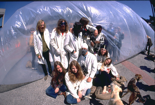
What if creating architecture was something that anyone could do in their back yard? This is the question Ant Farm, the legendary early-70s artist collective asked when they wrote the Inflatocookbook, an a recipe book for inflatable structures that attempted to liberate architecture from the realm of professionals.
With the advent of computer graphics and accessible CAD software Ant Farm’s dream of democratic architecture seems more plausible than ever. With this in mind I wrote a pattern generator for inflatable structures, implemented as a plugin to Google Sketchup. A digital supplement to the Inflatobookbook, it simplifies one of the most difficult parts of making an inflatable: deciding where to cut.
The hardest thing about building an Ant-Farm-style inflatable is designing the flat cut-out pattern used to create the 3D form. My plugin lets the computer do the thinking for you. All you need to give it is a model.
| Cheap | Cross-Platform | Easy To Use | |
|---|---|---|---|
| Lamina | $360 | Windows | Yes |
| Pepakura Designer | $38 | Windows | Yes |
| Blender Plugins | $0 | Windows, Mac, Linux | No |
| Ant Farm Unwrapped | $0 | Windows, Mac | Yes |
Before I created my plugin I hoped to modify existing software to create plans inflatables. However I was dissatisfied with the cost and difficulty of existing unfolding software.
Google Sketchup was an ideal platform for my plugin. It’s free, cross-platform, easy to use, and scriptable in Ruby.
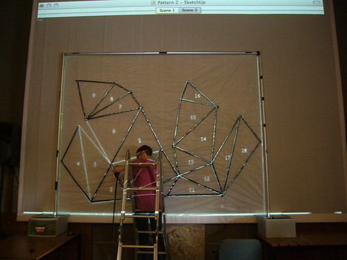
The plugin’s unfolding algorithm is based on a post by StackOverflow user Theran. It works by representing the 3D shape as a graph. Below is an example of how the algorithm works on a cube:


The sketchup model is converted into triangles—a polygon mesh.

The polygon mesh is converted into a graph (in the computer science sense.) Each face is a vertex in the graph, and each edge joining two faces in the polygon mesh is a connection between the two vertices in the graph.

By applying Dijkstra’s algorithm to this graph, we get a tree where every connection represents an edge that we won’t cut, but will ‘fold’ when the structure is inflated.
The edges to fold are chosen based on how much they would need to bend to achieve the right shape. Edges that connect faces with large angles between their normals are less likely to be used as folds than faces with similar curvature. In the cube below, it’s much more likely that 5 will share an edge with 4 than with 8 because the difference in curvature is small between them.


Once the edges to fold are determined, each face is laid out flat one at a time. The first face placed is the one determined to produce the lowest overall cost by the Floyd-Warshall algorithm. From there, all of the other faces are placed, connected to the other shapes by their fold edges.
Occasionally two faces will overlap in the unfolding. When this occurs, the program creates a separate shape that doesn’t intersect and continues adding faces off of that new shape.
This algorithm can be very slow for more complicated meshes, so it’s a good idea to simplify any model you provide it. I use a piece of software called MeshLab to clean up and simplify the mesh before loading it into Sketchup. The quadratic mesh simplification algorithm available in MeshLab can lower the number of polygons in a model while still maintaining its basic form.
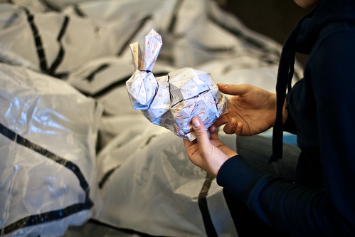
With large models, segmenting the mesh into components before processing can help make the output simpler. In the bunny model I created, I made a separate model for each ear, the head, the tail, the feet, and the body.
In a future version of the plugin, I plan to automate these steps.

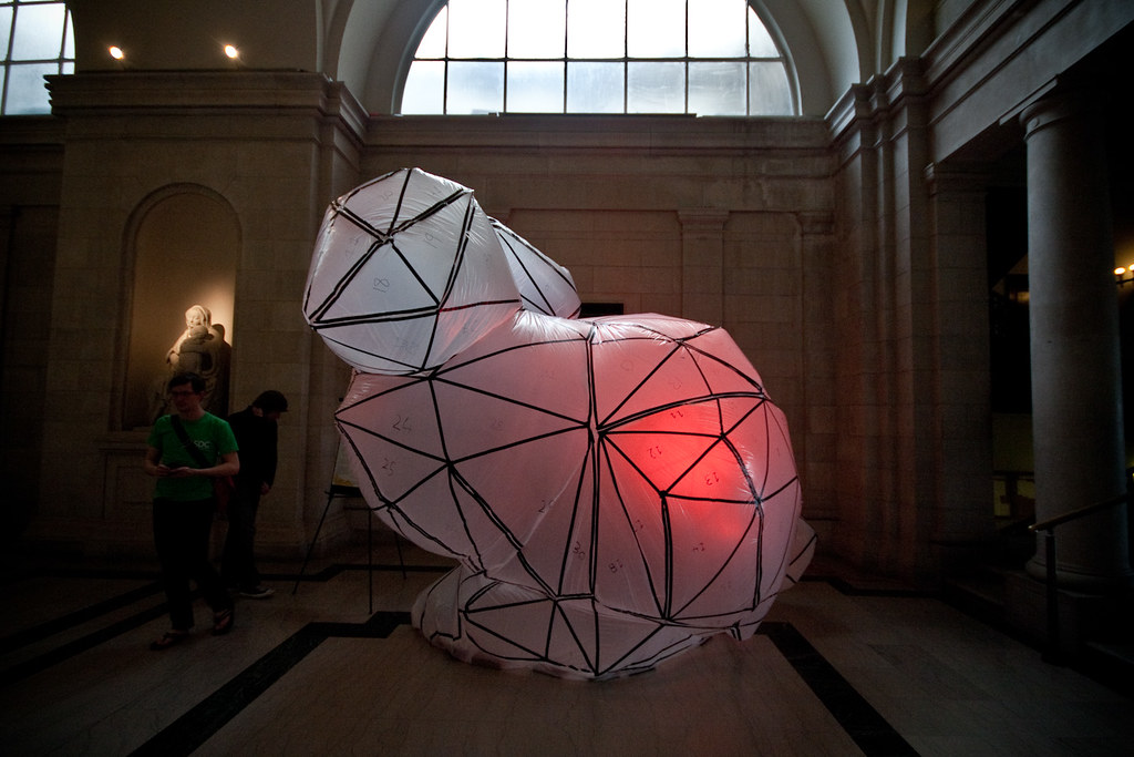
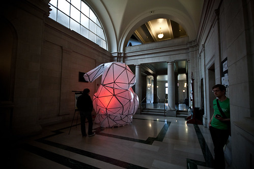
To test my software I decided to build a 12’ tall Stanford Bunny—a classic generic 3D model and somewhat of an in-joke among graphics experts. When a new graphics algorithm is created it’s usually tested first on the Stanford Bunny.
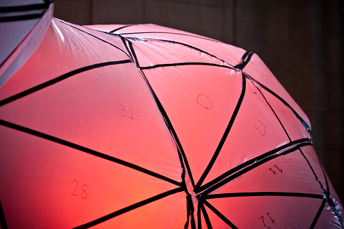
After some pre-processing, I ran my plugin on a model of the bunny. It produced several pieces, available as a printable PDF below. The numbers on the faces represent the order in which the software laid down each face.

| Item | Price | |
|---|---|---|
| Husky 4 Mil, 10 Ft. x 100 Ft. Clear Polyethylene Sheeting Roll
I used this cheap polyethylene, intended for construction, as a membrane for my inflatable. It’s available in most hardware stores, usually in the paint section. |
$43.60 | |
 |
16″ Hand Impulse Bags Sealer (SPB16)
This machine fuses together pieces of plastic to create a thin, tight seal. It greatly simplified the sealing process. In all, I sealed 218 feet of plastic over 125 seams. |
$150.49 |
 |
Utilitech 20″ High Velocity Floor Fan
During the final show I inflated the bunny with a borrowed fan. Afterwards I bought this 5000 CFM (cubic feet per minute) output fan from Lowe’s. It inflates the bunny but has trouble maintaining its speed when any pressure is applied to the bunny. I’m thinking of returning it and finding a more powerful fan. |
$69.98 |
I used a computer projector to get the pattern I had created in Sketchup onto plastic. I put a piece of black electrical tape over each line in the projection and wrote each face’s number using a black sharpie. This step took the most time.
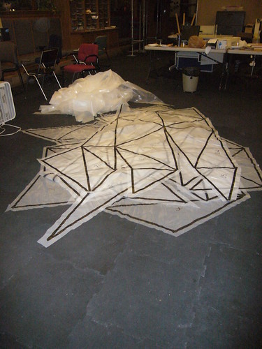
Afterwards I cut out each shape in preparation for sealing, leaving about an inch and a half around the edge for creating a seam.
A scale paper model of the bunny helped align the pieces in preparation for sealing.
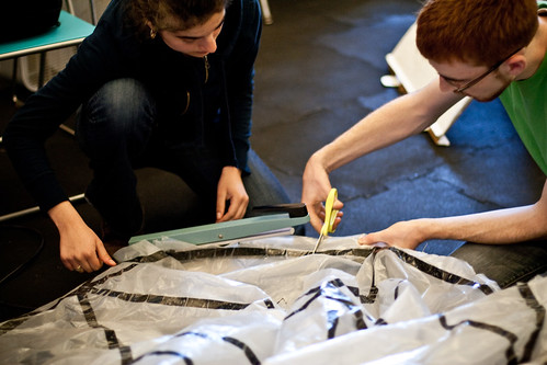
Sealing the bunny is a lot like sewing—It’s done inside out. First I matched up the adjoining faces with the outside, taped sides of the plastic facing in. Then I used the impulse sealer to fuse the plastic at the place where the two pieces overlapped. Since the impulse sealer I used wasn’t big enough, I cut a flap in the excess plastic each time so that it would fit in the machine.
Alternatively, a clothing iron can be used for this step. I prefer the impulse sealer because of the clean seam it creates.
I don’t have a picture of how I attached the bunny to the fan. There wasn’t much time before the show to design a proper fan tube, so it’s pretty MacGyver. I just cut a slit in the side of the bunny and attached the plastic to the fan using packing tape. Surprisingly the seal held.

After inflation, I found some holes that the impulse sealer had missed. A friend helped me seal them with packing tape from inside the bunny.
During the show my bunny sat in the hallway of Carnegie Mellon’s College of Fine Arts building. It was backlit with a stage light with a red gel.
This project is funded by a student grant from the Fine Foundation, received through the Electronic Arts area of the Carnegie Mellon School of Art
Thank you to everyone who helped assemble the bunny. You know who you are!
Project Title:
SubFabricator – Explorations in Subtractive Fabrication
Project Image:

Project Description:
Think of the simplest way to fabricate a sculpture. The answer is removing undesired volume of a bulk material till remaining volume shapes like the desired form. SubFabricator is an interface that enables user to input her/his 2d or 3d drill paths or drill vectors algorithm in Processing. Afterward, the SubFabricator provides visualization of final form and data for fabricating form (using CNC or 6-axis Milling Robot) through GrassHopper.
Exhibition Requirements:
All I need to exhibit the work is a table or any kind of flat surface for putting laptop and fabricated forms on. A 6.0′ x 3.0′ or 8.0′ x 2.0′ table would suffice.
Among all projects my favorites are:
Project 1 – The World According to Google Suggest by Nara
Project 2 – AI Brushes by xiaoyuan
Project 3 – Trace Modeler by Karl DD
import processing.serial.*;
XMLElement xml;
ArrayList Followers = new ArrayList();
Serial myPort;
int temptime=0;
void setup() {
size(200, 200);
if (myPort!=null)
myPort.stop();
myPort=null;
xml = new XMLElement(this, “http://rssfriends.com/followers/waffleshop“);
XMLElement site = xml.getChild(0);
XMLElement[] siteData = site.getChildren();
for (int i=0;i<site.getChildCount();i++){
if(siteData[i].getName().equals(“item”)){
String sttt =(siteData[i].getChild(0).getContent());
String[] tokins = split(sttt, ” “);
if(tokins[0].equals(“Follow”))
Followers.add(tokins[1]);
// if(tokins[0].equals(“Unfollow”))
// println(tokins[1]);}
}}}
boolean searchArray(ArrayList alist, String lf) {
for(int i = 0; i < alist.size(); i++)
if (alist.get(i).equals(lf))
return true;
return false;
}
void draw() {
background(255);
xml = new XMLElement(this, “http://rssfriends.com/followers/waffleshop“);
XMLElement site = xml.getChild(0);
XMLElement[] siteData = site.getChildren();
for (int i=0;i<site.getChildCount();i++){
if(siteData[i].getName().equals(“item”)){
if (myPort!=null)
myPort.stop();
myPort=null;
String sttt =(siteData[i].getChild(0).getContent());
String[] tokins = split(sttt, ” “);
if(tokins[0].equals(“Follow”))
if (!(searchArray(Followers,tokins[1])))
{
if (myPort!=null)
myPort.stop();
myPort=null;
println(tokins[1]);
temptime=millis();
while ((millis()-temptime)<1000)
{
if (myPort==null)
myPort=new Serial(this, Serial.list()[0], 9600);
}
Followers.add(tokins[1]);
}
}
}}
First off, here’s a screen shot of my final project so far:

My main question to the class was how to improve the interface. I changed the font from when I presented this in the morning. However, I have finished all the back-end calculations. The vast majority of the calculations (such as the neighbors calculation) is done during the loading, so there should not be an issue with speed while the user is actually interacting with the project.
Items Still Needed to Be Completed:
Items Needed for Exhibition:
I just need one computer. I can provide my own (however, my computer does sound like a jet engine–if that is an issue).
Some Favorite Past Projects of Fellow Students:
fantastic elastic (work in progress) from David Yen on Vimeo.
FaceFlip from Max Hawkins on Vimeo.
I’ll have more to show on Wednesday, but here’s some images of what I’m getting for the modules displaying gradients.

Rolling over the gradient displays the color and the image it came from.
I shouldn’t need any special hardware for the exhibit, I’ll show it on my own computer and I’ll make a poster or printed piece to go along with it (so maybe an easel or something to hold the poster)
Title/Sentence:
ColorShift: Creating color palettes from time lapse photos of items which change color over time.
Other projects I’d like to see at the exhibition: FaceFlip, Alyssa- Flower Generation, David- Fantastic Elastic
Shaper

‘Shaper’ is a prototype device that uses a three axis CNC machine to interactively dispense expanding foam material in an additive fabrication process. The device can be controlled directly via a translucent touch screen, allowing the user to look directly into the fabrication area and create physical artefacts with simple gestures.
At the Show: a 1m X 0.5 m space for the 3D printer, two tables by the side to place controlling computer and display printed objects, and a rubbish bin.
Also we’d need a cart to move the whole machine over to studio.
0. Progress
1. Project Image

2. Project Description
This Kaleidoscope mirror allows the viewers to see themselves with various fun effect. By rotating the mirror frame. viewers can manipulate their face in realtime and even allows the time travel.
3. Hardware Issue (tricky!!)
1. I need good quality of projector (if poor quality, viewer will see the rectangular edge of the screen – like the projector that I am using for the prototype).
2. The first picture below explains how the mirror setup will be. The projector should be slanted and set up high so that viewer do not block the projected screen.
For the exhibition, my idea is to hang the projector at the bottom of second floor hand-drill (yellow highlight). But I am sure about this idea.


4. Favorite Project
1. David Yen’s elastic type
2. Max’s Tesserae
3. Kuan’s Trees Cycle