Nir Rachmel | LookingOutwards-1
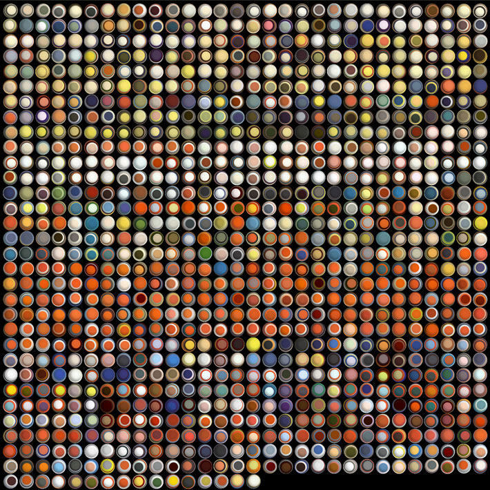
1. In the following link , I found a beautiful data visualization project by Jer Thorp. He was asked to visualize almost 140 years of the magazine Popular Science. The outcome is just beautiful, as can be seen – (Visualizing 138 Years of Popular Science Magazine. While is is a very creative idea, and very thoughtful, I wonder if the artist didn’t miss something. Besides being very aesthetically pleasing, this imagery does not convey any new information to the audience.
2. Another beautiful data visualization can be found in the following link. Following the riots in London, the artist mapped how misinformation could be spread on Twitter during a time of crisis. It’s visually appealing and invites the user to “play” with it for a while and learn. The user can choose different hoaxes and explore how the news spread among the twitter community. This kind of vizualization is very interesting, in my opinion, as it has political context and shows how twitter plays an important roles in these past few years’ events.
3. Last (but not least), Beautiful website. The interaction is very cool and engaging, but as always the case with these highly sophisticated html5 / css / js / flash techniques, one wonders what is the correct amount of “cool stuff”. Anything over that amount will very quickly lead to a slow website and impatient users not coming back ever again.