Madeline’s Revised House Prints
Placeholder for documentation.


Arthur Ganson

http://www.youtube.com/watch?v=cn6lHIhm5Xs
I’ve been working with gears on and off for the past year now. They are obviously complicated to mesh together properly depending on ratios, pitch, teeth, etc. But there are a limited set of rules that can be defined for creating perfect pairings of gears.
For my project I’m inspired by the obsession we have as academia to figure out how all things work. Therefore I want to create a rhinoscript which allows a generation of unnecessarily complicated scheme of gears. I’m imagining being able to specify a STARTING motor/torque point and then a FINAL output point and have the program generate hundreds of gears and random configurations in between.
For this project if I can get a script working with a few generated models and/or animations I will be happy. But preferably I would like to be able to laser cut these final confusing nightmares of random gears so that they function and move.
In how many different ways can you sort a collection? From how many different perspectives can you view an assembly of things?
A collection is a group of things related to each other in some identifiable way. The relationship might be through a topic, a place, a person, a type of object etc. Even though there is a specific motivation for gathering on the first place, what makes a collection dynamic is that one can reorganize the same data in alternative ways and make different sense of it.
The motivation about this project came from the ‘Pink project’ by Portia Munson. The pink project comprised a series still life installations created out of the artist’s collection of discarded objects, all of which are varying shades of pink and are objects used by females. The discarded items assume new meaning when seen out of the perspective of the common color and the connotation with gender as well as through the way they are organized in space.


Portia Munson, Pink Project, 1994
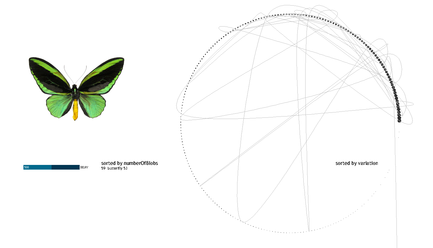
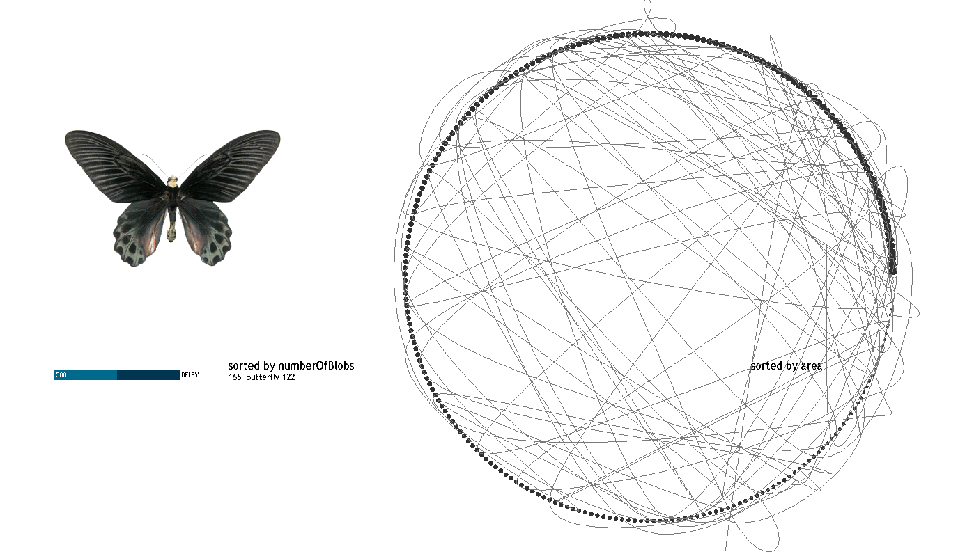
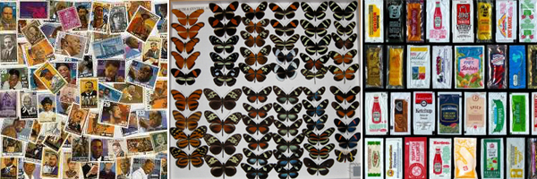
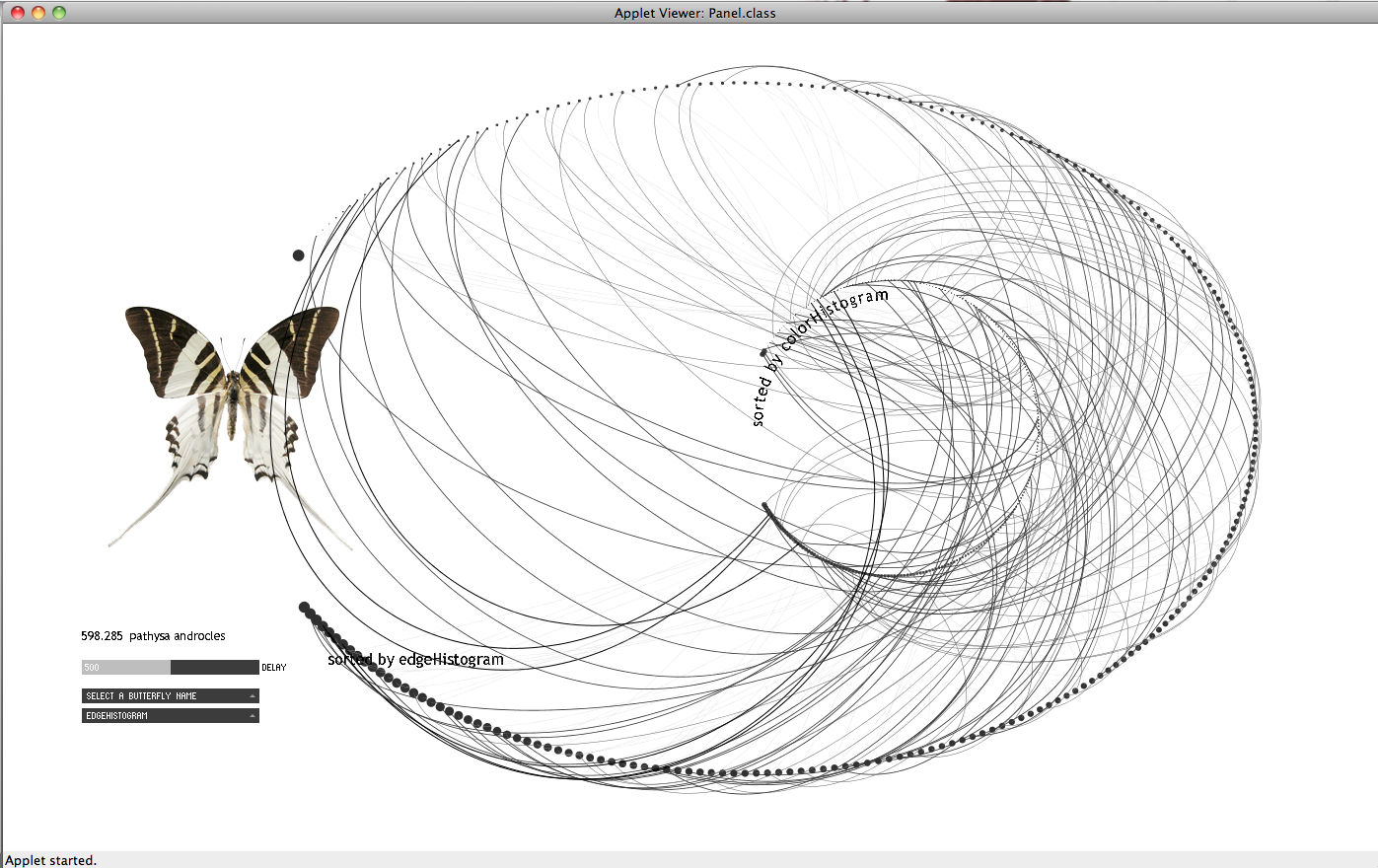
The data set I am using for the project, comes from a collection of images of butterflies provided by an iPhone app made by Hunter Research and Technology. The collection is composed by 240 images. Each butterfly is shown in plan on a white background; the images I extracted are 260×340 pixels in size. The only data accompanying the images is the name of each butterfly. The sizes do not reflect the real life size of the butterflies; they were probably all brought to the same scale before being used in the iPhone app. I later found that the original images are coming from the following website: http://butterflies.aa6g.org/ where also a description of how the butterflies had been photographed can be found.

From the results I got for the images I noticed that the values do not vary significantly. This, I believe, is also reflected on the slideshow: in most of the cases the reason for transitioning from one butterfly to the other is not observable. My impression is that given the collection under consideration (same family of things with similar characteristics) the linear ordering might not make that much sense in terms of results.
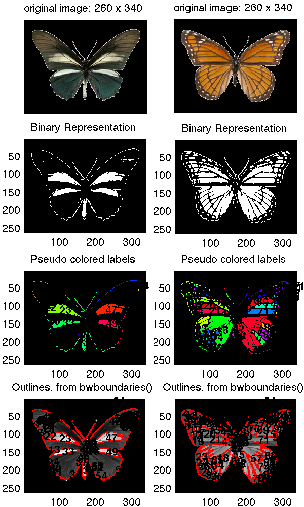
Also, it might have been wrong on the first place to compute the image statistics without taking into consideration that a significant amount of the image pixels were those of the background. So I run the histogram analysis taking a different approach:
(1) I considered all three color channels
(2) I masked the image in order to compute a histogram only on the butterfly shape
(3) I computed the similarity among all pairs of butterflies and got the corresponding sorts; more specifically given the histogram vector for each image I computed the distance matrix between all pairs of butterflies.
The results seemed more reasonable. Thus, taking the three points mentioned below under consideration, I repeated the image processing and extracted the following image descriptors:
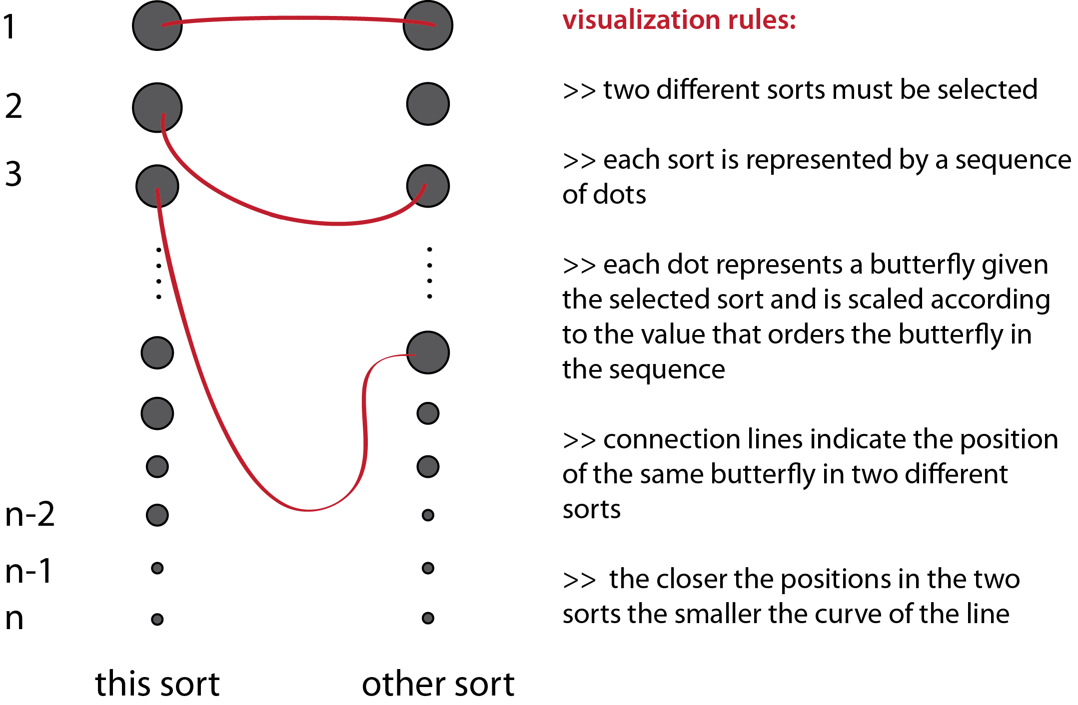
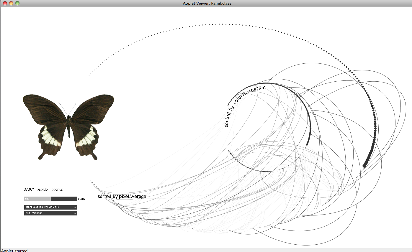
The following images are from my first attempt to visualize the data. I thought that it might be interesting to observe what kind of relations may occur among two different sorts. In the applet below I represented the sequence of a given sort e.g. by variation with a sequence of dots where each dot represents a butterfly in the sequence. By following the movement of a curve in time representing another sort e.g. by number of blobs I can compare how similar or not is the distribution of the butterflies with regard to the first sort.

I consider that this attempt does not work in communicating the objective of the visualization. I redesigned it following the rules below:

[slideshare id=11502902&doc=beastlyproportionspresentation-120209134454-phpapp01]
Inspiration-
Animal encyclopedias & reference books always list species height information, but it can be hard to imagine just how big a donkey is, especially when it is described as 3′ 5” from the shoulder. Many people find it hard to understand this information out of context and are much better and understand height in comparison to themselves. So I was inspired to create a life-size interactive size comparison chart to allow people to explore this information in an easy & relatable way.
Method-
I used a kinect sensor with a OSC program called Synapse (also required openNI/openNITE) to get readings on where the users right hand was. (With help from Dan and referencing a project that I found http://openprocessing.org/visuals/?visualID=33885 I was able to track the users right hand height with the simple variable- rhy). I used processing to check if there was an animal in my database that is as tall as the users hand height, and draw the animal. I projected this image on top of a 7 foot scale on a large white wall in my studio over.
Reflection:
I was really excited to do this project so I could experiment with the kinect. Once I got all of the required software downloaded (one of the biggest hurdles) I had a lot of fun imagining the potential of this technology.The second big hurdle was getting all of the animals to the correct scale because of different methods of animal measurement (from the shoulder, from the head etc). I learned a lot during this project through researching all of the software being developed for the kinect and was amazed by how many methods I could have used to do this project. Looking forward, I am glad to have this experience with the kinect, so I can created more sophisticated interactions in the future.
I think I could have improved this project in many ways. I would have loved if the animals faded in and out in an elegant manner, or if they could be little video clips or animations of the animals. Also I realized that if someone ‘plays’ with it for too long their arm gets tired.
Various awesome projects have explored how information filters through Twitter as a whole or how to characterize particular types of patterns, e.g., transit, again by searching through a large scope of tweets.
In this project, I took a step towards analyzing the interaction patterns around specific users, specifically, comedians.
Having been working with a robotic comedian that attempts to monitor audience reactions in real time, comedians that use twitter as a place to workshop their jokes provides data that could potentially continue to bootstrap that process. It is quantitative, public, and many, many comedians use it.
Do retweets, favorites and mentions reflect the success of particular jokes? Do they reflect the overall personality and interaction modes of that performer? How do they maintain rapport? Where do they divide their professional from personal? Do they ever lose their cool?
[vimeo=http://vimeo.com/36476603]
Please find some helpful resources to start playing with Twitter data in my previous Project 2 posts! It turned out some data was easier to scrape from twitter than others. Retweets were most supported by the twitter4j / Twitter API libraries.
The animations are adaptations of this openprocessing petaled flower: http://www.openprocessing.org/visuals/?visualID=48650. For readability, I do not re-include the visual adaptations in my code below, as I was mostly interested in sharing where my data came from.
You can also see in the extra bits of code (currently commented out), which include my first efforts at tracking down information about the whens and whos of individual retweets to extend the overall count. The next tricky bit is to track down responses to a tweet, which is quite convoluted as its not built directly into the API (again, take a peek at the code for the method I’m testing), happy to share with you my continued discoveries!
<pre lang=””java””>
// Runtime options
boolean part1 = true;
boolean part2 = false;
int numTweets = 10;
String who = “robdelaney”;
// Inits
ArrayList recentTweets = new ArrayList();
void setup(){
size(550,550);
background(255);
smooth();
//Credentials
ConfigurationBuilder cb = new ConfigurationBuilder();
cb.setOAuthConsumerKey(“*******************”);
cb.setOAuthConsumerSecret(“*******************”);
cb.setOAuthAccessToken(“*******************”);
cb.setOAuthAccessTokenSecret(“*******************”);
Twitter twitter = new TwitterFactory().getInstance();
Query query = new Query(“@”+who); //userid = 22084427 for ref
query.setRpp(5);
try{
//PART 1: FIND COMEDIAN STATUSES
if(part1){
println(“in part 1”);
// Get statuses
Paging paging = new Paging(1,numTweets);
List<Status> statuses = twitter.getUserTimeline(who, paging);
// For each status…
for(int i = 0;i<statuses.size();i++){
println(“in statuses”);
Status s = statuses.get(i);
// Get characteristics (text, time created, id)
String msg = s.getText();
Date d = s.getCreatedAt();
long id = s.getId();
println(“Tweet #” + i+” at” + d + “: ” + msg);
//Get total retweet count of that status
long rt_count = s.getRetweetCount();
println(“Total Number of Retweets: “+(int)rt_count);
//Add tweet to list
RecentTweet recent = new RecentTweet(msg, (int)rt_count);
recentTweets.add(recent);
/*
//For each retweet find time and username
for (int i = 0; i < retweets.size(); i++) {
Tweet rt = (Tweet) retweets.get(i);
String rt_user = rt.getFromUser();
Date rt_date = rt.getCreatedAt();
println("Retweet by " + user + " at " + d);
//Find Related Results: replies and more
//SADNESS: seems not to be a supported method, gives an insufficient authentication credentials error
//RelatedResults replies = twitter.getRelatedResults(id);
//println(replies);
println(" ");
}
}
// PART 2: MATCH UP @-REPLIES TO SPECIFIC COMEDIAN TWEETS
if(part2){
QueryResult result = twitter.search(query);
ArrayList replies = (ArrayList) result.getTweets();
for (int j = 0; j < replies.size(); j++) {
Tweet r = (Tweet) replies.get(j);
String r_user = r.getFromUser();
String r_msg = r.getText();
Date r_date = r.getCreatedAt();
long r_id = r.getId();
Status r_status = twitter.showStatus(r_id); // reply status
long orig_id = r_status.getInReplyToStatusId();
Status o_status = twitter.showStatus(orig_id); //original (replied-to) status
println("Tweet by " + r_user + " at " + r_date + ": " + r_msg);
println("Reply to: "+o_status.getText());
}
}
*/
}
}
}
catch (TwitterException te) {
println("Couldn't connect: " + te);
}
println("and we have stored "+recentTweets.size()+" tweets");
}
void draw(){
//do stuff
//println("in draw");
}
class RecentTweet {
private String msg;
//private Date date;
private int numRTs;
RecentTweet(String m, int rts) {
msg=m;
//date=d;
numRTs=rts;
}
public String msg() {
return msg;
}
// public Date date() {
// return date;
// }
public int numRTs() {
return numRTs;
}
}
</pre>
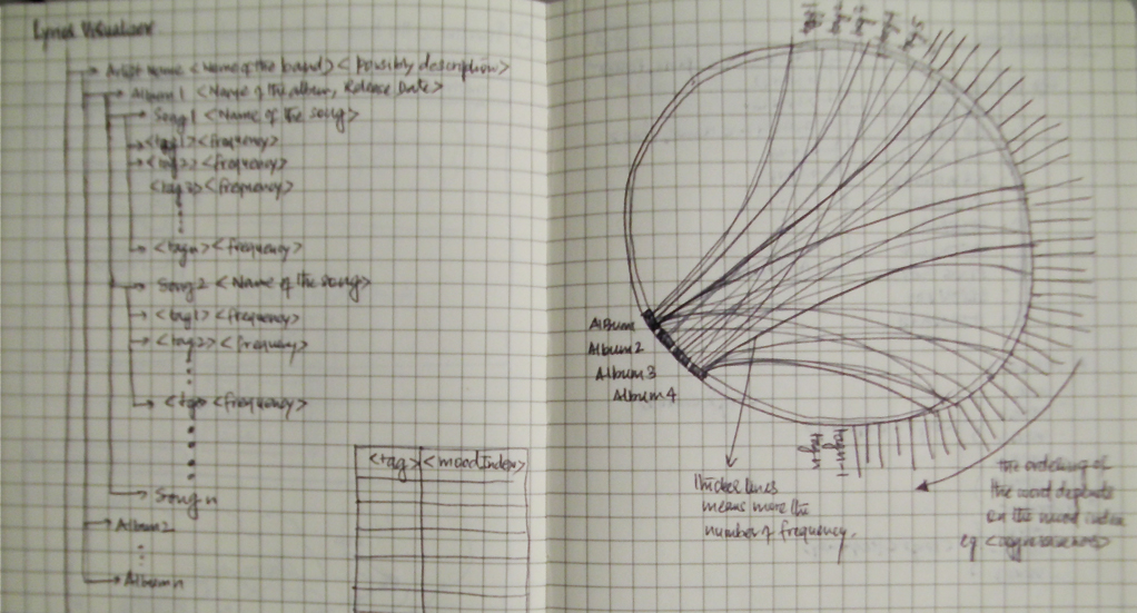
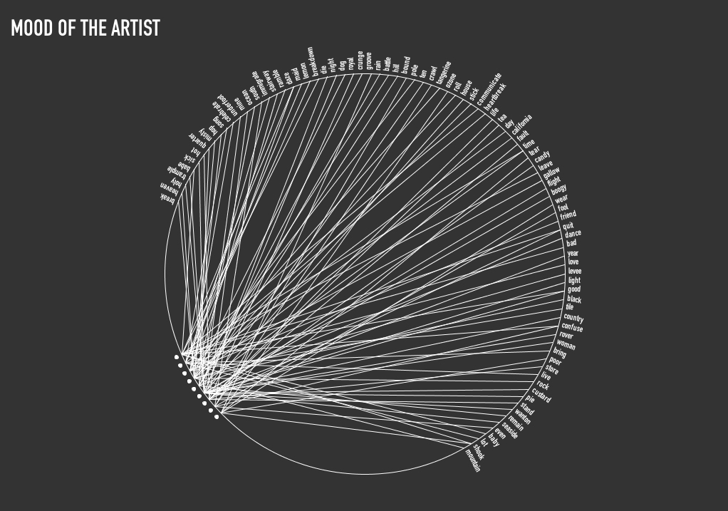
My project is a visualization of the emotion of the music albums recorded by a particular artist. I love listening to music and was really curious to know how do musicians evolve emotionally with time and number of records. Each album for a particular artist is visualized based on the words contained in the name of the songs for that album. Though the name of the song doesn’t present enough data about the emotion of the song, but it still summarizes the song effectively. The words are rated on the scale of [-5 to +5], -5 being the far end of negative emotion and +5 being the other end.
My initial idea was to use lyrics of song for every album and visualize the emotion using words in the song, more or less like sentiment analysis on paragraphs. I drew some initial sketches to see how would the visualization look like if I managed to get all the data processed and scored for sentiment.
Data collection was the easy part, All I had to do was look upto some lyrics website and scrap the album data onto my computer, However data refining turned out to be a pain. I discovered that the lyrics not only contained English words but also slangs.
GETTING THE DATA
Ex Line: “Speaking words of wisdom, let it be.”
1. Separating the lyrics into words using Lucene (http://lucene.apache.org/core/)
[speaking] [words] [of] [wisdom] [let] [it] [be]
2. Removing the stop words/ commonly occurring English Words (http://www.ranks.nl/resources/stopwords.html)
[speaking] [words] [wisdom] [let]
3. Stemming the words to its root form (http://snowball.tartarus.org/)
[speak] [word] [wisdom] [let]
(The library does an awesome job of converting the words to its root form but also screws up with words like lazy -> lazi, breathing -> breath
4. Assigning an emotion score to the words
a. Affective Norms for English Language(ANEW): a.parsons.edu/~spani621/thesis/context/ANEW.pdf
b. AFINN: http://www2.imm.dtu.dk/pubdb/views/publication_details.php?id=6010
c. SentiStrength: http://sentistrength.wlv.ac.uk
After I got the data in place I made a couple of iterations before I came to my final visualization.
FINAL VERSION:
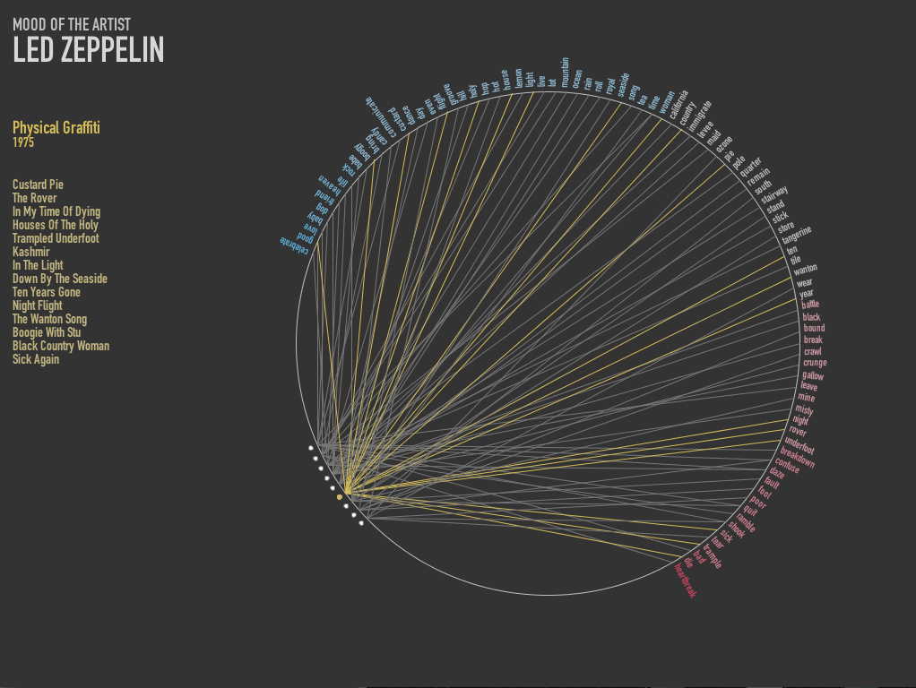
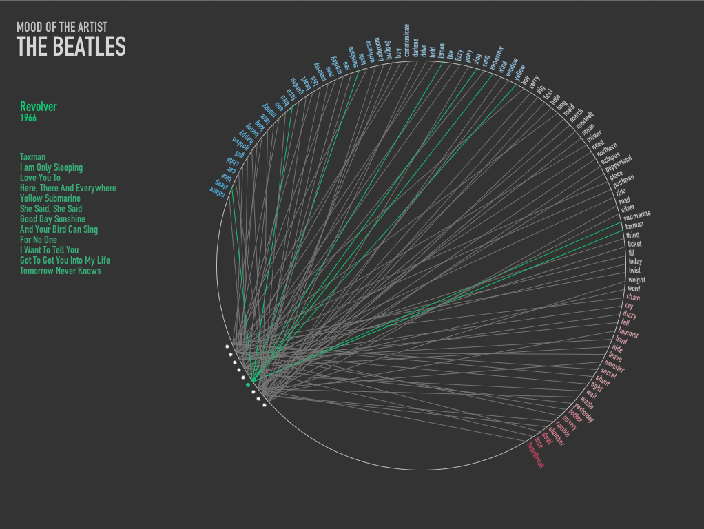
I added color to the words to signify the emotion that goes clockwise from Positive(Blue) to Negative(Green). In the third quarter of the circle the albums of the artists are drawn. The albums are then then linked to the words in the respective albums. On hover over the album circle, Name of the album, the track list and year of release is drawn.
Between the artist it was evident that Beatles used more words with positive emotion (assuming the emotion scoring did its job correctly). However I planned to overlap a couple of artist in one circle get a much better visualization, which I really want to do moving on.
My goal with this project was to visualize data that is not visual. I was inspired by a project by Kate McLean called Sensory Maps where she created taste, smell, touch and see(ing) maps of Edinburgh (link). I specifically wanted to work on visualizing smells of a place primarily because that would be personally meaningful to me and also because I think smells are associated strongly with place. I wasn’t initially sure if this is a good direction (as far as visualizations go), but I found out about synaesthesia (link & link): a neurologically based condition in which stimulation of one sensory or cognitive pathway leads to automatic, involuntary experiences in a second sensory or cognitive pathway. So synesthetes smell or hear in color. Famous synesthetes include Wassily Kadinsky & Richard Feynman. So this provided at least some basis (however vague) for this kind of mapping. Also, smellscapes are an interesting area with a lot of research (about the nose, etc). So despite the challenges, this was a pretty fun project to work on.
I initially wanted a way to visualize smells and have the data and visualization be auto-generated from data online, but smell data is hard to find. So I figured I would interpolate it from other sources: restaurants, landmarks (or smell specific landmarks like grass), and possibly people generated data like twitter feeds on smell. I could then use some simple simulations of wind (or something like wind) and map out the smells. The final visualization would be some version of a topographic map with colors associated with each category of smell (chinese food, grass, etc). So this initial goal was definitely too ambitious.
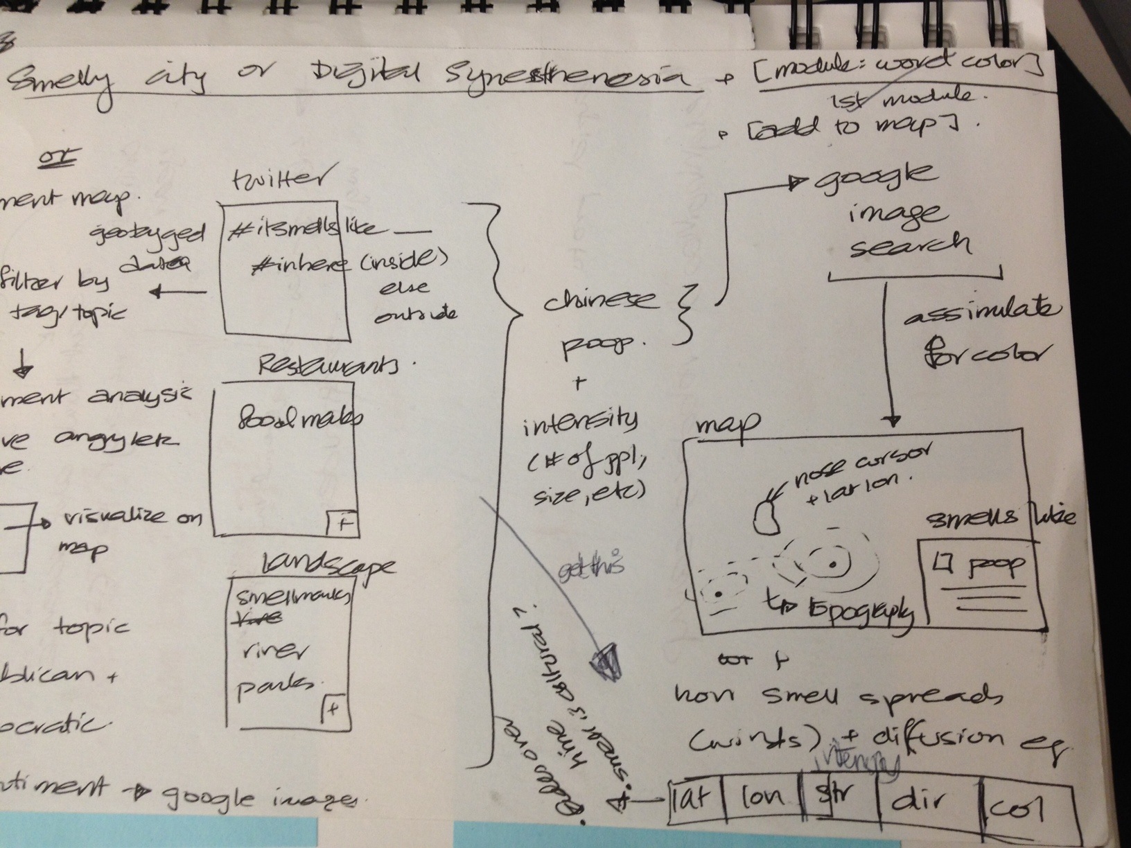
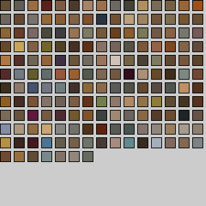
Because I was planning on playing with lots of data, I figured I needed a way to map a category of smell to a color. To do this, I played with getting images from a Flickr search, getting the dominant colors from a set of those images and averaging those together to get a representative color for that term. So I did initial tests just by downloading images from the site search for Flickr and Google Images and found that Flickr gave me better results. I had overlooked issues about copyrights when using their API, so the image results were not nearly as good. At that point, I had to scrap the Flickr script and grab data from Google Images: which had deprecated their API, so I had a limit on the number of images. To get the representative color, I also looked at trying to use the histogram in some way: probably too naive. I added all the histograms and then tried to use the peak colors: that didn’t work at all. I also ran into issues with HSB in Processing and had to move to RGB even though calculations for hues are better (even if you’re off). Eventually I ended up using the averages for each image and averaging that. The result for a few terms was pretty good: for each color I did get the color: e.g. green, yellow, pink. I got yellow for happy, red for anger, brown for coffee, another brown for poop, pink-ish for french fries (ketchup + fries), beige for chinese food. So I figured this was good enough. Uniqueness is still an issue, but I thought this mapping was interesting enough and let me scale. I also planned on having the visualization be interactive , so the smell category would show up when you hovered over some “smell”.
Apart from color data, smell data was pretty much my primary challenge. I spent a lot of time looking at different data sources and evaluating how useful they would be. I searched geotagged twitter feeds for something like smell and got results like “smells of jealousy”: which was interesting but not for this visualization. I figured restaurant data would be easy to find especially when we see it everywhere: but all the APIs I looked at had strict limits on how many requests I could make: which made this task infinitely harder. Also, I also wanted categories with restaurants and not all the APIs had that. At that point, I decided to ditch the smell idea and just play with Taste. I initially looked at a bunch of APIs: Google Places, Yelp and FourSquare. Google Places did not have categories for the places, so I decided not to use it. Yelp has great data but only allow 500 requests a day and a max of 40 results per request. I learned this only after I had scrapped the site for about 10K restaurants in Manhattan and realized some of them were missing. At that point, I had to go back and get data from FourSquare: their categories aren’t as great and the data is also not as clean, but it was the next best option. It has a limit of 5000 requests & 50 results per request. I was able to get 25K restaurants and 172 categories. The script I wrote went through tiny grids in a bounded location with an approximation that there would be less than 40/50 restaurants in that grid. With the foursquare data, the “Food” category also had things like Yoga Studio so it needed to be cleaned out.
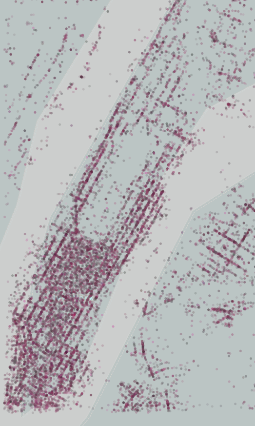
Finally, once I was able to do that, I had to write a script that would take that data & map it onto a map. I used TileMap for the background image and also looked at CloudMade (but I couldn’t export the map/tiles there). I initially used Till Nagel’s Mercator library to map the points, but realized the visualization is pretty much pointless without an interactive legend, so ported it to the Unfolding library. I wasn’t able to make the legend interactive (so you can select a point and have the matching tastes show up), but I am pretty close.
Map
Colors
So overall, this project was slightly a disappointment. Maybe with a little more time, I could get more interesting information from the dataset, but I wasn’t able to get what I wanted and my hunches about colors didn’t really pan out correctly. Things turned out very differently from what I had initially thought they would. Although I wasn’t happy with my final product, I learned a LOT during this assignment: primarily process and getting good data. I used a lot of tools also: Processing JSON library, FourSquare 2 API, OAuth2.0 library for Processing (Scribe), Yelp 2.0 API, Flickr API, Google Images API, Open CSV, colorlib (toxiclibs), Color Summarizer API, Unfolding library, Till Nagel’s Mercator Map.
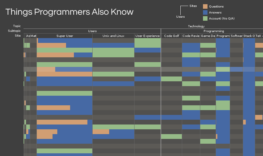
Things Programmers Also Know is a visualization of the knowledge and interests of the 400 highest ranked users on Stack Overflow.
Initially, I was interested in visualizing disinformation, or an idea I called “little myths”: the small rituals we go through, like adjusting TV antennae or standing in particular places for cell phone reception, that may or may not actually influence the outcome. It turned out that collecting this kind of data wasn’t feasible in the time we had, but with the help of some classmates, I arrived on the topic of “Question and Answer” websites. There are many sites in this genre, but Stack Overflow stood out as an popular, practical, and familiar choice.
For those unfamiliar, Stack Overflow is a site dedicated to asking and answering questions about programming and is widely used as a reference by students, amateurs, and professionals. After the success of Stack Overflow, the founders released the underlying technology so that others could make similar topic-specific Q&A sites. The result is the StackExchange (SE) network, which covers topics from server administration to martial arts and LEGO® bricks. Most importantly, there is a single API that gives access to an enormous amount of data about all the sites in the SE network.
[vimeo 36477715]
I started by looking at the top questions and tags on Stack Overflow. Unfortunately, the results were boring and predictable: the top tags are a list of the most popular programming languages and the top questions are usually people looking for advice on broad, general topics. In the process of sorting though these data, I decided to avoid text-focused visualizations if possible. While exploring the SE API to see what other data I could retrieve, I discovered that user accounts are shared between all SE sites. Given the wide range of topics covered by the network, I suspected there would be interesting trends in people’s interests.
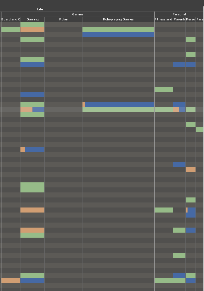
Data is collected by a series of Python scripts using the Py-StackExchange library to handle communication with the API. The scripts collect a list of users from a site, then find all associated accounts, and then query the individual sites to obtain more detailed statistics. While I chose Stack Overflow as the user source, it’s very easy to use any other site in the network as a source. Also, I obtained the highest-ranked users as a side-effect of my query parameters, but with some minor modifications, it is possible to slice other sections of the user base. The scripts output CSV files which are read into a Processing sketch for display.
The sketch displays a user-site matrix, with each row representing a user and each column representing a site. If the user has an account on a site, a box is drawn at the intersection of the row and the column. If the user has asked or answered questions on the site, the proportion of questions and answers is drawn in the box. I used parts of Karsten Schmidt’s excellent Toxiclibs libraries to handle zooming and color operations.
The zooming effect, while important for viewing the data, is also a little unstable, making it easy to miss columns when panning. There is also support in code for filtering the displayed sites at a site, subcategory, or category level. Unfortunately, this didn’t make it into the interface. I also think it should be possible to put more information into the display by correlating the saturation and brightness of the colors to the user’s reputation or the actual number of questions and answers provided.
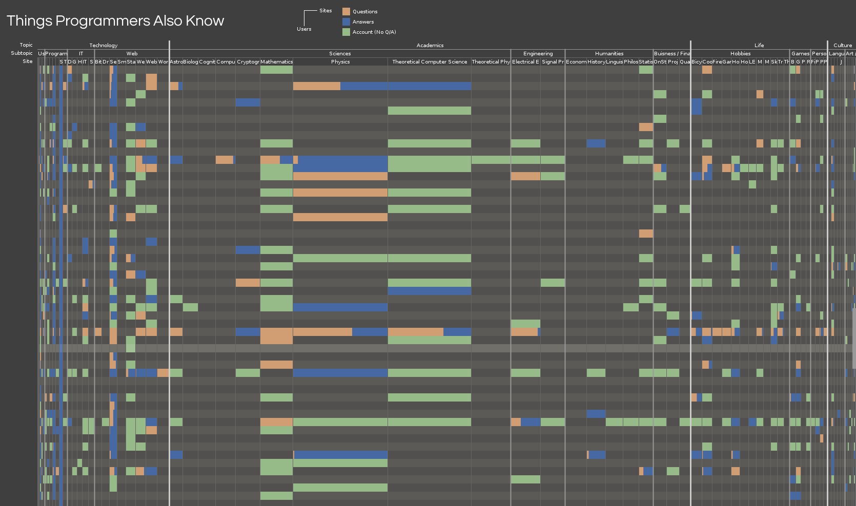
I think this works as a simple, effective visualization of the connection data. Trends, particularly in question/answer ratios are easily visible. For instance, most Stack Overflow users ask a lot of questions about server administration compared to the number of questions they answer. I was also surprised to see other sites, like English Language and Usage, have so much overlap with Stack Overflow in users.
I’ve used only a fraction of the data that can be had with the SE API, so I look forward to seeing any other visualizations of information from Stack Exchange network.
Download Things Programmers Also Know (src)
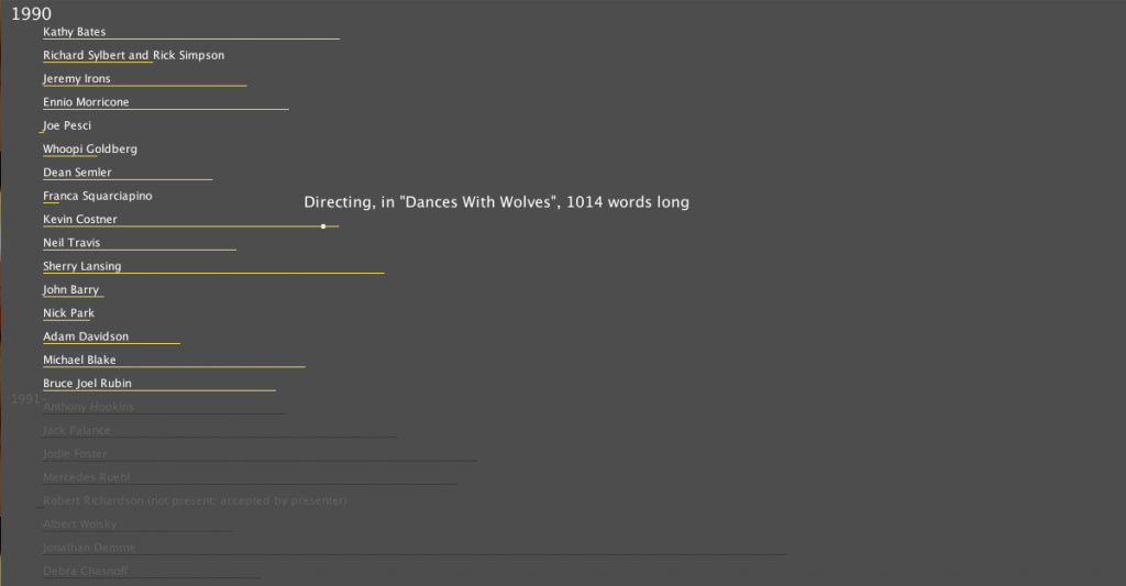
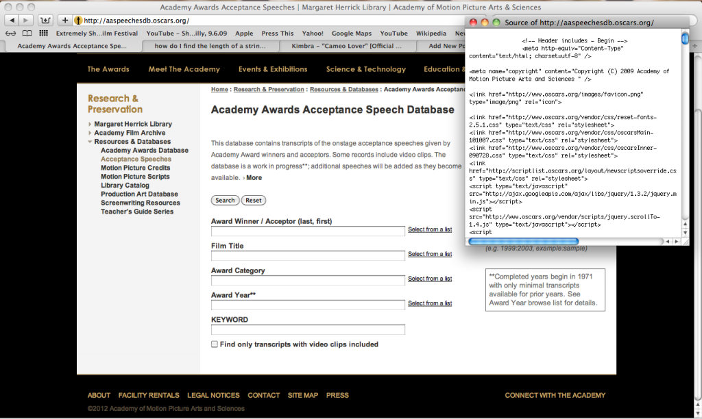
In my search for what data set to use for this project I found the archive of acceptance speeches from the Academy Awards since 1971 (and a few pre-dataing then too). I wanted to visualize the rambling and crying that usually occurs at this yearly event as well as play into how heavily publicized it is. The transcripts of the speeches are unfortunately cleaned up so I instead decided to focus on the length of the speeches, content and the gender of the speaker.
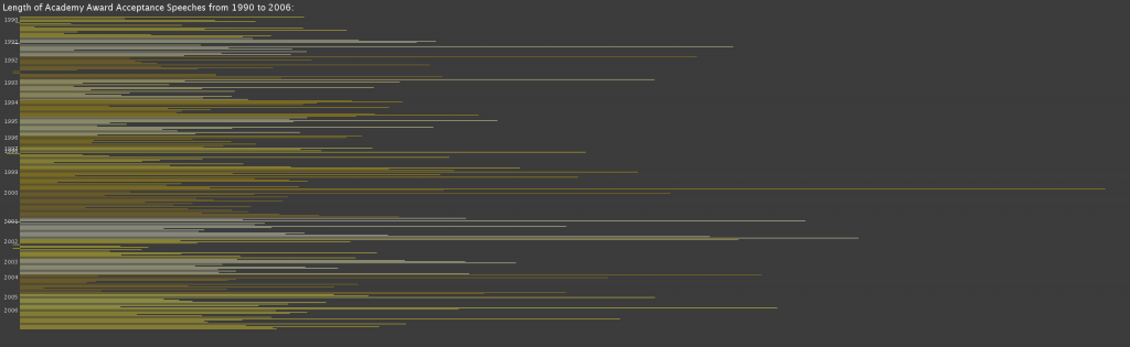
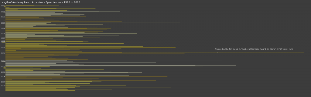
[http://www.openprocessing.org/visuals/?visualID=51811]
My project is a visualization of one’s deepest darkest browsing secrets. It takes a Google Chrome history file, cross-references it with a blacklist to extract all the unsavory parts, then visualized it all in a harsh white-on-black void. The title of each dirty history entry is displayed as a dynamic chain of letters tumbling toward the ground. They collect on the bottom to form a swelling mass of porn titles. The most recent entry is always red. The user can erase this entry by typing its name. Once a title is completely typed out, the sketch goes back and deletes that entry from the history database.
[slideshare id=11493469&doc=iacdproject2-120209015504-phpapp01]
The concept is to make each user face the reality of their actions. Browsers make it far too easy to delete one’s past without a second thought. Here we go through an act of recitation to ‘cleanse’ away the sin. I originally planned to have many more religious overtones, but those seemed heavy-handed compared to this minimalist approach. Overall I’m satisfied with the final product; I executed the original concept 90%. This really belongs online, though. I would love to make an HTML5 drag-and-drop version in the future.