SankalpBhatnagar-LookingOutwards-2
Project 1:

This is “Colours in Culture” by David McCandless and AlwaysWithHonor.com and it is just stunning. Why? Well because it makes information about color connotations around the world beautiful. The idea, I believe, is to demonstrate what different colors mean to different cultures across the globe. To visualize this, he uses orientation of concentric circles and a simple grid system of numbers and letters to tie various cultures to numerous colors and their corresponding emotional responses. I find this use of grid most interesting because I personally would never have thought of overlapping shapes to form a bigger grid system. If I were to change anything, it would only be to help minor aesthetic grievances I have with the centering of the circle and the margins on all edges.
Project 2:
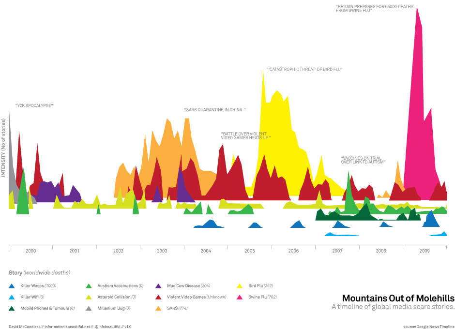
This is “Mountains Out of Molehills” by David McCandless. I really found this interesting mostly because of the information it conveyed. The idea behind the visualization is to portray major media “scare tactics” via google tracking of articles with a given number of “deaths” and a given “scare sory”. For instance, Swine flu was reported to have caused 65,000 deaths and thus was colored in Pink and linked during that time to this graph of sorts. What I found interesting is that it really plays with 3D shifting of a “base” for graphs. All of these patterns could have been viewed all smushed into a 2d realm and been quite confusing, but McCandless sort of shifts the angle of sight for the user and I admire that. If I had to change anything, I’m not sure I’d leave the entire top left so blank. I mean, I get that not everything in the image should be covered, and that that left white area sort of shows the intensity of the right pink area just by contrast, but it is a bit unappealing to me, personally.
Project 3:
http://www.onehourpersecond.com/
Okay. Wow. Let me just say. Youtube is officially awesome. It seems that they created this site with Punk & Butler, Alex Eben Meyer, Justin Young, and Use All Five. Before I go into what I like, let me just state for the record, before this site, I had never thought of time based info graphics before seeing this. Now, having said that, I was truly drawn to the concept presented because I was “curious” about how YouTube could possibly visualize periods of uploads in relation to other events. After the first few seconds or so, I was hooked. I attribute this to YouTube’s ability to make me, the user, curious or sort of compete with people I know (as to how long we can watch this visualization for). I mean, ultimately, the site informs you of directions as to speed up the process, but up until and even after that point, I felt drawn to this. If I had to change something, I’d perhaps give more of an introduction into the “visualize me” part of the site. I didn’t quite know what to expect, and I’m honestly not sure if I liked it that way–at least in the beginning. Ultimately, I caught on and wow! time based infoviz’s are great!