Deren Guler_Project1_Float PM
Originally, I wanted to create a visualization using air pollution data from Beijing that my friend had gathered for her project, Float Beijing. As I researched the air pollution reports in China, I came across pages and pages of blog posts and articles about the “fake weather reports” that the government broadcasts. The issue “exploded” a few weeks ago, when the US Embassy, and several external forces, confronted the government about this and demanded they report the real information. The Embassy now posts the actual air pollution index hourly on their twitter feed: http://twitter.com/beijingair
It was more difficult that I thought it would be to find the old data, now that there has been this intervention. Several sites linked to the Air Quality Monitoring and Forecasting in China site that has a pretty extensive archive, but there is a temporary error on accessing their archive, suspicious. I was able to find a monthly report from the Ministry of Environmental Protection of China that reported daily averages from the past month. I used this data set in comparison to the data from the US Embassy feed of the past month.
I wanted to get away from the “weather map” look, because as I looked at them I felt like they were just pretty colors over a map, and I wasn’t understanding very much from them. I wanted to make something that illustrated what was happening to the city from air pollution according to the government reports, and the actual data.
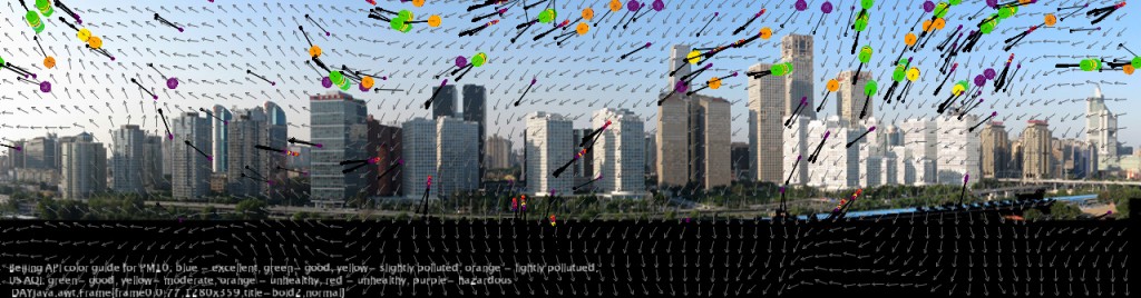
I started with the flowfield sketch from The Nature of Code to create a flowfield of random particles flying across the city. The boids (or flying circles pictured above) are colors of varying size and color. The program is cycling through the data and creating a set of circles for each new index reading. The data from the MEP is PM 10, or particulate matter 10 data, which is what they were reporting. These particles are larger, and do not really settle, they mostly float around in the air and can be filtered pretty easily. They do not lead to extremely serious health problems. I represented these with the larger circles.
The data from the US Embassy is PM 2.5, which is the really bad stuff that the government was not reporting at all. It is the smaller particles that settle throughout the city and creep into your body and can lead to cancer and other health problems. The PM2.5 circles are 1/4 the size and are able to flow around the entire image of the city, while the PM10 float around the sky portion.
In both cases the colors represent the respective colors used by the Chinese and US API color code. For example, the US uses light green to signify that the air is healthy (PM 2.5 < 50), while the Chinese uses light blue for PM10 < 100. The articles about the controversy explained that not only does the Chinese government use their own API scale and color code, their standards are 6 times lower than that of the WHO. Additionally, the weather station that the MEP uses to report from has been moved 3 times in the past two years, while the weather station the Embassy uses is right downtown.
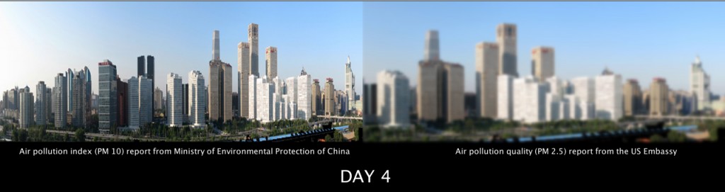
I then decided I wanted to show what was happening to the city over time, so I created a blur function that blurs the image by a factor of the daily pollution. This seemed to look better visually, so I created a version of the image blurring without any flying colored circles.
It became hard after a while to decide if the visualization was effective because I was reading so much about air pollution index formats and want they are supposed to mean. I became a bad test subject. My goal was to create something that you can understand without knowing very much, so after some feedback from my labmates I decided to keep it simple:
And here is a short video, showing the different versions of the program cycling through the month.
Beijing Air Pollution Visualization from Deren Guler on Vimeo.
code for version 3:
PImage bg; PImage bgblur; float blurval=0; float blurval2 =0; int days; //data from embassy int realpoll [] = { 302, 171, 125, 161, 30, 29, 152, 163, 214, 184, 242, 206, 155, 169, 211, 42, 57, 500, 464, 398, 94, 94, 94, 171, 232, 184, 55, 385, 325, 241 }; int daynumber [] = { 1, 2, 3, 4, 5, 6, 7, 8, 9, 10, 11, 12, 13, 14, 15, 16, 17, 18, 19, 20, 21, 22, 23 , 24, 25, 26, 27, 28, 29, 30 }; //data from MEP float liepoll [] = { 84, 52, 60, 26, 30, 92, 66, 62, 74, 67, 78, 45, 49, 149, 23, 21, 131, 269, 193, 111, 106, 60, 70, 79, 86, 25, 161, 102, 89, 65 }; void setup() { size(1280, 337); bg = loadImage("skylinecropped.jpg"); bgblur = loadImage("skylinecropped.jpg"); smooth(); } void draw() { delay(500); background(bg); days = frameCount % 30; if (realpoll[days] < 100) { //this is a clear day blurval=2; } else { blurval= map(realpoll[days], 100, 500, 0,10); //make it blurrier depending on pollution value } if (liepoll[days] < 50) { //this is a clear day blurval=2; } else { blurval2= map(liepoll[days], 50, 300, 0,10); } println(blurval); println(blurval2); image(bgblur, 0, 0, width/2, height); filter(BLUR, blurval); image(bgblur, 0, 0, width/2, height); filter(BLUR, blurval2); textSize(14); text( " Air pollution index (PM 10) report from Ministry of Environmental Protection of China", 30, 270); text( " Air pollution quality (PM 2.5) report from the US Embassy", 800, 270); int i = 0; textSize(30); text( "DAY " + daynumber[days], 600, 320); //text( "DAY ___", 630, 330); i++; // println(blurval); delay(500); } void mousePressed() { noLoop(); } void mouseReleased() { loop(); } |
========================================
Deren Guler: Bejing Air Pollution Visualization
it would be interested to see paneled blurred illustrations of data from air quality sensors from around the globe. plenty of live streams available for realtime visualization.
nice song choice for the vimeo vid, suits the content well+1. also, i like the idea but im not sure whether i would understand what’s going on without you having explained it. i like the data filled vs. the regular view to express the contrast between reality and the pseudo-reality that is broadcasted.
The data is really good and its a nice attempt with visualization, it projects what you want to convey, however you can explore more to visualize the data to its effect.
“good illustration, less effective as visualization”
I would like to see all the days at once, in a table… like column A–chinese, B–US… rows as the days.. So you could see over time how often and how much the chinese gov’t distorts the data.
Really cool idea, I think the comparison is very telling. You need some kind of reference (scale of not blurry to blurriest).
Maybe you should supplement the blur with some hard numbers that map to the pollution level, there’s no way to tell how much blur is ‘bad’ right now. Great video presentation though, I liked seeing the process and evolution of your work.
Good topic. This is a good example of visualizing INFORMation/ DISINFORMation. Algebra!
I like that you realized in your project that it was kinda overcomplicating the data in a cheesy way at first. It screamed computer physics. But I think the blurring effect is much more beautiful and telling about clarity through data and public powers.
The comparitive data displays are by far the most compelling because it reveals something very tangible. Perhaps you could experiement with the particles in that case in addition or instead of the blur. It’d be great if you could also print the number that the data is supposed to be representing.
The music really complements the imagery and sets the right tone for your project. I also like the use of blurring as a way of displaying more information, rather than just being aesthetic.
Very cool way of qualitatively illustrating the difference between the actual data and the government data. I think the visualization then becomes more about the difference between what the government says and what reality is. I do feel like this is sort of a more intuitive view of what’s going on, though. I don’t know that I have a sense for anything from this beyond the fact that the Chinese government was trying to pretend things were better than they are.
I agree that the bluring is more effective (although perhaps not the most effective thing that could be done). While the flow field looks cool, there are too many variables that don’t represent anything and distracts from the data.
I think the blurring was more effective at conveying the data of pollution, but using the colored dots maybe not so. Perhaps because the blurring is so pervasive whereas the colored dots do connote a strong sense of pollution.
The comparative visualization is really strong. I als find strong the contradiction of the particle movement (reminding peaceful kites flying) and polution.
I think you were able to capture the experience of pollution.
good use of the “Nature of Code” book examples.
PRoblem domain is interesting. I like the fact that you iterated different ideas and came up with an end result.
**Agreed.
blur has more of a immediate effect with the user, and I think it’s great that you chose to combine it. It’s almost like a warning of “what happens when you pollute—you lose your vision”.
Love the soundtrack!
The blur doesn’t have enough shades.. it all looks blurry. A bit hard to distinguish what is more / less polluted.
**not sure how a blur can be too blurry.
** it means that you cannot really distinguish between two different “levels” of blur.
** Yeah I think this is a good point. It turns out to be a good way to see that something has changed but it gives you very little information about how much pollution there is or what it means.
blurring definitely portrays the information better than the kites, though the combination of the two was visually cool.
** yeah I liked it best when both approaches were combined.