The first part of this project was to pick a data set and then map it geographically. I chose the data set of close to half a million hotels world wide. There were two main reasons I picked this data set. The first was that is was by far the largest. Worked with large data sets was new to me and I wanted to make sure that I wouldn’t be able to take any short cuts. It did prove difficult to work with a data set of this size. At first it took hours to plot points by after many iterations I was able to plot all the points 60 times per second after loading them in to ram (a 30 second process). The second reason I chose this data set was the wide variety of info about each hotel. For example the data set game lat and long but also, rating, URL, check out time, and facilities. I was looking forward to finding interesting relationships between these odd properties.
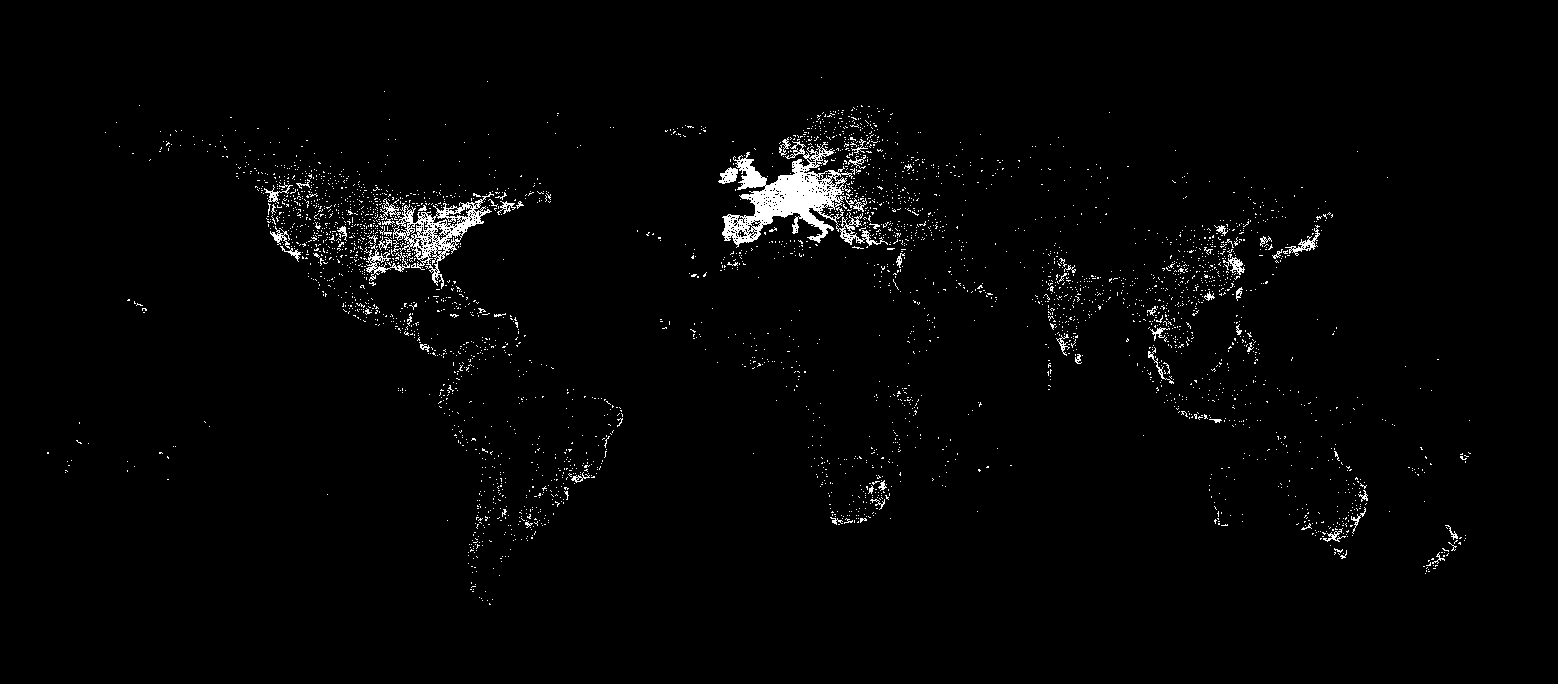
The first visualization is a map using the Mercator projection. Although this was meant to be a simple plotting of points I was able to discover a lot of fun things by looking though it. For example, in the United States you can clearly make out the highways that have hotels all along them. Another cool discovery was that hotels are clustered in curved lines in the Alps based on the mountain rage it’s self. I was able to make these discoveries largely because I added zoom and pan functions.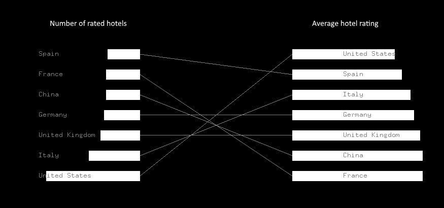
My second visualization was an attempt to answer to an actual question I found myself asking as I looked though the data. How does quantity vs. quality of hotels compare? To explore this I created two bar graphs. The one on the left is the number of hotels with ratings for the top 7 countries. The bar graph on the right is how those same 7 countries compare when it comes to the average ratings of those hotels. By drawing lines between these bars we start to see some interesting patterns. For the most part countries with many ratings (USA and Italy) have lower average ratings. The countries with less ratings (France and China) have much higher average ratings. And odd exception to this trend is Spain having both low quantity and quality.
Both of these visualizations can show interesting insights in to the same data set. I’d be interested to find ways of overlaying the two styles of visualization on top of each other. For example coloring the dots on the map based on the hotel ratings. Perhaps rating quantity could be mapped to the red channel and average rating could be mapped to the blue channel. This might give us more insight in to a connection between ratings and geographic location.