
Pedro Cuhna’s “Interactive Air Pollution Map” creates an extremely straightforward view of air pollution in the world by country. I was also happy to see that Pedro had also created a “By City” function, but a bit put off by the appearance of the function in action.
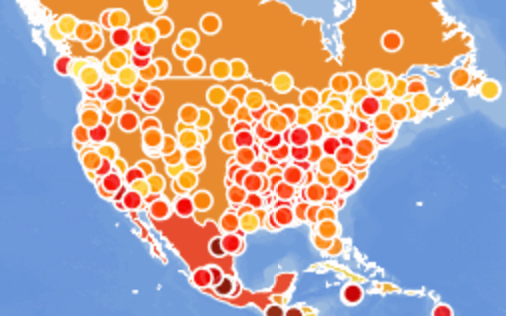
The “By Cities” option merely adds what I would equate to “zits” on top of the map. It simply makes the map feel cluttered and, in a way, unreadable. Even when we zoom in

the color scheme and structure of the map makes it difficult to feel the individual impact of a city. A simple fix, may have been to more accurately map city sizes, and spheres of influence based on pollution levels.