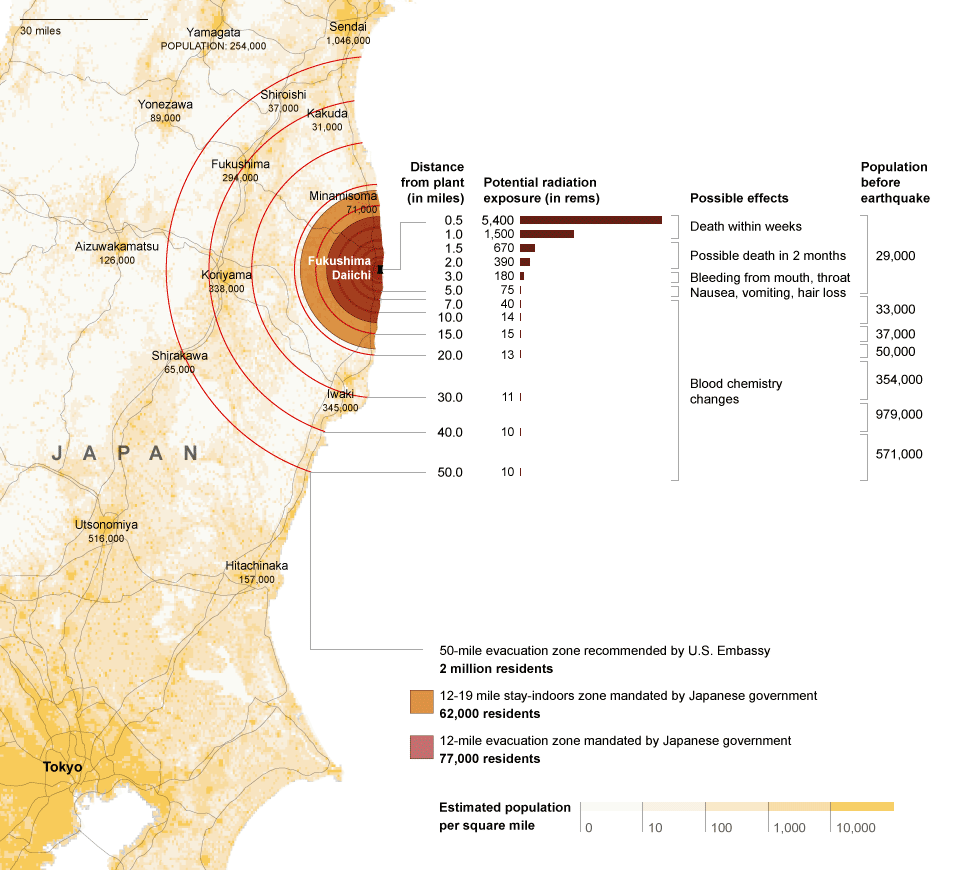
Radiation map in Japan by New York Times
http://www.nytimes.com/interactive/2011/03/16/world/asia/japan-nuclear-evaculation-zone.html
3-Way Street: Highlighting Dangerous Traffic Situations at an Intersection

The two images showing “safe zones”. The first one visualizes the evacuation area around Fukushima nuclear plant in Japan because of earthquake that occurred on March 11, 2011. Funny thing was that this map was more reliable information than info from Japanese government for some people. Good job New York Times.
Second one is an live-visualization showing Dangerous Traffic Situations on the street in New York. This is what we sometimes feel on the street but never been visualized because those events (or accidents) happen instantly, and difficult to capture.
The Bikini Chart

Third one is Obama’s bikini chart. “The chart shows the number of jobs lost per month over about two years, ending in early 2010. The message is clear: things were getting worse under Bush but have been getting better under Obama.” Usually pointing down bars indicate negative numbers, and it’s negative if you look at the info as “negative job growth”. It also makes this chart somehow unique than conventional histgram by turning them upside down. Good marketing.