 http://www.university-autonomy.eu/
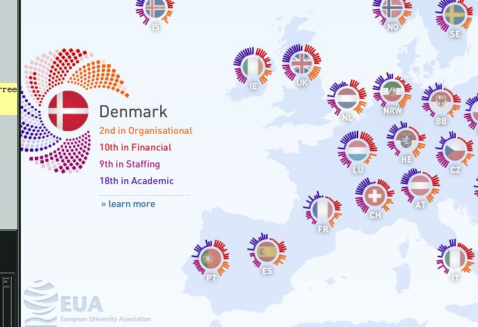
The idea, tough not useful, might possibly be interesting amongst some circles, or/and is potentially a interesting way of displaying EUA’s findings. At first the reasons behind the gradings are cryptic, when exploring the particular fields in which the universities are graded, you still have a hard time navigating the curved lines to decypher the reasons. Location+flag+countr code – two of them are redundant. The translation of visual to verbal is slow.
 http://www.iyou.nu/#question03
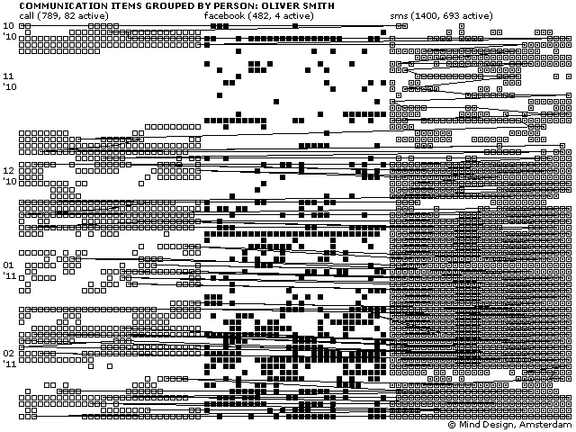
The simple visuals bring the data, which might be interesting to its owner(?), to the foreground. This example is sorted alphabetically, which is an unusual approach, but it might stem from the fact that it is also a representation of an adressbook. The other images are clean, don’t have redundant elements. Altough, the rectangles, I assume, could work even if they had the same appearence.
 http://infosthetics.com/archives/2011/08/cinemetrics_visualizing_movies.html#extended
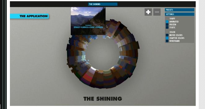
The fact that movement is represented by movement cuts the translation from visual to verbal to noneexistant. A relatively visually heavy method is used to illustrated the visuals of a movie – which means that it doesn’t even have to enter the verbal domain. Claims to be a tool, and actually is a tool, as allows us to see things in ways we would otherwise struggle.