#1.City Peaks
http://www.creativeapplications.net/scripts/city-peaks-digit-employees-climb-the-shard-mountain/
Provided description
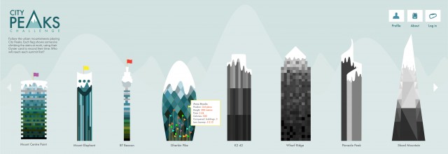
To encourage fitness in their studio, London design group Digit decided to use their R&D stream to create a new way for it’s employees to compete against one another by the amount of times they walk up the stairs. Thanks to Arduino, RFID Oyster Cards and some html/javascript, the sum of all climbs is represented on the website as a comparison to buildings and mountains.
Factual Information (How I understood it)
Dimensionality:
1. Users position/rank compared to others (Represented by flag)
2. Total height climbed in meters
- comparing to the buildings – to compete – height of the flag compared to
the building
- comparing to mountains – for individual – placement of the flag on
mountain
- Input from hardware (start and end point of particular staircase)
3. Overall time for climbing
- not represented graphically – only appears as number in pop-up
- Input from hardware (time laps between start and end point of particular
staircase)
4. Date stamp of last journey
- not represented graphically – only appears as number in pop-up
- Input from hardware
5. Calories burnt
- not represented graphically – only appears as number in individual user’s
info
- Synthesized from the total height climbed compared to time taken
- Higher heights achieved within less time : more calories burnt (?)
6. Climbing status : Rambler
- not represented graphically (Symbols) – only appears as number in individual
user’s info
- Synthesized from the total height climbed compared to time taken +
achievements (?)
Like
The most liked thing about this data visualisation for me is that it is in the region between interesting and useful implying money making region hence used by a corporation to motivate their employees.
The other good part of the visualisation is that the analogy of climbing stairs to climbing well known structures and mountains adding to the interest of the employees than just knowing how many times they have climbed the same staircase.
What if? (Tinkering with what it is)
All the dimensions of the data are not graphically visualised except for the rank and total height, which is useful for the purpose of the application but it will be interesting to see if all the dimensions can be visualised in a single visualisation and how? If not, how many different chart systems will be required?
#2. VILE VIVANTE
http://villevivante.ch
Provided description
The mobile phone has rapidly become a very essential tool, that we carry with us all the time, everywhere we go. It has become the focus of our communication and information in a hyper-connected world, which tolerates less and less that we disconnect or just don’t have immediate access to information.
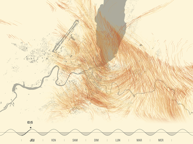
Based on this conclusion the City of Geneva decided to take the challenge to visualize these digital traces created by our mobile phones. The objective of this installation is to make this data visible and allow you to explore these streams of connected people around the city, in their everyday life.
Factual Information (How I understood it)
Dimensionality:
1. x,y position – denoted by a dot
2. Direction – Map : traces of lines
- Chart : Radial diagram showing direction in relation to toward city centre or away, relative to the time.
3. Time – colours of map and traces change according to the time
- White bg and orange lines, Black bg and blue lines
4. Amount of traffic – One of the charts (Parallel co-ordinates), not in the map view
- Amount of flow, thickness of the line
5. A week of activity – amount of traffic : dia of the circles
- Time – division of line in 24 dots
Like
I like the different methods used to represent different dimensions instead of scrambling everything in one visualisation making it easier to understand. The instantaneous and dynamic information is visualised in map view giving it a visual background of city to form connection and in other charts it is abstracted for visual simplicity.
The use of colours to represent time seems very natural for general understanding but having a very detailed timeline at the bottom is helpful to get specific information. It is very detailed in a way that it tells the time in hours and minutes (Digits). Its represented in a waveform denoting day and night. Plus it displays symbols for the sun and the moon denoting their presence in sky – sometimes alone and sometimes together.
What I didn’t understand and what if? (Tinkering with what it is)
At the end of the video the map instead of showing directional traces it displays vertical lines going towards sky, I wasn’t able to fully understand what it denotes? Is it the amount of traffic in the area?
Could the information about son’s and moon’s position be represented in even more natural way using the gradation in the brightness?
ImpulsBauhaus
http://www.visualcomplexity.com/vc/project_details.cfm?id=745&index=745&domain=

Provided description
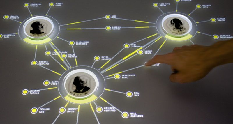
The exhibition is an immersive yet highly-structured digital archive rich with historical details, where complex interrelationships are made more accessible through the implementation of an innovative graphical interface. All visualizations of the complex network are drawn directly from the research database and presented in an intuitive computer-generated form.
Factual Information (How I understood it)
Dimensionality: considering only the Microsoft surface part
1. Important people – Physical chips
2. Information about people – word tags on surface and descriptive info at bottom
3. Connections between people – the shared word tags and descriptive info about the sharing
Like
A very dynamic and interactive visualisation. Using a Microsoft surface also ads to the tangibility of the interaction in form of the chips, which also become a part of info visualisation. Easy to access and navigate due to word tags instead of going through a lots of information.
What if? (Tinkering with what it is)
I think the strength of connection / contribution is displayed by the amount of the line being green and grey (?). Would it be better to use different line thicknesses?

