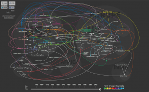
 At first glance the history of dance map looks quite complicated, however, upon pressing the ‘play’ button, the meaning behind the graphic is quite clear. It is simply the history of the evolution of music mapped over its geographic origins. The background image of a simplified western world is subtle but quite useful in this context. It is interesting to see how musical genres influence each other internationally. The most amazing part of the infographic is the ‘explosion’ of genres that happen after the 1980s. I think that there could have been some kind of audio added to this graphic to add more to the story; perhaps if you click on the name of the genre, the number one bestselling single of the decade (in that genre) would play. It would add another lovely dimension to the map.
Although the color of this infographic is practically offensive, I really enjoy the content. I love that it’s funny, not outdated, and uses facts to dissuade you from sending a stupid email. All the options in the flow chart make me curious so I end up reading all the options anyways. I think it would be great if they made similar charts for other situations – dramatic emails to friends and exes that you probably shouldn’t send, for example. This simple concept works well.
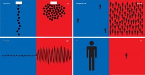
This infographic depicts some differences between the German and Chinese cultures. The material aspects (coke vs. tea, dinner table settings) are interesting, however, I find the human behaviors aspect the most thought-proviking – standing in line, the noise level in restaurants, self perception, etc. Yang Liu does not specify if she had a database or if she did research; perhaps this is just from her own point of view. I think it would be more informative if it were a website that you could interact with and choose which countries to set against each other. I would love to see more of her panels.

