1. Health Infoscape [MIT Senseable City Lab]
This visualization helps relate different ailments and symptoms with each other and to the underlying causes.
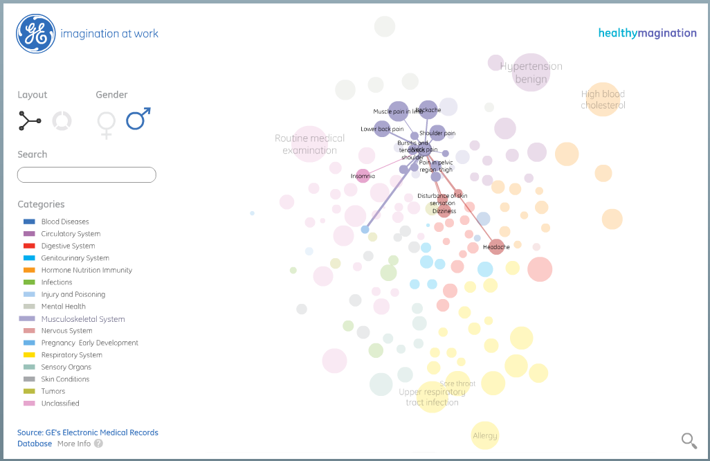
I liked the info graphic because of the flexibility in information layering and the ability to focus on most relevant information.
All it requires for the user is to click to select an ailment and show related symptoms, pan and zoom to navigate in order to bring some items into focus.
The two views present are useful. One shows the relation really clearly and the other view is convenient for finding an ailment by category and proximity to others.
2. The TSA’s Insane Budget And Woeful Track Record [Co. Design]
The second visualization here is a criticism of TSA (Transportation and Security Administration) in the US.

I liked the info graphic not for the content (I feel it is taking entirely a negative stance and devoid of a rational perspective) but there are some points in the presentation, which are worth noticing.
Use of graphic metaphors: The designer has used 3 metaphors to illustrate the 3 major parties in the visualization. The ”eye” stands for the scanners, the ”hands” denote the TSA and the ”gray figure” denotes people in general. Using these metaphors, the designer is able to showcase interactions between the parties along the visualization.
Tokens and data segregation: The different sections are separated in different areas and objects are clearly represented by tokens. I think it helps in bringing clarity to a condensed visualization like this.