Team: Rohit Sharma, Hideaki Matsui
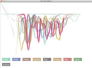
Data visualization of peoples voice. It visualises 9 people’s “welcome to Copenhagen” using different colors. English is common language at CIID, and we have different voice and English accents (we are from 14 different countries). It’s quite interesting to compare the similarities and differences between different voices.
