Video link: https://vimeo.com/38489318
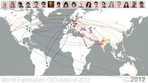
The data visualized is about the birthplaces and the places where students from the 2012 batch of CIID have resided. It is displayed in reference of time and generates connections between the places people move to. Every student is introduced on the world map as he/she is born. The beauty is in seeing how everyone ended up in CIID. It also provokes conversation as people see that they had been living at same place at same time in past.
The current visualization is manually made in Illustrator, creating each frame and rendering the video in After Effects to have a controlled generation of bezier curves (and time constraints). There is a great opportunity to create a tool for generating such maps in processing and also in exploring the Google maps API to add more interactivity like zoom and pan. We would be interested in exploring these opportunities.
