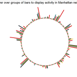

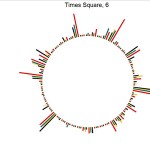

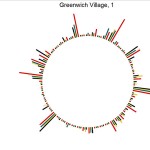
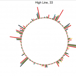
Here is my D3 visualization of the activity of Curbed:NY. A little background on curbed, the website shows the different architectural and real estate development and sales in a region. So what I did was use create a custom scraper that gets the amount of times that neighborhood is mentioned. Finally, I graphed that data to see how different neighborhoods compare to one another. One interesting find is that I did not expect Harlem to have a lot of activity. I did some more reading to see that the district is beginning to undergo a period of gentrification.
I hate javascript, its an annoyingly funky language that’s not very explicit on what you need and when you need it. I had a lot of issues with types of variables being passed/not passed through some functions (callbacks) and had to jerry-rig the code quite a bit…but I got the hang of it around 2am the night before this was due and above is the result of my dance with javascript!