Looking Outwards – Visualization
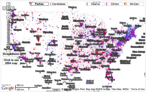
Fundrace 2008
With the election long-over this visualization is a little dated, but I still enjoy interacting with it. It’s a Google map that plots campaign contributions to presidential candidates based on location. The site is an endless source of enjoyment because there are an unlimited number of ways to ask “What if?” and test your theory. Is my neighborhood really as Republican as I think? Am I the only Democrat? Did my boss vote for McCain or Obama? Is it true that all actors are liberal?
The other interesting aspect of the visualization is its addition of 2004 map data. Unfortunately this feature is tucked away in hard-to-reach a corner. If this were more accessible it would be possible to see trends in political opinion in an area over time. Most likely people were interested in current data during the election so older information was left out.
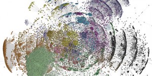
Phyllotactic Trees
I had never seen this visualization method before. It uses patterns found in nature like those created by sunflower seeds and cactus needles. I think it’s really beautiful.
It’s also (apparently) an efficient way to visualize large hierarchical datasets.
Nice finds Max. Pity the funding map is so hard to read (those labels are painful to look at), but you’re right that it’s great fun.
The phyllotactic principle is a real basic algorithm of the natural world, very simple to implement — give it a spin.