Jon Miller – Looking Outwards 2 – Small World
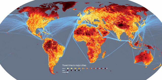
In tune with some of what has been shown in class, this is another project with a simple premise with meaningful implications. Presented in heat map form, it attempts to show the degree of “remoteness” in every location. It does this by calculating the distance it would take to travel (using conventional methods) from any point on the map to the nearest city of at least 50,000.
At a glance, it shows how mobile the world has become, and to me, the reds and yellows emphasize the dominance that humanity has over the planet. (Perhaps an interesting side note: in the comments about this image, people disagree over whether this is a good or bad thing.) It also reveals where people have not established themselves, showcasing the most inaccessible places on Earth. I was surprised by the remoteness of Tibet.
Source: http://www.newscientist.com/gallery/small-world
What’s all of that blue gunk on the border of the countries?
I believe they are common shipping routes, which seems odd since people would more likely take a plane.