Project 1: Words Across Culture
Here’s a link to my project >applet< .
And…here are some screen shots for each emotion:


Experience:
As mentioned, I used Mechanical Turk to collect most of the information. I was able to get responses from roughly 500 people total in 1-2 weeks from all over the world (which is pretty cool). I only ended up using about 300 of the responses–some participants did not fill out the survey correctly, and I had too many participants from the US and India (150-200 of the data I used were from US and India participants). For each country, I rounded the numbers to 20 to help my program run a little faster, but the trends are all still visible.
Figuring out how to make pie charts was the most interesting/challenging next to collecting the data. I got a lot of help from these two sites: Processing arc() reference and Processing Pie Chart Example. Yep–this project was written in Processing. I had a lot of fun with it…and I learned to appreciate it more after seeing how easy it was to load data from a file (Processing has a lot of cool formatting tricks for that).
You can’t really tell with the pictures, but this project is interactive…the “next >” button will turn white if you mouse over it, and if you click on the “next >” button, another word will show with its respected pie charts. I wanted to make the pie charts morph from word to word, but I decided to keep it simple and clean. I think with the colors and the way the information is displayed, the pie charts look aesthetically pleasing on their own.
So, why is the information I have interesting/useful?
Well, you can learn a lot about how colors and concepts are interpreted internationally. You can also see the relation between different concepts and colors. Some are rather obvious: like the more aggressive concepts (anger, fear) are usually associated with red and black. You can also see how some words which have no cultural context, people chose a color that suited their experiences. For example, with confidence, my participants were all over the board–from their comments, I learned that most chose their respected colors because the color looked good on them or they associated the color with a good memory.
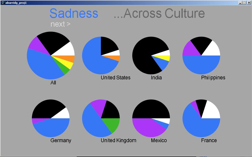
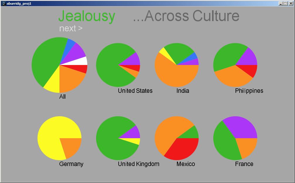
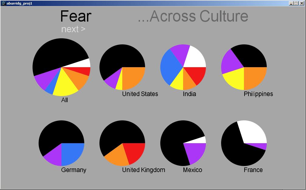
That being said, a lot of the trends you see in the data are pretty obvious. For example, for “Jealousy” all the Western cultures picked green predominately due to the coined phrase “green with envy”. Or, most people associate “Anger” with red because “people’s faces turn red” or “red is the color of blood”.
Another interesting observation is with “Happiness”. Most western cultures associate happiness with yellow while other cultures associate it with “green” because green seems to represent fertility and prosperity according to their religions.
I did want to display the comments–but a lot of them were redundant. I might add them on later…because I plan to continue with this project and collect more data to use for my final project.
Critique
Pro’s:
I did think I showed my data broadly and accurately. And, I did get some interesting results. I like the way the pie charts work–they’re very easy to compare against each other.
Con’s:
However, I don’t think 300 data points is necessarily enough to make an argument. I think I was a little too ambitious and probably should’ve sticked to pulling something off the internet, practically (however, I don’t regret my choice too much because I learned a LOT about obtaining my own data, and the process, though trying, was fun!). I also wish I could make the display a little more interesting.
Hi Amanda – here are the PiratePad notes from the crit. (Thanks for writing such copious notes for others, by the way!)
Interesting visualization, but could use some design work. The color palette should me more muted. Check out the Adobe Kuler API (http://kuler.adobe.com/) for creating attractive color schemes. -MH
I agree with the guy above. Theres a lot of potential for a really nice color piece here.
With infovisualization projects like this it’s more standard if you put all the info somehow on one page. The next button is awkward. You can have a menu for selecting beauty, anger, sadness, etc.
I really admire your use of Mechanical Turk — that’s terrific. Great investigation, very rigorous, interesting data source you have created and collected. I encourage you to open-source your data-set (an excel spreadsheet or .csv would be fine). Some interesting discoveries, some of which confirm expectations. Some comments from the Turk people would actually be helpful. Perhaps size the pie charts based on the number of respondents from that country!
Golan: We get it about the Mechanical Turk!
Alright, alright — GL 😉
I think it would be useful if there was number of participants from each country.
Here’s a pretty interesting study of color compared to emotions you might want to check out: http://www.emotionallyvague.com/ I especially like how they’ve displayed their information.
it is kinda too bad though that the mechanical turk people werent the “largest” or most populated countries. i think china (especially red) and russia’s info wouldhave been really interesting. would be interesting to see if there are color changes not just across cultures, but also geography (close to equator, further away, north vs south hemispheres…)
Really interesting topic! The content looks solid, although I kind of wish that the layout was a little prettier
Maybe if you clicked on a country it could take you to a new screen that has the comments about why people from that country chose the colors they chose. Pull out some common keywords and you might get some interesting word associations too (such as the sadness => mourning example).