ivy curtain
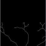
I was staring at the snow out of my window yesterday and decide to make myself a curtain with laser-cut patterns of snow, or something like that. The next few hours I collected some patterns I remember seeing from MoMA and elsewhere.

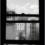
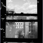
Compare to drawing vector patterns and scatter them randomly over the window, I am more interested in exploring how plant leaves cover a surface to maximize photosynthesis area. The idea dates back to last autumn, where I fantasized a self-regulating curtain that grows where sunshine is, and withers where there is not (see video sketch Mark Gross and I made together: plant a curtain).
The final approach is a processing program composed of these parts:
Use this link if the iframe fails to work.
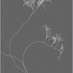
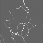
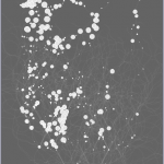
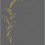
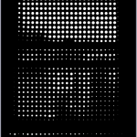
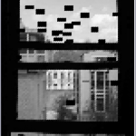
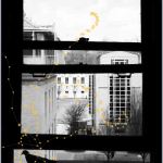
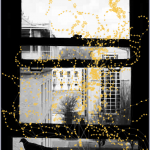
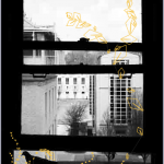
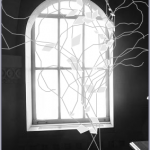
Finally, here are screen shots of process, and final results.


Hi Cheng, here are the comments collected from the class critique Piratepad.
————————–
This would be cool to project on a window. I want to see this IRL. Oh you’re doing that. Still would be cool to see interactive instead of a static printout.
^ I agree!! -Amanda
I like that you tried to create a physical, decorative object through programming, using real world information. I think the idea of making a curtain custom to your window and the light it produces is very interesting. I think the “plants” are a little bit too random. There could be a more obvious correlation between the light and dark areas of the window and the leaf size of the plants.
Your in-class presentation is confusing – it’s two minutes in, and only beginning to get what your project is about. It might be helpful to explain at the outset that you wanted to grow plants in response to real-world (or photographic) light levels. That said, the concept is very interesting — your idea to lasercut and mount in a window also very interesting. The implementation is not as convincing as it could be. Max’s suggestion about using projection is good (for real-time or slowly evolving plants).
Look into local gradients (Sobel filters can be used for this) to help the plants know which direction t
I’m still a little confused on how you are generating the images, but it does look very whimsical. I like how you determined where the patterns go based on light (this definitely sets it up to be used with a projector!). For this program as it is on the computer, I wonder if it would be cool to let the user pick a shade (or color, if you decide to add color images) that the patterns will react too and also the color the patterns are to be. Also, it would be interesting to add more patterns to choose from. If you actually end up making this a real-life installation, I would highly suggest having the banches form over time or morph over time–it would make it that more enchanting! 🙂 Right now it seems like an app someone could use to make an interesting picture with organic patterns. Very nice work! 🙂
-Amanda
I like the concept, and the forms you’re generating are very nice. I think the branch-leaf contrast is too heavy– I’m just seeing a lot of dots/shapes, but not the lines connecting them. I’d like to see the leaves filled in, too.
I agree with the above comment — for your final program, you can’t see the branches so it’s not obvious that you were inspired by trees. The results would be more convincingly organic if the branches were made up of real curves rather than segments of straight lines. I know that’s a lot more difficult but I think you can handle the challenge.
It would enjoy this more if we could see the generated results better. It would help me understand the final visualization that might appear on my window.
Why yellow? Green might make your metaphor clearer. On that note, it’d be nice if the UI in general made the purpose of the tool clearer just by looking at it. (Bearing in mind that if it winds up in a portfolio or something, they won’t get the benefit of your personal explanation.) Even something as simple as an “export to laser cutter” button that is technically useless and just spits out a PDF, but that drives home the point that “yes, these circles are things you send to the laser cutter,” would make people start to snap the pieces together. You’d
Cool idea, but the presentation needs to be much clearer to “sell” it. It sounds like you have the 10-second summary in your head; telling us that in the first 10 seconds is absolutely to your advantage. -SB