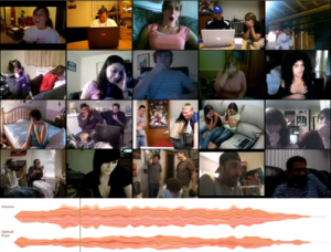
2 Girls 1 Cup Reactions
I plan to get a higher-res image when I get home.
Title: 2 Girls 1 Cup Reactions
Description: Analyzing the powers of one shock video.
Equipment:
probably just DVD player on a screen, maybe projector? I could provide my laptop.

Comments from 4/19:
✓ Paul: Girls, Cups
——————————————————————
http://entregeeks.files.wordpress.com/2008/08/x_girls_y_cups.png
The above link was obviously inspired by “The Secret Lives of Numbers”
please post your vimeo video (if you haven’t already).
I love the girl at the end who says “peace”. You *must* keep that.
I prefer the flat baseline, since the accumulation/averaging effect is what you’re after…
I think you should take the median value for the different signals. Or even better — another metric to try is the “Winsorized Mean”, in which you discard the bottom 10% and the top 10% (or 20%) and then take the mean of the remaining values. This combines the best properties of the median and the mean. You would take the Winsorized Mean on a per-frame basis for your two analysis signals (flow and volume).
Here are a big list of different measures of “central tendency”, including the mean, median, and many others: http://www.xycoon.com/central_tendency.htm, http://onlinestatbook.com/chapter3/comparing_measures.html
— also, give some thoughts to how you could arrange the grid better (whatever better means to you).
Your website design is really pretty.
How did you line them up again? to make sure each second being viewed and reacted to was the same across each video.
Hahahahahah—love the combination of all the videos together. The graphs are very pretty, however, I would like to see some mroe information about the video. I would also try to extentiate the spikes to show when peopel react together at certain points of the video. Very funny!
-Amanda
THIS IS FANTASTIC. I WANT A WALL OF THIS. A WALL.
Here’s how to test your hypothesis: find the two points common between all videos and try to automatically line up a video with the others. Then search youtube and grow your wall with random videos.
The data you produced is interesting, but not as interesting as the videos themselves. Use it to find more videos. The videos are gold.
This video alone is amazing. Holy crap. Awesome. The video alone would be a satisfying project for me, especially if you scaled it up to, say, an entire screen/wall of videos. It’s like, watching a large crowd. Totally overwhelms the senses.
Anyhow. As for your analysis. In light of the video, I’m not sure if I see the point of it anymore…how can I correlate this detailed analysis to such raw, visceral reactions in a way that helps me understand these reactions? It’s great that your findings look somewhat conclusive, but it feels like either you should make some *decisions* about what the data *means* and move the quantitative back into the qualitative in a really clear way at the end of your website/presentation, or you might be better served losing the quantitative entirely….-SB
…oh. You should have showed this video immediately after you showed the first one. That negates a little bit of what I’ve said, since showing it along the group videos is itself a strong act of curation. Still, I’d like to see a little *more* curating….and yes, this is totally a subjective assessment, but I think in an art department class I’m allowed to be totally subjective. 🙂 -SB
Totally agree.
(Was agreeing to my comment on the video, not my rant about your analysis. 🙂 -SB)
As you have created a framework for analyzing reaction to videos you can test your framework for diffrent videos, it would be great for creating movies or teaching visual effects in movies, even it is good for checking story telling process.
Awesome!
for the montage video:
Maybe some sort of indicator (a border?) when a video is finished (or still playing).
The graphs are pretty.
I think your graphs actually obscure the data – maybe if you put them all together insteda of layering them on top of each other, or made the bottom of the graph flat, it would make more sense.
Very entertaining.
I’m not sure what I”m looking at for optical flow– is this information going to be an interesting factor to display? Otherwise is there some other factor to display to give it context?
Going by Golan’s suggestion to figure out what the outliers are — what if you created a composite video that shows the most reactive video for each timestep? I’m just not sure what you’re accomplishing by showing all 20 videos together, because technically anybody could view all these videos on Youtube themselves, so what ‘value’ have you added for them? Lining them up and compositing them? — I think you need to think more carefully about this as a data visualization and as its own product. You said you want to create an analysis of a cultural artifact, but what ‘new’ thing are you adding?
Maybe you can somehow make it interactive so that the viewer can select one of the videos and watch only that one.
What if you sorted them by degree of optical flow? I remember this being suggested last time. Then the quiet ones could go together, etc.