Final Project Checkpoint
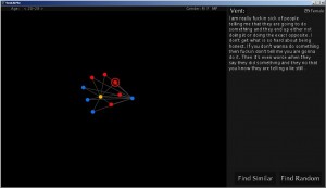
First off, here’s a screen shot of my final project so far:
My main question to the class was how to improve the interface. I changed the font from when I presented this in the morning. However, I have finished all the back-end calculations. The vast majority of the calculations (such as the neighbors calculation) is done during the loading, so there should not be an issue with speed while the user is actually interacting with the project.
Items Still Needed to Be Completed:
- Create Histogram on the right hand side of the graph space which contains all vents in the specified filter sorted by either length, profanity, age, or the number of similar vents to it.
- Make the vent text scroll
- Add information about the vent below where the vent is displayed: type of vent (indicated by the vent’s associated node’s color), length of vent, level of profanity, and the number of similar vents.
- Modify length of springs to be dependent how how similar nodes are to each other.
- Create Main Menu Page that links to the main app, an instructions page, and an information page
Items Needed for Exhibition:
I just need one computer. I can provide my own (however, my computer does sound like a jet engine–if that is an issue).
Some Favorite Past Projects of Fellow Students:
- Fantastic Elastic: http://golancourses.net/2010spring/03/03/fantastic-elastic-type
fantastic elastic (work in progress) from David Yen on Vimeo.
- Gaby’s Music Simulation: http://golancourses.net/2010spring/02/15/project-2-guribe
- Jon Miller’s Password Visualization: http://golancourses.net/2010spring/01/27/jon-miller-project-1
- Face Flip http://golancourses.net/2010spring/03/15/faceflip:
FaceFlip from Max Hawkins on Vimeo.

comments from crit — ✓ Amanda: Vent At Me
——————————————————————
These vents are great, but some of the information seems unrelated. I think this interface needs to be reduced to its essential elements. I would try to focus on making it easy to read the vents rather than focusing on the relationships between the vents.
I like the idea of categories. It could make it easier to find interesting vents. However maybe it would be more interesting to just have an “I’m feeling lucky” button.
I don’t like the Impact font.
– agreed
– Lucida Grande is a readable screen font. I might use that for the vent text.
– Helvetica is good but boring for a headline font. But sometimes often boring is good.
Why bother showing “this person did not feel comfortable sharing their vent”? Either filter out those entries, or show them anyway (since you’re not publishing/sharing them on the internet).
You need to get real data in there ASAP to see how well this scales.
I agree, the vents are great. A sentence at the top explaining what these “vents” are, and where they came from, will help orient your user/visitor to what they’re seeing.
Get some typography advice from a graphic designer…
Most importantly, you need to provide CONTEXT in addition to FOCUS. Give us some overview of the collection of vents — how they vary, how many there are, etc. Even a tag cloud is a kind of context.
What are the load times like in Proce55ing, for the 25…. what do you estimate they will be for 500… can you load it up once and then browse easily, or is the larger the data set the larger it will take for you to navigate.
-I do most of the data manipulation during the set-up, so it should be very fast when the user is actually interacting with it (I figured the long load time would be okay since I’m going to be displaying the project *after* it loaded during the show 😉 ) -Amanda
-you have some amazing data! Wow, people share some really intimate things!
-Why not automatically “find similar?” It seems like something someone would want to do, and the visualization looks sparse with just a single dot on the screen.
-as for other information–> swear words seem common. Maybe something with that?
–What is the general structure of a “vent?” How can this visualization help us understand “vents” and what they mean?
I would like more control than you have here to look at specific types or topics of vents. I wouldn’t worry about cluttering the space too much as long as its organized correctly. I’m interested to see the interface with many more nodes.
Also, on the design of it, the interface in general looks pretty cold and straightforward. You could try using different colors or something a little bit warmer since the project is addressing human issues, something subjective and variable.
When you have more nodes on the graph, it may? look better with varying scale, which could communicate something like length of rant or something
Not sure if someones said this but it could be nice to show some stats under the full text like a word count for key nouns, or perhaps categories (profanities, romantic relationships, weapons, jobs, taxes, etc)
Seems like a great project that could be popular online if distributed cleanly
I wonder if something could be done with a Wordle-like display to show which words are common, in addition to these nodes and things, because that might be a more intuitive way to look at the data.
recommendation of a tagcloud code: http://opencloud.sourceforge.net/