Looking Outwards – oSkope

by rcameron @ 8:21 am 18 January 2010

oSkope is a visual search engine that returns images as results. Pretty straighforward – You select a service from which to retrieve pictures and oSkope presents them to you. The winning feature here seems to be the graph view. This view charts the photos based on different statistics for each site. If you are searching eBay, it will chart them based on price and duration (of the auction, I assume).

oSkope

Looking Outwards – Information Visualization

by guribe @ 8:02 am

Although this project is not interactive, I find the images captivating. It was created by Colombia’s Spatial Information Design Lab and presented at the MOMA.

The project aims to depict the impact of incarceration on certain neighborhoods in New York City, mainly focusing on Brooklyn.

Guided by the maps of Million Dollar Blocks, urban planners, designers, and policy makers can identify those areas in our cities where, without acknowledging it, we have allowed the criminal justice system to replace and displace a whole host of other public institutions and civic infrastructures.


More information about the project can be found here and here.

Looking Outwards – Sonification

by Mishugana @ 6:51 am

Charts Music – Johannes Kreidler make  recession art with microsoft songsmith and depressing data.

Johannes Kreidler is an german avant garde composer. A lot of his work deals with data and computers and composing sound with abstract concepts in mind.

Kriedlers website

A book Kriedler wrote on using pure data for music

Johannes Kreidler

Below is an embedded youtube video for Johannes Kreidler’s  Charts Music.

(Project’s Webpage)

It was made by taking real data readily available to the public and visually displaying the data alongside the sonification of the data in this youtube piece, (i haven’t seen anything signifying that this is documentation and not the actual work)

He uses a simple program called microsoft songsmith to take values of data from the past (then present) and make them into eerie musaq-like song portraits.

The power and strength in this piece is obviously the sound work and the visual accompaniment only serves to reinforce the contradictions and disparity the tunes produce. Using sound and music to allow the viewer/listener to create an image of values that are mathematically are tied to real world events and catastrophes somehow is very powerful. The intriguing space he inspires is something i think  all artists strive to create.

Although it would be stronger as an info-vis software (and artists are trending more towards transparency as well) to make available a program that would allow the user to submit any data and then turn it into a song in the same way that he has…. any user still has the ability to do it themselves using microsoft songsmith. (you can try the software for free)

Kreidler also has a certain level of intentionality in this piece…. while giving users/viewers the ability to explore data is very powerful, choosing data, and arranging its order adds the hand of the artist back into a work a bit more, and can present a clearer approach. And lastly then again by removing himself he could have made the work more neutral and allowed the user to ask their own questions and draw their own conclusions instead of walking the line of political art and political activism with an agenda.

either way the piece is very interesting, and i think sonification is under-explored and should be considered visualization even though technically it relies on sound as its medium, which is inherently not visual.

“its got a good beat, and you can dance to it.”

The World’s Eyes

by jedmund @ 5:52 am


The World’s Eyes

The World’s Eyes is a project from the MIT SENSEable Lab that uses Flickr as a tool for tracking photographers’ travels through Spain. By using Flickr, you can track lots of information about the user and the photograph, from the hometown of the photographer to the geolocation of where the image was taken. This results in a lot of interesting data that might uncover interesting tidbits of what is interesting to people. For example, if two people take an image in the same place, then it’s probably of more interest than a place that only one photographer has captured. If three people take an image in that place, then its even more of a hotspot, and so on and so forth.

I’m very interested in using this kind of subconscious attraction to certain things to put together information about human behavior and visual culture, so something like this is very interesting. Unfortunately, it doesn’t seem to be an ongoing project, but some of the visuals are interesting nonetheless, and the concept behind it is very thought-provoking. I chose this because out of all the things I looked at, it struck closest to home, and I was thinking about possibly using Flickr as an aggregation tool for our upcoming project, so I wanted to see what it had been used for already. Out of all the visualizations involving Flickr I could find, this seemed to be the most meaningful.

Looking Outward – McDonalds

by jmeng @ 5:49 am

Found this in a blog, linked from another blog, etc…

While it is not interactive, I found it a very interesting visual representation.

This map (found here) shows data from the 48 contiguous states colored by distance to the nearest McDonald’s. The information was sited to be taken from AggData.com around September 2009.

Some interesting things:
– In the US there are approximately 13,000 McDonalds
– The furthest distance between two McDonalds is 107 miles (between Dakotan hamlets of Meadow and Glad Valley)

Placebo’s Video Embed Test

by teecher @ 2:27 am

Hi everyone! I’m Placebo, Golan’s fake student. I think I’ve figured out how to embed videos. Check out this 3D Milk Scanner by Friedrich Kirschner, from Vimeo:

Now check out the latest interactive work by my friends, YesYesNo, on YouTube:

Looking Outwards – Fleshmaps

by Cheng @ 2:23 am

Fleshmaps: listen ( Fernanda Viégas and Martin Wattenberg) counts how frequent body parts appear in lyrics and show images of the body parts sized to its popularity, grouped by genre. Hip Hop, obviously, gets the biggest hip. Most genres have big eyes, followed by hand.

A interesting way to “view” music and genre, I found it amusing at a glance. Here are three things I would like to change, if I redo the work.

1. Change the soft, pale, sleepy pink color in the visualization to something more energetic.

2. Add interactivity. When viewer clicks on one body part, show random sample lyrics instead of numbers accurate to 0.01%.

3. Change visual presentation. Instead of cloud and array of circular images, build a real body with proportioned parts.

frequent

Looking Outwards – Data Visualization

by mghods @ 12:44 am

While looking for examples of data visualizations, I found this web-page, categorized some approaches for data visualization. I enjoyed its collection personally. Hope visiting, and reading it could be helpful for you doing Project 1.

Looking Outwards – Battle of the Bigs

by jsinclai @ 11:56 pm 17 January 2010

http://www.bme.eu.com/news/avatar-vs-modern-warfare-2/

I think this is a really nice comparison visualization. It’s simple; there is nothing groundbreaking in any way. I think this comparative technique did its job, and certainly let’s you see a bit more than numbers themselves would (in the same manner that this comparison of the world’s tallest buildings .

I particularly like the emphasis on prominent information, but also the subtle inclusion of peripheral, albeit relevant information.

Looking Outwards – Visualizing information flow in science

by ryun @ 11:51 pm

Visit the website

Eigenfactor.org is a non-commercial academic research project sponsored by the Bergstrom lab in the Department of Biology at the University of Washington. Eigenfactor uses the structure of the entire network to evaluate the importance of each journal. A set of 4 interactive visualizations based on the Eigenfactor Metrics and hierarchical clustering were produced in order to explore emerging patterns in citation networks.

With the same data, Eienfactor visualizes it in 4 different ways successfully. It does not seem that this visualization can be customized but if can, this would be very useful to visualize the complicated relationship among data.

Looking Outwards – Visualization

by Max Hawkins @ 11:12 pm

Fundrace 2008

With the election long-over this visualization is a little dated, but I still enjoy interacting with it. It’s a Google map that plots campaign contributions to presidential candidates based on location. The site is an endless source of enjoyment because there are an unlimited number of ways to ask “What if?” and test your theory. Is my neighborhood really as Republican as I think? Am I the only Democrat? Did my boss vote for McCain or Obama? Is it true that all actors are liberal?

The other interesting aspect of the visualization is its addition of 2004 map data. Unfortunately this feature is tucked away in hard-to-reach a corner. If this were more accessible it would be possible to see trends in political opinion in an area over time. Most likely people were interested in current data during the election so older information was left out.

Phyllotactic Trees

I had never seen this visualization method before. It uses patterns found in nature like those created by sunflower seeds and cactus needles. I think it’s really beautiful.

It’s also (apparently) an efficient way to visualize large hierarchical datasets.

Looking Outward: Diseasome

by Nara @ 7:25 pm
Diseasome

Diseasome

Diseasome is an interactive map that visualizes the links between hundreds of different diseases and genes. It does a good job of illustrating how many of the diseases humans are diagnosed with are anything but random, and how having one disease can indicate that you are susceptible to many others. I am personally interested in this because several members of my family have recently been diagnosed with cancer, but all of them have had different types of cancer: lung, breast, and pancreatic. Seeing this visualization helped me to understand that these diseases are all genetically linked, and has therefore helped me to bridge a lack of understanding about the role of genes in cancer. While this map doesn’t really illuminate much about the research being done into specific diseases, it does illustrate that we are forming an ever-clearer picture of the human genome and represents hope for those of us who know we are at risk for serious illnesses.

Looking Outwards: Two Sites

by Michael Hill @ 7:03 pm

Information is Beautiful

So here is a new blog, written by freelance writer and author David McCandless, that contains some of his work as well as pulls information visualization from various places across the net.  Something I find especially nice is that when he is posting his own work, he does his best to post a link to his source of information.

infographic

Good.is

This site is filled with a great variety of short articles and blog posts regarding many of today’s important issues. They even have a special section for infographics aimed at making large amounts of data easier to understand.

Looking Outward – Visualizing Possibilities

by sbisker @ 6:52 pm

This class has got me thinking about both how people visualize things and how they visualize what’s *possible* to do (make, visualize, destroy…) with the tools at their disposal.

Right now, training in the construction of visualizations seems to be through immersion – reading blogs like Infosthetics, Visual Complexity, Boing Boing and the like. Much time is spent dissecting projects individually to try to sort out how they were made a certain way and why. Indeed, that was the structure of most of our class Wednesday – deconstruction and discussion of project after project. But in order to really understand how tools can be used to visualize something, you have to also visualize the process by which those things are created. Sites like Instructables do a very good job of having their members not just show off interesting creations, but also their process of creation through step-by-step instructions. But something is still missing…after looking at my Looking Outward find for this week, I believe we are missing sites that let potential visualizers see relationships between methods of visualization and the visualizations that people have made with them.

This week, I wanted to chat about a site called Thingaverse. Thingaverse is interesting to me because the site itself is a new way for people to visualize the relationship between tools and things that people have created with those tools. In that sense, it’s a bit of a “meta” visualization.

Take, for instance, these funky looking laser-cut MST3K glasses. In addition to showing the finished product, the site also encourages showing off the 2D .dfx file as an image, and tells people to list the tools used in its construction (“laser cutter”, “3d printer”, etc.) This lets people build a much clearer understanding of why it was possible to make this with the tools chosen.

In addition to showing construction processes for individual projects (which is already possible on Instructables), Thingaverse takes things idea a step farther, and lets people really explore a specific tool’s potential. This is done by letting people tag a project with the tools they’ve used – these glasses are tagged with “laser cutter.” Then, a Laser Cutter page allows people to say “Neat, so this was made with a laser cutter – what else can I make with a laser cutter?” By letting people explore a gallery of built objects by tool, the site effectively crowd-sources a visualization of what *can* be made with any tool people might be considering picking up.

————————–

Why is there no site like this for software visualizations – or most types of software projects in general, for that matter? It’s nice that Processing hand-assembles a library of interesting projects made with that tool, and other individual tools do this as well – but this is more for self-promotion than critical deconstruction of visualization tools and techniques. What I would love is for a site like Infosthetics to really pay attention to the tools used in making particular visualizations, and letting the resulting comparisons between tools give people some feel for what tools they might need to learn to create visualizations of their own.

Looking Outwards- Capitol Words

by caudenri @ 6:37 pm

Screen shot of "Capitol Words" web site

capitolwords.org

Capitol Words is a robust information design project on the web that visualizes daily word counts in Congress in a number of different ways. What I like about this is that in a few minutes of browsing you can get a very good idea of the most discussed topics in Congress of the day or the past week or month, and get and idea of who is talking about it. The web site has an option to see individual lawmakers’ word counts as well as overall who the loudest or quietest lawmakers are. I think this is especially useful and relevant to the public because it updates every day, making it a tool to help keep up with activity in Congress as well as an entertaining diversion.

Looking Outwards Visualization

by paulshen @ 5:45 pm

http://www.virtualgravity.de/

This visualization depicts the “weight” of data, in the form of comparisons similar to ones shown in class. Again, Google is used to determine how important a word is. What’s interesting about this piece is its execution. Instead of providing a screen display (bar graph or the like), the piece uses the analogy of a scale to show how two words compare. Unlike the other visualizations presented in class, this piece incorporates tangible interaction and physical display for representing information.

banner2

The physical execution is nice, albeit a bit gratuitous. I wasn’t too fond of the input, but I like the interaction of dropping something onto the scale representing the word.

Looking outwards – Info visualization

by xiaoyuan @ 1:48 pm

This is the information visualization looking outwards. The artist is Randall Munroe, creator of the webcomic xkcd.

Munroe is a geek’s artist, and his work often deals with topics in science, mathematics, and nerd culture. While not exclusively an information visualization artist, he often creates graphs and charts that are unconventional, clever, complex, and revealing.

Not all the graphs are rigorously precise. For example, “Fuck Grapefruit” does not have measurement units and is apparently a reflection of his subjective opinion.

However Munroe succeeds immensely in presenting information in humorous ways that most people would never think of.

Looking-Outwards:The Whale Hunt

by kuanjuw @ 11:47 am

It is from Jonathan Harris two years ago.

A new way of interactive storytelling by using a bunch of  photos which are presented in a framework that tells the moment-to-moment story of the whale hunt. The full sequence of images is represented as a medical heartbeat graph along the bottom edge of the screen, its magnitude at each point indicating the photographic frequency (and thus the level of excitement) at that moment in time. A series of filters can be used to restrict this heartbeat timeline, isolating the many sub stories occurring within the larger narrative.

check it out:

http://thewhalehunt.org/whalehunt.html

Looking Outwards – Interactive Facades

by mghods @ 2:03 am

Surfing  “Interactive Architecture” website, I decided to explore real world  implementations of “Interactive Facades”. “City of Sound” and “Web Designer Depot” have listed considerable numbers of buildings with “Interactive Facades”. Comments, also, contains links to other examples of “Interactive Architecture”. From interaction point of view, “Interactive Facades” can be divided into two categories:

1- Those which interacts with environmental factors, as an example Ned Kahn works, or Flare Facade.

2- Those which interacts with individuals, such as Aperture (has not been built yet) or Climate on Wall.

Alternatively, all of these facades can be controlled independently by a passive code.

From architectural point of view, “Interactive Facades” can be divided into four categories:

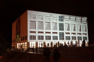
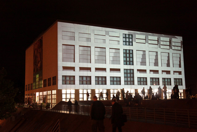
1- “Projection Facade”, in which facade has just used as a surface for projection. Input, processor, and memory of interaction system may be built-in facade or not; however, source of interaction system output is not involved with architecture. 555 KUBIK is a successful example. I believe this method is best for built buildings, and can be used as a renovation solution, for making facades interactive.

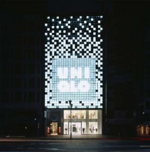
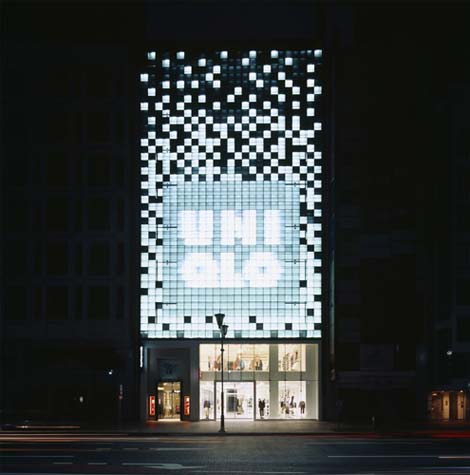
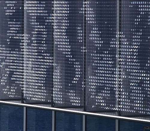
2- “Lighted Facade”, in which facade has built-in LEDs, or other light sources, and they act as an interaction system output by changing color or light luminance. Moment Factory is a funny example of them. Building Music is another example of this category. This approach is both suitable as a renovation solution, same as new architectures, especially those with multiple membranes.

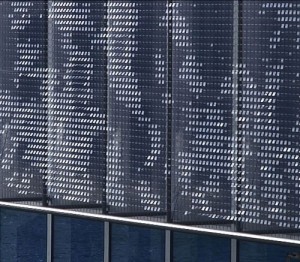
3- “Mechanistic Facade”, in which facade has built-in mechanical mechanisms, and they act as an interaction system output by different movement of  mechanisms; however, architectural form of facade, as well as architecture itself does not change. Most of Ned Kahn works, specifically those related to wind fell under this category. This system is mostly suitable for new architectures, yet, could be considered as a renovation solution in some cases. (Parking Structure 9)

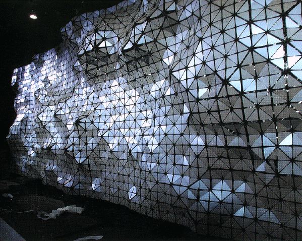
4- “Protean Facade”, in which facade has built-in mechanisms that can change the shape of facade, and architecture, in response to inputs of interaction system. Hyposurface is an example of a surface with these characteristics, however, it has not implemented in an architecture as facade. It is obvious this category is not a renovation solution, and should considered as a part of new architectural designs.

Looking Outwards – Formula for Computer Art

by Karl DD @ 5:44 pm 14 January 2010

I thought some people might be interested in knowing a bit of background on Jim Campbell’s Formula for Computer Art. Campbell published the diagram in an article for the journal Leonardo in 2000. It is well worth a read:

Delusions of Dialogue: Control and Choice in Interactive Art


The process that Campbell outlines can be thought of as transcoding data from one form to another. I don’t think this abstraction is escapable, and I don’t think adding interactivity, in the form of a feedback loop, necessarily makes the system more meaningful.

What we can do is make interactions richer by moving away from one off ‘reactions’ towards richer responses. Campbell notes:

The first time I walked through an automatic door at the supermarket I thought the door was smart and was responding to me. Now I step on the mat to open the door on purpose. The point is that often the first time an interface is experienced it is perceived as being responsive, but if the interface is experienced again it becomes controllable. The second time it is not a question but a command.

This is particularly relevant for us now. Audiences are not new to interaction, meaning gimmicks are out, and we have to deal with the expectation of interactivity – “Why doesn’t the [image/sound/robot…] do anything when I [move my arms/speak out loud/touch the screen…] ?”

For non-interactive art the question is: Do we see Campbell’s formula in the work? Is out attention drawn by the questions the work raises, or the insight it gives us, or the aesthetic beauty? Or does the work lack substance and all we see are sensors connected to actuators?

« Previous PageNext Page »
This work is licensed under a Creative Commons Attribution-Noncommercial-Share Alike 3.0 Unported License.
(c) 2016 Special Topics in Interactive Art & Computational Design | powered by WordPress with Barecity