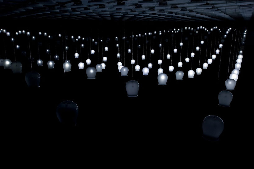
Furin is an interactive light installation. When a user steps underneath it, each light chimes and lets off a corresponding glow in a rippling effect across the space. A simple interaction with beautiful results
Plaster cast of head is 3d scanned, and translated into drawings to create a sort of head -topo. More interesting would be the possibility of applying this to something alive rather than the plaster cast.
Kinect project, user can push/stretch simulated skin using the kinect. My favorite is when you catch the glimpse of detail underneath, like lips or a finger
This was one of the first clips that really made me consider the future of computer vision and virtual reality. The researcher in this video creates a 3D virtual model of an object just by showing it to the camera. A lot of predictive processing takes place on the back end, but ultimately, the result looks pretty good. This approach doesn’t even make use of a depth camera like the kinect, which would make this process a lot easier.
Kinect and Wiimote and Nanotech Construction Kit (direct link here)
This guy is building a structure in 3D using a wii mote and separating himself from the background using the depth given by the Kinect. As he says in the video, there is still some work to do with the background subtraction operation. Nonetheless, the idea of building virtual structures on the fly is very appealing to me.
One thing that confuses me is the orientation of the triangles he’s putting together. At the beginning it seems like they are flat, but then they end up forming half of a sphere. How did that happen? Is it because the guy is rotating the cube view?
ShadowPlay: A Generative Model for Nonverbal Human-Robot Interaction (paper can be downloaded from here)
NOTE: This is a paper by Eric Meisner, Selma Šabanovic, Volkan Isler, Linnda R. Caporael and Jeff Trinkle, published in HRI 2009. All pictures below were taken from the paper. Not sure if this work is what motivated the puppet prototype by Theo and Emily.
The abstract of the paper goes as follows:
Humans rely on a finely tuned ability to recognize and adapt to socially relevant patterns in their everyday face-to-face interactions. This allows them to anticipate the actions of others, coordinate their behaviors, and create shared meaning— in short, to communicate. Social robots must likewise be able to recognize and perform relevant social patterns, including interactional synchrony, imitation, and particular sequences of behaviors. We use existing empirical work in the social sciences and observations of human interaction to develop nonverbal interactive capabilities for a robot in the context of shadow puppet play, where people interact through shadows of hands cast against a wall. We show how information theoretic quantities can be used to model interaction be- tween humans and to generate interactive controllers for a robot. Finally, we evaluate the resulting model in an embodied human-robot interaction study. We show the benefit of modeling interaction as a joint process rather than modeling individual agents.
The authors interestingly study human-robot interaction through gestures. In the process they model hand gestures and use compute vision to receive human input:
A robot then interacts with a human using similar gestures:
The whole paper is very interesting, specially when thinking about the synchronization of actions between a human and a robot. I think this paper is now reproducible with the Kinect.. no more need for an expensive stereo camera :)
This interaction is very traditional from my opinion, but it’s a good example of the high level of engagement that these experiences produce. The system works using an infrared camera, and tracks the position of people passing by. Different animations and drawings are displayed as viewers move in front of the screen. If I were playing with this installation, I would completely forget that Adobe is being sold to me…
Comments Off on Marynel Vázquez – LookingOutwards – 5
I’ve heard Bruce Sterling talk about the importance of augmented reality technology before, but it didn’t really click with me until I watched this video.
It’s a little long, but worth it for the visionary part at the end.
It’s interesting that he relies so heavily history as a basis for his prognostications. If you want to see 25 years into the future you must look 50 years into the past.
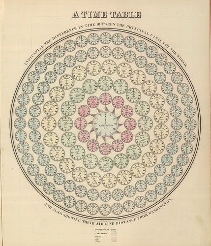
I love this collection of Victorian infographics from the blog BibliOdyssey. It’s easy to become too techno-centric when creating information visualizations. These beautiful graphics made without computers are a reminder of what’s possible without the assistance of a computer.
This is a really spectacular heatmap of Manhattan showing where taxis are picking up fares across the borough. An extra dimension of this visualization is the ability to watch the data change over the course of the week by playing the animation. Now that taxis in NYC have mandated GPS systems installed, very rich information can be extracted and mapped like this. Taxi pickups peak at major tourist shopping districts and transportation hubs such as Penn Station and Grand Central Terminal.
Comments Off on Mark Shuster – Looking Outwards – 5
This is a geographic map that attempts to show what people are thinking about when searching for state names in Google. The labels for the state names are all auto-completed to make interesting associations between the state names and popular searches. The map template used makes the labels difficult to read, but the version of “The People’s Republic of Autocomplete” addresses this problem and makes it easier to read.
Comments Off on Mark Shuster – Looking Outwards – 4
Stephan Thiel made Understanding Shakespeare as his B.A. thesis project to provide a new analysis of Shakespeare’s works and invite his audience to re-examine their understanding of them. The visualizations were created using Processing and toxiclibs. They present the most frequently used words for each character broken down by scene. Characters are ordered by appearance in the scene from left to right. Presenting the characters of each scene in order of appearance preserves some of the natural flow of the story. The overall advantage to this format of presentation for text analysis of a narrative is clear, as it uses a reasonable chunk size (scenes) to preserve the distinct moments throughout the story. e.g.: With Romeo and Juliet, the balcony scene in act 2 scene 2 is full of love and warm-fuzzies, with vocabulary to match, but that is quite different from act 5 scene 3 where our two leads kill themselves.
I like the abstraction of this piece. It is less of an “infographic”, finding a way to display the data in a visually appealing/informative manner, and more of a unique structure on its own, using the data merely as a means to an end. The work takes a poem and generates a single sheet of “paper” with multiple lines to make folds on. Each line represents a word that changes depending on its length and frequency. It is then folded in order to create unique forms, like a “mad oragami master”. As well as the abstraction element, I like the aspect that this piece would be so easy to bring into the physical realm. As well as a digital object, you could print out the flat “paper” state and actually create the maddening sculptures, maybe bringing them to an even architectural scale.
Asteroid Discovery From 1980 – 2010 | Scott Manley
“View of the solar system showing the locations of all the asteroids starting in 1980. As asteroids are discovered they are added to the map and highlighted in white so that you can pick out the new ones.” Simple, clean and visually appealing. I especially like how you can pick out the differences between the technology they were using to discover asteroids in the different eras by the frequency and placement of the sparking new white asteroids.
Comments Off on Alex Wolfe | Data Visualization | Looking Outwards
The Stanford Dissertation Browser is an interface for viewing the relationships between Stanford departments based on a text model applied to dissertation abstracts. The Browser is an excellent model of presenting data flexibly and from multiple perspectives: Relationships are presented based on the selection of a department, and a different selection re-forms the presentation. It would take two times the number of departments times the number of years in simple pictures to present the same amount of data that this interactive visualization contains. This presentation method isn’t limited to dissertation abstracts or even text analysis, but could represent any relationship between nodes in a set over time or some other convenient form of progression.
Datasets to use: + Comments on Youtube video or possibly 4Chan, parsing text to see what trends come from it
+ Facebook Network Packets w/ Carnivore PE or personal account data scraping w/ php
+ Game Engine Events
+ web stats – stat whore (combine networks, gmail, sms, analytics, YT hits, games, etc)
Questions to ask:
Does the data necessarily need to be visual – couldn’t it be audible, feel-able, smell-able?
My biggest problem with information visualization is the seemingly lack of human experience – the phenomenological.
Sorry if this offends anyone — but it asks critical questions of network culture
This website briefly, but beautifully charts the different ways and reasons governments censor internet access around the world. Upon further inspection, the information it presents is varied and well scoped, but is not particularly deeply explored in each of the visualizations. The website also lacks proper citations (there are not even links to the sources it draws froms), which severely hinders both its usefulness and credibility on the internet. There are, nevertheless, several strong aspects of the visualization. First is that it works with different kinds of data – it shows different views and ranges of the information. Its visual language is very consistent, and works well with the language of the visualizations.
Comments Off on SamiaAhmed-LookingOutwards-5-Infoviz
The google nGram viewer lets you quickly and easily see the occurrence of a word, or words, across time as found in google books. Its visualization, like that of Facebook’s lexicon, take the form of a graph, with time as the x axis, and word frequency as the y axis. The scope of the nGram viewer is what makes it interesting — seeing how a word falls in and out of relevancy. As a tool it is straight forward, with no frills. While this makes the nGram viewer easy to use, the tool could benefit from easy ways to integrate “social” media. Why is there not a built in community, for example? While fun to play with, I’m not sure as a viewer that I want to sit there and spend time looking for a particularly insightful pairing of words to look up, and I would enjoy the opportunity of having a community built in to google that let me view graphs that others found interesting.
I actually don’t think there’s much to be gleamed from this data visualization, but in a way it is a very very beautiful graphic. I guess the only thing that’s probably visible are which agencies are those that funds many of the phd students but the extent in which it differs from an agency to another is unclear. However, it is laid out in a pretty beautiful manner and the entire layout achieves an almost poetic feel to it. In short, I’m not sure what is the point of this visualization, but it’s just beautiful.
Comments Off on Chong Han Chua – Info Viz, Looking Outwards 2
1. among millions of graphic visualization projects, this one stands out for its special representation – using tangible objects to explore the data.
2. Good concept. By changing the rice in different icon objects, one can see directly from the balance changing that even a tiny little changing in the world can ruin the world’s balance. Very interesting concept and representation.
A Week in the Life
this is another physical visualization project. See details.
In this project, the data sculpture represents the author’s one week movement and communication made with his cell phone.
I’m not a big fan of the soft drink industry. In fact, I don’t really drink anything other than diet coke and I think soft drinks are really bad for human health. This data visualization kinda just highlights how absurd the entire situation is and how many sub brands are controlled by the big three. It’s just insane how big the entire sugared water industry is and how far they go to segment their product so that it reaches every part of the population.
Comments Off on Chong Han Chua – Info Viz, Looking Outwards 1
TweetCatcha captures the movement of NYT articles through Twitter. The chosen display is a clock. Drawing on a well known paradigm strengthens on the viz. Also, being able to update it in real time (grab articles as they are published and perform the search them), also adds to its power.
The UI is still limited since it will pick a random article for you. And it’s limited to NYT.
This blows my mind! It can also speak for itself very well:
Three firms control 89% of US soft drink sales. This dominance is obscured from us by the appearance of numerous choices on retailer shelves. Steve Hannaford refers to this as “pseudovariety,” or the illusion of diversity, concealing a lack of real choice.
It goes to show how helpless we are to these corporations. Pepsi also used to own Taco Bell. Maybe this can be expanded with other industries (outside of drinks) and cross-matching them.
Comments Off on Susan Lin – Looking Outwards – 4: InfoViz Inspiration
I find this map of Facebook connections striking for how clearly it shows political and cultural borders. Clear lines are drawn between the US and Canada, among the North-Western South American countries, separating Europe from Asia… China is notably absent from the network, though India is included.
This interactive graph shows how people spend the hours of their day. Certain stereotypes are on average validated: men spend more time working, women spend more time on “household activities”. Ages 15-24 sleep in later than older groups. Other trends are unexpected: black people show smaller “eating” spikes during traditional mealtimes. Women more often report not remembering what they were doing at a specific time.
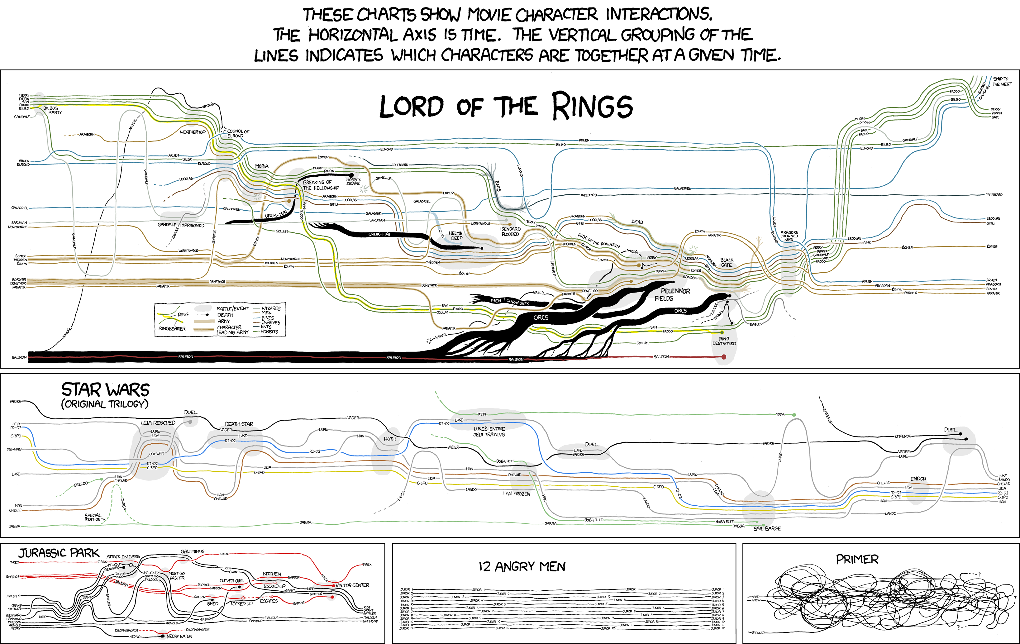
1. ) I’m very attached to these visualizations of movie character interactions from xkcd‘s Randall Munroe; he plots the narrative of a set of movies using only character’s names, and lines representing their movements and interactions with each other. Included are deaths, places of significance, and alliances. The Lord of the Rings trilogy is especially effective, taking Tolkien’s masterpiece and simplifying it down into a series of dots and lines, while remaining legible.
2. ) Nathalie Miebach creates beautiful woven sculptures with data from astronomy, ecology and meteorology data – including parameters like land, sea and ocean temperature, tide readings, moon phases, the solar path in relation to horizon, and the distance between Sun and Earth. I know weather is overdone as a data visualization, but I think these pieces are beautiful; she brings something new to the data by rendering it as a physical piece, almost as if the data has crawled off the page and taken on a life of it’s own.
Comments Off on Caitlin Boyle :: Looking Outwards :: 4 (infoviz)


