Nick Inzucchi – Looking Outwards 2

by nick @ 11:59 pm 30 January 2012

Empires Decline is an animated visualization of the historical rise and fall of major western imperial powers since 1800. The British, Spanish, French and Portuguese empires are each visualized as amorphous blobs that split and swell each time a territory is added or subtracted. The best moments are those of dramatic change; for example the declaration of independence in 1776 or French decolonization in 1960. The artist could have done more to capitalize on these events, perhaps using zoom or color to heighten tension just before a break.

Fühlometer is an enormous neon smiley face mounted atop a lighthouse in berlin. Its mouth rotates to reflect the mood of the city, as determined by facial analysis software running on nearby pedestrians. Much like the Green Cloud in Helsinki, Fühlometer becomes a public spectacle in plain view. I wouldn’t change a thing about the project, but Twitter sentiment analysis could be used to gather firmer mood readings if desired.

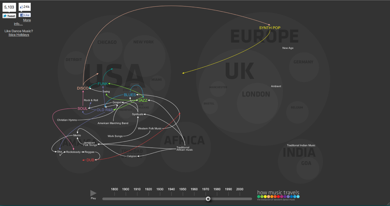
Sync/Lost is an interactive installation that allows multiple users to collaboratively browse the history of electronic dance music. Each user selects a musical genre using a wiimote and those tracks are mashed-up in real time. The evolution of EDM is a personal interest in mine, and Sync/Lost does a good job of displaying this information in a spatially intuitive way. However, interaction seems clunky. A turntable would have been a better controller for users to achieve tactile feedback on their selections.

EliRosen – LookingOutwards2

by eli @ 10:39 pm

VoteEasy is a cool website which aims to help voters make an informed decision. It provides a lot of data about candidates in a digestible format. It also lets the voter input their own stance on key issues so that the candidate can be measured at a glance against the voter’s political leanings.


Pig 05049 is a book that visualizes all the products that a single pig ended up in. I think this is a really interesting piece. The sources of our food and other products are generally obscured and this book serves as a very honest confrontation with modern manufacturing and food industries. The results are surprising. Apparently three years of research went into the book.


This is a visualization of Lisbon’s traffic by Pedro Miguel Cruz and Penousal Machado. It uses gps data from taxis collected over a month and then condensed to show an average day. The orange areas represent traffic jams or slow moving traffic. The visualization is more beautiful than informative but with some study it could be used to determine routes to avoid problematic traffic areas.

Luci Laffite- Looking Outwards 2 (Even more cool things!)

by luci @ 10:36 pm

CHICAGO BOUNDARIES

I remember someone was interested in urban areas- this shows a map of chicago with boundaries drawn by populations of ethnicity instead of the “city neighborhoods”


Colours in Culture

This shows how different cultures associate ideas and emotions with colors. The graphic is very fun to explore and pick apart, but it is a little annoying to have to go back and find what a number references each time. Maybe interactivity could help this?

Luci Laffitte – Looking Outwards 2

by luci @ 10:17 pm

How long do animals live?

This simple print infographic compares how long different animals live on average. I think this is interesting data and enjoy how the animals are simply placed along a line.

The piece tries to add additional information, by color coding the different types of animals (mammals, birds, other vertebrates, invertebrates) but it is easy information to miss because the key is small, in black&white and at the bottom.

I wonder if this content could be beefed up with interactive filters or tangible menu control.. does the size of the animal or other factors affect its life span?


The Sexperience 100

http://sexperienceuk.channel4.com/the-sexperience-1000#/

“Welcome to The Sexperience 1000, an interactive journey through the sexual experiences and preferences of one thousand British individuals. What’s the favourite sexual position of iPhone users in the North? Do country music lovers over 55 prefer to do it in the dark? Explore the 20 questions of our survey and discover what the great British public get up to between the sheets…”

I like this interactive infographic because it animates a bunch of little people moving around as you change the survey question or filter. At any point you can hover over a person and get their age and location. This make the statistics seem more real & trustworthy, because you can SEE that real people answered the questions. It is also interesting that you can watch specific people move between the different filters… you can *star* a person to follow them throughout all of the questions, or see their answers to all of the questions.

There a tons of layers to explore in this infographic, that makes a somewhat taboo subject easily accessible and friendly. This is a good example of a social experience that friends would enjoy gathering around, and comparing reactions.


How Music Travels

http://www.thomson.co.uk/blog/wp-content/uploads/infographic/interactive-music-map/index.html

This animation visualizes the time and place of music style/genre origins and trends. It shows how music evolved and moved across the world, changing & morphing as it encountered different areas and influences. I enjoy how the spread of sharing really picks up after the 70s and this change of pace is visible in the animation.

I think this could be improve if the different lineages were clickable & could be isolated or learned about. Or if you could play clips of what the music was like.


Mahvish Nagda – Looking Outwards (Info Vis)

by mahvish @ 9:18 pm


Urban Remix

Urban Remix is a project aimed at allowing others to communicate the soundscape of their communities. The platform consists of a mobile phone and web interface for recording, browsing, and mixing audio sounds together. Although, the creators of the project do not identify this project as a visualization, I find that I can listen to the audio tracks to get a sense of the rhythm of the city or community they were recorded in: noisy vs quiet, trains vs birds. The project creators call this the acoustic identity of these communities. I think this might be something that’s missing when we’re looking/exploring a place on Google Maps, for example. One way this could be improved is to mash it using data associated with these soundscapes or make these soundscapes tangible. The audio clips are already laid out on a map, but there might be other information like timestamps that could be used. Acoustic Poetry (link) is one attempt at making soundscapes tangible: soundscapes are interpreted and mapped to poetry that are displayed to users (the primary target user is deaf).


Project Fühlometer

I’ve heard (but not seen) that the Gulf Building downtown (link) has a beacon on the top that forecasts Pittsburgh’s weather: orange for fair weather, blue for rain. I think a giant emoticon installation that displays the mood of a city is a much better visualization and would be an awesome use of that space. This project uses face recognition software to recognize the “moods” of passer-bys from a strategically placed camera. With geo-tagged twitter feeds, I don’t think we need face recognition software: we can just do a streaming emoticon search to determine the mood of a place, or a set of places.


[youtube=http://www.youtube.com/watch?v=nBstJ6_HMac]


Shoplifters of the World Unite
Data from the Global Retail Theft Barometer was visualized in this infographic. Who knew that shaving products and cheese were one of the top shoplifted items? Apart from the interesting data, I thought the poster itself was presented well visually. I think retail loss is specific, so a lot of the information so it should be expected that shoplifting is one of the larger piece of the retail loss pie. That might not jump out immediately because initially I had associated retail loss with loss for the retailer (as a whole): not knowing how big of a pie, retail loss is, I can’t understand the impact of shoplifting in that bigger picture.
(link to infographic)

Deren Guler-Data Viz_Looking Outwards

by deren @ 2:11 am

How Music Travels

http://www.thomson.co.uk/blog/wp-content/uploads/infographic/interactive-music-map/index.html

This is an animated flow chart that shows how music travels around the world by genre made by the British Travel service, Thomson. It is is neat to watch and clearly shows the relationships and trends of how music spreads in popularity around the world. You can watch the whole timeline- starting at 1800-2000, or click on a decade. The spacing of the timeline is a bit confusing- there is the same amount of space for a century and a decade. I also think it would be cool, if you could isolate by genre- I thought the colored buttons on the bottom did this but the do not do anything…Still a neat tool to use if you want to learn a bit about the evolution of music.


MSNBC Hurricane Tracker

This was made by Stamen for MSNBC weather, much like the NYTimes hurricane tracker. This interactive map shows the path of the hurricane and allows you to zoom in on a specific point to get information about the wind and direction. There is a 3 color code for current, previous and forecast conditions, along with an animation showing how the storm is traveling. You can get a lot of information about the current location of the storm, but it is a bit confusing to navigate through. There is a lot of information available in layers and the first layer give a good summary of what is going on. It might be better to sift through some of the information and either merge or get rid of some layers at it can be a bit overwhelming to be bombarded with so much information. There is a also a neat historical storm map showing paths of past storms.


Planetary cycles from 10th century

This is a very interesting graph of the planets. It clearly shows different patterns of travel throughout time, but the shape of the orbits is unclear. There is no real evidence of how the orbits behaved, except for in relation to one another. The orbits appear to be wave functions with different amplitudes. They could be interpreted to interfere with each other, or be parallel to each other. Considering what was known about the planets at this time, I think this is a pretty nice picture of what the trajectories may have been. Knowing everything we know, or rather I know about planets now, it is hard to not want to relate the lines to this information. It would be interesting to see an updated version of it based on the facts we have discovered since it was made.

Nir Rachmel | LookingOutwards-2

by nir @ 6:17 pm 29 January 2012

The Interactive ZIPScribble Map

ZipScribble Map
This info graphic is beautiful in my opinion. Using only black and white, with basic map interactivity it creates a really fun experience. I found myself looking at different countries and checking out how they look with our without the map, as the instructions suggested. It also made me want to share, and see if any of the countries are of people I know. As for the more practical side, while the website suggests that interesting information can be inferred from the piece, I highly doubt it. It’s just cool, but nothing more.

Wifi Light Painting

Immaterials: Light painting WiFi from Timo on Vimeo.

This piece is just awesome. The artists took something that exists in our environment – wifi signals and found a very interesting way to visualize it. They use long-exposure photographs over scenic parts of the city, while a person is walking with a wifi-signal sensitive rod with lights on it. The result is an imaginary cross section of the wifi signal strength, overlaid on top of the real world. I like the fact that this could have been done on photoshop, but was still physically done at the field by people. I also like to think about other “invisible” entities that we can map this way, starting from radio and cell-tower signal, air-pollution, smell and noise just to name a few.

Billy Keyes – Looking Outwards 2

by Billy @ 3:55 pm

I’m on the look out for information visualizations this week.

Keyboard Frequency Sculpture

Mike Knuepfel made this clever, simple visualization of the letter frequencies of the English language (as reported by Wikipedia). The physicality of this piece (literally) makes it stand out, given that the data are common and could be visualized in many different ways. By building on top of a real keyboard the inefficiencies of the standard QWERTY layout are made obvious; you can imagine laying your hands on top of the sculpture in a way that you wouldn’t do with a bar chart, heat map, or other 2D representation. Some commenters have called out the project for depicting letter frequency and not key frequency as might be implied by the setting. But while key frequency would be interesting (especially for gamers or Photoshop users), I don’t think the use of letter frequency detracts from the result.

Binary Subdivision of the World

Binary subdivision of the world

This image by Eric Fischer divides the world into boxes that contain an equal number of geotagged tweets. The result is, for the most part, not surprising: areas with low population density require larger boxes to contain the same number of tweets as areas with high population density. What I liked is how clearly the shapes of continents are outlined by the changing density of boxes. This visualization would be unremarkable if it was overlaid on an actual map of the world; the fact that the world map emerges from a non-topographical data set makes this effective. Also of note: Eric wrote this to figure out the ideal way to query geo-APIs of web services like Picasa.

Drawing Water

Last, another piece which shows geographic shapes derived from non-traditional data. David Wicks’s Drawing Water depicts a theoretical flow of water from locations of rainfall to locations of consumption. While sources and sinks are based on actual consumption and precipitation figures, the paths are generated. Again, I think this disconnect from reality makes the piece more effective. We all know, to some extent, how water flows through streams and rivers to feed lakes and reservoirs and by removing this element, Wicks lets us focus on the where of flow rather than the how. It appears that an interactive version of Drawing Water exists, and I wish there was a better video demonstrating how the interaction works.

Sarah Keeling; Looking Outwards 2

by sarah @ 1:51 pm

Sweet Spot

Jonathans Gitelson created the data visualization “Sweet Spot” that shows where to stand on the train platform so that when the train stops, you would be conveniently right in front of the doors. The project consists of a diagram showing where the sweet spots are on the platform as well as a series of photographs of him standing in each “sweet spot”. The idea for the project came from his morning commute into Chicago and the struggle to get a seat on the train during the morning rush. I saw this piece at the Scottsdale Museum of Contemporary Art over the break and thought it might be interesting to look at for its concept and ideas of the different odd data that can be visualized. I think that his approach of making the diagram by hand is unique, but that the way he formatted the information could be done in a different way that would convey the information more effectively.

http://www.thegit.net/sweet_spot

Map of Scientific Collaboration Between Researchers

Oliver Beauchesne created a data visualization that mapped where scientific collaborators were from through 2005 to 2009. He got the idea to do so from the Facebook friendship map and decided to make a similar one with a data set from his work. I think it shows interesting patterns and groupings of collaborations that would otherwise not really be known. I also think that data removed, it is a beautiful image and that the abstraction of the map adds to its interest.

http://www.visualcomplexity.com/vc/project_details.cfm?id=747&index=747&domain=

20 Hz

20 Hz was made by Ruth Jarman and Joe Gerhardt (known as Semiconductor) in 2011 and is a bit of a different approach to data visualization than some of the example we have been looking at. They use radio data (captured at 20 Hz) gathered from a geo-magnetic storm in Earth’s upper atmosphere as the audio for the piece. The changes in the sound then generates the visual forms and patterns that appear.

EvanSheehan-LookingOutwards-2

by Evan @ 10:00 pm 28 January 2012

Bowing Gestures

[youtube=http://www.youtube.com/watch?v=nuFPmEJkSkA]

So much expression in bowed instruments comes from how the musician uses the bow. I love watching all these dimensions of the bow represented simultaneously in real-time with the actual music. Unfortunately, I don’t find it all that readable, so it’s not very instructive. There’s a little too much going on and the data’s too raw for me to get much out of it without a great deal more study.

The Beatles: Song Keys

This is probably my favorite graphic from the Charting the Beatles project. I think it’s pretty cool how much information is packed into this static image, and the kinds of trends you can see just at a glance. Things like Help! having no songs written in a minor key or how the three of the Beatles’ more unusual records—Revolver, Sgt. Pepper, and Magical Mystery Tour—immediately stand out from the rest because of the variety of unusual keys the Beatles used on those albums.

I wish the visualization was interactive, though. I’d like to be able to mouse over the pie segments to see which songs they represent. I’m curious, for example, which songs on A Hard Days Night were written in Fm.

« Previous PageNext Page »
This work is licensed under a Creative Commons Attribution-Noncommercial-Share Alike 3.0 Unported License.
(c) 2024 Interactive Art and Computational Design, Spring 2012 | powered by WordPress with Barecity