Above is a visualization done by Burak Arikan and Ben Dalton. This work aims to explore the effect of the fashion system by creating a micro fashion network with the basic elements color and time. In the project, similar colors connected to each other form a large color network over time. I love this project how it creates such a beautiful image at the same time it contains useful data of fashion network. I think that a data visualization is better to output attractive images, and I am inspired by this one in creating my project 2.
[vimeo=http://vimeo.com/3912251]
One of projects in the exhibition, Terre Natale, Exit 2 is a data visualization of global immigration rates. This project immerses the viewer in a dynamic presentation of data documenting contemporary human movement. For the project, the viewer enters a circular room and is surrounded by a panoramic video projection of a globe which rolls around the room printing maps as it spins. This project it built for exhibition, seeking for a way to interact with viewers. In this way, viewers can comprehend the data set of global immigration rates more easily and quickly.
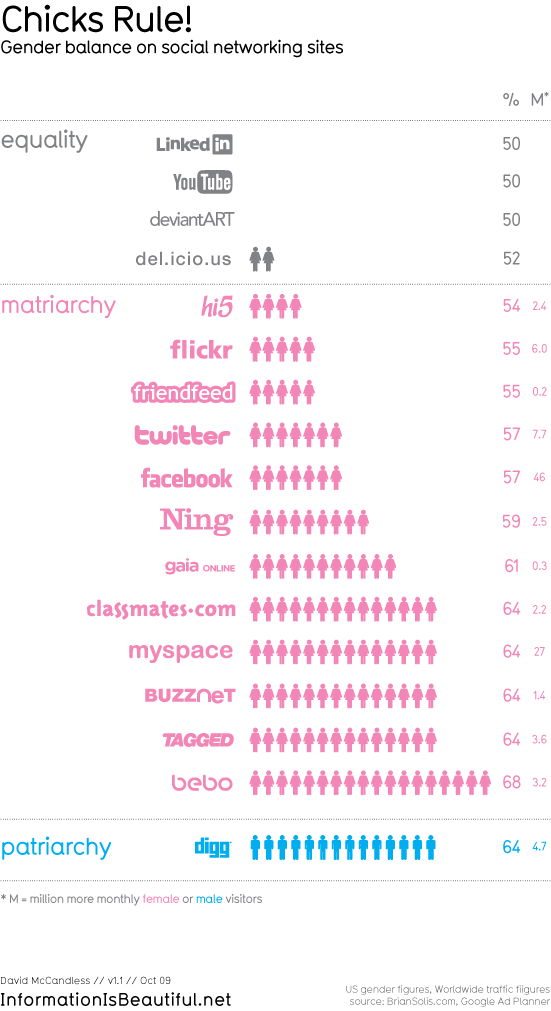
Who rules the social web? is one of the projects from ‘Information is Beautiful.’ I like most of works from them, and this one is just an example to demonstrate their ideas and missions. They literally encourage people to use data and create own design for make information beautiful. In the blog, http://www.informationisbeautiful.net, anyone can find data sources and project ideas easily. I personally find this useful, so I wanted to share it with people.
The Virtual Choir isn’t a traditional data visualization project – the project was created by conductor/composer Eric Whitacre in order to show hundreds of simultaneous singers performing his work, even though each track was recorded asynchronously. Although it could be considered a music video, seeing so many singers performing together, yet on their own, with the beautiful visualization is very awe-inspiring.
The project is rich in data, and I can imagine that the process of editing, synchronizing, and compositing all of the videos with all of the effects was an immense undertaking. But the project also has a lot of personal meaning for the singers involved, and there’s even a global visualization for where the singers came from. I’m sure there are plenty of other interesting ways to visualize and experience all of the singers’ videos other than for the sake of a balanced performance – the first thing that comes to mind would be blending/morphing the faces and voices of similar voice parts, to create an “average” voice part. It’d be very interesting to try to search for all of the original YouTube video auditions and recombine them in such a manner.
You can watch the video of the second Virtual Choir here:
[vimeo=22960177 width=550px]
Planetary
Planetary is an iOS app that visualizes a user’s music library as a planetarium of sorts, where each artist is represented as a star, albums are planets, and tracks are moons.
It didn’t take long for the bloom.io team to translate the relationships within a music library to the concept of celestial bodies, but the most interesting part of their work is the effort that went into optimizing and beautifying their display. I can completely see how they started off completely in 2D with only primitive graphics, but reading about the progression from 2D to 3D, stars to planets, and seeing the final visualizations of planets was very inspiring.
After only seeing their progression, however, it’s hard to get a sense of how well the planetary analogy works for browsing a music collection. Throughout my years of seeing documentaries and educational videos of planets and galaxies, seeing stars rush past and orbiting bodies inspires an immediate sense of scale and exciting exploration. Being able to look at music in a more emotional way seems like a great way to explore music just for the fun of it.
You can check out a video demo here:
[vimeo=23168163 width=550px]
Comments Off on Duncan Boehle – Looking Outwards 2
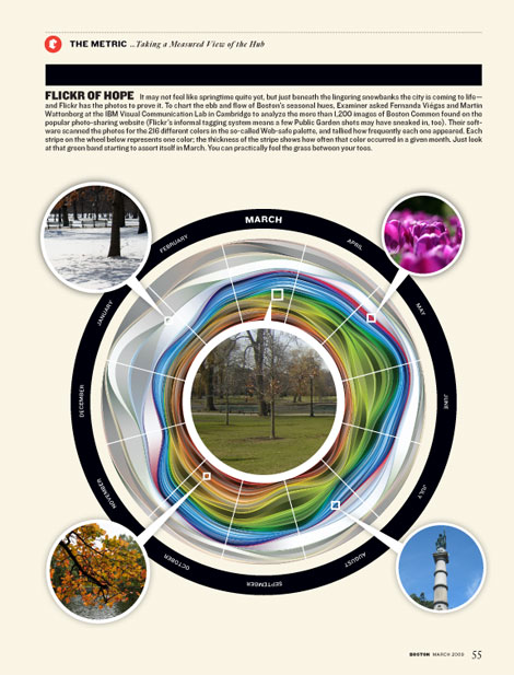
I really liked Fernanda Viega and Martin Wattenberg’s (him again!) Flickr Flow visualization. They took photos from Flickr taken in different months of the year at the Boston Common, plotting the relative proportion of different colors. Aesthetically, I think it’s a beautiful piece because of the flow of the different colors and their undulation. However, the really interesting part of Flickr Flow for me is the questions it raises about why people are taking the different photos, and what the relative rate of photo taking is during each season. During the winter, it seems that people are essentially taking pictures of the Common covered in snow, although I might assume there are fewer people taking photos than during the summer. I wish there were a concentric circle around the outer ring giving data on how many photos were analyzed for each time period, or, even better, posted on Flickr with metadata saying they were taken during that time.
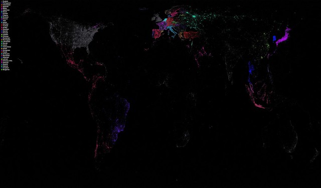
Eric Fischer’s Language Communities of Twitter is very interesting to me because it visualizes a dataset that keeps some of the most interesting features hidden. He makes a world map with different colored dots placed on the world indicating language usage on Twitter, taken from the streaming API. The resultant map reveals both population density and Twitter usage. Features such as the English language usage by lots of people on the U.S. East coast, the nebulous blob of Moscow and its Russian usage, and clear Western European national boundaries that are divided by ethnicity are very clear. However, I thought it would be interesting to look for enclaves of languages indicating the presence of ethnic minorities in different areas. Unfortunately, these pockets are not visible in Eastern Europe or in parts of the U.S. as I would have hoped. Part of this lack of linguistic interestingness could be explained by the lack of Twitter usage in Eastern Europe, although I think the main issue is the plotting algorithm biasing towards the dominant language in an area.
This is “Colours in Culture” by David McCandless and AlwaysWithHonor.com and it is just stunning. Why? Well because it makes information about color connotations around the world beautiful. The idea, I believe, is to demonstrate what different colors mean to different cultures across the globe. To visualize this, he uses orientation of concentric circles and a simple grid system of numbers and letters to tie various cultures to numerous colors and their corresponding emotional responses. I find this use of grid most interesting because I personally would never have thought of overlapping shapes to form a bigger grid system. If I were to change anything, it would only be to help minor aesthetic grievances I have with the centering of the circle and the margins on all edges.
Project 2:
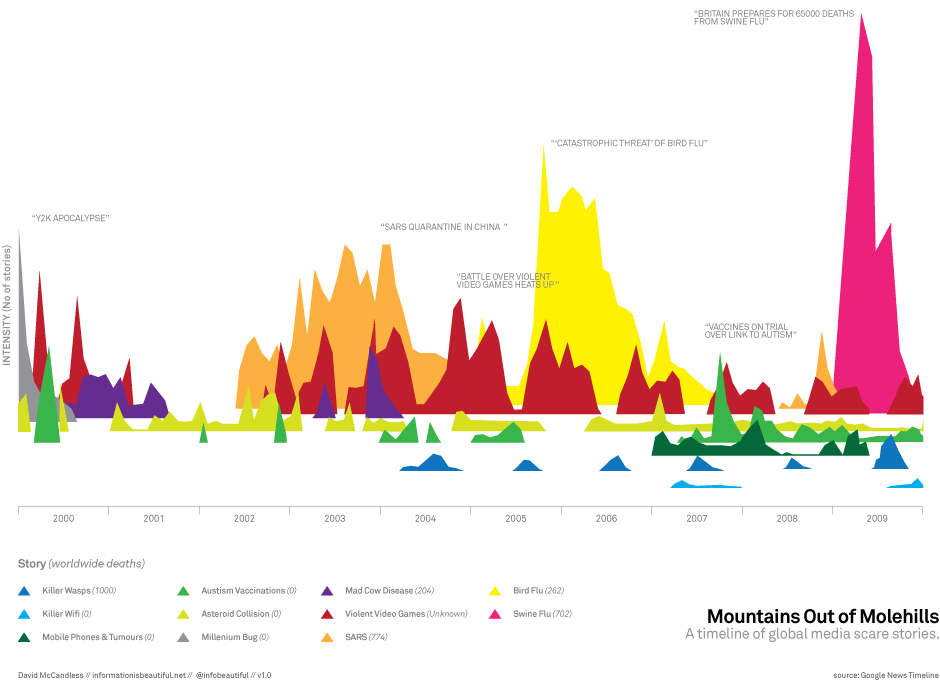
This is “Mountains Out of Molehills” by David McCandless. I really found this interesting mostly because of the information it conveyed. The idea behind the visualization is to portray major media “scare tactics” via google tracking of articles with a given number of “deaths” and a given “scare sory”. For instance, Swine flu was reported to have caused 65,000 deaths and thus was colored in Pink and linked during that time to this graph of sorts. What I found interesting is that it really plays with 3D shifting of a “base” for graphs. All of these patterns could have been viewed all smushed into a 2d realm and been quite confusing, but McCandless sort of shifts the angle of sight for the user and I admire that. If I had to change anything, I’m not sure I’d leave the entire top left so blank. I mean, I get that not everything in the image should be covered, and that that left white area sort of shows the intensity of the right pink area just by contrast, but it is a bit unappealing to me, personally.
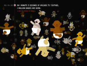
Okay. Wow. Let me just say. Youtube is officially awesome. It seems that they created this site with Punk & Butler, Alex Eben Meyer, Justin Young, and Use All Five. Before I go into what I like, let me just state for the record, before this site, I had never thought of time based info graphics before seeing this. Now, having said that, I was truly drawn to the concept presented because I was “curious” about how YouTube could possibly visualize periods of uploads in relation to other events. After the first few seconds or so, I was hooked. I attribute this to YouTube’s ability to make me, the user, curious or sort of compete with people I know (as to how long we can watch this visualization for). I mean, ultimately, the site informs you of directions as to speed up the process, but up until and even after that point, I felt drawn to this. If I had to change something, I’d perhaps give more of an introduction into the “visualize me” part of the site. I didn’t quite know what to expect, and I’m honestly not sure if I liked it that way–at least in the beginning. Ultimately, I caught on and wow! time based infoviz’s are great!
Comments Off on SankalpBhatnagar-LookingOutwards-2
I chose the two following projects, which happen to come from the same design studio, because they deal with form generation; the first, maybe not that explicitly, visualizes form that otherwise is invisible and the second grows form by “growing” data.
Onformative, 2009, Experimental data visualization: Growing Data
Growing Data is a research project that examines how real processes and structures can be used to create an alternative form of data visualization. The project uses a plant growth algorithm and experiments on the possibilities of visualizing the air quality in various large cities. Various data, coming from data bases for large cities, is assigned to variables that control life span, density and speed of growth in the algorithm. The algorithm is based on an agent model in which various agents are controlled by Brownian motion and are influenced in their movement by the various variables. What I find interesting about this project is that it does not focus on visualizing the precision of the data but rather on letting new formal structures to emerge which tell their own story and are open to interpretation by the observer.
Onformative, 2011, Immaterials – the form of meta data
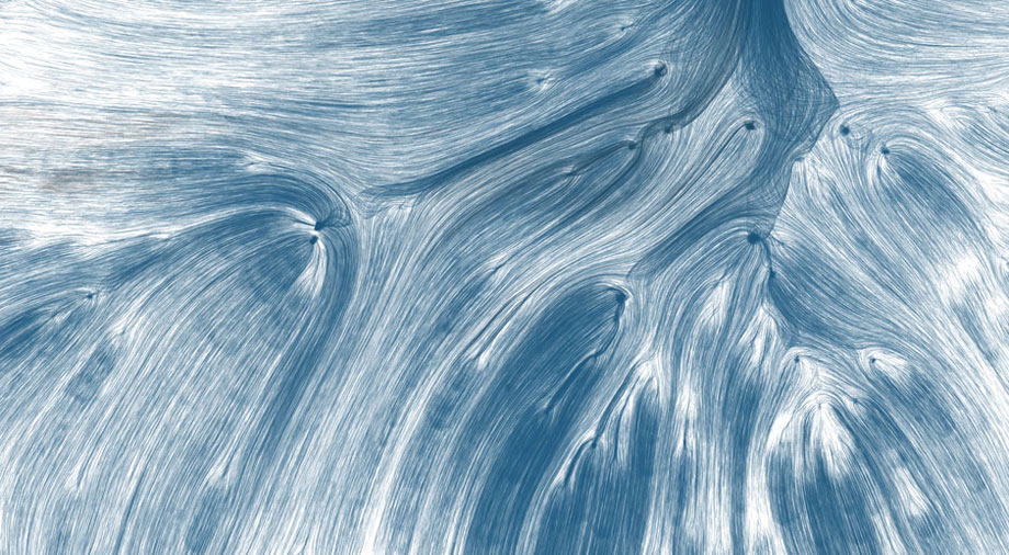
This project is about visualizing the immaterial. About suggesting ways to visualize the electro-climate of a space, electromagnetic fields of data. The project is not based on real data but on visualizing in space the fictional illustrations by Ingeborg Marie Dehs Thomas who who interprets the spatial expansion of radio waves. The visualizations were created using the procedural light painting technique, employing a projector, a distance sensor and a camera set to longtime exposure.
Immaterials – Data between visibility and invisibility
Below, the visualizations of electromagnetic fields by Ingeborg Marie Dehs Thomas.
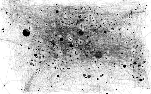
Anatoly Zenkov, IOGraph (formerly known as MousePath)
IOGraph is an application that visualizes mouse movements over time. Visualizing the invisible again! It is interesting to see what patterns and structures may emerge out of the overlaying of the multiple traces.
Comments Off on VarvaraToulkeridou-LookingOutwards-2
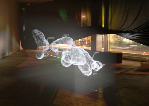
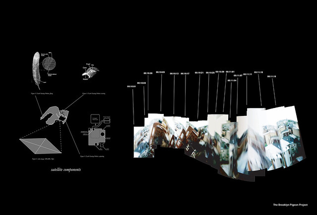
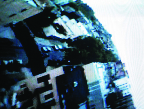
Brooklyn Pigeon Project by Aranda/Lasch BPP presents a novel technique for recontextualizing urban cartography: mapping how a flock of birds navigates the city. A flock of trained homing pigeons were sent off from Brooklyn with video cameras, microphones, and GPS devices attached to their backs. The data was then wirelessly transmitted and recompiled into a kind of ‘satellite image’ that emphasizes an off-the-grid representation of the city.
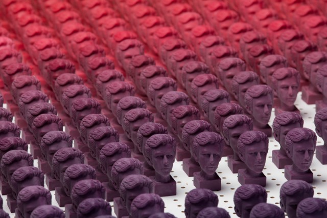
In Best Friends, Colin Pinegar decomposes the network representation of his facebook friend connections into a gradient of relationships. Colored wax busts were cast from an identical silicon mold to denote the level of intimacy with a ‘friend’ (purple being the most intense, and pink being the least…)
[vimeo=http://vimeo.com/6939976 width=640 height=400]
High Line Record or also known on the internet as the Sound of New York City is a visualization by Mark Edward who has visualized an area of New York. The area is categorized by the type of business(bars, pubs, cafes, nightclubs, parks etc.) and their daily working hours. The distance of the business is the radius from the center and the arc denotes the time for which the business is open (top being 12am and the bottom being 12pm). To supplement, he takes recordings from the places and adds to the visualization. The interesting thing is that in one glance, one can figure out what kind of businesses are there in the vicinity with their working hours and noise level to expect. I wonder if there was a way to represent the intensity of the noise as an overlay graph, or how busy these areas were.
Social Memories
[youtube=http://www.youtube.com/watch?feature=player_embedded&v=5vkQGSOsZRc]
This is a visualization of the facebook profile by Nicholas Felton. It is essentially like the facebook timeline. The visualized data is reported in form of a 28 pages book with all the events and statistics compiled together. It can be accessed as a facebook book and it highly interactive. The beauty of the project lies in the simplicity of thought combined with interesting statistics which would not occur to an average facebook user, which makes the experience compelling.
Comments Off on KaushalAgrawal – Looking Outwards – 2
The good thing about it is that I love the way that the abstract data is displayed in physical blocks and are continuously moving. And those patterns are not pretty readable. The artist said “Yes, this is one aspect, the other is that we as humans are only capable of reading and interpreting the letters of the alphabet, but in reality the code of the chains is like a barcode. For a machine, every part of this barcode is readable, for us it is just noise or random patterns. We can only deal with information that we have been taught or trained to read.” However, if the artwork has a pattern that the observer could recognize it will be better.
»Enerugii Wa Antee Shite Inai (Unstable Energy)« by Karsten Schmidt 2006
Advanced Beauty is an ongoing exploration of digital artworks born and influenced by sound, an ever-growing collaboration between programmers, artists, musicians, animators and architects.
………………………………………………………………………………………………………………………………………..
The first collection is a series of audio-reactive ‘video sound sculptures’.
Inspired by synasthesia, the rare sensory experience of seeing sound or tasting colours,
these videos are physical manifestations of sound, sculpted by volume, pitch or structure of the soundtrack.
I like the idea of different types of artists working together for a single project. And the experience is deep in different perspectives. And the work explores space, sound, shape, color and animations in a very inseparable way. I could not tell how to improve it maybe in the future as the technology became better, the visual and sound will be even better.
Drawing Water visualizes the movement of water across the US, from where it falls to where it is ultimately consumed. The graphic was developed in Cinder by David Wicks for the UCLA D|MA thesis exhibition Tell them nothing of the things I thought about and created while I was sleeping and uses water consumption data provided by the USGS and rainfall data provided by NOAA/NWS scraped and parsed in Python. I like this piece particularly for its clarity and visual impact. It is difficult to find visualizations that are beautiful and yet still give a clear impression of the data from the first glance.
My Daily Palatte
A very simple non-techy sort of info visualization that I quite like. Jacobo Zanella, divides his body up into 100 squares and denotes what colors he is comprised of that day, every day.
Cinemetrics
Film visualization has been done before in many forms, but Cinemetrics stood out for me as being one of the most clear and comprehensive while still being visually beautiful. The visualization is an interactive application that displays film palates throughout the course of the movie, its chapters, and the intensity of movement in those sectors.
This installation uses static data collected from one voyage over Lake Superior. Recording wave g-force and acceleration data from the trip, the movement of the water is recreated via mechanical grid.
Comments Off on Alex Wolfe | Looking Outwards | Project One
I absolutely love this. I believe the most successful data visualizations are those that combine an innately interesting comparison with very arresting visuals. Though I cannot say this particular project has jaw dropping eye candy, the execution and the use of full screen comparative illustrations worked really well. I think with these data visualizations, it comes back to the creating that level of depth. If the same visualization was about data that was more literal, the impact would not nearly be as great. This is pretty much obvious, but sometimes it’s easy to get caught up in the visual “cool” factor of data visualizations, concerned more about the visual complexity and “ooooh” factor than where the real beauty lies in the data. I guess finding the data in the first place is the true hunt.
Whooaaa. This is actually pretty neat because I actually saw this at an art festival in The Hague while I was abroad in the Netherlands, but totally forgot about it. Firstly, the interface is wicked neato. I wish I had the skill to fuss over details like how the visualizations fade in and out or other ways of representing the data kinetically instead of the usual static poster-y infographic. It’s incredible how kinetic visualization adds such a powerful dimension to information, in fact judging by where communication design is heading, kinetic visualizations should be incorporated into the regular cirriculum. Anyways, this kind of stuff is definitely pretty cool.
Another gnarly one hailing from my homestate of California. In kind of an ‘aw, shucks’ moment, I had a similar idea for this project. However, instead of taking videos of the sky for a year, I desired to take snapshots of the Pittsburgh sky, color average them, and see if there’s any kind of link to the choice of key words in the Twitterverse during that hour. Anyways, I think this is another example of taking an overlooked aspect of our life and changing the way we perceive it. In a sense, I guess that’s what the basic foundation of what art is supposed to do, expose us to different perspectives and change the way we think in an ever so subtle way leaving us with new refreshing thoughts. I guess what I need to figure out is where my abstract thinking and my (not)awesome programming skills intersect.


