insanely great history of apple
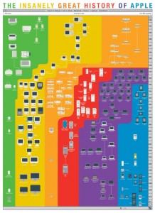
link : http://popchartlab.com/collections/prints/products/the-insanely-great-history-of-apple
This is a visualization of the all the apple products by time (exhaustive?). The graph captures (all?) the ‘product types’ Apple have ever come out with.
Also captures the relationship between form factors in product types. I feel its a visually powerful way to study the product growth of Apple.
Questions that linger : Are there relationships between form factors across product domains ? Is the relative size of domains real ?
evolution of video game controllers
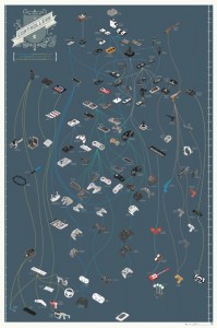
http://popchartlab.com/collections/prints-gaming/products/the-evolution-of-video-game-controllers
Similar to the form factor relations in the apple chart, this shows the relationship between various controllers over time.
Capture of relations across domains. Would like to know the source of the relation information between devices ? Company-wise categorization ?
visualizing last.fm
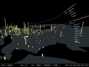
link : http://visualizinglastfm.de
the genreballung
This is a map based view of concerts in europe, showing cubes representing the concerts. They can be sorted by genre. (They have a mixed genre version too). Clicking on a concert shows information about that particular concert and when clicked, the artist highlights their tour data.
Even thought the tour data on a map is simple easy way to capture an artist’s fan base information, I find that without the time dimension, that data is not complete.
(Also on zoom in for genre based selection difficult to tell between cubes )
Which artists are a “one-hit wonder” and which artists have a constant fan-community? Are Radiohead supporters more receptive to different music trends than hip-hop
artist Nelly’s fans? Where do certain music genres cumulate and where is a recently launched album heard first