
See Something or Say Something
The contrast of the prevalence of Twitter and Flickr are a curious visualization in this project by Eric Fisher. At the city level, it’s a telling pattern to see where the aggregation of Flickr and Twitter show up within the boroughs of the city.
The biggest issue here is scale of the two provided images – one of New York City and the other of continental Europe. It’s misleading in that it communicates to viewers that Europe is overrun with tourists who use Flickr while NYC is primarily Twitter users. To get a better sense of the different scales, a European city (i.e. Paris, London, Rome) should be used to compare the cities while New York state or the eastern seaboard is shown to illustrate how it fares compared to Europe.
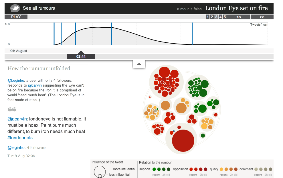
Seeing the Spread of (Mis)Information on Twitter
This project highlights how information was dispersed via Twitter during the London Riots. There are specific elements within this project that comes across really well such as the timeline to show the number of tweets as the rumour persisted and the highlighting of key points in the rumour’s lifespan.
However, there are some other items I do not like about this data visualization. Primarily the fact that it seems that the timeline on the top and the circles below. The use of the commonly used colour scheme of red, yellow & green are misused in this instance as these colours are commonly used to represent a linear scale of some form (e.g. worse, bad, good) and that is not the case for what they represent (in relation to the rumour – support for green, query for yellow and opposition to red along with a grey scale for comments). As I am expecting the colours to communicate one thing but they represent something completely differently, I find that I am looking at the legend more frequently that I should.
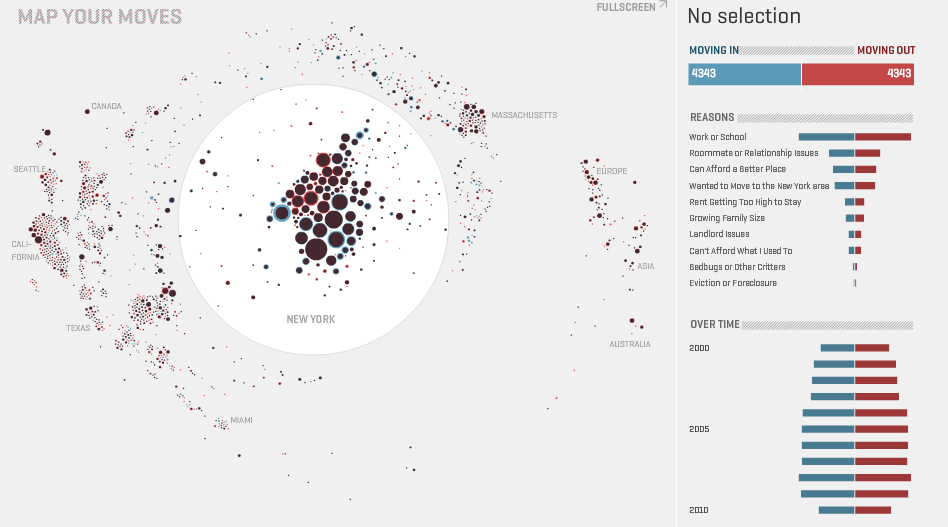
The visualization of the data of where New Yorkers have moved in the past decade. The use of the blue or red outline around each circle is a quick way to indicate whether there was a net gain or loss of people from a specific area. However, even at the full screen mode, it’s not very clear to see the small circles, let alone click on them. A zoom feature might help alleviate that issue, unless the author wanted to have the users focus on the larger circles themselves.
Describing a purple dot with a red outline and saying that it indicates a less attractive place seems to come across as a completely subjective, baseless statement. The reason for stating that is that there are a number of reasons people moved in/out and that does not communicate about whether a place is less attractive or not.