What is the color of life?
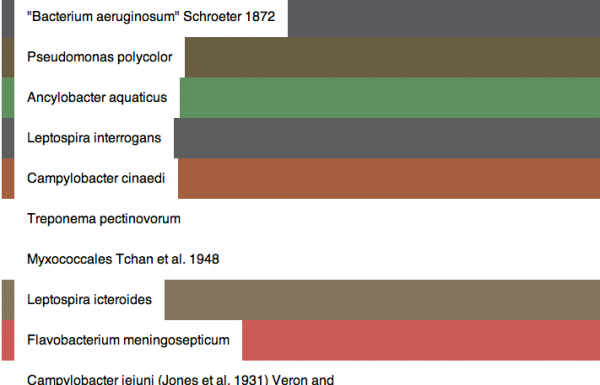
There are many visualizations of the diversity of life on Earth, but most are only interested in the evolutionary relationships between species. In the vein of Martin Wattenberg’s Color Code, this visualization attempts to give an idea of the color of life by extracting colors from google image searches for the name of each species in the NCBI taxonomy database.
Colors
The color of each species is determined by the simple color average of the first five “photo content” hits on google images using the scientific name of the species as a query string. (source here)
This color usually tells you something about the environment in which the species lives, and patterns begin to emerge when comparing different types of life. For example, bacteria are pink or blue because of the stains biologists use to observe them under the microscope. Animals colors tend to be more brown than bacteria. Example color output from 100 random species in the database is available here. The data has not yet been processed to boost saturation.
Unfortunately there are some problems with this technique:
- Straight-averaging makes dull colors and often tells you more about the background than the subject
- Some species don’t have any images available to sample from
I’m hoping to solve the first problem by using a more sophisticated sampling technique. A color quantization algorithm will help identify the dominant colors in an image. After quantization and sampling for the most frequent color, I will increase the saturation to make the colors more visually interesting.
Even a saturated version of the straight-averaged colors (shown in the above article photo) makes the colors more visually interesting and highlights significant differences between species.
Nodes
I was hoping to make a more sophisticated tree visualization (like a phyllotree) but got bogged down trying to interface with my database (didn’t happen) and so my result isn’t very interesting.
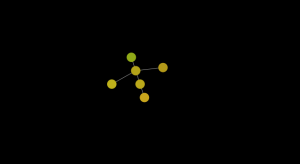
The idea is that each leaf node (species) has a color from the Google search. Each species has a genus. If species share a genus, the genus node’s color is the average of the species under it. That way it’s easy to see when related species are similar in color.
I can imagine tracing down branches and visually being able to detect shifts in skin color or environment when the color of the nodes changes.
The final product, as mentioned, isn’t very impressive. I wasn’t able to export data from my graph database without exporting the entire 400,000+ node tree of life so I had to enter the values by hand. I imported the genus Pan (chimpanzee) into a javascript-based graph visualization framework. Here are the results.
Given a little more effort I think I could get the information out of my database and into something like processing or openframeworks and make it look more impressive. In the immortal words of CSI:Miami’s Horatio Caine, “I need… more time.”

