Project 1 – ESPN Jersey Numbers
IDEA
My project is about “Jersey numbers”. When I was a middle school student, NBA was so popular in Korea, I was one of the big fans of it. Back then, I noticed that a lot of famous players had numbers such as 23, 32, 33, 34. Maybe it is because the basketball heroes had such those numbers (ex. Kareem Abdul-Jabbar had 33, Magic Johnson had 32 and so on). In this project I wanted to see if there is any pattern of popular jersey numbers according to the specific sports, positions, ages and even salaries. This is the reason why I came up with this idea.
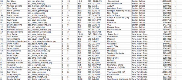
It took a while to make such a huge data sheet. From ESPN website, I copied and paste team by team. Finally I could get almost all the current players information containing their age, position, height, weight, jersey numbers even salary.
Total 3272 players(383 NBA players + 1261 MLB players + 1628 NFL players). I was able to get all the NBA players pictures but due to the time limitation I decided not to handle the other sports players. This is why you do not see the pictures of MLB and NFL players.
PROCESS
I used Processing to visualize this data. I categorized the data by numbers, sports, positions, experience, salaries, and so on. I tried to apply the color code to make the visualization more clear.
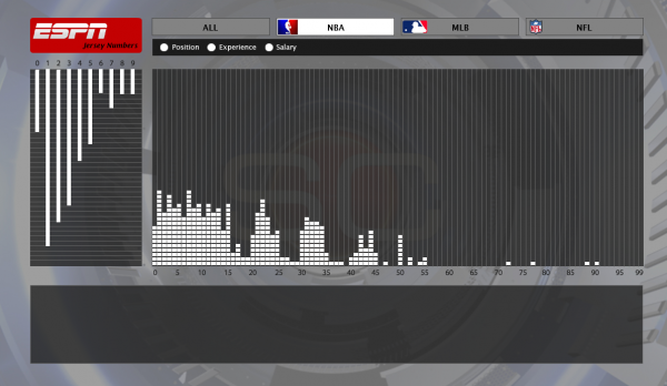
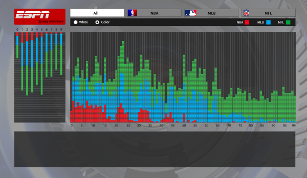 There are two graphs – one is to see what numbers are popular to use as a one digit (i.e. 34 is counted as 3 and 4) and the other is to see the popular numbers as a whole. Each sports has options to choose so that you can sort and filter the players by positions, experience and salary.
ANALYSES
As I expected, I was able to see a certain patterns for each sports. I want to show some interesting patterns here.
As far as I know, NBA players can wear any number they want unless other players in the team have the number already. But surprisingly, you can see the numbers over 50 are not so popular.
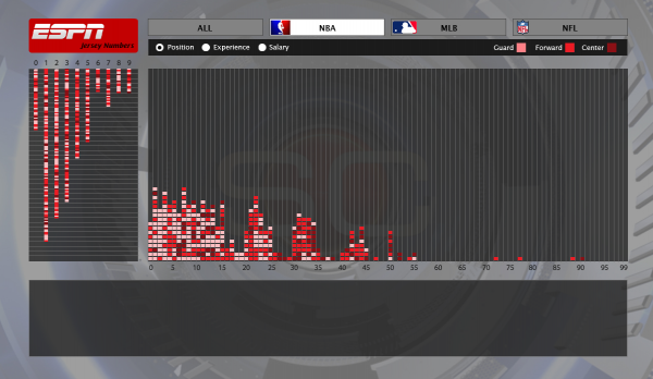
The position wise, you can observe the small size players such guards wear small numbers(light color) and big players such as centers have big numbers – it this coincident?
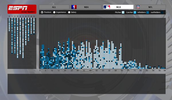
There is a strong pattern that pitchers(light color) have over 25-65 and infielders and outfielders have small numbers (1-25).
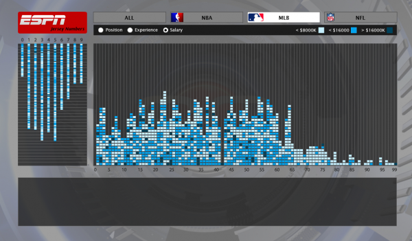 Another interesting thing in MLB is if the player are new or low salary, they mostly wear big numbers. I assume that their numbers here are their temporary numbers in case that other players wear it already so they have to wear leftover numbers. This indicates that big numbers are not very popular in MLB too.
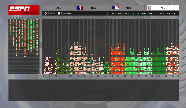 In NFL I was able to get a very strong pattern. Because NFL players usually wear their numbers by positions you can see this interesting visualization.
CONCLUSION
Accrding to Benford law (the first digit is 1 almost one third of the time, and larger digits occur as the leading digit with lower and lower frequency, to the point where 9 as a first digit occurs less than one time in twenty.), I was not able to get a strong outcome to support it. But I can guess that MLB and NBA players do not tend to have large numbers. And Some article indicate that number “12” is the most popular in NBA but not with my data. FYI, number 1 and 7 was the most popular.
It was so fun to see such patterns but I wish I had more time to play with it more. Maybe I could have compared with more of other sports with more other categories. In HCI perspective, the interface has some things to fix and improve such as cursor shape for mouseover features, Y axis on the graphs should have indicators , maybe could use more effective colors to compare each others. But with the limited time, I am pretty happy with this result.
DOWNLOAD
Source file (16.2M)
Presentation slide (6.5M)
Hi Raymond – nice work on this. We understand that you were out of town at TEI. Please remind us to have you show this work next week when you’re back!
Ok, I will. I just finished uploading the source file and description. Thanks for your comments.
Hi Raymond, here are the class’s comments from the PiratePad from the crit.
——————-
Wooah–looking at your project on my computer atm–very nice design! Love the mouseover information and the filters. Very impressive! Very nice filters. I agree that it would be interesting to see how this data has changed over time. Also, I wonder if it would be cool to also include a score? I’m not sure how that would work, since I think your score differs between what position you play. But maybe, for example the MLB, include the bat hit rate or something. Perhaps use a sub-filter beneath your current filter bar which changes depending on which filter you choose. I’m not trying to diss your project—it’s amazing as is, especially considering the time you had and all the data you had to work with–just trying to push you to include more data, if you have time! 🙂 It’s such a great interface! And, I find it extremely interesting even though I’m not a huge sports fan. -Amanda
This visualization is very interactive in an intuitive way. I also like that you manually scraped their data (i think?) – this set should totally be open; ESPN is doing themselves a disservice if you didn’t grab this via an API. This itself should be proof to a place like ESPN why their data should be open. Anyhow. You seem to have hijacked the look and feel of a real ESPN site – which is very cool, and means you could turn this around and get bought by (or sued by) ESPN in a heartbeat. I like that you used the private data source – it seems to add an authenticity to the visualization that seems to help it. I wouldn’t get the same “ooh” effect if this was the same player data pulled off of Wikipedia. Power of ESPN’s branding, or quality of their data? Unclear. 🙂
You’ve done an incredible job scraping the metadata (and in many cases, creating your own). You should make a blog post that walks through not just the process itself, but the *things you’ve found,* using the insight about sports that you clearly have. The interpretation of the data is what’s going to interest a sports fan to continue playing, and get this project the attention (and lawsuits) it deserves.
This looks like an ESPN visualization. Very nice. I really llike the player profiles you get when scrolling over. Get this on the internet!
The left graph on the left is a little confusing at first. I think it’s because it’s upside down.
Wooo! John Elway! 😀 would be nice to see jersey numbers over time, like if a certain number was not popular but then someone got more welllknown using it and if it became more trendy… i really enjoy that you split it up by position. love seeing the dfferences.
really like the project! would be nice to see more information than just current players
i agree. past players would make this amazing.
It’d be interesting to see a number’s popularity over time. Did #23 become more popular after Jordan?
For the NFL, you should take into account that the numbers aren’t just random — there’s a very specific numbering system described here: http://www.jt-sw.com/football/pro/index.nsf/Documents/0-jers-nums So maybe on the screen you could have something about those brackets, pointing out for example that 1-19 are quarterbacks, punters and kickers. — Okay, never mind, you do have it with the ‘position’ thing. Still, maybe including something on that page about the rules of football numbering might be helpful. most sports have certain numbers associated with position
Very nice and informative visualization. A controller for period is useful.
wow super thorough coverage of different perspectives on the data
The color sort seems to be a bit disorganized when looking at a specific sport. Why not sort the same way you did in “all” ? Grouping experience of position or salary together in an intuitive way. There may already be a logic to it, but i didnt catch that.
Clicking on anything that isn’t a button makes the chart revert to white.
Raymond — this project is a home run, no pun intended. You’ll have to (carefully!) find the right way of releasing it to the public. Beautifully done, and impressively ambitious! It will surely attract tens of thousands of users online!