SamiaAhmed-PotentialSources-Infoviz
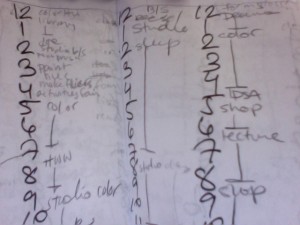
1. A record of every hour of my life for (most of the days) of fall semester 2009, and spring semester 2010.
In the fall and spring of my sophomore year, I kept a (fairly) meticulous record of all of my actions. Even in just looking at “backwards schedules” as I wrote them, I noticed patterns. It might be interesting to compare weekdays to weekends, or fall semester (in which I was more productive) to spring semester, (in which I was mostly cold) or even just see the language in which I wrote things.
Potential pitfalls: Trying to read and enter all of the data in order to work with it. Feels oddly voyeristic.

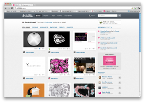
2. Dribbble
Dribbble has a pretty usable API, I’ms still throwing around thoughts on what I would actually like to visualize. Perhaps looking at “trees” of users and their draftees (dribbble is an invite-only website). I would ideally like to make some visual inferences, maybe looking at the colors used in posts, drafter to draftee, or debuts to popular? Maybe looking at the tags on posts to see what kinds of things do better on dribbble verses others?
Potential pitfalls: I have never extensively worked with APIs. Also, dribble seems to have a fairly low request count thing?

3. Twitter
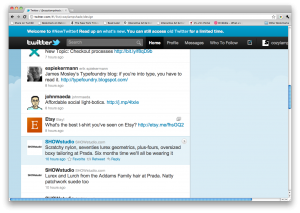
Would it be possible to write/visualize “six degrees of erik spiekermann” (I have already checked — Kevin Bacon is not on twitter)? It might be interesting to see who are the “power users” on twitter.
Potential pitfalls: The internet tells me that “six degrees of separation” algorithms are mostly guess and check and recursive. This may not work so well on twitter. Erik Spiekermann does not follow very many people.
