TweetCatcha captures the movement of NYT articles through Twitter. The chosen display is a clock. Drawing on a well known paradigm strengthens on the viz. Also, being able to update it in real time (grab articles as they are published and perform the search them), also adds to its power.
The UI is still limited since it will pick a random article for you. And it’s limited to NYT.
This blows my mind! It can also speak for itself very well:
Three firms control 89% of US soft drink sales. This dominance is obscured from us by the appearance of numerous choices on retailer shelves. Steve Hannaford refers to this as “pseudovariety,” or the illusion of diversity, concealing a lack of real choice.
It goes to show how helpless we are to these corporations. Pepsi also used to own Taco Bell. Maybe this can be expanded with other industries (outside of drinks) and cross-matching them.
Comments Off on Susan Lin – Looking Outwards – 4: InfoViz Inspiration
1. The Entertainment Software Ratings Board is the voluntary regulatory organization for computer and video games. They assign each game a rating, and describe the content that causes it to receive such a rating. While submitting a game for review to the ESRB is a completely voluntary process, most brick-and-mortar retailers and all major console-producing companies (Nintendo, Sony, Microsoft) will not sell or allow any non-ESRB rated game to be published on their system – or any game that receives a rating of Adults Only. The rating data for the ESRB would be something interesting to visualize, as it shows what we as a society consider inappropriate for those of certain ages. It could be interesting to visualize this information in the form of a game as well.
2. Get all of the text off of the CMU admissions site and perform a word frequency analysis. I think it could be interesting to view how the school advertises itself and see how it meshes with our own view of life at this school.
3. Go to various illegal music sharing blogs and get data based on what music they upload and make available for download based on the tags of their music. Using stats on how many people download it (available from some sites), and what files end up getting removed for copyright reasons could provide additional information. I think it would be interesting to visualize what and how we steal.
I find this map of Facebook connections striking for how clearly it shows political and cultural borders. Clear lines are drawn between the US and Canada, among the North-Western South American countries, separating Europe from Asia… China is notably absent from the network, though India is included.
This interactive graph shows how people spend the hours of their day. Certain stereotypes are on average validated: men spend more time working, women spend more time on “household activities”. Ages 15-24 sleep in later than older groups. Other trends are unexpected: black people show smaller “eating” spikes during traditional mealtimes. Women more often report not remembering what they were doing at a specific time.
I find interesting how people (their thoughts, what they do..) change over time. What if we look at the text files stored in the Documents/Home folder of our computer? Does a visualization of the words contained in these files show how we have changed?
The inspiration is Wordle. I think it would be interesting to group relevant words by time, instead of showing them all together.
Visualization of steps based on game style interaction. Users may participate by downloading a smartphone app which records location, elevation change and image of the various staircases throughout Pittsburgh.
This will document and visualize the location and state of decrepitude of Pittsburgh Public staircases.
Or, data may be gathered by myself of a series of stairs across pittsburgh describing slope, elevation change, etc.
Call of Duty stats vs Violent Crime
This correlation is based on my own excess of FPS hours logged and recent highly publicized acts of violent crime. This infographic would be intended to serve as a statement on the current state of affairs rather than a true correlation study (More Art than Statistics).
MRI cross sections
I’m not really sure how this data could be utilized as an infographic but I have access to MRI images (my own and others). k-space is the fourier transform of the input image data which is in turn reconstructed to create an output image. It would be intersting to see if this data could be reinterpreted not as an image but as a graphic providing visual data less legible in an image.
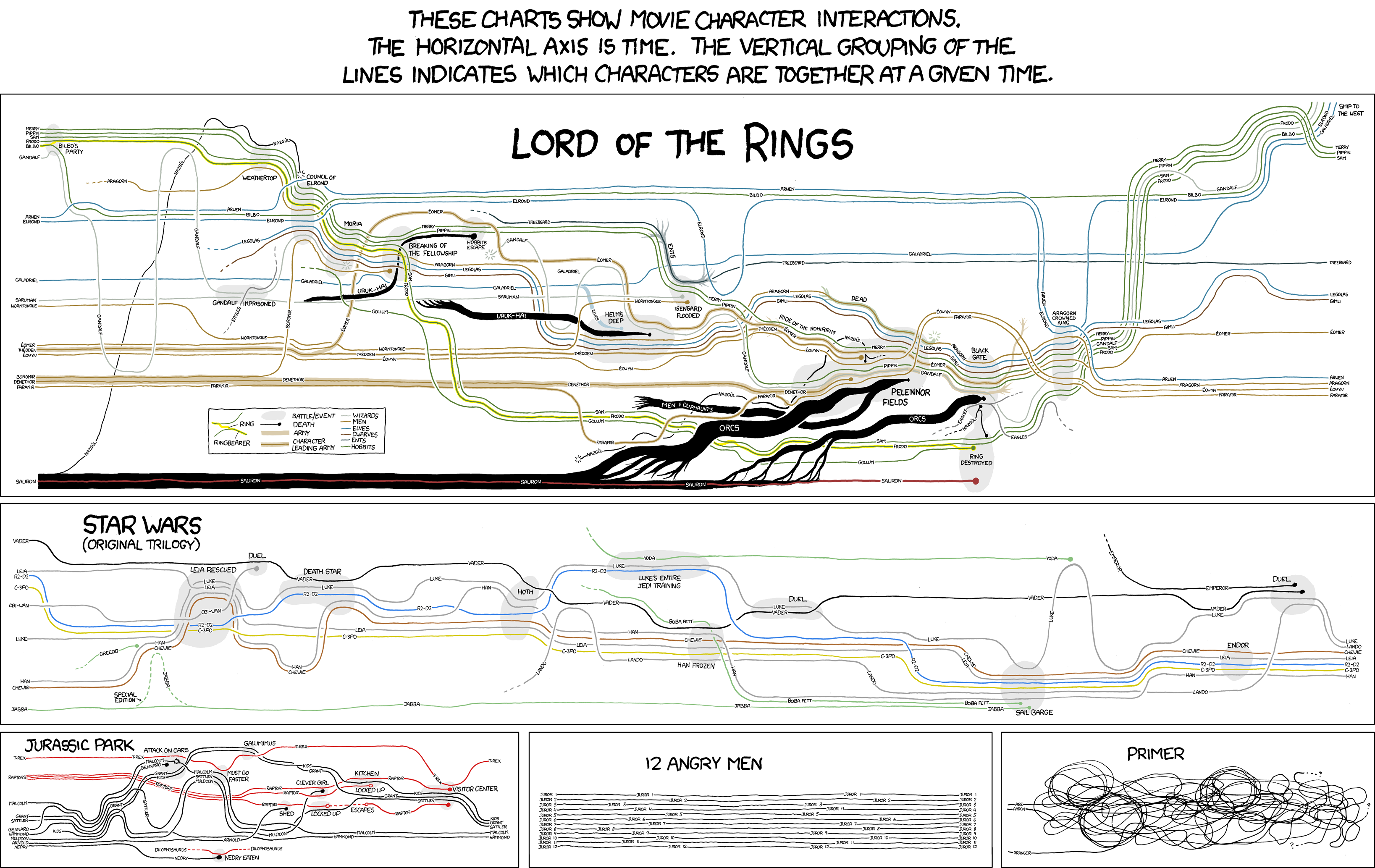
1. ) I’m very attached to these visualizations of movie character interactions from xkcd‘s Randall Munroe; he plots the narrative of a set of movies using only character’s names, and lines representing their movements and interactions with each other. Included are deaths, places of significance, and alliances. The Lord of the Rings trilogy is especially effective, taking Tolkien’s masterpiece and simplifying it down into a series of dots and lines, while remaining legible.
2. ) Nathalie Miebach creates beautiful woven sculptures with data from astronomy, ecology and meteorology data – including parameters like land, sea and ocean temperature, tide readings, moon phases, the solar path in relation to horizon, and the distance between Sun and Earth. I know weather is overdone as a data visualization, but I think these pieces are beautiful; she brings something new to the data by rendering it as a physical piece, almost as if the data has crawled off the page and taken on a life of it’s own.
Comments Off on Caitlin Boyle :: Looking Outwards :: 4 (infoviz)
SMS Message Logs:
For the last couple weeks, I’ve been working on a tool that syncs SMS messages off Android phones and stores them on your computer. As a result, I have a data set of thousands and thousands of text messages I’ve sent and received, along with their contents and timestamps. I’d like to create an infographic that explores SMS usage by graphing messages as they travel between phones in a graph. I’d like to visually represent the social network that can be inferred from the frequency of communication between people, and also look at how SMS “conversations” (in which many messages are sent back and forth in quick succession) can be used to gauge the complexity of the relationship between two individuals.
GPS data of runners in Pittsburgh
Garmin Connect is a website that allows people to track their outdoor exercises (running, biking, hiking, etc…) using the GPS signals recorded by Garmin devices. The site has recorded more than 657,000,000 miles of movement by it’s users while exercising, and I’d like to synthesize that information to produce a visualization of this style (http://www.vimeo.com/10199455) that shows the activity of runners within the city of Pittsburgh.
Price of flights out of this winter crap over time
I’d like to write code that periodically looks at the price of plane tickets between Pittsburgh and warmer cities and provides a visualization of the average change in price in the weeks leading up to the flight. This visualization would be a map of the united states. Arrows going from Pittsburgh to other cities would change in thickness based on the price of those flights, and the user would be able to scrub through time to see prices change.
“Lush” is an interface that allows the user to interactively explore and visualize music in an organic environment. The notes “swim” through the environment like fish using a flocking algorithm, and the user can create a line across their paths that cause their notes to be played. The application takes MIDI files as input, so there really is a song that can be played and reproduced if the user “finds” it in the environment. It’s a really cool idea, but a lot of the time, the notes just sounds like arbitrary noises…
The Shape of Song is a way of visualizing music that reveals repetition within a track. It’s an interesting way of profiling a song and revealing the underlying data, and the implementation uses arcs for some pretty cool looking shapes. Unfortunately, the visualization is static–when I ran it for the first time, I really expected the visualization to be generated as I listened to the song, and I was a little disappointed when it was already there.
1. A record of every hour of my life for (most of the days) of fall semester 2009, and spring semester 2010.
In the fall and spring of my sophomore year, I kept a (fairly) meticulous record of all of my actions. Even in just looking at “backwards schedules” as I wrote them, I noticed patterns. It might be interesting to compare weekdays to weekends, or fall semester (in which I was more productive) to spring semester, (in which I was mostly cold) or even just see the language in which I wrote things.
Potential pitfalls: Trying to read and enter all of the data in order to work with it. Feels oddly voyeristic.
2. Dribbble
Dribbble has a pretty usable API, I’ms still throwing around thoughts on what I would actually like to visualize. Perhaps looking at “trees” of users and their draftees (dribbble is an invite-only website). I would ideally like to make some visual inferences, maybe looking at the colors used in posts, drafter to draftee, or debuts to popular? Maybe looking at the tags on posts to see what kinds of things do better on dribbble verses others?
Potential pitfalls: I have never extensively worked with APIs. Also, dribble seems to have a fairly low request count thing?
3. Twitter
Would it be possible to write/visualize “six degrees of erik spiekermann” (I have already checked — Kevin Bacon is not on twitter)? It might be interesting to see who are the “power users” on twitter.
Potential pitfalls: The internet tells me that “six degrees of separation” algorithms are mostly guess and check and recursive. This may not work so well on twitter. Erik Spiekermann does not follow very many people.
Comments Off on SamiaAhmed-PotentialSources-Infoviz
‘Exhale Pavilion’ by Rotem and Huoang is an interactive installation in Miami Beach. The bio-luminescent ropes are inspired by algal blooms.
The installation is beautiful in it’s design and execution. The ropes are unique in a field saturated with LEDs and the colors are appropriate for an organic form and inspiration. Unfortunately the data which drives the lights is local wind data. This idea for data collection in interactive art is fairly played out.
This visualization shows facebook use throughout the world. It is similar to flight visualization data used to describe air traffic in the united states.
The blue colors are spectacular and the information highlights the use of facebook in North America Europe, Inda and South East Asia.
Bruce Munro’s ‘Light Shower‘ is not a data visualization but an art installation. It is designed to create an ambient, ethereal lighting environment in Salisbury Cathedral in the UK. This installation could easily be used as an interactive data visualization, however this seems out of place in a church. Arguably the piece is a visualization of the unknown.
Comments Off on Eric Brockmeyer – Looking Outward 2
As we all know, Wikipedia contains a wealth of information about pretty much anything you could hope for. Certain facts and figures are organized in a pretty standard way across Wikipedia entries, making them easily extractable with a little bit of coding.
“The UK’s largest collected of digital research data in the social sciences and humanities.” This is an educational and research oriented catalog of over 5,000 data sets. Seems like there could be a lot of useful stuff to find here.
The main purpose of this looks to be displaying the data in interactive graphs, but they also provide the sources of the data. Playing with Google’s graphs could be good for previewing the data and seeing whether there are any interesting trends to explore, and then the actual data could be used for our purposes.
This app over at the NY Times is incredible because it allows you to look at demographics down to a block by block level. Pittsburgh is actually pretty incredibly how segregated are around the university neighborhoods.
Comments Off on Ward Penney – InfoViz, Looking Outward2 – Granular Demographics
This is an interesting dataviz of what it is like to commute in many different American cities. It compares spending on roads vs amount of commuters in a city. Interesting to see where cities land. Although, I think it’s a little hard to understand. I can’t tell if Pittsburgh is a good or bad city in this regard.
Anthroposts [http://anthroposts.com/] is a collection of found post-it notes from various locations across the globe. The interactive site gives users the option to organize them by color, complexity, location, topic, and more, and can create a web of post it notes that use the same words. You can also click on each individual note to see its contents and get an interesting little glimpse into the life of some stranger. The information available about the content of each note was generated by humans through Mechanical Turk, so there are some pretty interesting and rich categories to play around with.
This project is basically a really pretty survey, but is advertised as a “personality infographic generator”. It starts by asking the user a few questions about their favorite food, mode of transport, online activity, etc. and then compiles them into an infographic displaying their answers next to statistics of what other people answered. What really struck me about this was that even though I didn’t realize you could change the language of the survey (it defaults to Portuguese), the icons were communicative enough so that I basically knew what was being asked. Although the content of the infographic is not particularly illuminating, its a good example of a visualization that both collects and displays information, and with nice graphics to boot.
Google Labs launched the nGram Viewer, which allows you to search their archived books for keyword frequency. People have had fun with it so far, comparing words like “phone, computer”, but the important thing is they provide the data to you in a raw format. I could compare analysis of different words against each other over time.
UFO Sightings and Descriptions
I found a collection of 60,000 UFO sightings in database format. Keywords and craft descriptors are listed per article. I could visually display what features are most described by them. I could create a UFO with those features, proportional by their mention.
US Diplomatic Cables
I have the US Diplomatic Cables released by WikiLeaks, and could do some word frequency analysis on them. Probably picking out a few keywords and displaying their frequency over time.
Comments Off on Ward Penney – Infoviz, Possible Sources
I would like to do some sort of physical representation (i.e. Rubens’ Tube) of data, with physical information being represented physically. I would also like to do something involving beer, as starting a brewery is a future goal of mine and a group of friends.
One idea that was tossed around was the creation of a “smart coaster” that would visualize data about the beer in the glass that is on it. It would be controlled by an arduino with a pressure/weight sensor, as well as a potential temperature sensor. It would feed data to a program that would represent the fullness of the beer (shown in a battery level type graphic) and its temperature. The program would be written in MaxMSP, and the hardware would theoretically be able to be replicated a number of times with their information all shown on a common screen.
This piece captures my attention because of the depth of historical and cultural information that can be obtained through a simple graphic. The paths of empires splitting up into independent nations is radically different for each empire, and a concise way of viewing that decline is presented with fissuring blobs, completely stripping centuries of historical tides down to raw numbers.
The Rubens’ Tube is a physical representation of sound waves using propane flames. The changes in air pressure that sound produces directly control a bar emitting a line of many small flames, which change size based on the sine wave of the audio. I would be very interested in doing a project of this type in which I can build a physical object that monitors real-time data input.
The brilliance of this bit is as much a factor of the fantastic representation of the data as it is the delivery of the narration. The way that he brings everything together over time, much like Visualizing Empires Decline, says a huge amount about how history has progressed.
Comments Off on Project 2: Data Visualization – Looking Outwards


