Category Archives: 23-Scraping-and-Display

Chanamon Ratanalert

11 Feb 2014

friendsdataVisualization of anyone who has appeared on Friends as scraped from IMDb using KimonoLabs and represented in D3.

The app can be played with at https://friends-nejoco.backliftapp.com/.

<< getting the d3 visualization on here correctly is still being worked on. please hold >>

Friends

Hover over a circle to see the actor and how many episodes they were in.

Tweet this: “Hardcore Friends fan @jaguarspeaks visualizes cast info. How did Jack and Judy beat Janice?! http://bit.ly/1cz4fXd”

Watching an episode of Friends while doing my homework (as I usually do), gave me the idea to scrape the actors of the show and the number of episodes in which they’ve appeared. After visualizing this data, it shows that the 6 main characters are all in every episode (most shows lack this quality for whatever reason–pregnant cast members, movie deals, etc.). Something I found surprising from this data was that some characters that are vital to the show and seem so prevalent were only in less than 20 episodes, such as Maggie Wheeler as Janice*. What I like about my visualization is that it shows how many people have been on the show, how some are so memorable and some get the response “who is this”. It also opens up exploration from needing to pick and examine specific bubbles. The visualization opens up for discussion the significance of characters over the quantity of their appearances. Golan suggested that I could go further map a character to how many lines they’ve spoke–I’ll definitely enhance this project in the future.

Github: https://github.com/chanamonster/FriendsScrape

— side notes —

In the effort of saving time for the other projects, I used kimonolabs to scrape my data. My initial idea for scraping was the Academy Awards nominees (best actor, best actress, best director) to see the actors and directors that were consistently nominated, which generally indicates talented people. However, after scraping the wikipedia listings, I realized that there wasn’t that much information and Wikipedia’s structure created some issues with how kimono scrapes the data. This is something that I will go back and work with in the future.

*Janice is one of the few characters in almost every season, similar to James Michael Tyler’s Gunther. But Gunther appeared in 148 episodes in comparison to Janice’s 19. She even appears less often than Monica’s parents Jack and Judy, which I found interesting. ** My friend told me just today (2/12) that she had been playing around with the Backlift app version (1st) of my visualization and found the exact same character’s 19 episode appearance interesting to discover, too.


Andre Le

11 Feb 2014


Screen-Shot-2014-02-11-at-10.51.12-AMScreen-Shot-2014-02-11-at-5.29.21-AM

For this project, I decided to scrape AllRecipes.com and find out which ingredients popped up the most frequently, how they were connected to other recipes, and most importantly, how many degrees they were away from bacon. I wrote the scraping script in Python using the beautiful soup library and simplejson, which was all new to me. After scraping some data, I realized that the ingredients list was not normalized. The list contained various versions of water, butter, and other common ingredients.

I set out to look for an automated way to pre-process this information and came across a natural language processing library for Python called NLTK. From there, I learned about how to tokenize strings, tag them, and interpret the coded tags. What I was looking for was a way to distinguish nouns from the rest of the ingredients. For example, “Cold Water” should just be “Water”. Unfortunately, NLTK tagged both “Cold” and “Water” as nouns, so I ended up keeping my original data.

dataViz

I went on to attempt a D3 visualization without much luck. No matter what I tried, nothing would display on screen. Turns out that it was an issue with the way the Javascript calls things asynchronously. Unfortunately I wasn’t able to get the interactivity I wanted, but it does display slices of ingredients on screen.

Link to visualization: https://dl.dropboxusercontent.com/u/5434977/CMU/IACD/Scraper/html/index3.html

Github:


Collin Burger

11 Feb 2014

var diameter = 600,
padding = 1.5, // separation between same-color nodes
clusterPadding = 4, // separation between different-color nodes
maxRadius = diameter/7;
numWords = 150;

var svg = d3.select(“.chart”).append(“svg”)
.attr(“width”, diameter)
.attr(“height”, diameter);

var n = numWords, // total number of nodes
m = 31; // number of distinct clusters

words = [];
occurences = [];
pos = [];
rowArr = [];
var clusterNames = [”, ‘FW’, ‘DET’, ‘WH’, ‘VBZ’, ‘VB+PPO’, “‘”, ‘CNJ’, ‘PRO’, ‘*’, ‘,’, ‘TO’, ‘NUM’, ‘NP’, ‘:’, ‘UH’, ‘ADV’, ‘VBG+TO’, ‘VD’, ‘VG’, ‘VBN+TO’, ‘VN’, ‘N’, ‘P’, ‘EX’, ‘V’, ‘ADJ’, ‘VB+TO’, ‘(‘, null, ‘MOD’];
var CSV = d3.csv(“http://golancourses.net/2014/wp-content/uploads/2014/02/words1.csv”, function(d) {
words.push(d.lyric),
occurences.push(+d.occurence);
pos.push(d.pos);
}, function(error, rows) {
console.log(words.length);
console.log(occurences.length);

var clusters = new Array(m);
var nodes = d3.range(numWords).map(function(element,index,array) {
var clusterInd = clusterNames.indexOf(pos[index]),
r = maxRadius*occurences[index]/occurences[0],
d = {
cluster: clusterNames.indexOf(pos[index]),
radius: r,
lyric: words[index],
occurence: occurences[index],
pos: pos[index]
};
if (!clusters[clusterInd] || r > clusters[clusterInd].radius) clusters[clusterInd] = d;
return d;
});

var tip = d3.tip()
.attr(‘class’, ‘d3-tip’)
.offset([-10, 0])
.html(function(d) {
return “” + d.lyric + ““;
})

// Use the pack layout to initialize node positions.
d3.layout.pack()
.sort(null)
.size([diameter, diameter])
.children(function(d) { return d.values; })
.value(function(d) { return d.radius * d.radius; })
.nodes({values: d3.nest()
.key(function(d) { return d.cluster; })
.entries(nodes)});

var force = d3.layout.force()
.nodes(nodes)
.size([diameter, diameter])
.gravity(.03)
.charge(0)
.on(“tick”, tick)
.start();

/*var svg = d3.select(“.chart”).append(“svg”)
.attr(“width”, diameter)
.attr(“height”, diameter);*/

svg.call(tip);

var coordinates = [0,0];

var circle = svg.selectAll(“circle”)
.data(nodes)
.enter().append(“circle”)
.style(“fill”, function(d){
if (d.pos == “”)
return “yellowgreen”;
else if (d.pos == “FW”)
return “turqoise”;
else if (d.pos == “DET”)
return “slateblue”;
else if (d.pos == “WH”)
return “royalblue”;
else if (d.pos == “VBZ”)
return “firebrick”;
else if (d.pos == “VB+PPO”)
return “purple”;
else if (d.pos == “‘”)
return “darkred”;
else if (d.pos == “CNJ”)
return “gold”;
else if (d.pos == “PRO”)
return “indigo”;
else if (d.pos == “*”)
return “lawngreen”;
else if (d.pos == “,”)
return “magenta”;
else if (d.pos == “TO”)
return “moccasin”;
else if (d.pos == “NUM”)
return “navy”;
else if (d.pos == “NP”)
return “peru”;
else if (d.pos == “:”)
return “plum”;
else if (d.pos == “UH”)
return “powderblue”;
else if (d.pos == “ADV”)
return “tan”;
else if (d.pos == “VBG+TO”)
return “tomato”;
else if (d.pos == “VD”)
return “crimson”;
else if (d.pos == “VG”)
return “darkgreen”;
else if (d.pos == “VBN+TO”)
return “dimgray”;
else if (d.pos == “VN”)
return “lightblue”;
else if (d.pos == “N”)
return “brown”;
else if (d.pos == “P”)
return “forestgreen”;
else if (d.pos == “EX”)
return “lightseagreen”;
else if (d.pos == “V”)
return “mediumorchid”;
else if (d.pos == “ADJ”)
return “aqua”;
else if (d.pos == “VB+TO”)
return “indianred”;
else if (d.pos == “(“)
return “lightslategray”;
else if (d.pos == null)
return “salmon”;
else
return “thistle”;

})
.on(‘mouseover’, function(d){
tip.show(d);
d3.select(this)
.style(“stroke”,”#000″).style(“stroke-width”,3);
})
.on(‘mouseout’, function(){
tip.hide();
d3.select(this)
.style(“stroke”,”#000″).style(“stroke-width”,0);
});

circle.call(force.drag);

circle.transition()
.duration(250)
.delay(function(d, i) { return i * 5; })
.attrTween(“r”, function(d) {
var i = d3.interpolate(0, d.radius);
return function(t) { return d.radius = i(t); };
});

function tick(e) {
circle
.each(cluster(10 * e.alpha * e.alpha))
.each(collide(.1))
.attr(“cx”, function(d) { return d.x; })
.attr(“cy”, function(d) { return d.y; });
}

// Move d to be adjacent to the cluster node.
function cluster(alpha) {
return function(d) {
var cluster = clusters[d.cluster];
if (cluster === d) return;
var x = d.x – cluster.x,
y = d.y – cluster.y,
l = Math.sqrt(x * x + y * y),
r = d.radius + cluster.radius;
if (l != r) {
l = (l – r) / l * alpha;
d.x -= x *= l;
d.y -= y *= l;
cluster.x += x;
cluster.y += y;
}
};
}

// Resolves collisions between d and all other circles.
function collide(alpha) {
var quadtree = d3.geom.quadtree(nodes);
return function(d) {
var r = d.radius + maxRadius + Math.max(padding, clusterPadding),
nx1 = d.x – r,
nx2 = d.x + r,
ny1 = d.y – r,
ny2 = d.y + r;
quadtree.visit(function(quad, x1, y1, x2, y2) {
if (quad.point) {
if (quad.point !== d) {
var x = d.x – quad.point.x,
y = d.y – quad.point.y,
l = Math.sqrt(x * x + y * y),
r = d.radius + quad.point.radius + (d.cluster === quad.point.cluster ? padding : clusterPadding);
if (l < r) { l = (l - r) / l * alpha; d.x -= x *= l; d.y -= y *= l; quad.point.x += x; quad.point.y += y; } } } return x1 > nx2 || x2 < nx1 || y1 > ny2 || y2 < ny1; }); }; } }); [/d3-source] 
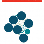
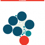
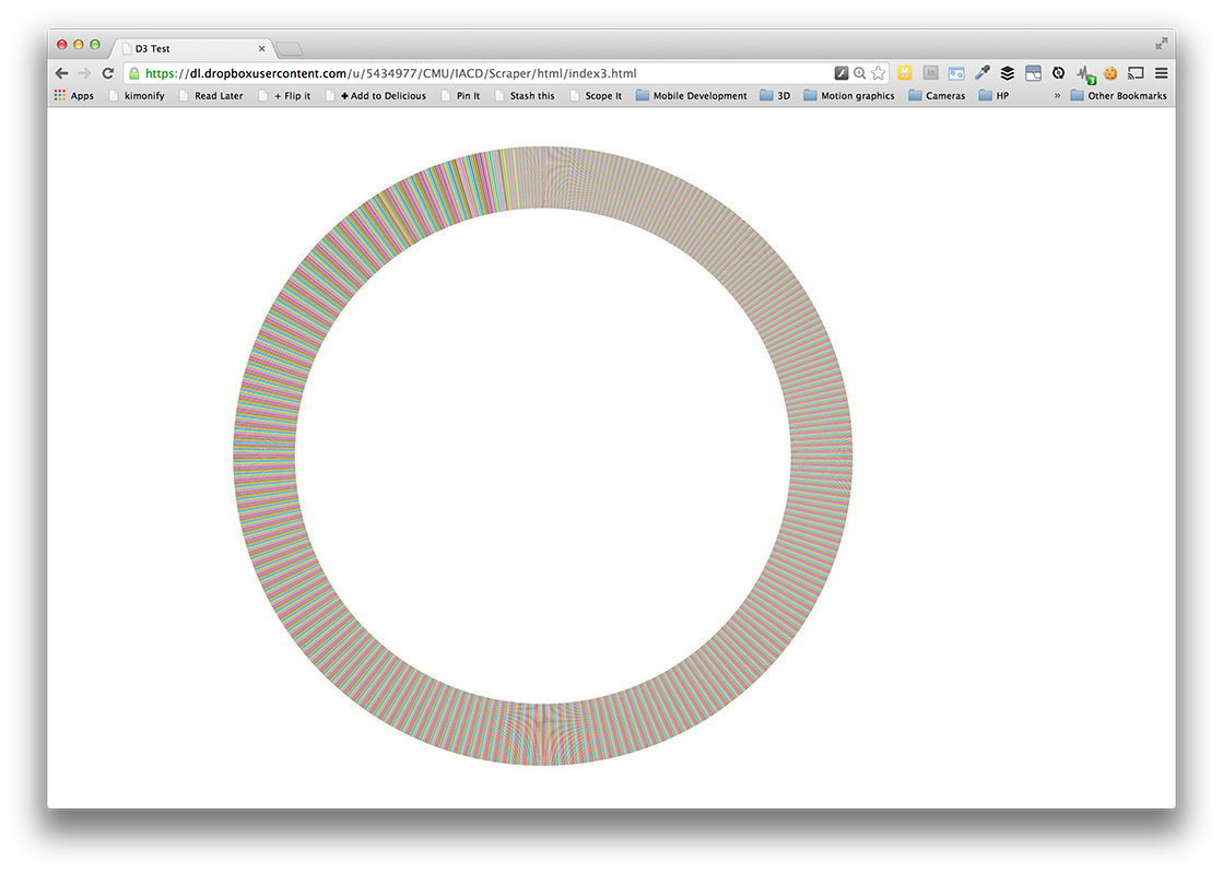
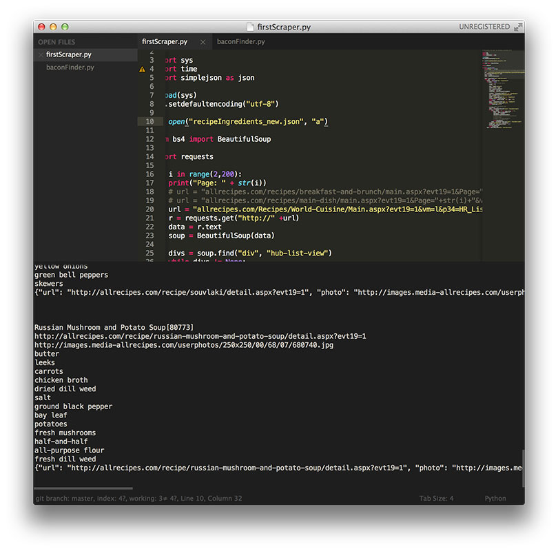
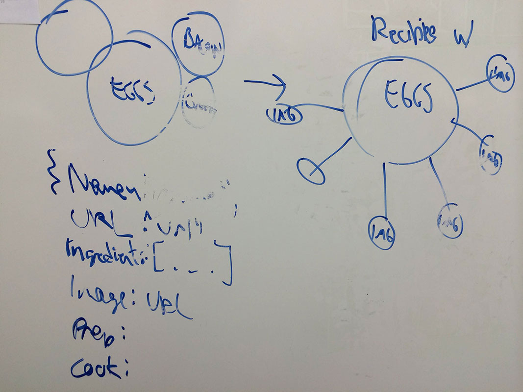
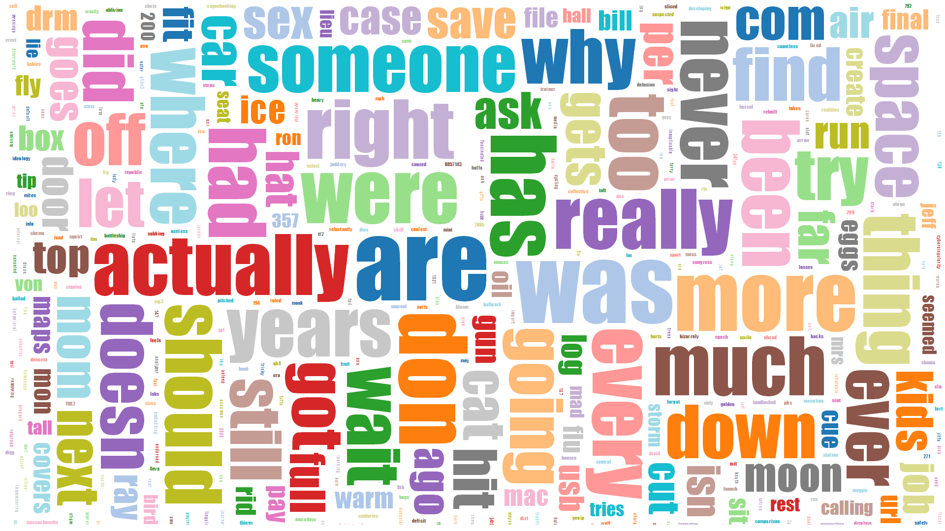
The above is a d3 visualization of the 150 most prevalent lyrics in popular music since 2006. The lyrics are clustered by the part of speech to which the word belongs.  The data collection incorporated a number of APIs and processing techniques in order to make it into the visualization. First, the Billboard music chart website was scraped for artists and titles of the top songs per year since 2006 using an API formed by Kimono . Second, the Lyric Wiki API was used in conjunction with Beautiful Soup to extract lyrics for these songs in a Python script.  Next, the data was parsed and processed using some disgusting regular expressions and the Natural Language Toolkit with the Brown University Standard Corpus of Present-Day American English to separate the words and assign parts of speech to each word. Finally, I managed to get that data input to the Cluster Force Layout IV  by Mike Bostock. I also incorporated d3-tip to show the actual lyrics in the data.

At the moment, the visualization is basically a less informative histogram with some bits to explore.  One of its only redeeming qualities is the ability to toss the information about the screen.  The only interesting feature of the data shown is the large concentration of word usage with little variation. The data needs to be reorganized to show changes over time or differences in genre, or more data should be collected to compare the lyrical data to other modes of language such as normal speech.

Fortunately, this was a tremendous learning experience.  Previously, I had done little programming that interfaced with a web application, much less and sort of large scale data scraping, nor had I ever written any sort of Python script.  I got a bit more experience with Javascript but any sort of command of that language still eludes me.

Emily Danchik

11 Feb 2014

For this project, I scraped data from DoesTheDogDie.com, an internet database of movies, rated based on how the pets in the film fare. The dataset is ~670 points.

Here is a stacked bar chart, where each stack represents animals in the movies released that year. Blue represents animals that were still happy by the end of the film, grey represents animals that weren’t so happy, and red represents animals that died. Thanks, DoesTheDogDiecom! At least the percentage of movies with happy animals seems to be increasing.

Screen Shot 2014-02-11 at 5.01.00 AM
(neither media upload nor wordpress d3 seem to be working, so here’s my visualization, hosted on my own site: here)

Originally, I tried to scrape the site using Kimono, but I wasn’t receiving reliable data. Then, I tried to use the Beautiful Soup Python library, but because DoesTheDogDie isn’t formatted well, I couldn’t easily grab the parts I was interested in.

So, long story short, I wrote a bunch of small python scripts that kept going over the data until I had a format I liked.

Next, the visualization. I felt so lost looking for complete tutorials. What I ended up doing was finding an example that fit what I was trying to do, and walking myself through building something similar that would work for me. I modified several aspects of the graph’s presentation, the format that it would accept in order to read my data, and the sorting of the bars. The example graph sorted based on total height, and I wanted mine to be chronological.

GitHub

MacKenzie Bates

11 Feb 2014

screenscreen

 Indie Video Game Name Visualization

screen_small

Originally I wanted to deal with Australian Indie bands but the website I was trying to use made it so no easy way was possible. So Instead I went Indie Video Games.

The result is a visualization of 777 indie video games’ names in relation to the game’s rating and word occurrence. In classic word cloud style, words that occur most often are largest. Words are also colored according to the average rating for games who it was a title for (Red being negative, Green being positive).

Most annoying bug: Python & Javascript split differently on spaces and I assumed they behaved similarly. It took me a good 2-3 hours to figure it out.

I use Jason Davies D3 Word Cloud Library as the base for my visualization.

Live Version: View

Github: Code

Data Source: The Indie Game Database (TIGdb)

Jason Davies’ D3 Word Cloud Library: View Github

Andrew Sweet

11 Feb 2014

I used Kimono Labs and Excel for this project. I decided to grab the top 1000 movies of all time as claimed by the NY Times, and plot the number of movies on the list per year.

The curve was relatively as I expected. I expected relatively low numbers very early on, a middle point in history where we claim the “best films” come from, and then a drop as time declined slightly. I was surprised, though it makes sense, that there were so many spikes, some years where tons of great, noteworthy movies were released, and years where there are none of any real note. Kimono Labs was a great tool to work with, and made the whole process painless and quick. After some data cleanup and reorganization, I managed to plot the number of movies in the top 1000 list over time.

Screen Shot 2014-02-11 at 3.59.28 AM


Screen Shot 2014-02-11 at 3.59.58 AM


Screen Shot 2014-02-11 at 3.57.35 AM


Screen Shot 2014-02-11 at 3.42.44 AM

Andrew Russell

11 Feb 2014

For the scraping assignment, I decided to figure out which words were most commonly used in XKCD’s alt-text. Being a big fan of Python, I decided to use Python and Beautiful Soup to scrape the data.

XKCD uses a very simple URL scheme (http://xkcd.com/<comic_number>). I simply figured out what was the most recent comic number manually, then, in a python loop, went from 1-1328 and downloaded the html of each page. Once that was done, I loaded each page in Beautiful Soup to extract the alt-text from the comic. Each comic page contains a <div id=”comic”>…</div> which has an <img> inside that. The <img> tag contains the ‘title=”…”‘ attribute which is the alt-text.  I then created a file where each line contained a single comic’s alt-text.

I then created a second Python script to parse the alt-text data. This script loaded the file I had created earlier, removed all punctuation, and counted every single word.  It then output a csv file of each word and their count.

I then loaded the csv file into d3 and, using d3.layout.cloud.js, created a word cloud of the alt-text words.  To get the word cloud to look nicer, I removed all common English words (eg, the, and) and removed all words less than length two.  The result is shown below.

cloud

I did not imbed a running example of the d3 code since it takes a few minutes to parse the csv file.  However, all code, data, and instructions on how to run it can be found on my Github.

Brandon Taylor

11 Feb 2014

I scraped property information from the Allegheny County website.  Originally, the mapping project had got me thinking about mapping property values.  Unfortunately, the two projects didn’t totally come together (I’d need to convert address data from the Allegheny website to geo data via google maps or something).

I used BeautifulSoup to write a scraper that just iterated through parcel and lot numbers and pulled off addresses, land size, purchase prices & dates, and land & building values.

I got hung up using d3.  I don’t do a lot of web programming.  Though it turned out the biggest problem was with trying to access a local file.  After I figured that out, I didn’t have much time to do anything interesting beyond just plotting the data.

ScrapeViz


The implementation was largely taken from Jerome Cukier’s blog.

Also, I couldn’t get the embedded d3 stuff to work.  It seemed like no one did?


2.3- Nastassia is pretty scared of news website commenters

For this project, I decided to take data from around 100 comments on articles announcing that the Boston bomber may be eligible for the death penalty. I have sort of a morbid fascination with how happy people seem to be able to get about other people being executed. I got a bunch of comments from several different news sites (but essentially the same article) with Kimono and found the most common words in the comments. I discounted words that show up in basically all written English, like ‘and’ or ‘the’. I coincidentally already had an excel sheet for finding the most common words in blocks of text, so I used that to find them. I did encounter a couple of websites that didn’t work with Kimono, but most did, so it wasn’t a major problem. I also had to continue to struggle with JavaScript, and I’m starting to hate it slightly less!

Trying to get the D3 imbedded properly below, but here is the screenshot. Winner of most surprising word is probably “virgins.”
screenshot_finished

Spencer Barton

10 Feb 2014

Sleep from Fitbit

Screenshot 2014-02-10 18.30.48

I created a d3 heatmap using my total sleep time over the past few weeks as recorded by my fitbit.

The main challenge here was parsing the data. Temboo/Fitbit returned json with a bunch of escaped characters in unicode. This took awhile to deal with and convert to ascii. Pulling the data was very simple using temboo. Once I had data, python was immensely helpful with parsing and cleaning. I set-up sheetsee to hold my data which was fairly simple but I again had difficulties getting sheetsee to communicate with d3 stuff as they had slightly different formats.

I learned the most about d3 which was a new tool for me. I was impressed by the versatility though I had to work heavily from provided examples.

Github

Live Project (sorry I couldn’t get d3 working in this page):