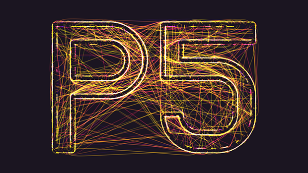
Category Archives: LO-1

jackkoo

15 Jan 2015

My Looking Outwards

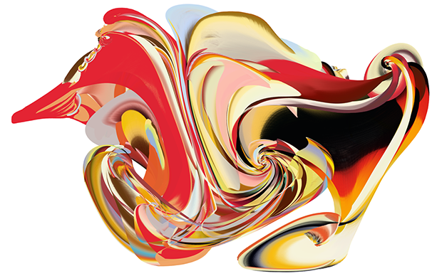
Smoothed out mickey mouse

sekumoi3-2-smooth-operator-matthew-plummer-fernandez

http://www.plummerfernandez.com/Smooth-Operator

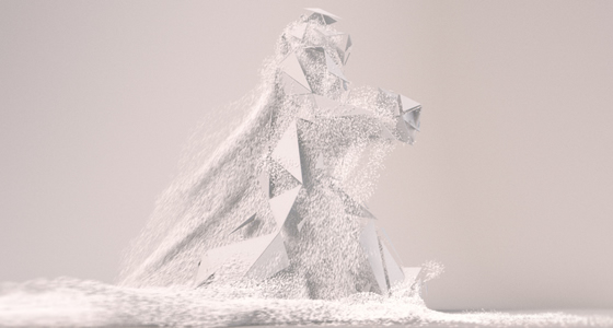
I did a lot of digital sculpting and also like viewing glitch art. When you first started using zbrush you would work on your character you always run into problems  where you don’t use your move tool correctly and end up with bad mesh. Then you start trying to smooth it out and you end up with these pointy areas that just won’t go away.

There was a lot of faculty from college that liked glitch art so I often took pictures when programs crash and resulted in pretty artifacts, or when my fractal algorithm isn’t “correct” but ends up looking really cool. I usually looked at glitches as a potential good thing and felt that they had their own aesthetic. However whenever I got those weird pointy spots causes by smoothing bad mesh, they were just annoying. Its felt really strange to see it used as a glitch art aesthetic.
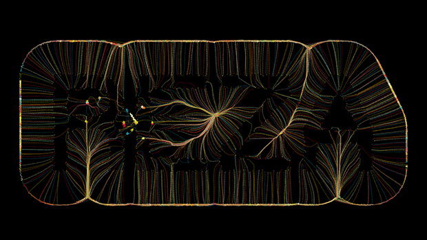
L System 

l-systems7

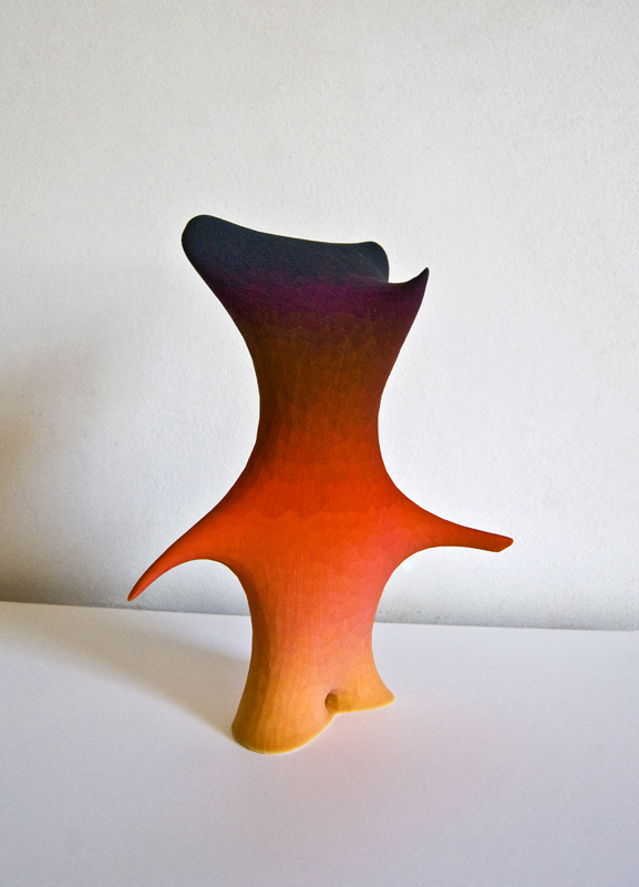
http://www.michael-hansmeyer.com/projects/l-systems.html?screenSize=1&color=0#8

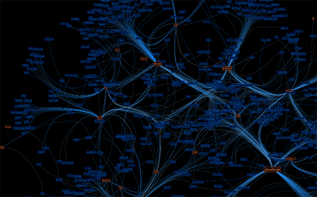
I found this piece on a person’s gallery tucked away in the final images of a series. L – Systems are famous for rendering trees. Most algorithms seem to be praised for having some semblance of organic life, such as conway’s game of life, or Mandela fractals. We see square looking fractals but they honestly don’t look very impressive. This however is a lindermayer rendering of what looks like a factory or warehouse. That’s kind of really odd…

What this picture made me wonder a lot, is how much are the designs and the pattern part of the actual algorithm. If the stair looking parts, the colors, and transparency were naturally part of the algorithm it somehow makes it a really cool piece. But I feel that if they were applied after it loses some kind of value to it. I guess its a bit like how we dislike hard coded programs, since they aren’t “elegant”. Hmm I really wish people would explain their procedural art more and how explain how the shapes were formed. This one is rather curious.

pedro

15 Jan 2015

How can we define generative strategies to help inhabitants or experts to organize their own environment?

Many computational approaches to spatial generation were developed and debated in the 1970s and 1980s but they were too specialized and deterministic and so… ended up not influencing real architecture practice. Today, we have access to many techniques of form-finding and digital fabrication. However, in this quest for new shapes and among the widespread complex geometric techniques available for architecture, spatial organization remains an secondary topic.

Facing this gap, I searched for recent experiments of generative design related to spatial organization. The first example is Space Syntax programme and external form generator by Frano Bazalo.

This project is based on a excel sheet set to register the characteristics of the rooms (size, height, level and name) and its connections. This set is an input to a grasshopper definition that generates a three-dimensional space syntax diagram (a graph of the functions). Based on the attributes of each node or room, the algorithm generates an overall volume that is divided by a 3d voronoi diagram.

On one hand it is interesting to note that the author adopts part of these design strategies to develop some specific design experiments, using the resulting 3d voronoi diagram to generate also the structure. On the other hand, this strategy seems to work without real building constraints such as circulatory systems or site conditions. Besides, it needed to be more interactive to stimulate design exploration.

Another interesting project that I found is a multi-agent systems called PROBOTICS, developed at the Architectural Association Design Research Lab by Jose Sanchez, Knut Brunier, Anica Taneja, Diego Rossel (Course Tutor: Alisa Andrasek).

It seems to be formed by primary agents that move around and interact in vector fields. The environment is also populated by secondary structures that can leap to the orbit of these agents generating different patterns of organization. In this interaction of two levels of agents, the team was able to organize different infrastructures.

It is even more experimental than the first project presented, so it does not deal with real constraints and does not consider a specific programme as a pre-requisite. Besides, it is based on agents and it is more adaptable to a specific environment, which increases the space of possible solutions.

dsrusso

15 Jan 2015

Hexi – responsive wall from Thibaut Sld on Vimeo.

HEXI // THIBAUT SID

Hexi by Thibaut Sld is a responsive wall system that utilizes sensory input from a depth camera and outputs to an array of wall mounted servos.  The wall responds to various human behaviors by moving each individual panel in the array.  The panels are coordinated in such a way that a fluid rippling effect is exhibited by the wall.  The fabrication for this installation is quite streamlined and clean.  Everything from the panel’s polished appearance, to the tremendously accurate tolerance of the servo hardware creates an extremely fluid execution.  Although the interaction between people and the installations very playful and energetic, I think this specific installation would be a very compelling way to display information of some kind.  The object and it’s interaction appears to exist in it’s own vacuum of space, and could possibly benefit from reaching out further into the world.  The exact sources of inspiration for this project are difficult to track down, however upon close examination pieces like Tessel and Versus from David Lettelier come to mind.  Both use similar interaction typologies coupled with very smooth mechanical action to create engaging experiences.


Breaking The Surface [Interaction Test / Tracking Software / Collision detection] from Bjørn Gunnar Staal on Vimeo.

BREAKING THE SURFACE // BJORN GUNNAR STAAL (SCANDINAVIAN DESIGN GROUP)

Breaking the surface by Bjørn Gunnar Staal is an interactive installation that uses a large array of suspended acrylic tubing to create an implied dynamic surface.  The surface directly responds to inhabitants below it.  The actuation system uses a combination of motors, wheels and a depth camera.  This installation is impressive in the level of immersion it can reach with a participant.  Once in the center of the installation, outward views are easily compromised.  The data processing ability and general agility of the installation is very impressive as well.   It sits as a very complete and visually impactful piece, however I think the nature of the actuated tubes was a bit of a missed opportunity.  The combination of some more advanced geometry coupled with dynamic lighting could have made the piece a lot more engaging.  The lineage of Staal’s pieces are very interesting in that they seem to stand out from many other artists that perform at an environmental scale.  The open frameworks apps that was written serves as both a simulation tool through the design process, as well as the controlling software for the physical installation. To me this a fairly new idea and would love to track down more examples like it.  The thematic interaction typology is very similar to other projects performed by Staal and Scandinavian Design Group, although it’s very unique in its very aggressive kinetics.

Yeliz Karadayi

15 Jan 2015

“Generative Typography Experiments” by Reza Ali. 2010
rezaali-font1 rezaali-font2

rezaali-font3

Generative Typography Experiment #5 from Reza on Vimeo.

Reza Ali is an amazingly talented computation designer who shows off some pretty interesting experiments with typography. Reza uses various computational strategies to get his design effects from fluid simulations, spring forces, particle simulations, and audio-input. Although the designs are still images, their effects give a feeling of liveliness and movement. The real interest for me in this project is the complexity of the computation to depict letters, which are quite basic forms. This level of complexity in the image allows for the designer to convey a story within the image such that the word paired with the animation style can work together to create a story or evoke an emotion. Reza seems to avoid doing this, as he uses only his name and does not seem to be controlling the effects beyond basic behaviors, which yields no hierarchy, and thus no story or emotion. This is something I’d like to look into.

More

“Repository Activity By Language” by Eduarda Mendes Rodrigas. 2012
datavis-1

Eduarda wins third place in a GitHub data challenge with this project, used to lay out a map of all of the languages used in GitHub. The orange text shows languages while the blue shows project repositories on GitHub. This image shows elements of design embedded into the visualization with an applied aesthetic. Using a force directed graph, a hierarchy is made visible so that the reader. This map is actually pretty awesomely packaged in a web app that works with pinch-zooming on my touch screen and responds very smoothly and renders quickly. What lacked was an interface with the actual map, making it truly interactive by making the buttons clickable and opening up a second layer of information.

The Map
More

ST

14 Jan 2015

I wasn’t under the impression that we had a theme for this week’s LO, here are two projects I like, theme-less.


render_1

Jerry’s Place is a virtual reality environment inspired by (television character) Jerry Seinfeld’s apartment. The project was made by Greg Miller, using Blender and Unity. One aspect of the project that inspires me is that the project was completed by a single developer as a personal project. Just using 2 dimensional screenshots, he was able to create a 3 dimensional space that can be explored. Having access to an oculus rift, I am excited about the opportunity to turn my own 2 dimensional works into a space for exploration. This project showed me that with some experience in blender and unity, I can create my own virtual reality. This also brings me to my critique of the project: because Seinfeld is based in reality, they use real props, and rooms have real lighting and texture, which can be especially hard to replicate in blender, especially at hobby level. I would love to see how a cartoon world could be translated.

http://jerrysplacevr.com/


CA_nica_560

Walking City is an animation which features a walking figure, which is gradually and continuously changing forms throughout the 7:45 video. This project stood out to me due to my interest in animation. The use of texture throughout the video was particularly interesting, especially due to the lack of color. The importance of sound in animation was made very apparent in this video, which relied on sound to define abstract forms. The animation uses the familiar motion of a walk cycle to emphasize the similarities between different forms and materials. This was an effective approach because the motion is so common, but it also felt like an easy/obvious choice. According the its creators, Universal Everything, the animation is inspired by design, animation, sculpture, fashion, and architecture. After seeing the video, I would say that this is fairly clear.

http://prix2014.aec.at/prixwinner/12662/