A Visualization: or,
Data Rendered into Meaningful, Perceptible Form
Develop an information visualization which offers insights into some data you care about.
Expectations
- This project is due at the beginning of class on Tuesday, March 3.
- Your work will be judged in several respects:
- whether the visualization is interesting (relevant or provocative);
- its quality of aesthetic craft (graphically or interactively); and
- how well it communicates (or allows the discovery of) insights about your dataset.
- In point of fact, the real “problem” of this assignment concerns how we can render data into meaningful, perceptible form. This means that, although a visualization is the most likely format for your Project 32, other formats are potentially acceptable as well, such as an information sonification, or a physical (sculptural) form such as those we studied previously.
- It goes without saying that your visualization should be computational, i.e. code-driven. This is also to say that you must develop (or use) some sort of algorithm for interpreting your data visually. You may use any programming language or environment you please.
- It is anticipated (but not strictly required) that you will use the data you collected in Assignment 12.
- This assignment is part of Assignment 3X, which has two parts (31-Bot and 32-Visualization). One of these (up to you) is your primary submission, and one of these is your secondary submission for 3X. Decide (and be sure to indicate) which is which. If this is your secondary submission, use of readymade template visualization tools (such as Highcharts or D3 patterns) may save you some time. If this is your primary submission, developing a visualization ‘from scratch’ (in P5.js, openFrameworks, or customized D3) may be more appropriate.
Learning objectives
Upon completion of this assignment, students will be able to:
- demonstrate familiarity with a complete workflow of operations in information visualization: from data acquisition, parsing, and cleaning to representation, distillation and interaction.
- demonstrate practical skills in using a popular toolkit for creating computational information visualizations, such as D3.js, P5.js, Processing, openFrameworks, etc.
Remarks
Remark 0. Operate from the standpoint that your visualization is a tool you’re building to help you answer a question. What are you curious about? (Why?) Can you help your data reveal insight about a phenomenon that nobody has ever considered before?
Remark 1. You are encouraged to combine multiple sources of data, in order to establish frameworks within which interesting comparisons could be made, and unexpected insights could be drawn. Sometimes an orthogonal dataset can help bring order or contrast to your ‘main’ data.
Remark 2. You are encouraged (but not required) to create an interactive (as opposed to a static) visualization. Consider how your project can support (one or more of) the core interactive operations of zooming, sorting, filtering and/or querying. Think about how your user can explore your data, in order to experience a large data set in detail. Is interactivity required for this project? Well, no, not strictly; it is acceptable to generate a high-resolution PDF if that presentation format suited your concept well. Likewise, I know that some of you are very musically oriented — you are welcome to consider making a information sonification.
Remark 3. Not everything is a timeline, just because you happen to have data with a timestamp. Consider your email, for example. While you can certainly visualize this as a timeline (e.g. the number of emails you sent and received per day), you could also view it as a graph (e.g. the social network of your friends and acquaintances), or as a histogram (e.g. which people you communicate with most, or which words you use most often).
Remark 4. Give yourself permission to be specific. Sometimes focusing your investigation on a subset of your data is not only simpler, but can be much more conceptually interesting, than trying to visualize the “whole thing”. For example, instead of “visualizing all of your text messages” (a study of your texting behavior), what if you only examine the ones you exchanged with a certain person (a study of your relationship)? What if you choose a specific way of comparing your text messages, such as whether or not they contain swear-words? Give yourself permission to have a point of view.
Remark 5. Hey, why not have a look at some of the projects by last year’s IACD students. I particularly recommend:
- Shan Huang’s favicon visualization of her browser history
- Collin Burger’s custom Chrome Extension for visualizing his browser tab history
- Spencer Barton’s visualization of his daily journal
- Kevan Loney’s unusual scene from a play, which is also a visualization
- Kevyn McPhail’s physical visualizations of his exercise habits.
Deliverables
- Create a visualization which offers insights into some data you care about.
In a blog post,
- If your project is embeddable, please embed it in your IACD course blog page. See the instructions in the section below for how to do this.
- In the blog post, please write a tweetable short description (of 140 characters or less) which summarizes what your project is, and why it might be interesting.
- In your blog post, discuss your project in 150-200 words. Please discuss your inspirations or relevant prior work by others (if any), and your motivations (why did you make this?), and your process (including some scans of your sketches.) Critique your project, discussing what it does well and poorly.
- IMPORTANT. Discuss some specific insights about your data which your visualization reveals. For example, you might begin a sentence with “Note how this peak indicates such-and-such…” If possible, illustrate this with a labeled image or two.
- Include a screenshot (still image) of your project. If your project is very dynamic, show a few different views, ideally each showing some interesting aspect of your data.
- If your visualization is interactive, include a screengrab video of your visualization in use, even if you’re able to embed it. As browsers evolve, your embedded project may stop working in a few years — but at least the video will still capture your work.
- Be sure to include a link to your Github repository for the project.
- Categorize your blog post with the Category, 32-visualization.
Embedding D3.js and P5.js in WordPress
In these examples below, I show how to embed D3 and P5 visualizations in our WordPress blog. I’m using the simple Bar Chart example provided by David Newbury. Note that the methods described below will require you to (1) edit your post in “Text” mode (possibly irreversibly), and (2) upload various Javascript, HTML and data files into the blog using the “Add Media” button.
Embedding D3
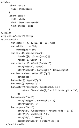
The Wp-D3 plugin appears to have some issues. Instead, I was able to get D3 to embed into this WordPress blog by copy/pasting lines 9-21 and lines 28-78 from David Newbury’s D3 example directly into the Text (HTML — not the “Visual” editor) of this WordPress page. Observe that I also surrounded the script tags with a div tag.
Here’s what my WordPress HTML looks like. (Note that it is not necessary to include d3.js itself, as this is already included in our blog’s headers):
Embedding P5
The P5.js embedder has been disabled, as it seems to be incompatible with the (more recent) version of WordPress used in our course blog.
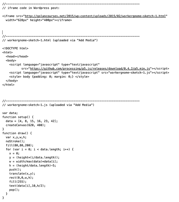
Instead, use the “Add Media” button to upload an html file for your visualization, and a (p5) javascript file (or files) for your visualization. Then embed the html file using an iframe.
Here’s what my iframe code (in the WordPress), my html file, and my javascript file look like:
NOTE: Make sure to give your html and javascript files unique names, so that your filenames don’t collide with other students’ uploads. Also, remember that the width of our blog is 620 pixels, in case you’d like to fit your work in a normal column. (You can work wider if you wish).