Category Archives: LO-1

dave

14 Jan 2015

Metrico is a platformer on PS Vita by Digital Dreams that uses inforgraphics as the environment. It is interesting because it combines games and data visualization into a single piece. However, I felt the project missed a great opportunity. Sure it uses the aesthetics of visualization, but there are no actual underlying data behind anything. Numbers and bars are arbitrary and just exist to serve the gameplay. It reminds me a flash game where one can surf on stock market slopes, and its art style is similar to Monumental Valley. Finally, I have rants against this game only being on PS Vita, meaning it will not be accessible to many people, like me.


Stanley Piano is made by Digital Kitchen. It takes in song requests via Twitter and plays them. I really enjoyed the video presentation of the project, however the actual performance part is a bit short. I also enjoyed that social media aspect, which allows people to have their own personal musician who plays their requests. It is very similar to self playing pianos that have existed for a long time now, but because of Stanley Piano’s interactive aspect, it feels a lot less mechanical than those. Also, because its insides can be easily viewed, it also feels less creepy than those self playing pianos.

Zack Aman

14 Jan 2015

KHStGallen_Darknet_2014-10_MG_3304_LowRes_crpd_540

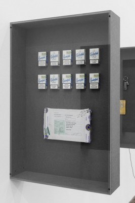
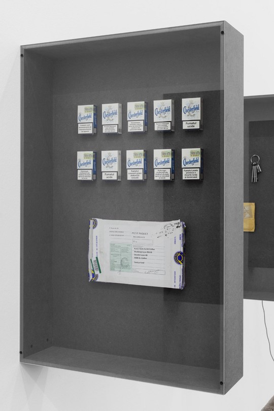
Random Darknet Shopper (2014)

The “Random Darknet Shopper” is a bot that buys a random item from the Agora marketplace once a week, and has the item mailed to the !Mediengruppe Bitnik art collective, who display the item in a gallery space. The bot is given an allowance of $100 a week to make its purchases.

I was initially drawn to this project by this article on Motherboard, which details just the “best things” that the bot purchased. There’s something comical about the way it’s covered by Motherboard; the bot is heavily anthropomorphized and given a personality by way of the products it purchases and a hypothesized reason or backstory for the purchases. It doesn’t seem like this was intentional on the part of the authors, but raises an interesting set of questions regarding agency and legality. Specifically, at what point would a robot be considered to have agency on its own? At what point would an illegal action, such as purchasing drugs, be attributable to the robot and not to the creator?

The authors do not say much about their intention, but they seem focused on giving tangibility to the dark web and describing its idiosyncrasies. Several of their descriptions for the products focus on the quality of product or service, such as “Shipment took 2 weeks,” and “Ordered from the U.S. – arrived from Singapore.” These descriptions remind us that real people and systems are on the other end of the transaction.

The “Random Darknet Shopper” is influenced by the Random Shopper by Darius Kazemi, which makes random purchases on Amazon. Darius’ intentions were to break out of algorithmic profiling. Both bots seem are conceptually similar to other bots, such as twitter bots, but with a very specific method of agency.

2015 Interaction Awards: Flutter from Interaction Design Association on Vimeo.

Flutter – by Alex Rothera, Ivor Williams, Jacopo Atzori, and Aaron Gillett

Flutter is a mobile application designed for grieving adolescents to help them express themselves and give form to their feelings. The user taps on the screen to define base notes and then can place objects above or around the note to modulate it.  This project is particularly interesting to me for two reasons: the goal of empowering creativity and the design process. When I think of interactive art, one of the main things that comes to mind is designing interaction from the user’s perspective and allowing them to explore and create on their own. Regarding the design process, it’s just great to hear them talk about how they used contextual design and see the process I’m learning at CMU in action.

I thought the parts that worked especially well were the end, “captured” musical result and the simplicity of interaction and control. However, the abstraction of musical control seems a bit simplistic, almost like bad Instagram filters. Maybe the abstractions just grate against my mental model of electronic music and would work well for the intended audience.

They don’t say what their specific influences are, but there are many generative music applications.  In particular, Flutter reminds me of the Brian Eno application Bloom, as both have a down-tempo, subdued musicality.

Bryce Summers

14 Jan 2015

I found a neat popup book entitled ABC3D, invented by Marion Bataille.

This project is a Popup book with a lenticular cover that conveys each letter of the alphabet through a dynamic, interactive reading experience. The letters are implemented as popup shapes that require many different movements to view properly.

When I started exploring digital art (broadly construed), I communed with many fascinating structures that I had never seen in the real world. I witnessed fields of perfect sinusoidal fields, utilitarian user interfaces, and other peculiar visual forms that many people had independently discovered, and visualized. I believed these visual artifacts to be products of the virtual world and completely separate from the Physical world that the average person eats, sleeps, and breaths in.

As time has passed, I have noticed that it is possible to naturally encounter many visual effects that seem to be unique to the digital world in the real world, for instance I was sitting at the dinner table at my parents house one day and looked out a screened window and noticed that the screen actually pixelated my view of the outside world! I currently believe that visual effects of digital culture should also be present when encountering designed culture, i.e. buildings, chairs, side walks, and everything else that humans have made. It makes sense that there might be an equivalence relation between the two because both of these fields of work were created by humans.

This project tickles my fancy, because it demonstrates properties of font geometric decomposition, interactivity, movement, and experimental structure that I have previously only seen in Electronic art and typography. The project also uses connective pieces, reflectivity, and translucence in ways that appeal to the pattern and form lover in me.

As for a critique, I will say that the color scheme could have been more varied and it seemed as if some of the letters repeated themselves. I think the author nailed the creative task of finding relationships between subsequent letters and did quite well at working within the ordering constraint. The history of pop-up books is pretty well documented, due to it being a very well known medium. The designer’s website is: http://www.marionbataille.com/ She has made several artistic books based on forms.


Second Project

http://www.csismn.com/SYN-Phon


This project, based on the art and composition of Candaş Şişman displays a lengthy graphical display that conveys subject matter through time. As the imagery scrolls performers produce tones to match the imagery. I like this project because it conveys a story through structured imagery along with a relationship between musical sound and imagery. I think that the documentation provided makes it a bit unclear how improvisational the performance was, but I feel as if the music could have been a bit more consonant. It would be interesting to make the reverse project, that in which musicians perform and a computer generates structured platforms that represent the performance. Then a 2D platform based game could be formed with a unique procedural creation technique. One potential influence is the capturing of local sounds as a representation of culture. I have seen several pieces including one at the Frame Gallery that have used locally captured sounds to make the artwork more intimate to its intended audience.

dantasse

14 Jan 2015

I’m kind of sad this is for new things only, so I can’t post about re-finding Black MIDI.

But here’s something close. Specimen Box, by the Office for Creative Research, is a visualization/sonification for botnets. Data comes from Microsoft’s Digital Crimes Unit.

Specimen Box – Sonification from The OCR on Vimeo.

It has 3 views: 1. see all botnets animated as messages come in, 2. see one or two botnets alone as “retina plots” and listen to their activity (video above), 3. plot botnets along 3 axes. It’s oddly soothing to listen to them. I think the unlikely but awesome outcome of this would be that people can listen to it and hear patterns in the botnets that help them fight them. Less awesome but more likely: makes botnets more approachable, both raising awareness of an issue while lessening fear. It’s kind of hard to be scared of one of these things playing a soothing noise.

I’d like to know, well, if it works. If it’s useful; if it helps people to find out more things about botnets, or if it’s just pretty. Not that there’s anything wrong with that.

Fatberg (warning: kind of gross), on the other hand, is somewhat more organic. It’s a giant mountain of fat. They aim to build it in the ocean and get it to the size of an oil rig. I think it’s cool to take something so common and unseen, and make it definitely seen. I know it’s not really their goal, but I’d think that it would be pretty effective in preventing future sewer clogs, if enough people saw it. Plus, it could be a neat piece against the factory farming system and crazy quality of meat we eat, if they wanted. But it’s not.


They insist it’s “not a speculative design project”, but rather “inspirational data” to stimulate the imagination. I don’t know, that sounds like a speculative design project to me. It’s almost too flippant, like a stunt more than something to actually make you think about anything in particular. Still, I appreciate the scale, and the willing to deal with the squeamish.

alexsciuto-lookingoutwards-1

The Dawn Wall: El Capitan’s Most Unwelcoming Route

Screen Shot 2015-01-14 at 2.57.07 PM

http://www.nytimes.com/interactive/2015/01/09/sports/the-dawn-wall-el-capitan.html

This was a news project I saw this morning, and I think it’s a great use of web-based 3d. The New York Times article shows a series of images and captions as a 3d model of El Capitan is rotated in the background. The 3d movement give the viewer a better sense of how large the cliff is, and the added labels and scales give me more cognitive information about the wall itself. When I first opened the page, I scrolled up and down it a few times, mesmerized by the 3d models smooth movements. The experience has stuck with me all day because the creators got the most important part right: that by having a moving model, the viewer would get a better sense of how big the wall is.

The creators of the project could have done more with the 3d model to convey its massive size. In the first swoop of the model, we are meant to see the cliff from its base. But the movement felt more like the cliff was being laid flat on the ground. That movement suggested to me showing comparable other objects next to the cliff. How many football fields tall is the Dawn Wall? How many city blocks?

I can tell that the project was created using WebGl and D3.js. D3.js’s creator, Mike Bostocks comes out of Stanford and Jeffrey Heer’s data visualization lab. I haven’t seen many good uses of WebGl to date. I remember http://spacecraftforall.com/ that used WebGl and 3d in conjuction with documentary footage and interviews iISEE-3 reboot. Google Maps uses WebGl for their maps (try Google Maps, go into satellite mode, and zoom out as far as possible). On the non-technology side, this graphic seems to fit in with National Geographic’s great history of creating detailed maps for print that included lots of overlays of additional information. like Draining California and this map of Venice.

Echos

Videographer Susie Sie creates rich and mysterious textures using common materials filmed in slow motion. In Echoes, she uses video of inky fluids to create other worldly effects. The music and sound design is by Clemens Haas.

I like this piece because of its raw experimentation and craftwork that ends up as great polish. Sie didn’t do any advanced computer editing, she took great films shots first. Together, the shots and the music induce a feeling in the viewer that is both sinister and also beautiful. The unknown in majestic and kind-of-scary glory.

Sie describes her work as trying to expose the underlying mathematical-basis for nature using strictly analogue means:

She is on a mission to explore the physical and mathematical nature of unusual forms, substances and materials 
to show the hidden beauty and magic of our natural world that constantly surrounds us.

Her dedication to analog and documenting nature as specifically as possible reminds me of Group f/64 from last century. Like Group f/64, Sie is dedicated to using photography without much human intervention. For the camera to be a seeing eye that impartially takes in the world that surrounds it. Unlike Group f/64, she seems to realize that the act of taking a picture is by itself an editorial choice. We can never really objectively photograph the world around us, just as can never write about or draw the world around us.

I call this piece an experimentation because it can’t live on its own. There’s not enough there to sustain interest or engage for more than a few minutes. I think the web video format doesn’t suit the piece. What if it were in a different context? One that allowed people to ignore or pay attention to it as they liked? What if we were given more information about what is being filmed? I think these images could be used in other projects very well.