I picked 4. I wanted to pick a number because it seemed like they were getting the least love. I like how it looks, really, especially on the Anitype characters which have the unconnected triangle. The 4s that were already made seemed frustratingly literal to me; like they’re trying to tell a joke. Plus, when I was a kid, I loved this song. So, four.
A few sketches:
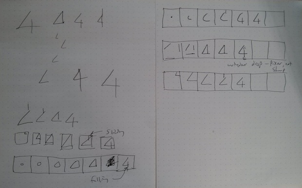
It all seemed so angular and precise, like a knife cutting glass. The angle of the 4 gave it a sense of movement, and then the vertical bar just seemed very sharp. It’s not a very friendly or humanistic character. So I just played that up, and ended up going with the angle moving in from the corner and then the vertical bar slicing into it.
Here’s the completed character.
Anitype.register('4', {
  author: 'dantasse',
  website: 'http://www.dantasse.com/',

  construct: function(two, points) {

    var anitype = this;

    var angle = anitype.makePolygon(points.slice(0,3));
    var vertbar = anitype.makePolygon(points.slice(3,5));

    angle.translation.x = 700;
    angle.translation.y = -700;
    vertbar.translation.y = -900;
    anitype.addTween(angle.translation, {
      to: { x: 0, y: 0 },
      easing: Anitype.Easing.Quartic.Out,
      duration: 0.5,
      start: 0
    });
    anitype.addTween(vertbar.translation, {
      to: { x: 0, y: 0 },
      easing: Anitype.Easing.Exponential.In,
      duration: 0.2,
      start: 0.5
    });

    return two.makeGroup(angle, vertbar);
  }
});
One thing was unintentional: I thought that, when you published it, anything outside of the “guide” box would get cut off. Turns out, it’s still there. It feels like having the vertical bar there changes the metaphor from a cutting or stabbing action into more of a guillotine. Which is also cool, in its own way.
Favorite other letters include this 8 from Quasimondo, this T from Greg Kepler, and this M from Chris Delbuck. They’ve all got this more human quality to them, whether it’s indirectly (like the “uncertain” wavering M) or more directly (like the T, that’s “twirling a baton”). I would really like to do the drawing I had on the bottom left of my sketches above, where a circle grows into a triangle and then the vertical bar falls down a little bit. Might help give this same more humorous touch instead of the stark angularity that I played up.