Ok, dang. Too early for LO 9 I suppose but I got to share this because what I thought it was is super inspiring.
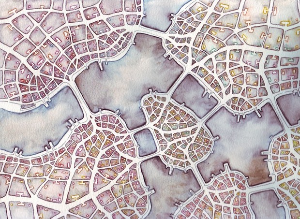
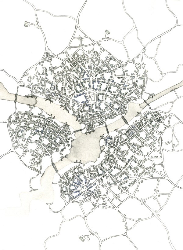
Emily Garfield’s an artist, and some of the things she draws are maps of imaginary cities, like these:
 .
.
Based on the title of this article about her art, I thought there was some kind of fractal algorithm behind it. Turns out she’s just drawing these by hand, which is awesome, but I’d love to see generative cities, where you put in a few parameters and see what the map looks like. Right now they’re evocative and fun, feel like the city map from an old video game or something. But I feel like they could be evocative and informational. Like, get a rough idea of what a city would look like if you put this or that policy into place. And then, it’d be even better to connect it to life somehow; to take a map and see how it’d feel on a day to day basis.
Huh, maybe that’s a final project idea. (well, it’s two final project ideas: generative maps, and maps -> feelings.)
Places and Non Places by Andrew Price
Price takes satellite photos of places, manually annotates the “Places” (buildings, parks, useful space) and the “non places” (roads, pavement, parking lots, green space that you can’t really use for anything). Here’s an example in San Francisco: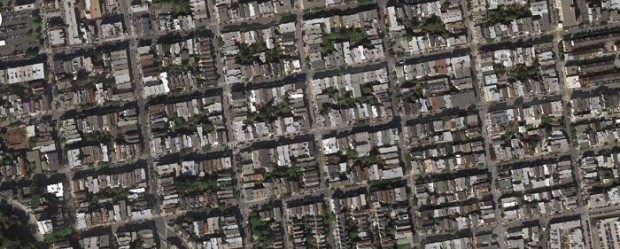

Then he quantifies the ratio of places to non places (places are blue, non-places are red). 4.25:1 in this case, or 81% place. Here’s an example in suburban Little Rock:

0.08:1, or 8.5% place.
I find this really compelling, as it gets at what we really want to know about density. How much is *neat stuff* and how much is dead space? Neat stuff is fun to walk around, dead space is not. Also, it might give us a way to quantify the destructive impact of parking lots, wide streets, and other big wastes of space.
The downside is, it’s quite labor intensive to make one of these drawings. (So far.)