I want to talk about visualization of expressive movement. To begin, I’d like to define data visualization as taking a complex data set and distilling it into a human-digestible format which enhances our understanding of the data.
Motion Bank

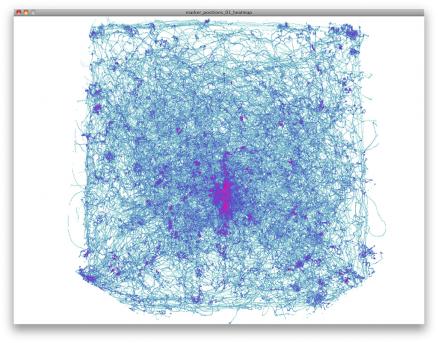
Motion Bank is an ongoing collaboration project involving a group of designers, dancers, and engineers that archives the motion of dance. The visualization techniques output from the collection of three-dimensional data creates a more measurable understanding of dance as a science, something that can be broken down into understandable parts. The purpose for this project is to enable comparisons for learners as well as to understand the range of motion of a dancer and optimize the space around them. Despite this seeming to be their goal I found the most completed aspects of their project to be more of a representation than actual visualization, for there was little to no visible measurement in the final output, which makes it difficult to truly understand. However I found that the process work shown in the website and in parts of videos shows a lot more interesting sets of visualization, making this collaboration a note-worthy project.
I find the website for Motion Bank to be a little confusing, not to mention the language is primarily German. The website was a little confusing to navigate so it is difficult to really get a clear understanding of what’s going on. I did not see any particular documentation to really explain Motion Bank or what its ‘final result’ is, so to speak. It seems to be an on-going process simply exploring methods for archiving dance. That idea alone makes the project an interesting precedent for its playful and experimental qualities, testing numerous techniques for visualizing motion. The idea of using visualization to learn things is not unheard of, so I’d be interested to see the data being used for some other purpose. Like expression. Which leads me to the next project.
More
Link to un-sharable video
E-TRACES by Lesia Trubat. 2014
E-TRACES, memories of dance from Lesia Trubat on Vimeo.
This recent project collects the data of a dancer’s movement and creates something expressive from it. Now I know that the data visualization from this particular project doesn’t collect the amount of data that we will be expected to from our project, but I still think that the purpose of the visualization is something to take note of. The purpose for the visual effects happening here is to work in collaboration WITH the dancer and push the expressionism happening with her motions into a still drawing. Certainly this approach can be pushed to another level, covering more data, and continuously changing itself in response but not necessarily showing measurable data as much as it is expressing…something? Really, I just like the idea of data visualization being something that does not necessarily depict information on a one-to-one level the way a graph or chart would, but instead become its own art form.
I think that the video documentation could be pushed beyond an overlay on the dance itself. What if the actual dance wasn’t seen at all, and its only purpose was to output some visualization? Can that visualization become legible in its own way? Can it be transcribed back into dance if someone learned how to “read” it? I’m interested in this kind of ‘telephone’ game being played and I’d like to see that taken a step farther.
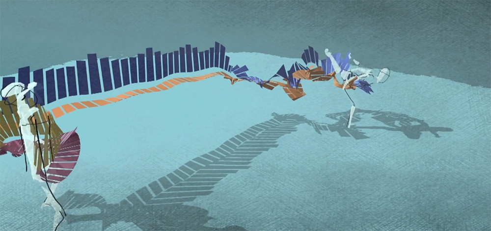
“Humanizing Motion Graphics” by Matt Pyke. 2012
Speaking to my interest in expressive data is Matt Pyke who talks a lot about anthropomorphizing digital graphics so that people can empathize. His work is not data visualization so much as it is visual representation of motion. Though his work does not invoke an understanding of a set of data, it is evocative and exciting. Can data really be this exciting or emotional? Oh yes. Yes it can. Just stick some googly-eyes on it.