The goal of this project is creating a heat map of attractive and scenic places for Google maps. Find more about this project here.
For the first step, I developed a JavaScript based web-page combining Google maps and a Processing environment. In this web-page user can navigate through maps using Google map system, while JavaScript code transfer map boundary coordinates to processing applet embedded. Processing applet use map boundary data to get number of uploaded pictures on http://www.panoramio.com/, which are tagged to be within those boundary coordinates. Applet divides map to sub-maps, based on “Precision” value which is controllable using “Precision” scroll in bottom of the web-page, and get number of pictures for each sub-map. Processing applet gets number of pictures by querying following string:
in which minX,maxX,minY, and maxY are boundary coordinates. The result of above query is a JSON file containing a field called count, which specifies number of pictures within the coordinates. Using number of pictures and maximum pictures of sub-maps an array of transparency would be created. The JavaScript get this array from applet and create a heat-map for current map based on it, and display the heat-map on top of map.
Applet is able to create two different kind of heat-map, red transparent variant map and color spectrum map. User can alternate between two modes by pressing “Mode” button. Also, user can control heat-map overall transparency by “Transparency” scroll-bar. Finally, user can remove less attractive places by adding value of “Popularity”.
Currently, there are two main problems stops the web-page from working:
1- JavaScript can not get the transparency array from the applet.
2- Generating the transparency array has O(n^2) complexity runtime, which makes it really slow in “Precision” values more than 10.
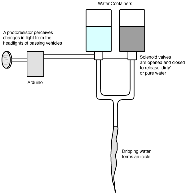
This project involves the fabrication of ‘polluted’ icicles based on the amount of traffic in proximity. Pure water is trickled out from a container at regular intervals, while passing vehicles cause darkened water to be dispensed and pollute the icicle. The project explores how we can visualize information though physical fabrication and also hopes to raise questions about how our presence impacts upon nature.
Background
Being a new resident of Pittsburgh and experiencing for the first time in my life a lot of snow, I was struck by how beautiful the fresh white snow can appear. I was also impressed by the beauty and temporal nature of the icicles that formed in the cold weather. At the same time, I also noticed how quickly the snow darkened at the side of the road as vehicles pass by.
For this project I was interested in exploring how fabrication could be used as a form of visualization. Digital Fabrication usually means, creating some kind of digital model, then outputting it to a given fabrication device such as a 3D printer, milling machine, or a laser cutter. In general, I am interested in exploring how we can ‘unify’ this process more so that realtime factors contribute to the fabrication process, i.e. the input more closely affects the output. An icicle for example, forms in an incremental process when water flows then refreezes repeatedly. Nature has no prior design for the icicle, but rather its form is derived from the process. This project is one small step towards exploring this bigger idea.
Some Related Artworks
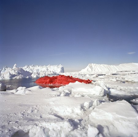
Marco Evaristti, Ice Cube Project, 2004. From Wikipedia:
With two icebreakers and a twenty-man crew, Evaristti used three fire hoses and 3,000 litres (790 US gallons) of paint to color the iceberg blood-red. The artist commented that, “We all have a need to decorate Mother Nature because it belongs to all us.”
Although a very simple idea, it immediately communicates a powerful ‘open’ message. This could be commentary on whaling, general environmentalism, or even protesting a war. The juxtaposition of blood red, with pure white is strongly out of place.
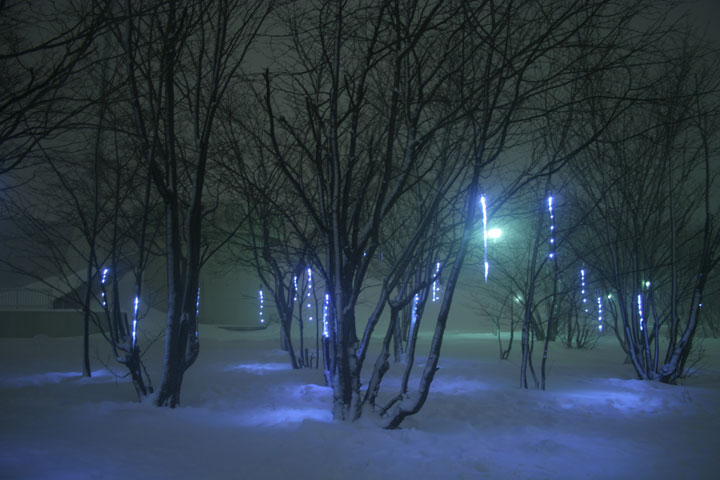
We have developed the device which “invites/induces” natural icicles. Our device is composed of two parts- a pot and a string. A pot can preserve snows, control ices, and make a drop of water. A drop of water freezes again by an electronic-controlled cold string during trickling down. The accumulation of iced strings grows up to a big icicle.
8 LEDs which is attached to a string light up an icicle from inside. Light flickers like virtual drops, and generates new optical phenomena. Real water drops generate poly-rhythmic percussive sounds.
Using the above technique they can create icicles artificially regardless of the environment. What is really beautiful, especially in the top image below, is the way the icicles have been illuminated. They don’t look at this work as a ‘fabrication’ experiment, but rather an exploration of the aesthetics of icicles.
Prototype
Here is an overview of how the prototype works.
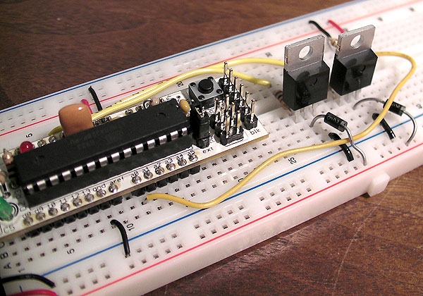
The water is released using a gravity feed solenoid valve. Its regular state is closed, so by turning an Arduino pin on HIGH for 100ms or so it will quickly open and close, releasing a dribble of water.
Here you can see the two valves attached to the bottom of the water containers.
The solenoid valves are controlled by a very simple circuit: a Boarduino and some transistors to deliver the 12VDC to the solenoid.
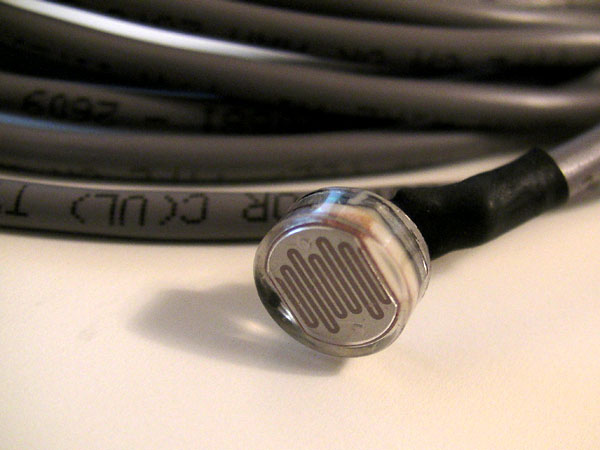
A photo-resistor is used to detect cars passing by. As icicles are made overnight when the temperature drops, it is easy to detect the jump in light levels when a vehicle with headlights switched on passes by.
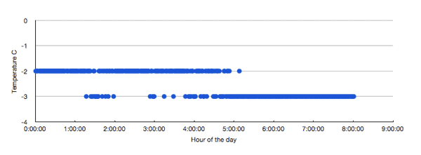
To get an idea of how many vehicles were passing by on my street I made a small program to record the time and light level reading overnight.
I live on a reasonably quiet street, so there is not a constant stream of vehicles going by. You can see that between 2am – 5am it is pretty quiet, but from 6am it really picks up as people start their day. I also recorded the temperature on a given night, and was surprised at how little it changes. Granted the values below are rounded to the nearest integer, I still expected a more dramatic change.
From the image and movie below you get an idea you get an idea for how the icicle would form from the dripping water in the right weather conditions.
Trials
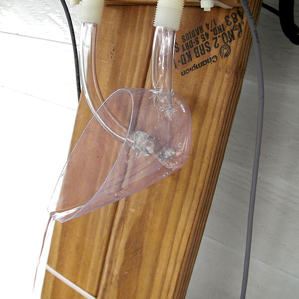
The next stage was to do a trial, and try and ‘fabricate’ an icicle. Surprisingly, there is such a thing as black food coloring, which serves the purpose of polluting the icicle every time a vehicle passes by.
When you drop some full strength coloring into the water it creates an interesting effect.
Here are the containers, one clear and one dirty.
As reliably cold as Pittsburgh’s weather has been over the first half of January, it appears that we are experiencing a ‘warm patch’. After leaving the device out overnight, I awoke to find nothing but a puddle of dirty water. The temperature was supposed to come down to -2C, but the lowest reported temperature I noticed was 3C. If anything, it is clear that the sensing/actuating device is working as the water has been polluted by the vehicles going by.
Reflection
After several more attempts, Pittsburgh’s weather just hasn’t been cold enough to go below freezing. Unfortunately I am away at a conference for the last week of this project, so it is frustrating to see it is going to dip below freezing during that time!
I have several improvements I would like to make to the device, thanks to suggestions from people in class. Firstly make the point where the drips form curve to a vertical. This should slow down the drops to allow them to freeze easier. Secondly, another suggestion was to attach some sort of freezer-made piece of ice to the dripping tip, in order to get the icicle started. I am hoping to try this out when I get back.
The most disappointing thing about not being able to form the icicles, is not being able to see how the ‘data’ would form a visualization. For example, would small black patches form? Or would layers of clear and dark ice build up over time? These patterns would be interesting to observe and also try and accentuate by varying the mixtures and release rates.
For my project I will create an interactive display containing videos of people perceiving a minute (without time keeping), where their spatial arrangement is based upon personal background information. When an individual’s minute is up, their video disappears from the screen. This is a continuation of a project I started a while ago, so I already have a database of about 20 people perceiving a minute plus their background information. The next step will be creating an interactive visualization of the data in openFrameworks in which the user can select the background information by which they would like to arrange the videos. This will hopefully reveal interesting correlations between a person’s background (such as their age, whether they drink coffee, and happiness) and their perception of the length of a minute.
There are many visualizations of the diversity of life on Earth, but most are only interested in the evolutionary relationships between species. In the vein of Martin Wattenberg’s Color Code, this visualization attempts to give an idea of the color of life by extracting colors from google image searches for the name of each species in the NCBI taxonomy database.
Colors
The color of each species is determined by the simple color average of the first five “photo content” hits on google images using the scientific name of the species as a query string. (source here)
This color usually tells you something about the environment in which the species lives, and patterns begin to emerge when comparing different types of life. For example, bacteria are pink or blue because of the stains biologists use to observe them under the microscope. Animals colors tend to be more brown than bacteria. Example color output from 100 random species in the database is available here. The data has not yet been processed to boost saturation.
Unfortunately there are some problems with this technique:
Straight-averaging makes dull colors and often tells you more about the background than the subject
Some species don’t have any images available to sample from
I’m hoping to solve the first problem by using a more sophisticated sampling technique. A color quantization algorithm will help identify the dominant colors in an image. After quantization and sampling for the most frequent color, I will increase the saturation to make the colors more visually interesting.
Even a saturated version of the straight-averaged colors (shown in the above article photo) makes the colors more visually interesting and highlights significant differences between species.
Nodes
I was hoping to make a more sophisticated tree visualization (like a phyllotree) but got bogged down trying to interface with my database (didn’t happen) and so my result isn’t very interesting.
The idea is that each leaf node (species) has a color from the Google search. Each species has a genus. If species share a genus, the genus node’s color is the average of the species under it. That way it’s easy to see when related species are similar in color.
I can imagine tracing down branches and visually being able to detect shifts in skin color or environment when the color of the nodes changes.
The final product, as mentioned, isn’t very impressive. I wasn’t able to export data from my graph database without exporting the entire 400,000+ node tree of life so I had to enter the values by hand. I imported the genus Pan (chimpanzee) into a javascript-based graph visualization framework. Here are the results.
Given a little more effort I think I could get the information out of my database and into something like processing or openframeworks and make it look more impressive. In the immortal words of CSI:Miami’s Horatio Caine, “I need… more time.”
So, for Project 1, I have decided to collect information and display it in an interactive scatter-like graph. I chose to collect the data myself. So far, I have 66 results. I’m bribing people at the UC with cookies on Wednesday (3:30-5:30) to get some more from CMU. However, I am pleased to say that I used Mechanical Turk to obtain most of my results–so actually half of my participants came from outside the US, which is pretty cool.
The idea behind this project is (as said in the title) see how different cultures interpret the meanings of words (via color). I provide eight words, and have each participant pick one out of eight colors for each word that he/she thinks best describes the word. Then, I have them briefly explain why they chose the colors.
First, I included “obvious” words, like Anger (which, as expected most people described as red) and Jealousy (which most people from the US and European countries described as Green). And, then I included some tricky words such as Happiness and Confidence.
Here is a prototype. For some reason, adobe reader is not happy with the font. So, here’s what the words say:
On the Y-axis, from top to bottom: Anger, Sadness, Jealousy, Happiness, Fear, Confidence, Beauty, Truth.
On the X-axis, from left to right: Red, Orange, Yellow, Green, Blue, Purple, Black, White
This graph is a prototype, but it basically shows how my final project’s graph will look (without the interactive-ness). The data used in the prototype are 20 participants from Mechanical Turk.
On the final, you will be able to select a filter (on the top right–you can filter gender, age range, and country of origin), and the graph will morph into another graph with the new filter settings. There will also be a random comment displayed from participants depending on which filter is set (I denoted where the comments will be displayed in the prototype).
I guess the issue I’m running into is whether or not people will be able to understand the data. The graph with the pretty circles and font looks really nice, but I’m wondering if people will be able to understand it. Any comments are appreciated! 🙂
Comments Off on Project 1 Sketch — Words Across Culture