by heather @ 1:28 pm 13 February 2012
1. Lichen photography by Jessica Rosencrantz
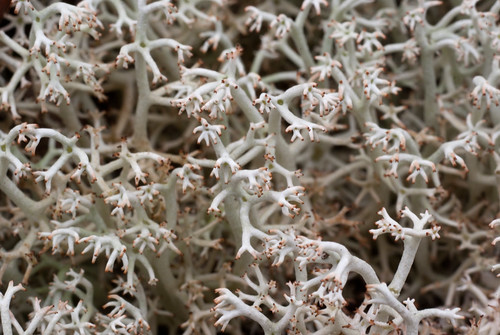
What generative art assignment would be complete without the inclusion of Mother Nature herself? Lichen photographs by Jessica Rosenkrantz, see complete photo collection here: http://n-e-r-v-o-u-s.com/blog/?p=1950 — she creates a great deal of generative art and sculptures (e.g. unique lamps or jewelry) so it is interesting to observe how her perception of mother nature interweaves with the visual and algorithmic output of her various works.
She writes:
Some people describe a lichen as a fungus that has taken up farming, growing sugars in little algae patches throughout it’s body, in contrast to the decomposing habits of normal fungi. If fungi can be described as living inside their food, then lichen are essentially fungi turned inside out. Their food lives inside of them.
But I find it more intriguing to think of lichen as a fungus trying to be a plant. Like a plant it has photosynthesizing portions which produce food (the algae or cyanobacteria) but also structural components (the fungi) which protect and arrange the photosynthetic elements. As a photosynthesizing organism, lichen are under a lot of the same constraints as plants. They have to effectively collect sunlight and water. They have to be rooted to something, they have to resist gravity… Correspondingly, lichen have independently evolved very similar body plans to plants…..despite have an entirely different chemical and biological makeup.
2. “A Confidence of Verticies” by Brandom Morse
[flickr video=2399356089]
Buildings at generative war, the ebbs and flow of their fight creates natural drama and sympathies. This implementation runs in single sequence, but one could imagine a version where each building is imbued with various ranges of characteristics and each blow has a distinct probability of success. Citiscapes brought to life with the flaws and strengths of boxers. I enjoy the way this project unifies generative behavior with the sense of interacting agents. It also introduced the idea of curating the output of generative art, rather than just always selecting whatever the algorithm provides. Jer Thorp had an assistive tool for designing parks that he would use to breed possible design solutions, but he would subselect the best at each stage and “breed” them together. Artist-technology collaborations.
Source: http://www.generatorx.no/20080409/structural-tension-brandom-morse/
Various additional works: http://www.coplanar.org/work/
3. “Decorative Growth Pattern” by Allison Kudla
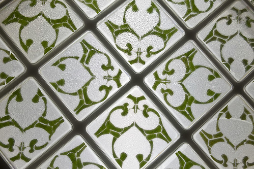
Finally we join computational art with Mother Nature in Allison Kudla’s “Growth Pattern,” also currently on display at the Miller Gallery on campus. Here she prepares biological squares of geometric leaf cuttings in a nutrient solution, visually reminiscent of spanish and moroccan tiles. Some cuttings sprout new leafs, others with less complete sterilization sprout fungus and by the end of the installation, they all die. Visiting it on a single day does not tell the story, but over its lifespan it becomes unpredictable, beautiful and evocative.
Additional images and details: http://allisonx.com/2011/01/growth-patterns/
Comments Off on HeatherKnight – LookingOutwards4
by a.wolfe @ 11:00 pm 12 February 2012
Generative Fluids by field.io
[vimeo 1870521 w=600]
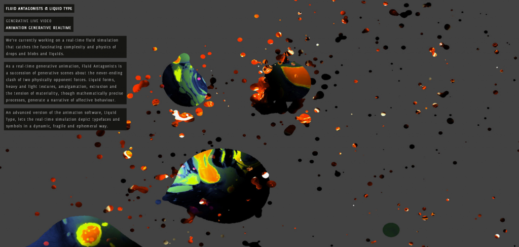
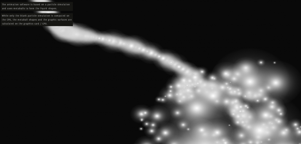
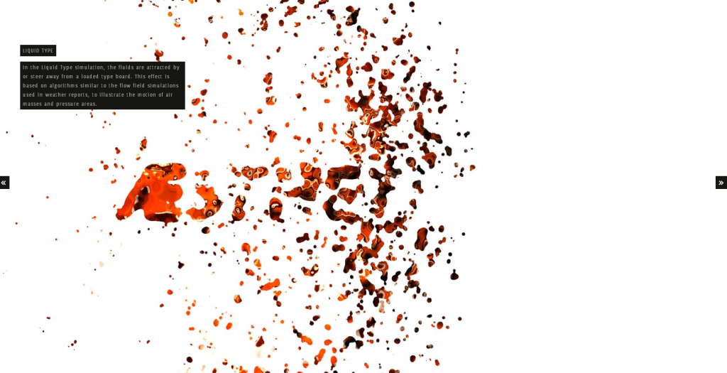
I think this is a particularly beautiful fluid simulation. Rather than use a complicated physics engine, the approximation is based off of particle metaballs, and the texture is created by a combination of shaders and photographs. Its not quite realistic, but a close approximation using a much simpler method, with a very stylized look and feel. They later took the same simulation and altered it slightly so that the particles would be attracted to text in the background to create some very interesting font effects
Sonic Acts IX Identity by Coup


This generative process (although analog) produced stunning visual results. The image was created by progressively zooming out the original and then overlaying it in a different color over the original.
“Starting point was a process that would generate the design. With every printed item an extra layer was added to the printing sheet containing a zoom-out of the same design in a new pantone colour. All items have been cut in several ways from that same printing sheet, which results in different crops of the design for each item.
As a result of this process, the final item (the book cover) was cut from the complete message containing seven solid pantone colours.”
Kokkugia | Swarm Matter


Swarm Matter creates forms through emergent patterns. Kokkugia uses this logic on several of their larger architecture projects using the paths of people or traffic through the space as the “particles” to generate the larger forms. I think even these ornamental pieces are beautiful.
Comments Off on Alex Wolfe | Looking Outwards | Generative
by heather @ 9:18 am 7 February 2012
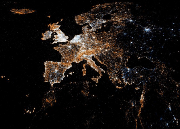
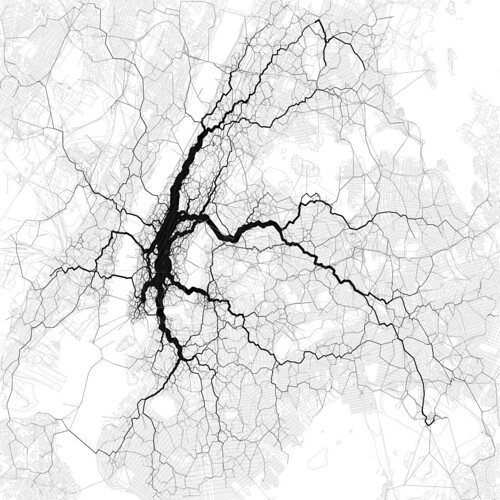
I wanted to investigate other ways people had explored Twitter data as that is the focus of my data visualization project. My last looking outwards also included an image of a veined transit map based on tweet density (link).
“Eric Fischer compared Flickr and Twitter usage in this series of maps. White indicates where people used both, blue is just Twitter, and orange is Flickr,” as reported by: http://flowingdata.com/2011/07/12/flickr-and-twitter-mapped-together-see-something-or-say-something/ – It’s very beautiful and might characterize location of visual or storytelling interest, local habits, or the distribution of technology across the world. It leaves you to draw such inferences rather than making direct conclusions itself.
For my second (word-based visualization) and third (grouping by similarity) discoveries, I present “Spot,” which I discovered here: http://flowingdata.com/2012/01/16/spot-visualizes-tweet-commonalities/
The application includes the most recent 200 tweets about the subject and provides various modes of visualization, that took me a minute to figure out how to operate (there are button graphics on the top left of the Spot site). I decided to visualize a reality show that’s about to come on “Love and Hip Hop.”
They provide ways to clustor conversations via similar phrasing and retweets, as shown below.
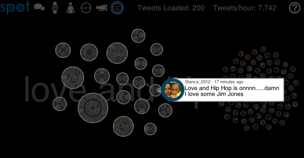
There are various other features where the talk bubble corresponds to most popular tweet clustors, the watch to a timeline of that subject in recent tweets, the person icon shows the people that had the most popular tweets and a visual of their repetitions, the word, I show below because its (to me) the most interesting, the loudspeaker shows what kind of platform people were tweeting from, and the final clusterbubble in which the image above shows cliques of retweets and replies to each other.
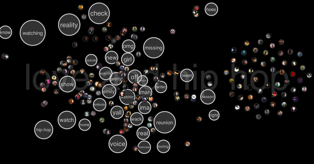
It’s also interesting to see how the most popular words tell the story of what people are doing. A few minutes before the show there was anticipation. As the show went on the content reflected reactions to the fighting or gossip happening along the way, or the characters most recently featured. It would be neat if we could combine the above clustering with the word clouds so we could also better understand individual groups rather than generalize across all of twitter, which I would generally expect to be diluted. The popularity of a television show allowed me to explore those kinds of features in a generalizable way, but in my project I hope to reveal more minutia of individual networks.
Comments Off on HeatherKnight – LookingOutwards3
by craig @ 8:55 am 2 February 2012
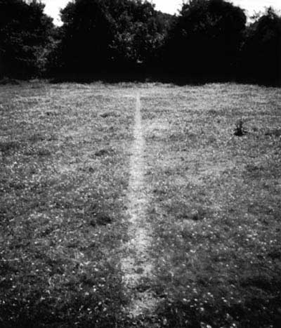
Richard Long – A Line Made By Walking
In this early performance art work, Richard Long visualizes a simple gesture: walking backwards and forwards in a field. He repeats this gesture until a visible mark appears in the grass below his feet indicating his path. In this 1967 work, Long aims to materialize an otherwise fleeting gesture through a durational performance. One imagines this line disappearing over time, becoming grown over. The line is a ghostly indication of what was once there.

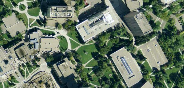
Pathways at the University of Calgary
Thinking about a similar kind of performative data visualization, I thought about the paved pathway system at the University of Calgary, where I studied for my undergrad. The pathways were not laid out according to any sort of Cartesian plan. Rather, they were laid overtop of paths worn in the grass by students taking the same routes, etching them out in the ground the same way Richard Long did. There is an interesting democracy in this sort of method.
Comments Off on CraigFahner-LookingOutwards-2
by heather @ 7:46 am 1 February 2012
Below I present three gorgeous and structural explorations of data visualization spanning a traditional flat graphic, the surface of a building itself that brings its features into focus in a new way and an unusual setup for holstering a tree that brings into focus the drivers of its growth and its sugar maple strength.
Visualizing 10,000 geotagged tweets in NYC for most popular travel corridors, by Eric Fischer, seeks to explore peoples working and commuting patterns.
via: http://mashable.com/2012/01/27/nyc-geotagged-tweets/
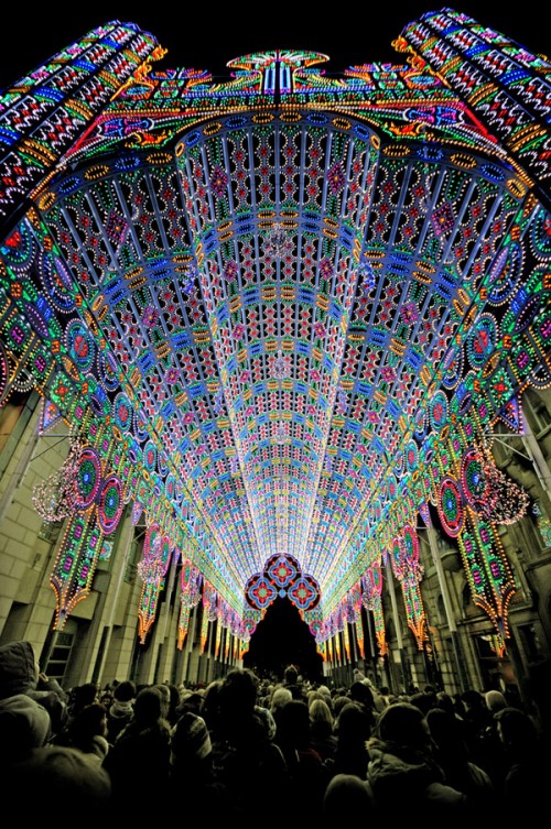
So this is how they get people to go to churches these days. Height visualization.
via: http://www.neatorama.com/2012/01/31/the-cathedral-of-light/
Natalie Jeremijenko’s Tree Logic at the Massachusetts MOMA
via: http://www.massmoca.org/event_details.php?id=29

Comments Off on HeatherKnight – LookingOutwards2
by ju @ 9:04 am 31 January 2012


Above is a visualization done by Burak Arikan and Ben Dalton. This work aims to explore the effect of the fashion system by creating a micro fashion network with the basic elements color and time. In the project, similar colors connected to each other form a large color network over time. I love this project how it creates such a beautiful image at the same time it contains useful data of fashion network. I think that a data visualization is better to output attractive images, and I am inspired by this one in creating my project 2.

[vimeo=http://vimeo.com/3912251]
One of projects in the exhibition, Terre Natale, Exit 2 is a data visualization of global immigration rates. This project immerses the viewer in a dynamic presentation of data documenting contemporary human movement. For the project, the viewer enters a circular room and is surrounded by a panoramic video projection of a globe which rolls around the room printing maps as it spins. This project it built for exhibition, seeking for a way to interact with viewers. In this way, viewers can comprehend the data set of global immigration rates more easily and quickly.
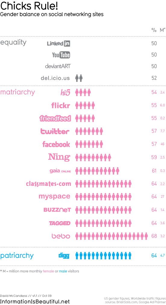
Who rules the social web? is one of the projects from ‘Information is Beautiful.’ I like most of works from them, and this one is just an example to demonstrate their ideas and missions. They literally encourage people to use data and create own design for make information beautiful. In the blog, http://www.informationisbeautiful.net, anyone can find data sources and project ideas easily. I personally find this useful, so I wanted to share it with people.
Comments Off on Ju Young Park – Looking Outwards
by duncan @ 8:47 am
The Virtual Choir
The Virtual Choir isn’t a traditional data visualization project – the project was created by conductor/composer Eric Whitacre in order to show hundreds of simultaneous singers performing his work, even though each track was recorded asynchronously. Although it could be considered a music video, seeing so many singers performing together, yet on their own, with the beautiful visualization is very awe-inspiring.
The project is rich in data, and I can imagine that the process of editing, synchronizing, and compositing all of the videos with all of the effects was an immense undertaking. But the project also has a lot of personal meaning for the singers involved, and there’s even a global visualization for where the singers came from. I’m sure there are plenty of other interesting ways to visualize and experience all of the singers’ videos other than for the sake of a balanced performance – the first thing that comes to mind would be blending/morphing the faces and voices of similar voice parts, to create an “average” voice part. It’d be very interesting to try to search for all of the original YouTube video auditions and recombine them in such a manner.
You can watch the video of the second Virtual Choir here:
[vimeo=22960177 width=550px]
Planetary
Planetary is an iOS app that visualizes a user’s music library as a planetarium of sorts, where each artist is represented as a star, albums are planets, and tracks are moons.
It didn’t take long for the bloom.io team to translate the relationships within a music library to the concept of celestial bodies, but the most interesting part of their work is the effort that went into optimizing and beautifying their display. I can completely see how they started off completely in 2D with only primitive graphics, but reading about the progression from 2D to 3D, stars to planets, and seeing the final visualizations of planets was very inspiring.
After only seeing their progression, however, it’s hard to get a sense of how well the planetary analogy works for browsing a music collection. Throughout my years of seeing documentaries and educational videos of planets and galaxies, seeing stars rush past and orbiting bodies inspires an immediate sense of scale and exciting exploration. Being able to look at music in a more emotional way seems like a great way to explore music just for the fun of it.
You can check out a video demo here:
[vimeo=23168163 width=550px]
Comments Off on Duncan Boehle – Looking Outwards 2
by sankalp @ 6:18 am
Project 1:

This is “Colours in Culture” by David McCandless and AlwaysWithHonor.com and it is just stunning. Why? Well because it makes information about color connotations around the world beautiful. The idea, I believe, is to demonstrate what different colors mean to different cultures across the globe. To visualize this, he uses orientation of concentric circles and a simple grid system of numbers and letters to tie various cultures to numerous colors and their corresponding emotional responses. I find this use of grid most interesting because I personally would never have thought of overlapping shapes to form a bigger grid system. If I were to change anything, it would only be to help minor aesthetic grievances I have with the centering of the circle and the margins on all edges.
Project 2:
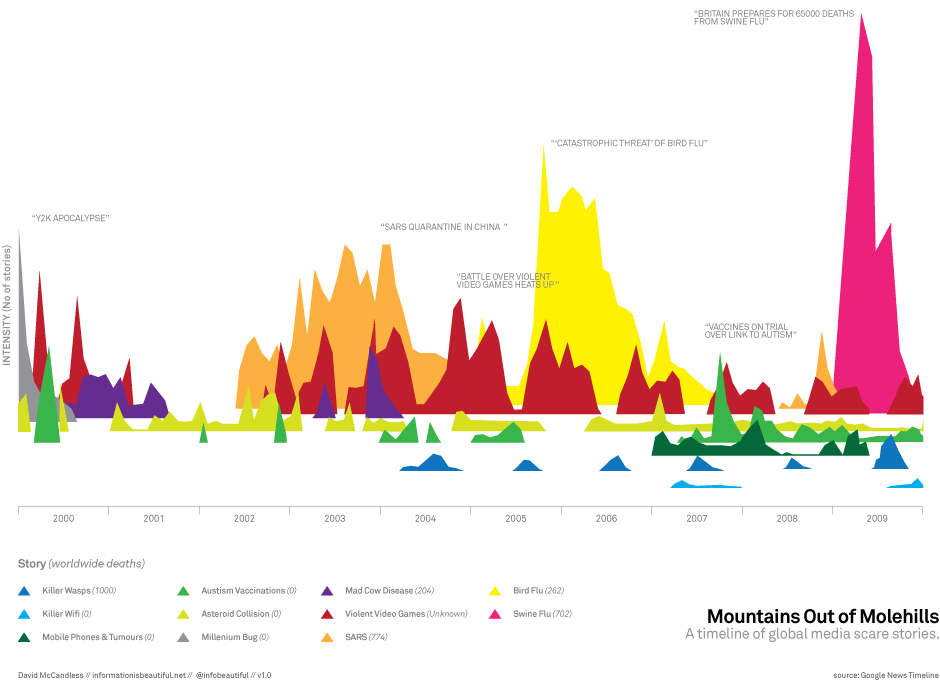
This is “Mountains Out of Molehills” by David McCandless. I really found this interesting mostly because of the information it conveyed. The idea behind the visualization is to portray major media “scare tactics” via google tracking of articles with a given number of “deaths” and a given “scare sory”. For instance, Swine flu was reported to have caused 65,000 deaths and thus was colored in Pink and linked during that time to this graph of sorts. What I found interesting is that it really plays with 3D shifting of a “base” for graphs. All of these patterns could have been viewed all smushed into a 2d realm and been quite confusing, but McCandless sort of shifts the angle of sight for the user and I admire that. If I had to change anything, I’m not sure I’d leave the entire top left so blank. I mean, I get that not everything in the image should be covered, and that that left white area sort of shows the intensity of the right pink area just by contrast, but it is a bit unappealing to me, personally.
Project 3:
http://www.onehourpersecond.com/
Okay. Wow. Let me just say. Youtube is officially awesome. It seems that they created this site with Punk & Butler, Alex Eben Meyer, Justin Young, and Use All Five. Before I go into what I like, let me just state for the record, before this site, I had never thought of time based info graphics before seeing this. Now, having said that, I was truly drawn to the concept presented because I was “curious” about how YouTube could possibly visualize periods of uploads in relation to other events. After the first few seconds or so, I was hooked. I attribute this to YouTube’s ability to make me, the user, curious or sort of compete with people I know (as to how long we can watch this visualization for). I mean, ultimately, the site informs you of directions as to speed up the process, but up until and even after that point, I felt drawn to this. If I had to change something, I’d perhaps give more of an introduction into the “visualize me” part of the site. I didn’t quite know what to expect, and I’m honestly not sure if I liked it that way–at least in the beginning. Ultimately, I caught on and wow! time based infoviz’s are great!
Comments Off on SankalpBhatnagar-LookingOutwards-2
by varvara @ 2:34 am
I chose the two following projects, which happen to come from the same design studio, because they deal with form generation; the first, maybe not that explicitly, visualizes form that otherwise is invisible and the second grows form by “growing” data.
Onformative, 2009, Experimental data visualization: Growing Data
project’s web page: http://www.onformative.com/work/growing-data/
Growing Data is a research project that examines how real processes and structures can be used to create an alternative form of data visualization. The project uses a plant growth algorithm and experiments on the possibilities of visualizing the air quality in various large cities. Various data, coming from data bases for large cities, is assigned to variables that control life span, density and speed of growth in the algorithm. The algorithm is based on an agent model in which various agents are controlled by Brownian motion and are influenced in their movement by the various variables. What I find interesting about this project is that it does not focus on visualizing the precision of the data but rather on letting new formal structures to emerge which tell their own story and are open to interpretation by the observer.
Onformative, 2011, Immaterials – the form of meta data
project’s web page: http://www.onformative.com/work/immaterials/
This project is about visualizing the immaterial. About suggesting ways to visualize the electro-climate of a space, electromagnetic fields of data. The project is not based on real data but on visualizing in space the fictional illustrations by Ingeborg Marie Dehs Thomas who who interprets the spatial expansion of radio waves. The visualizations were created using the procedural light painting technique, employing a projector, a distance sensor and a camera set to longtime exposure.
Immaterials – Data between visibility and invisibility

Below, the visualizations of electromagnetic fields by Ingeborg Marie Dehs Thomas.

Anatoly Zenkov, IOGraph (formerly known as MousePath)
IOGraph is an application that visualizes mouse movements over time. Visualizing the invisible again! It is interesting to see what patterns and structures may emerge out of the overlaying of the multiple traces.

Comments Off on VarvaraToulkeridou-LookingOutwards-2
by madeline @ 2:08 am
Data Visualization |
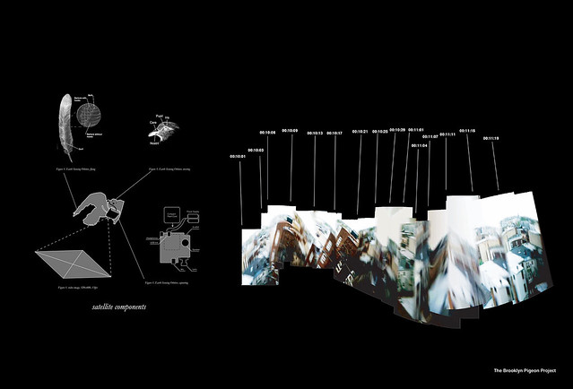
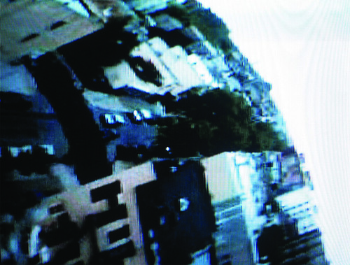
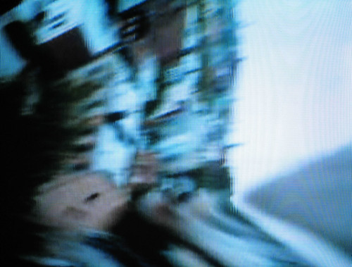
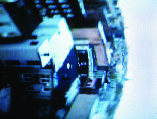
Brooklyn Pigeon Project by Aranda/Lasch
BPP presents a novel technique for recontextualizing urban cartography: mapping how a flock of birds navigates the city. A flock of trained homing pigeons were sent off from Brooklyn with video cameras, microphones, and GPS devices attached to their backs. The data was then wirelessly transmitted and recompiled into a kind of ‘satellite image’ that emphasizes an off-the-grid representation of the city.

Best Friends by Colin Pinegar
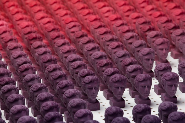
In Best Friends, Colin Pinegar decomposes the network representation of his facebook friend connections into a gradient of relationships. Colored wax busts were cast from an identical silicon mold to denote the level of intimacy with a ‘friend’ (purple being the most intense, and pink being the least…)


Comments Off on MadelineGannon-LookingOutwards-2