On the topic of new-media arts & design, here are a few projects I’ve discovered over the past few days that intrigue and interest me.
A project I admire
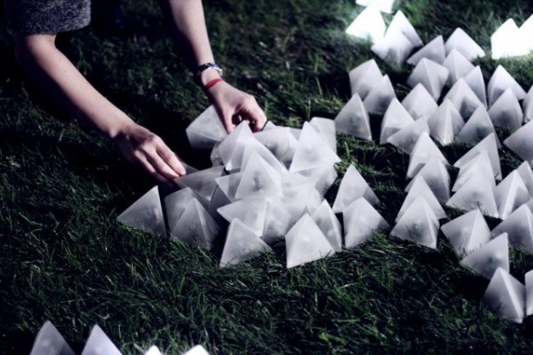
Photo from panGenerator, the Polish new media collective that created Constellaction
Constellaction is an installation piece that demonstrates “intricate emergent behavior using autonomous building blocks”. There are multiple translucent tetrahedrons that contain tiny light-detection photoresistors, batteries, and microcontrollers. The tetrahedrons emit light and sound when they detect nearby changes in light intensity. The demo video shows viewers sparking a reaction from the cubes with a flashlight or phone, producing this light wave as tetrahedrons react to the light and send their neighbors into a reaction as well.
I love this project because it shows a very playful kind of interaction design—you manipulate these small blocks in a kind of children’s-toy-arranging way, and through exploration develop an understanding of the mechanics of the blocks. It looks really delightful and fun to play with. I feel the combination of reactive lighting-up and the small sounds seems to give the tetrahedrons a bit of life & character.
I think this is really well-executed, but would have loved to also see some kind of “sound gradient” over the course of the light wave—e.g. the sounds emitted by the tetrahedrons produce some kind of melody or change slightly (rising in volume and then decreasing?) over the course of the light wave. I suspect if each tetrahedron acts as an independent unit, though, it would be a little difficult to process ambient sound and determine the change in sound for each successive tetrahedron, though.
A project that surprised me
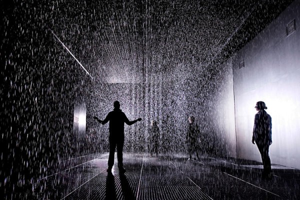
Photograph from Fast Company
The Rain Room installation by Random International (first at the London Barbican, next at the New York MOMA) creates an indoor downpour that visitors can walk through without getting wet. There are eight motion sensors on the ceiling and a few 3D cameras that locate people as they move through the room, and shut off the rain that’s falling above their heads. Here’s a video of it from the Gizmodo writeup:
It seems like a very surreal experience, and the technology creates an experience that feels a little bit impossible. I love the idea of technology being used to create the experience of being a little god-like, or maybe sheltered by an unseen force, or having a kind of magical fairy-tale journey.
A project that could have been great but disappointed me
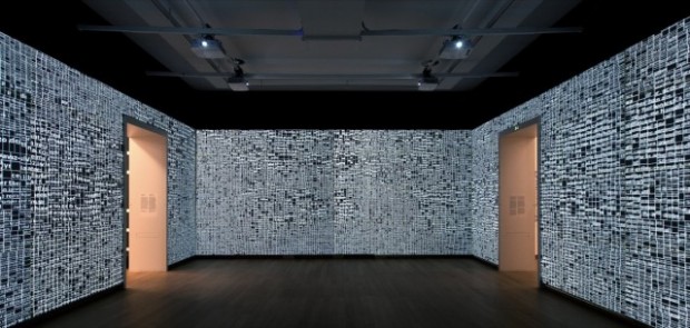
Photo by Gert-Jan van Rooij of the installation at the Stedelijk Museum in Amsterdam.
Type/Dynamics is an interactive typographic installation by the Dutch design studio LUST. It was created to complement the print typography work of designer Juriaan Schrofer (who explored dynamic typography in a lot of his work), so the pieces builds on top of Schrofer’s work and aesthetic sensibilities using new-media techniques—specifically, enormous projectors and Kinect sensors to create a dynamic display. From the Creative Applications post:
The installation visualises information that continuously surrounds us and is always accessible. By searching for real-time locations currently in the news, like “Ground Zero”, “Reichstag”, or “Tiananmen Square”, the installation can locate the panorama images from Google Street View, abstract them into grids and fill the grids with new information. As a visitor to the space, you are ‘transported’ to that location and surrounded by all the news associated with that specific location. Instead of a photographic representation, the place is represented purely typographically with a host of new items currently being talked about at that location. Nothing in the gallery space stands still; all information is dynamic.
I’m relatively used to the idea of gigantic typographic-mural installations, type-as-texture, and interactive typography…but I really liked that in this the individual text blocks of content also shift around and arrange themselves to produce larger words. It’s nice to have different levels of information at different scales—the clearly visible message of the large words from far away, the discreet message of the words that make up each box when you’re close to the wall. However, I feel that there could have been a lot more done to make the type dynamic not just in content/positioning, but in form and visuals.
The installation is intended to complement the static work of Schrofer, which is incredibly colorful, relies on bold patterns, and breaks out of a right-angled typographic grid in all kinds of interesting ways. In contrast, the visual style of Type/Dynamics is pretty cold and clinical. I feel it could have been much better if Type/Dynamics also played with procedural color palettes and shifting color schemes as the text changed, and also had a greater variety of type sizes and faces and styles.
Honorable mentions
One thing I really want to do in this class is expose myself to more physical, electronics-based projects (since a lot of the art & design I consume is digital and purely software-based). But here are some web-based (fancy HTML5/WebGL/<canvas>/&c) projects I found that are also particularly cool:
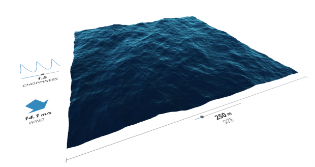
The Waves simulation by David Li allows you to change the wind direction, choppiness, and size of a body of water and observe what the waves look like. I’m sure there’s a ton of behind-the-scenes math & graphics work going on, but the end result is something that’s really beautiful and well-contained. The simulated waves look so good—the color is great, it definitely gives a sense of translucent volume at a great depth, it’s pretty fun to watch in a screensaver-y kind of way.
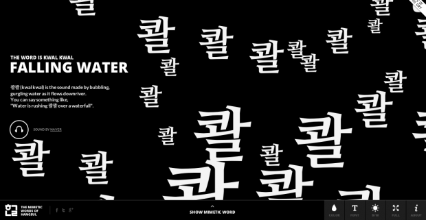
The Mimetic Words of Hangeul project by Jongmin Kim is a really beautiful example of dynamic, expressive typography that represents a certain mood/action/idiom. There are different Korean words that are defined, and the hangul characters for the word are animated in a way that represents the word’s meaning. It’s also a very contained concept, well-defined, and I think the result is really fun and informative in a playful way.