Category Archives: 21-Interactive-Map

MacKenzie Bates

13 Feb 2014

It took a while for me to figure out how to scrape the data and how to use the mesh but after that it went pretty smoothy.

The hotels are plotted based on location with colors representing their rating. Green = well rated, Red = poorly rated, Blue = No rating given.

The user can zoom and rotate and can control what information is displayed on the Z-Axis.

[ENTER] – To view Price on Z-Axis

[SPACE] – To view Rating on Z-Axis

As would be expected we see that those which are more expensive have better ratings. Also amusingly it looks as if America has the worse rated hotels. However it seems like it may just be that far more hotels in the US reported ratings compared to other countries, so those in other countries may not typically report unless the rating is positive.

hotelVis_2 hotelVis_3 hotelVis_4 hotelVis_1

Github: Code

Sama Kanbour

11 Feb 2014

Github

Link

Description for this assignment, I used the Google Map API to visualize the data points. This API comes with a zoom feature and other interesting features that I later discovered while reading the documentation. Given the large amount of data, the rendered graph wasn’t readable at first, therefore I had to implement the sort, filter and search features to enhance user experience. I have made several design choices to group the hotels by proximity. In particular, I used markerclusterer.js which renders the map in a visually appealing and interactive way.

bad

Early stages of the Interactive Map assignment 


Wanfang Diao

11 Feb 2014

map


I used ofCsv addon.  It takes me a lot of time to figure out  I have to clear the “NULL” to overcome the errors in openFramework. What’s more, this project also force me to pick up my middle school geography knowledge to map points to the map picture. I visualize the stars and the position of hotels, if you put your , mouse on it, you will get the latlong.

screen capture video:

Kevyn McPhail

11 Feb 2014

In this project, the goal was to map 500,000 data point, each being a hotel in the world. I knew right off the bat that I was going to have to deal with efficiency with plotting the points, however I wasn’t really sure what or how to plot them. So I went with my instinct and did a little sketch in processing. This helped a lot. It helped me test a the different methods of plotting the points. I ultimately chose to plot a globe and the part that surprised me the most was how the hotels give you rough outlines of countries and continents. I then moved from processing to C++ to gain a little bit of speed with parsing. From there I added the interaction of choosing how far you want to travel, what rating of hotel you want, and your max price. Then plotted in red, the hotels that meet your criteria. The most challenging part of this project was trying to figure out how C++ runs through your code. Initially I was having problems with the interaction where functions were called when variables were called. which was perplexing but I figured out how to make the interaction work. It was a great project!

git

Screenshot (7)

Screenshot (8)

Interactive Map – Constellations

I visualized the ratings of hotels (stars) across the world.

MAP :  acrylc.github.io/constellation

GITHUB :  github.com/acrylc/constellation

The map renders poorly in the iframe below because it is not responsive, I’m working on fixing it. The mapbox layer could be embedded, but I’ve styled the hover over tooltips in javascript so I decided to share an iframe of my webpage instead.

Process

I was very interested in mapping the hotels in the browser because i wanted to see whether it would be possible to map an interactive map of such a large dataset.  I cleaned the csv in the terminal using csvquote and awk for simple data manipulation such as cleaning invalid hotel ratings (there were 200,000 invalid hotel ratings, all of which were set to -1).

I could not use Mapbox’s JS api because the dataset was too large, so I decided to use Tilemill to render mbtiles and upload those instead. The CSV file was too large to upload in Tilemill. Instead, I converted the CSV to a shapefile using QGIS. Bellow is a screenshot of the shapefile in QGIS.

I then played around with styling the markers in Tilemill.

Afterwards, I uploaded the mbtiles to Mapbox. The process was not fun. It used up 600% (?!) of my cpu for 3 hours. Since the upload speed increases exponentially with the number of zoom levels uploaded, I restricted the upload to a small range of zoom levels. I’d like to upload more detailed zoom levels later.

Haris Usmani

11 Feb 2014

map_new

I chose TIleMill (by Mapbox) to accomplish this task- it’s the perfect tool to create beautiful interactive maps in a matter of minutes- turns out that’s not exactly the case. I feel TileMill, even though being the ideal map tool, is still in its development phase. Its application is not stable, and even the examples that came with TileMill tend to crash when the user interacts with it (simple zoom in/out).

Nevertheless, I set out to use TileMill and achieve at least the minimum of plotting these points on top of a world map example. True to the data set provided, I cleaned it up and stored it as a .csv file- kept hotel name, latitude, longitude; removed duplicates/blank values etc. I was able to all this in Excel, which also helped to verify the data although its encouraged to do this using Python or R etc which can handle even bigger data-sets. The problem began when I tried to import this in TileMill- the .csv import would bring it to its knees every time. I figured the next step should be to import the points in parts, so it gradually fills up its memory with those 499000 points. I broke the .csv into aprox. 14 parts, each file about with about 35k points. This way, TileMill accepted 2 sets of data of 70k points but then my RAM peaked and the software crashed. [I’m using Windows 8.1 x64]

crash1_up Next, I tried importing points as a SQLite database- downloaded some tools online, made a database but had a hard time importing it into TileMill- apparently TileMill requires a very specific db format to support SQLite. Later, I learned from Maya that the ideal way to get more points in TIleMill is to convert the CSV to a shapefile using QGIS.

Solution: For the scope of this assignment, I restricted myself to data points in South-Asian countries only. I used “Geography Class” as a base example from TileMill and plotted my points along with dynamically labeling each Hotel point with its Name, Location and URL.

Interactivity:
– Zooming (by default in TileMill)
– Point Size determined by Hotel Stars
– Hover over Point to learn about Hotel Name, Location and URL


Emily Danchik

11 Feb 2014

For my map visualization, I plotted each hotel, and color-coded them so national boundaries could emerge. The map is tilt-, zoom-, and pan-able, so the data can be explored.

When I plotted the points originally, some of the data looked weird. Why were there two different colors representing American hotels? This pattern was visible elsewhere, too.
Screen Shot 2014-02-08 at 9.16.34 PM

I thought I had discovered some amazing pattern about foreign hotel ownership or something, but upon further inspection of the data, I realized that the second color represented hotels without a country listed in the csv. Womp womp.

For the final version, I colored all points without a given country value white, so they’re still kind of visible if you look for them, but not immediately.

I’m having issues with file uploading, so expect sketches soon!

Shan Huang

11 Feb 2014

Hotel facility codes:

TOP 30

56:  Television

6: Car Parking Facilities

3: Broadband Internet Access

202: WiFi Internet

292: Parking (Free)

22:Non-Smoking Rooms Available

21:Air Conditioning Available

41:Premium TV from Cable or Satellite

53:Room with Hair Dryer

2: In-Room Service

209:Full Shower

1: Center for Business Activities

148: Fax Services

136:Photo-copying Facilities

7: Pool Facilities / Swimming

60: Clothes Washing

17: Guest Elevators

8:  Pets Allowed & Encouraged

139: Work Desk

34: Safety Box / Deposit Box

5:Dining Area / Restaurant

19: Laundry Service

51: Hot Beverage Maker

253: Storage for Luggage

49: Business Meeting Area

66: Outside Garden Area

10: Access for those with Disabilities

29: Dining and Banqueting Area

4: Gym / Fitness Area

65: Tours Organized

LEAST 30

(Ignore the first column. They are the numbers of hotels that have the facility. Also I filtered out the codes that have fewer than 50 counts because I found the interpretations were usually inconsistent.)

50 237: Bar / Pub

59 138: Work Desk

75 269: Quick Check In / Out

89 271: Late Check-Out where Available

98 273: Lesbian & Gay Friendly

102 146: Document Binding

104 265: Rooms to Accommodate Families

107 149: Laser printing Facilities

138 248: Bidet Provided

150 216: Dressing Gowns / Robes

158 161: Flip chart Available

182 279: Special Anti-Allergy Room Available

243 105: Kids’ Playground

247 227: Kid Friendly Menu

248 124: Ecological Themed Tours Available

264 177: Bespoke event planning

278 184: Knock Light Facility

307 156: Meeting Manager / Co-Ordinator

369 174: Events & Ceremonies

371 176: Rehearsal Events & Dinners

373 152: Document Scanning

374 91: On Site Nightlife

377 116: Terrain Walking / Hiking

496 110: Wildlife Watching

562 122: Wine Tasting Available

604 89: Facility for Karaoke

616 160: Conference Management

661 150: Ideas Blackboard

703 119: Ice Skating Facilities

717 87: Football Pitch

2

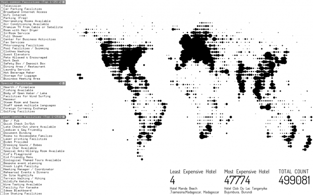
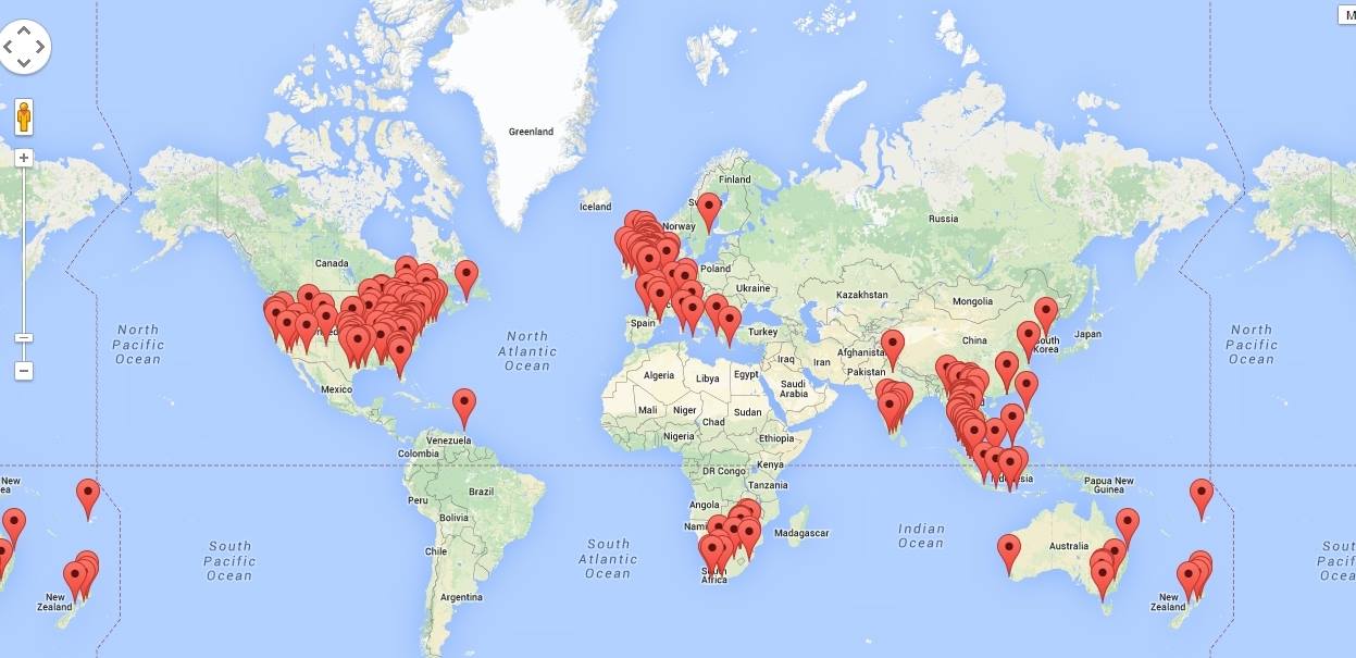
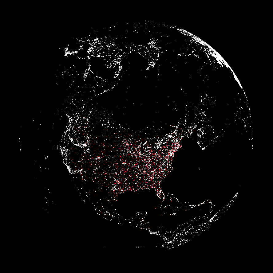
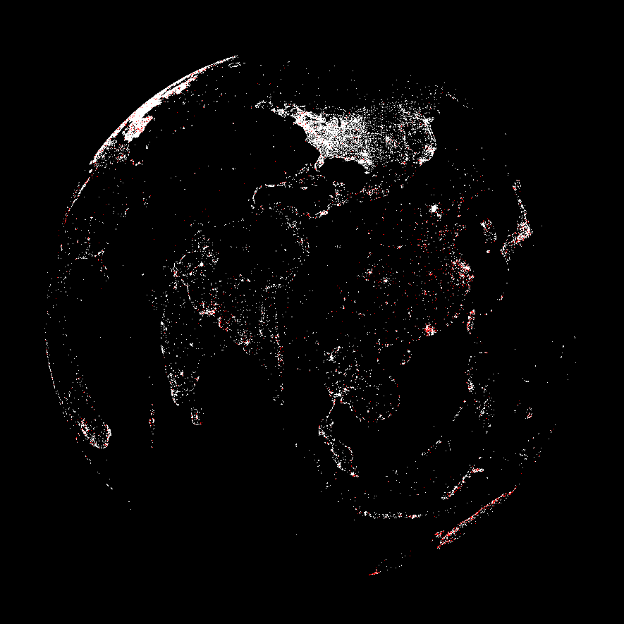
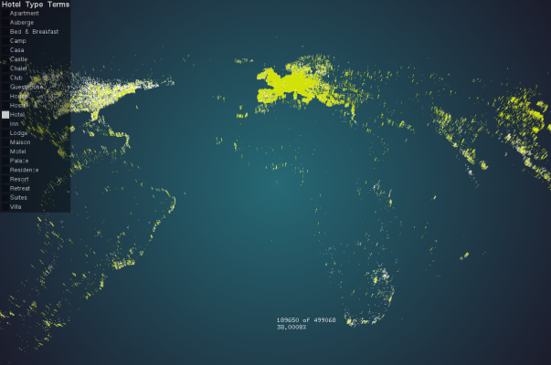
Each point in the map represents the hotels in a particular coordinate range near the point, with size showing the number of contained hotels. This helps limiting the size of the points in Europe so that Europe doesn’t explode into a puddle of black ink. I added toggles for hotel facilities so that you can filter hotels by facilities. The toggles cover the top 25 most common hotel facilities, the top 25 least common hotel facilities and 10 selected facilities that I find particularly interesting.

1
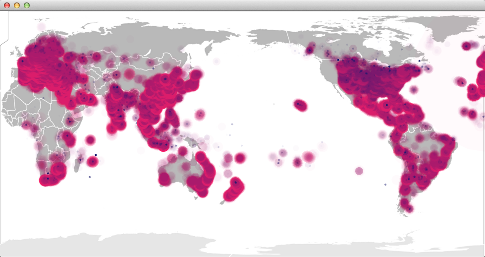
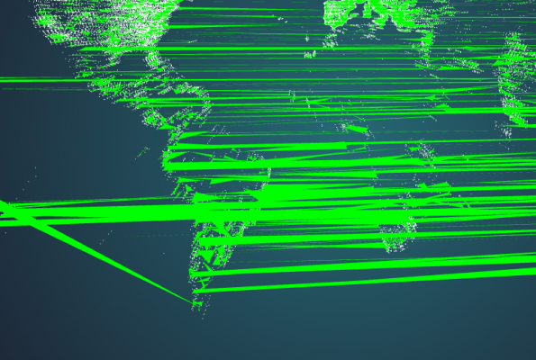
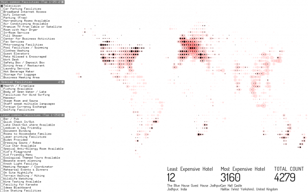
The red areas above shows how many hotels are filtered out after adding the last facility.

To interpret the facility codes that come with the raw data, I visited the hotel pages on hotelsbase.org and manually matched the codes with the text. It was a painful process, worsened by the fact that some code was duplicated or off by one. If I had done the data scraping project first I would totally have parsed the codes with scraped text, but sadly I did it the wrong order…

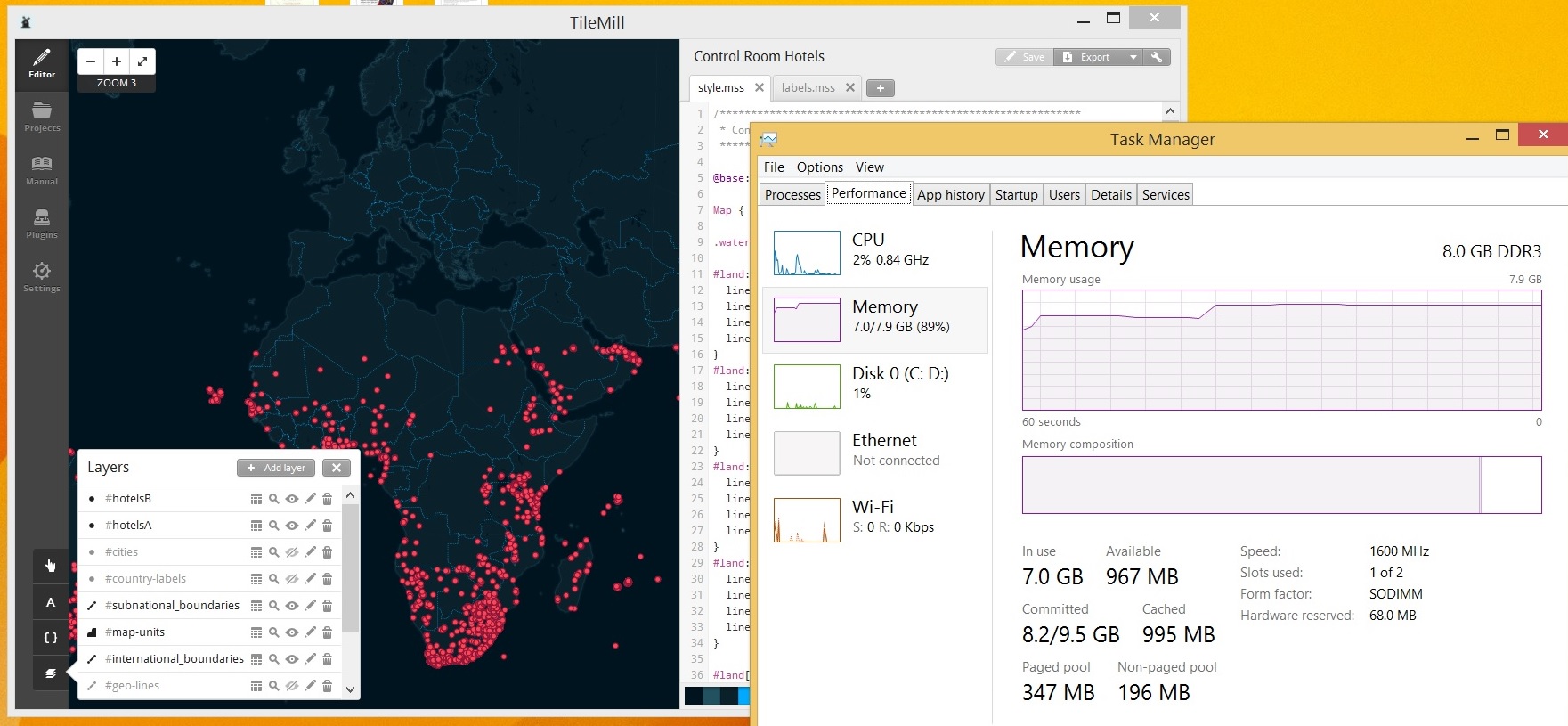
The two plugins I used were ofxUI and ofxCSV. I enjoyed ofxUI a lot. Its UI looks geeky and awesome, although the library lacks fine-grained customization functionalities.


Celine Nguyen

11 Feb 2014

For this project, I became interested in the different terms that hotels use to describe themselves. There’s something very different about staying somewhere advertised as a “Hotel” or a “Hostel” or a “Motel”, obviously, but there’s also some difference in terms like “Villa”, “Retreat”, “Castle”, “Chalet”. So I wanted to explore something very simple: a map where you could filter points by the terminology in the hotel name.

Hotel filter A

I used ofxCSV to parse the Hotelsbase file, after first manually cleaning up the data (removing empty rows). This addon didn’t have great documentation, and the example provided with the addon didn’t immediately work for me. It also took some time to figure out that it worked better if the file was renamed to a .csv instead of a .txt.

Hotel filter B

I briefly experimented with trying to create an adjacency data structure so I could plot lines between vertices near each other (and hopefully explicitly define the shape of countries, since many have hotels dotting their borders). It ended up being really computationally expensive to do so, and my early attempts resulted in the charming but undesirable graphics you see above, so I abandoned this idea.

I only use 4 fields when visualizing the hotels: latitude, longitude, hotel name, and stars. The number of stars is used as the z-position of the points, so “better” hotels float above the mediocre or even bad hotels. The other hotel fields were less immediately interesting/useful, or were indecipherable, or had incomplete information across all data points. I was interested in the facilities field, but couldn’t find a reliable source for what the data meant. The fields were cryptically formatted like: 2|3|5|9|13|20|22|31|34|40|53|59|60|65|66|72|108|202|203|209|210|211|.

For my final version, I used ofxUI to provide an interface to toggle different kinds of hotel terms and see. The addon has an incredible set of examples, so it was fairly easy to get it working.

Hotel filter C

At the bottom of the screen is printed a percentage and count for the number of hotels that have the selected term in their name. I also ended up utilizing ofEasyCam to allow users to scroll in and out, but the camera controls are a little wonky (especially with a touchpad), so I’m still fiddling with that a bit.

It’s actually very interesting to see the countries where particular terms are prevalent. “Suites” is exclusively a US phenomenon, “Castle” is the domain of the UK. “Casa” can be found in Spanish-speaking areas, and also a good amount of Italy.

I also learned an important lesson about Git in the making of this project. The Hotelsbase file is 132mb long, and Github’s maximum file size is 100mb.  It turns out that when you push a file to Github, it also attempts to upload the history of files in previous commits. This is generally sensible and convenient unless you have a file you want to ignore entirely from the version control standpoint (or exclude so Github will accept your repo’s push). I forgot to add hotelsbase.csv to my .gitignore early on, so the history of my commits had this enormous file that was trying to push to the Github servers. There are a few wonky ways to clear a file from your commit history, but I honestly ended up going with the “nuke-everything” option and just recreating my Git repo in order to get the code online.

You can see the repository here.

Ticha Sethapakdi

11 Feb 2014

0 1 2


The locations of the dots were determined by the x-y coordinates of the hotels, the colors were determined by the hotel prices (blue -> green = less expensive -> more expensive), and the heights were determined by the length of the hotel name.

I was not entirely sure how to visualize the map in an interesting way (information visualization isn’t my strong suit), so I decided to take a simpler approach to the visualization and was more concerned about observing the relationships between variables. I am someone who is fascinated by patterns, so I wanted to use the map to determine whether two seemingly unlike attributes of the hotel were correlated with each other in any way. Thus I decided to compare price with the length of the hotel name. I hypothesized that longer hotel names would have higher prices (because they tend to be more exotic / ‘fancier’)–and it turned out that the data actually seemed to support that theory (somewhat). Another interesting–but unsurprising–find was that Thailand has the hotels with the longest names, whose data points tower well over the rest.

Github code here.