Monthly Archives: May 2014

Afnan Fahim

26 May 2014

ScreenShot002

This post documents the final project carried out by Sama Kanbour and Afnan Fahim.

Couplets
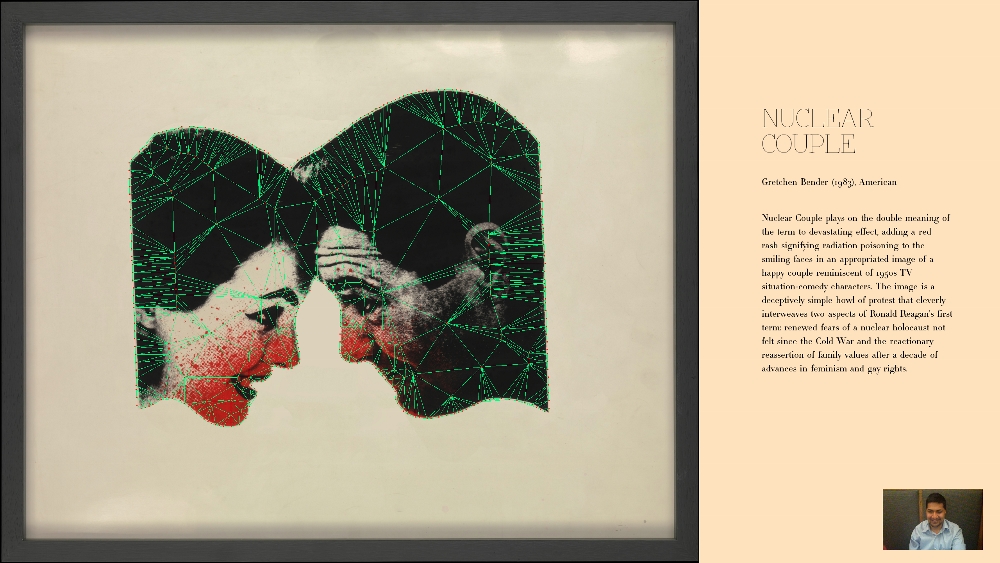
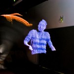
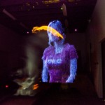
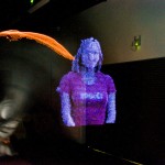
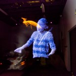
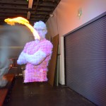
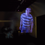
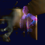
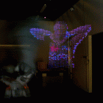
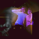
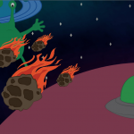
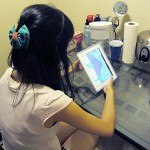
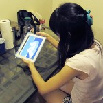
For our final project, we built a way for people to interact with artworks using their face as a puppeteering tool. Visitors to the project use their face to distort and puppeteer images of male/female “couples”. Each half of the user’s face controls one member of the couple.

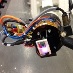
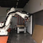
We found the couples by exhaustively searching the online image archives made available by the Metropolitan Museum of Art. We then edited these images using Photoshop to make the edges of the couples clear, and then used computer vision techniques to find contours of the bodies and/or faces of each of the couples. We then triangulated the couples, and built puppets from the resulting mesh. We then used a face-tracker to detect the facial expressions of the user, and then used this data to control the couples’ puppets.

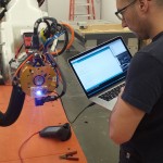
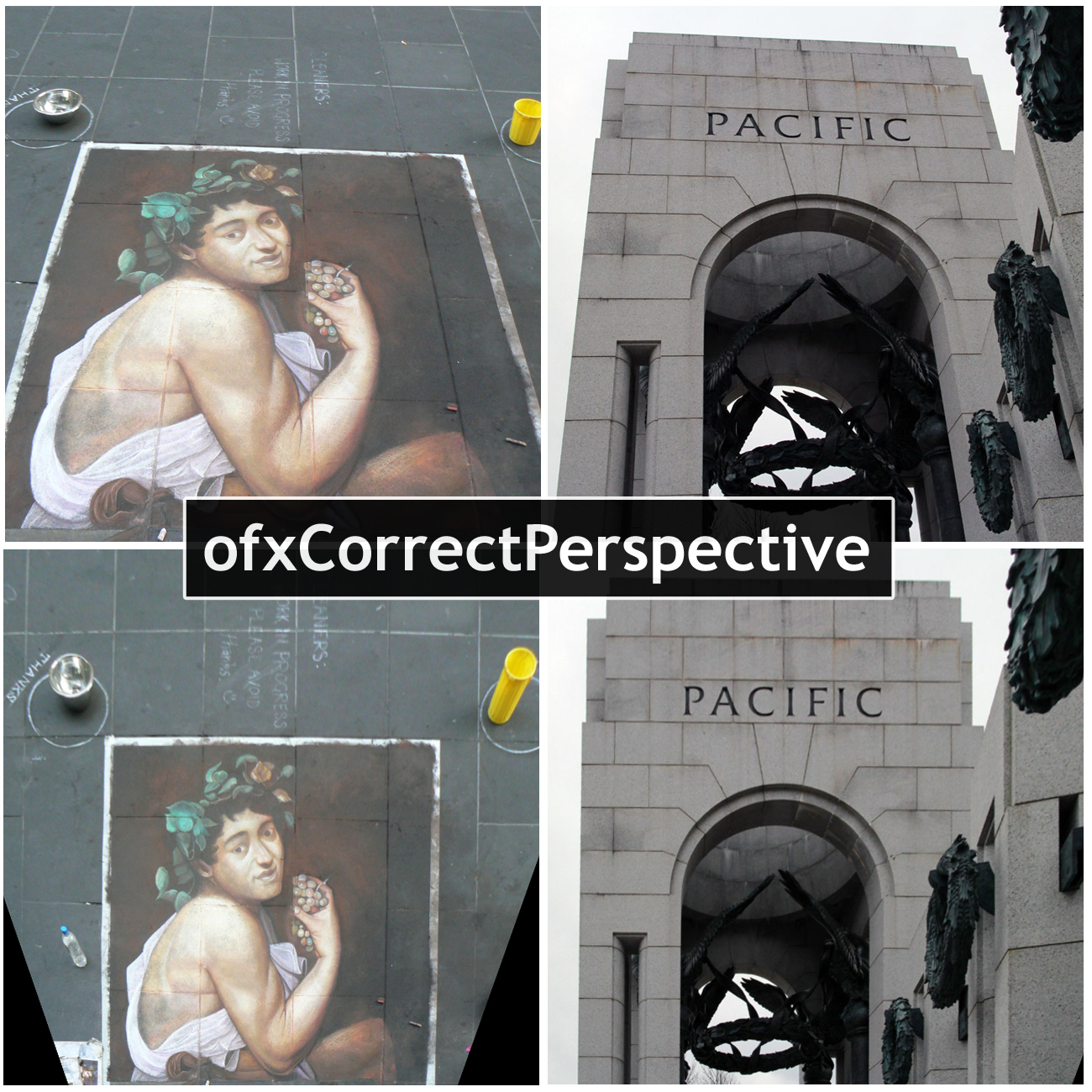
The project was built with the openFrameworks arts-engineering toolkit, and various addons including ofxCV, ofxDelaunay, ofxPuppet, and ofxFaceTracker. Source code for the project is available here: https://github.com/afahim/Mimes

Tweet:
We brought couples from the Met museum back to life.

Abstract:
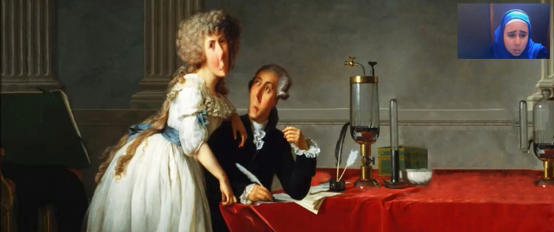
This interactive art piece brings fourteen couples from the Metropolitan Museum back to life. It allows people to discover the stories of different couples in history. Viewers can animate facial expressions of these couples by use of puppeteering. The left half of the viewer’s face puppeteers the male partner, while the right half of the face puppeteers the female partner. By using the two halves of their face, the viewer can simulate the conversation that was potentially happening between these couples back in history.

Narrative:
This interactive art piece brings fourteen carefully selected couples from the Metropolitan Museum of Art back to life. It allows people to discover the stories of different couples in history. Viewers can animate facial expressions of these couples by use of puppeteering. The left half of the viewer’s face puppeteers the male partner, while the right half of the face puppeteers the female partner. By using the two halves of their face, the viewer can simulate the conversation that was potentially happening between these couples back in history.

We desire to make historical art more tangible and accessible to today’s audience. We hope to help garner meaningful interactions between the audience and our selected artwork, and perhaps interest the audience to learn more about the artwork presented.

The piece was built using OpenFrameworks. We used Kyle McDonald’s ofxFaceTracker to detect the viewer’s facial features; ofxCV and ofxDelaunay for creating a mesh out of couples; and ofxPuppet to animate their expressions. Oriol Messia’s prototypes helped kickstart the project. The artworks were handpicked from the Metropolitan Museum of Art’s online Collections Pages. The project was carried out under supervision of Professor Golan Levin, with additional direction by Professor Ali Momeni.

Video: 
Couplets :  https://vimeo.com/96155271

ScreenShot (1000x563)

Wanfang Diao

16 May 2014

Windsound1

tweet

Motion Sound :  Transferring kinematics models to sound.

Overview

Motion Sound is an installation that can make sound  based on its motion.  Kinematic models (gravity, inertia, momentum) help us create a continuation of our gestures, it is a duplication of people’s gesture goes on into the future. My idea is make it to be heard.  In this project, I made a wooden bell shape pendulum. When people touch it, different sound can be triggered based on its motion.

A Longer Narrative:

When I study kinematics, I learn a lot of patterns. I always feel that there is a tight relationship between physics and sound. This idea is also inspired by Mitchel Resnick’s  BitBall  of “digital manipulatives”.

On other hands, kinematic models (gravity, inertia, momentum) help us create a continuation of our gestures, it is a duplication of people’s gesture goes on into the future. What if I can make it be heard?

My first prototype is use touchOSC app in iphone connect to max/msp to get the data of iphone’s accelerometer data and map them to sound. I 3D print a tumbler holder for iphone. Here is the video:

In the final version, I chose pendulum as kinematics model. In the hardware part, I used ardunio Nano as controller and wind sensor and accelerometer to collect data. Programming part, I used Mozzi, a sound library for arduino to design the sound effect. After some experiments, my final prototype’s sound effect sounds like a e-wind chime__ 2 (7)

I lathed a wooden bell shape shell for arduino, sensors and the speaker.

__ 1 (5) __ 2 (6)


__ 1 (6)


Joel Simon

15 May 2014

I made this last week and forgot to post it here http://www.joelsimon.net/fb-graffiti.html

Tweet : “A Chrome Extension that allows any post or photo on Facebook to be publicly drawn over.”

Blurb:

FB Graffiti is a chrome extension that exposes every wall post and photo on Facebook to graffiti. 

All drawings are:

  • Public (for everyone else with the extension).
  • Anonymous (completely).
  • Permanent (no undo or erase options). 

The purpose of FB Graffiti is twofold. First, to enable a second layer of conversation on top of Facebook. The highly controlled and curated nature of conversations on Facebook is not conducive to many forms of conversation and also not analogous to real ‘walls.’ For better or worse, anonymous writings allow this.
Second, it allows any image to be a space for collaborative art that is deeply connected to its context (the page it is on and the content it is on).  Wandering Facebook can now be a process of discovery, coming across old artworks and conversations scattered across all of the site.

Narrative:

I went through a lot of ideas for this project and a lot of uncertainty if I would find a project I liked. I wanted something that would be an online tool that could be sharable and involve facebook. This was, of course, after spending 2 weeks on the faceboook phrenology idea and 2 weeks before that on an online collaborative sculpture program. Each of those ideas actually had decent progress, including full ngram generation from all fb messages for the phrenology idea. I had the idea to create a full 3d living creature that would be built out of your fb div elements using webgl css3d rendering.  Once I got complete control of facebook in 3d I got really excited because I knew that had not been done before and I had just stumbled into a lot of potential. After working through some 3d ideas such as a museum generator or games I realized that 3d was actually holding me back since it was a lot of complexity for not much gain (the internet is in 2 dimensions for many reasons). I realized I had been distracted by the technics of implementation and had to go back to the meaning of what I was doing. I gave myself the restriction of still using facebook otherwise I was at step 0.

I decided to look at the basic analogies of facebook and try to build from there. That’s when I began to think about the ‘wall’ analogy and how to expand it. I thought about poster covered walls and how those are different than their virtual counterpart. I had also recently watched a documentary about graffiti and its history in NY which a good way to ground my thinking in the history of graffiti.

Our walls on facebook are very curated, polished and non anonymous. All of these descriptors are polar opposites the ‘real’ walls which are exposed, unprotected and anonymous places. I wanted to bring that vulnerability of the real world to facebook. Obviously the quality of the content is going to be mostly poor (penises). However, by giving it to members of this class on the first day I was able to see a lot of really great content come out of it. I am totally ok if only  a minority of the pieces are creative collaborative works if the rest of them are still fun and non-destructive.

I have been working hard the last two weeks to improve it. I redid all the logging yesterday to use a dedicated database and have been working hard to try and have the ability to share the drawings directly from FB. There are a lot of technical challenges there. I look forward to improving FB-Graffiti all summer.

Jeff Crossman

15 May 2014

Banner

Tagline
Industrial Robot + a LED + Some Code = Painting in the physical world in all 3 dimensions

About the Project
Light painting is a photographic technique where light is moved in front of a camera taking a long exposure. The result is a streaking effect that resembles a stroke on a canvas. This is usually accomplished using a free moving handheld light source which creates paintings with lots of arcs and random patterns. While some artists can achieve recognizable shapes and figures in their paintings, they usually lack proper proportions and appear more abstracted due to the lack of real-time visual feedback while painting. Unlike traditional painting, the lines the artist makes does not persist in the physical space and is only visible using a camera. Recently, arrays of computer controlled LEDs placed on a rigid rod have allowed for highly precise paintings, but only on a single plane.

Industrial Light Painting is a project that for the first time aims to merge the three-dimensional flexibility of a free moving light with the precision of computer controlled light source. Together, these two methods allows for the creation of highly accurate, in both terms of structure and color, light paintings in full three-dimensional space. As in a manufacturing environment, an industrial robot replaces the fluid, less precise movements of a human with highly accurate and controlled motions of a machine. The automated motions of the industrial robot solves the problem of lack of visual feedback to the artist while painting in light, by allowing him or her to create the painting virtually within the software used to instruct the robot as well as the light attached to it.

How it Works
Industrial Light Painting creates full color three-dimensional point clouds in real space using an ABB manufactured IRB 6640 industrial robot. The point clouds are captured and stored using a Processing script and a Microsoft Kinect camera. The stored depth and RGB color values for each point are then fed into Grasshopper and HAL, which are plugins to Rhino, a 3-D modeler. Within Rhino, toolpath commands are created for the industrial robot which instruct the arm how to move to each location in the point cloud. Custom written instructions are also added to make use of the robots built-in low-power digital and analog lines which run to the end of the arm. This allows for precise control of a BlinkM smart LED which is mounted at the end of the arm along with a Teensy microcontroller.

Using DSLR cameras set to capture long exposures, the commanded robot movements along with precise control over the LED recreate the colored point clouds of approximately 5,000 points, within about a 25 minute period.

Result Photos

GIFS!
gtony

Process Photos

About the Creators
Jeff Crossman is a master’s student at Carnegie Mellon University studying human-computer interaction. He is a software engineer turned designer who is interested in moving computing out of the confines of a screen and into the physical world.
www.jeffcrossman.com

Kevyn McPhail is a undergraduate student at Carnegie Mellon University studying architecture. He concentrates heavily on fabrication, crafting objects in a variety of mediums pushing the limits of the latest CNC machines, laser cutters, 3D printers, and industrial robots.
www.kevynmc.com

Special Thanks To
Golan Levin for concept development support, equipment, and software.
Carnegie Mellon Digital Fabrication Lab for proving access to its industrial robots.
Carnegie Mellon Art Fabrication Studio for microcontroller and other electronic components.
ThingM for providing BlinkM ultra bright LEDs

Additionally the creators would like to thank the following people for their help and support during the making of this project: Mike Jeffers, Tony Zhang, Clara Lee, Feyisope Quadri, Chris Ball, Samuel Sanders, Lauren Krupsaw

Haris Usmani

14 May 2014

banner_ofxCP

Tagline
ofxCorrectPerspective: Makes parallel lines parallel- an OF addon for auto 2d rectification

Abstract
ofxCorrectPerspective is an OpenFrameworks add-on that performs automatic 2d rectification of images. It’s based on work done in “Shape from Angle Regularity” by Zaheer et al., ECCV 2012. Unlike previous methods of perspective correction, it does not require any user input (provided the image has EXIF data). Instead, it relies on the geometric constraint of ‘angle regularity’ where we leverage the fact that man-made designs are dominated by the 90 degree angle. It solves for the camera tilt and pan that maximizes the number of right angles, resulting in the fronto-parallel view of the most dominant plane in the image.

image1_ofxCP-c

2d image rectification involves finding the homography that maps the current view of an image to its fronto-parallel view. It is usually required as an intermediate step for a number of applications- for example, to create disparity maps for stereo camera images, or to make projections over planes non-orthogonal to the projector. Current techniques of image 2d rectification require the user to either manually input corresponding points between stereo images, or adjust tilt and pan until a desired image is obtained. ofxCorrectPerspective aims to change all this.

How it Works
ofxCorrectPerspective
automatically solves for the fronto-parallel view, without requiring any user input (if EXIF data is available, for Focal Length and Camera Model). Based on work by Zaheer et al., ofxCorrectPerspective uses ‘angular regularity’ to rectify images. Angle regularity is a geometric constraint which relies on the fact that in structures around us (buildings, floors, furniture etc.), straight lines meet at a particular angle. Predominantly this angle is 90 degrees. If we know the pairs of lines that meet at this angle, we can use the ‘distortion of this angle under projection’ as a constraint to solve for the camera tilt and pan that results in the fronto-parallel view of that image.

In order to learn about these pairs of lines, ofxCorrectPerspective starts by detecting lines using LSD (Line Segment Detector, RG von Gioi et al.). It then extends these lines, for robustness against noise, and computes an adjacency matrix. This adjacency matrix tells us what pairs we should consider, as pairs of lines ‘probably’ orthogonal to each other. After finding these probable pairs of lines, ofxCorrectPerspective uses RANSAC to separate the inlying and outlying pairs. An inlier pair of lines is one which minimizes distortion of right angles for all prospective pairs. Finally, the best RANSAC solution tells us the tilt and pan required for rectification.

image_small_ofxCP

Possible Applications
ofxCorrectPerspective
can be used on photos, similar to how you’d use a tilt-shift lens. It can compute rectifying homography in a stereo image, to speed up the process of finding disparity maps. This homography can also be used to correct an image projected using a projector that is non-orthogonal to the screen. ofxCorrectPerspective can very robustly remove perspective from planar images, such as a paper scan attempted by a phone camera. It produces some interesting artifacts as well for example, it modulates a camera tilt or pan as a zoom (as shown in the demo video).

image2_ofxCP-c

Limitations & Future Work
ofxCorrectPerspective
works best on images that have a dominant plane, with a set of lines or patterns on it. It also works on multi-planar images but usually ends up rectifying one of the visible plane, as ‘angle regularity’ is a local constraint. One approach to customize this would be to apply some form of segmentation on the image, before running it through this add-on (as done by Zaheer et al.). Another approach could be to allow the user to select a particular area of the image, as the plane to be rectified.

About the Author
Haris Usmani is a grad student in the M.S. Music & Technology program at Carnegie Mellon University. He did his undergrad in Electrical Engineering from LUMS, Pakistan. In his senior year at LUMS, he worked at the CV Lab where he came across this publication.
www.harisusmani.com

Special Thanks To
Golan Levin
Aamer Zaheer
Muhammad Ahmed Riaz

Chanamon Ratanalert

14 May 2014

tl;dr
– this class is awesome, you should take it
– nothing is impossible/just try it regardless
– be proud of your projects

As my junior year draws to a close, I look upon my semester with disdain. Though not because I hated this semester, but rather I am saddened by its finish. I never would have thought that I could come so far in the three years I’ve been in college. I thought my “genius” in high school was my peak. I thought it was good enough—or as good as it was going to get. This course has brought that potential much higher—way beyond what I could have ever imagined I was capable of. And I don’t mean this in terms of intelligence. The experiences I’ve had in the past three years have brought my perseverance potential light years beyond what I could have had if I didn’t go to this school and push my way into this class’ roster.

What have I learned from this course you may ask? The main takeaway I received from this class that I’m sure was intentionally bludgeoned into all of us, was that whether or not something is impossible, you should just try it. The possibility of achieving your goals, believe it or not, increases when you actually reach for them. This mentality has produced amazing projects from the course’s students that I could never have thought to witness right before my eyes. I always felt that those amazing tech or design projects I saw online were like celebrities: you knew they grew from regular people, but you never thought you’d see one in the same room as you.

I will also forever take with me the idea that how you talk about your project is just as important as the project itself. This seems obvious and you’d think that you’ve talked up a project enough, but, as it can be seen with some of my peers’ projects this semester: the right documentation and public potential you give your project can make a world of difference.  How you present a project will determine how it will be perceived. That self-deprecating thing that most people do when they talk about themselves to garner “oh psh, you’re great”s and “what are you talking about, it’s wonderful”s doesn’t work too well for most projects. Looking down upon your own project will make others look down upon it too, and not see it for what it is at that moment. Sure, often times your project might actually stink, but you don’t want others to know that.

You also have to be careful about how much you reveal about your project. You may think that the technical aspects of how many programs are running in the backend or how many wires you needed to solder together is interesting, but it’s really not. If someone looking at your project cares in that much detail, they’ll ask. You have to present your project for what it is at the moment someone sees it, not what it was a couple hours ago while you were booting it up. It’ll be important to say how you created the project (especially if it was in a new and interesting way), but the extra details might be better off left out. But I digress.

I value this course in more ways than I can describe. Let’s just say that I’m very thankful to have been scrolling through CMU’s schedule of classes on the day just before Golan picked his students. Luck could not have been more on my side. Of course, after the class started, luck was no longer a factor—just hard work. And I’m glad to have needed to put in all that hard work this semester. Without it, I would not have realized what great potential there is inside of me and inside of everyone, for that matter. You always feel like there’s a limit within you so when you think you’ve hit it, you never dare to push past it in fear of breaking. This course has annihilated that fear because I’ve realized that the limit only exists within our minds. Okay, maybe I’m getting a little carried away here, but even so, limitless or not, if there is anything you want to try, just try it.

Chanamon Ratanalert

14 May 2014

bannerSm2

Tweet: Tilt, shake, and discover environments with PlayPlanet, an interactive app for the iPad

Overview:
PlayPlanet is a web (Chrome) application made for the iPad designed for users to interact with it in ways other than the traditional touch method. PlayPlanet has a variety of interactive environments from which users can choose to explore. Users tilt and shake the iPad to discover reactions in each biome. The app was created such that the user must trigger events in each biome themselves, unfolding the world around them through their own actions.

Go to PlayPlanet
PlayPlanet Github

My initial idea had been to create an interactive children’s book. Now you may think that that idea is pretty different than what my final product is. And you’re right. But PlayPlanet is much more fitting toward the sprout of an idea that first lead to the children’s book concept. What I ultimately wanted to create was an experience that users unfold for themselves. Nothing to be triggered by a computer system. Just pure user input directed into the iPad via shakes and tilts to create a response.

After many helpful critiques and consultations with Golan and peers (muchas gracias to Kevyn, Andrew, Joel, Jeff, and Celine in particular), I landed upon the idea of interactive environments. What could be more user-input direct than a shakable world that flips and turns at every move of the iPad. With this idea in hand, I had to make sure that it grew into a better project than my book had been looking.

The issue with my book was that it had been too static, too humdrum. Nothing was surprisingly, or too interesting, for that matter. I needed the biomes to be exploratory, discoverable, and all-in-all fun to play with. That is where the balance between what was already moving on the screen and what could be moved came into play. The environments while the iPad was still had to be interesting on their own, but had to be just mundane enough that the user would want to explore more—uncover what else the biome contained. This curiosity would lead the user to unleash these secrets through physical movement of the iPad.

After many hours behind a sketchbook, Illustrator, and code, this is my final result. I’m playing it pretty fast and loose with the word “final” here, because while it is what I am submitting as a final product for the IACD capstone project, this project has a much greater potential. I hope to continue to expand PlayPlanet, creating more biomes, features, and interactions that the user can explore. Nevertheless, I am proud of the result I’ve achieved and am thankful to have had the experience with this project and this studio.

Shan Huang

14 May 2014

One sentence tweetable version: Stitching sky views from all over Manhattan into an infinite sky stream.

In the process of inspiration searching for my final project, I was fascinated by the abundance of data in Google Street View, a web service that grants you instant access to views from all over the globe. I really enjoyed taking street view tours in places I had never been to, or even heard of, like a lonely shore on the north border of Iceland. But as I rolled my camera upwards, I saw buildings and the sky intersecting at the skyline, and the skyline was extending way beyond the view itself, beyond the street, the city and even the country, the continent. So I was inspired to make some sort of collective sky that creates a journey along a physical or a psychological path.

Scraping

Everything starts with scraping. I wrote some python scripts to query images from the Google Street View Image API and stored metadata such latitude, longitude and panorama id in the filenames. An advantage of Google Street View Image API compared to Google’s other street panorama service is that it auto-corrects the spherical distortion in panorama images. I found it really handy because I could skip implementing my own pano unwrapper. But I had to face its downsides too, meaning the maximum resolution I could get was 640×640 and I had to scrape strategical to avoid exceeding the 25k images/day query quota.

40.7553245~-73.96346984

Typically the sky image I got from each query looks like this. I tried scraping several cities in the world, including Hong Kong, Pittsburgh, Rome and New York, but ultimately I settled on Manhattan, New York because the area had the most variation in kinds of skies (skylines of skyscrapers can look very different from that of a two floor building or a high way). Besides contours of Manhattan sky had the simplest geometric shapes, making shape parsing a whole lot easier. In total I scraped around 25K usable images of Manhattan sky.

QQ20140429-1

Shape parsing

I was the most interested in the orientation of the sky area. More specifically, for each image, I wanted to know where the sky exits on four sides of the image. With the color contour detecter in ofxOpenCv, I was able to get pretty nice contours of skies like this:QQ20140428-14

1 (Contour marked by red dotted line)

From full contours I marked its exits on four sides and computed the direction of the exits. This step gave result like this:

2(Exits marked by colored lines)

These exits helped me in deciding along which axis I should chop the image up. For instance if a sky only had exits on the left and right, I’d certainly subdivide it horizontally. If an image had three exits it would then be subdivided along the axis that had exits on both sides. For four-exit images it didn’t really matter which way to subdivide. And finally, images with one or zero exit were discarded.

3


The above steps resulted in a huge collection of slices of the original images, with metadata marking the exits on each slice. I also computed the average colors of sky and non-sky regions and recorded them in the metadata file. The collection was tremendously fun to play with because each strip essentially became a paint stroke with known features. I had the power to control the width and color of my sky brush at will. My first experiment with this collection was to align all skies with a specific with along a line:

4

In my final video I sorted the images based on color and aligned them along arcs instead of a flat boring straight line. The result is a semi-dreamy, surreal sky composed ball that led people through a psychological journey in New York.


Emily Danchik

13 May 2014

Finding emilyisms in my online interactions.

This post is long overdue, and exemplifies the time-honored MHCI mantra of “done is better than perfect.”

I downloaded my entire Facebook and Google Hangouts history, hoping to find examples of “emilyisms.” By that, I mean key words or phrases that I repeat commonly enough for someone to associate them with me.

Once I isolated the text itself, I read it into NLTK, and used it to find n-grams of words, for combinations 2-7 words long. Then, I put the data into a bubble cloud using D3, hoping to visually find phrases which identify my speech. Here is the result: (you can see the full version here)

big


My original intent was for phrases with fewer words to be lighter colors, and phrases with more words to be darker. This way, I hoped to easily point out phrases which were uniquely mine. Many of the larger circles represent two-word combinations that I use frequently, but are not particularly Emily-like.

I mean, of course I say "and I" a lot

I mean, of course I say “and I” a lot

Through exploring data in the visualization, I did find some interesting patterns. For example, during my in-class critique, it was pointed out that I say “can you” twice as often as I say “I can.” That realization actually helped me shape the rest of my semester here, as silly as it sounds.

There are some definite emilyisms mixed in, but they are not highlighted:

Screen Shot 2014-05-13 at 4.47.01 PM

Screen Shot 2014-05-13 at 4.47.46 PM

Screen Shot 2014-05-13 at 4.48.11 PM

The last picture represents a feature / quirk of NLTK: it knows to analyze conjunctions as two separate words. This may have affected my emilyism search.

Once I figure out coffeescript, I hope to highlight the phrases with fewer words, so the majority of the bubbles will be light green, and the ones with more words will be darker.


Emily Danchik

13 May 2014

TEDraps2

Computationally generating raps out of TED talks.

About

TEDraps is a project by Andrew Sweet and Emily Danchik.
We have developed a system which allows for the creation of computationally-generated, human-assisted raps from TED talks. Sentences from a 100GB corpus of talks are analyzed for syllables and rhyme, and are paired with similar sentences. The database can also be queried for sentences with certain keywords, generating a rap with a consistent theme. After the sentences for the rap are chosen, we manually clip the video segments, then have the system squash or stretch them into the beat of the backing track.

Text generation

We scraped the TED website to generate a database of over 100GB of TED talk videos and transcripts. We chose to focus on TED talks because most of them have an annotated transcripts with approximate start and end points for each phrase spoken.

Once the phrases were in the database, we could query for phrases that included keywords. For example, here is the result of a query for swear words:
Here you can see that even on the elevated stage, we have many swearers.

Here is another example of a query, instead looking for all phrases that start with “I”:
Here we can see what TEDTalkers are.

Using NLTK, we were able to analyze the corpus based on the number of syllables per phrase and the rhymability of phrases. For example, here is a result of several phrases that rhyme with “bet”:

to the budget
to addressing this segment
of the market
in order to pay back the debt
that the two parties never met
I was asked that I speak a little bit
Then the question is what do you get
And so this is one way to bet
in order to pay back the debt

Later, we modified the algorithm to match up phrases which rhymed and had a similar number of syllables, effectively generating verses for the rap. We then removed the sentences that we felt didn’t make the cut, and proceeded to the audio generation step.

Audio generation

Once we identified the phrases that would create the rap, we manually isolated the part of each video that represented each phrase. This had to be done by hand, because the TED timestamps were not absolutely accurate, and because computational linguistic research has yet to develop a completely accurate computational method for separating spoken word.

Once we had each phrase on its own, we applied an algorithm to squash or stretch the segment to the beats per minute of the backing track. For example, here is a segment from Canadian astronaut Chris Hadfield’s TED talk:
First, the original clip:

Second, the clip again, stretched slightly to fit the backing track we wanted:

Finally, we placed the phrase on top of the backing track:

We did not need to perform additional editing for the speech track, because people tend to speak in a rhythmic pattern on their own. By adding ~15 rhyming couplets together over the backing track, we ended up with a believable rap.