Data Visualizations:
After looking around a bit, here is a short list of inspiration/ eye catching data visualizations that I found intriguing.
1) Beyonce Self Titled Album Drop: Data Visualization
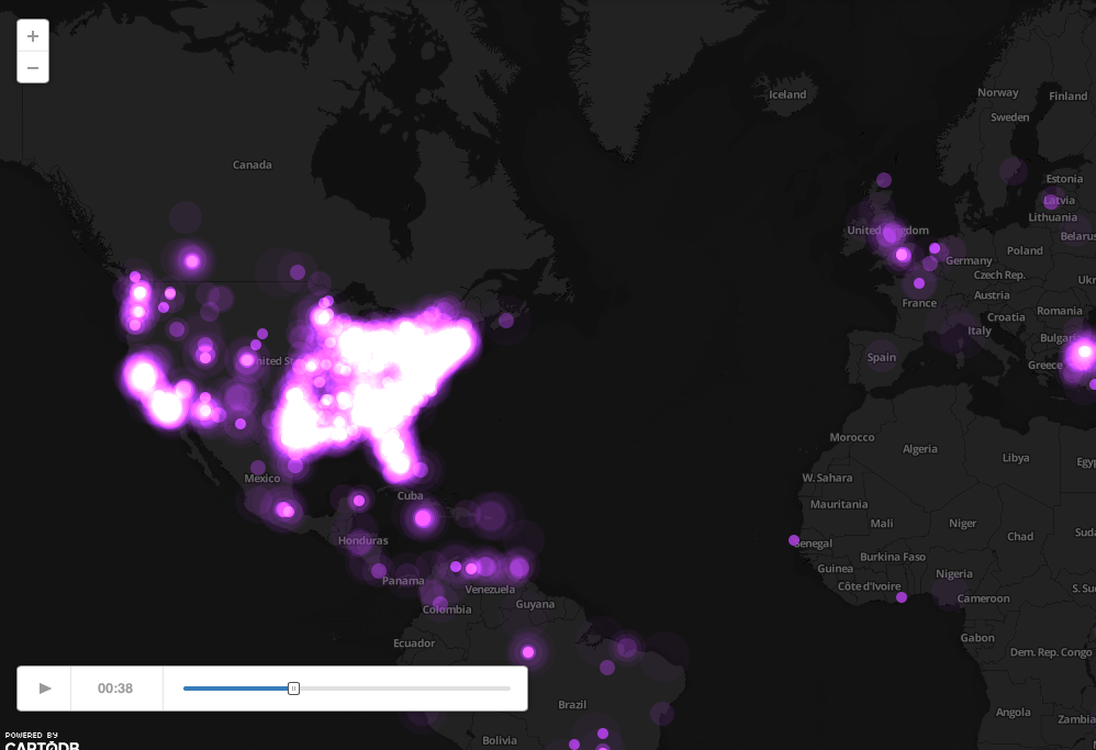
This visualization pulled Beyonce tags from twitter to fill its visualization. They tracked the world via twitter mentions of her name from hours before the release of her secret album through the day of. What I found interesting was how quickly the news of this secret album spread like wild fire around the USA. It was like the whole East coast literally exploded for a moment. I think this layout, although simple, looks charming and elegant in its presentation.
2) Where We Feel Emotion: Visual Data
http://flowingdata.com/2014/01/02/body-maps-show-where-we-feel-emotion/
I found this data very interesting. Not only are the colors appealing and evocative of there own emotional response. The visual aid of seeing where these type of emotions take place in the body is a very interesting fact to me.

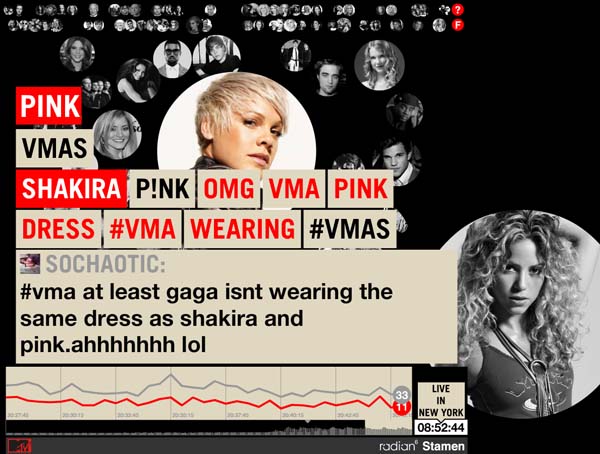
3) MTV Twitter Data: Tracking
http://content.stamen.com/kanye_west_is_an_a__hole_and_other_twitter_moments
Although this is another data tracker following Twitter feeds. The pure thing that caught my attention on this piece is the visual appeal of it. The design alone caught my attention, which caused me to follow it longer and investigate further. I want my future data tracking to be presented in a way that is interesting in the data presented, but also visually appealing for the viewer. This will be my top priority while building!